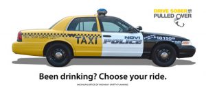
Recently I saw this add campaign above online. The campaign is against drunk driving. The image displays one car split into two different vehicles, one being a taxi cab and the other being a cop car. The image also displays text reading, “Been drinking? Choose your ride.”
What the author wants to communicate to his audience is if a person has been drinking then they can decide between going home in a cab or being put in the back of a cop car and headed to prison. He wants to put the decision into a more blanked black-and-white statement that shows how easy it should be to decide between a taxi or a cop car.

The campaign is doubly effective because the image is so eye-catching that he’d immediately have the attention of his audience. He did this by taking a very common place image that people would recognize and transformed it to fit his needs. Also without having multiple images or a lot of words on the picture people can understand the information in a quick amount of time. This all leads to an effective campaign to limit drunk driving.