
 Luckily, data can be displayed in various different ways. For some people, reading text and trying to decipher the message being conveyed is nearly impossible. These individuals are only able to interpret data by looking at a chart, diagram, or some sort of visual representation is better for their understanding; it is the only way that they can understand.
In the book Designing Visual Language: Strategies for the Professional Communicators, by Charles Kostelnick and David Roberts, the paramount usage of various ways of visual data display are analyzed and discussed further. Specifically, in chapter seven, interpretation and its relation to data displays are explored, and it is concluded that the way in which data is displayed can influence one’s interpretation and perception of that data.
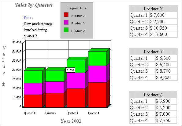
Although variations of data displays are commendable so that more people are able to understand information, the multiple ways provided to representing data also allow the representer to illustrate, or even skew the data, so that it is conveyed in a certain light. For example, on page 247 an example is provided that displays membership trends of a large nonprofit organization. The way in which the information is presented, a table, is rather difficult to read and merely looks like a times table chart. After “scanning the table, [even] Ed (the creator) quickly realizes that in this form his readers can’t see the trends in membership very easily or dramatically.”
Even though Ed realizes this and decides to recreate his data display method as shown in his next two drafts of a pie chart and bar graph, it still presents the idea that creators of data displays have the power to present their information in a murky way in order to hide certain trends, or emphasize what they would like highlighted.
Michael Lenyo is an author who has explored the effects of data representation, and in 2004 he published a book, Crooked Numbers: Using Opinions to Shape Statistics, that explores the subject in more detail. Although his book is primarily about flawed statistical data, he does a great amount of discussion on how the creators of data displays, text or visual graphics, hold power in swaying the audience.
In some cases, creators may feel compelled to represent data. If they are forced to represent their data some how, but feel that the information they have to show is incompetent or not worth they may feel that displaying it in a murky way is the only method that will not sabotage their purpose.
“There are many reasons why people choose to manipulate statistics. They may feel pressure from outside sources, they may be constrained by budget, or they may have personal objectives or values they wish to support” (Lenyo).
This is an alarming thought because, in some sense, it makes us question every set of data we have ever read and utilized. This fortifies that fact that each individual who ever views data that is not presented by their own creation, could possibly be viewing skewed data, and even biased data. It is the responsible of the interpreter to read the information at hand with knowledge of adulteration and corruption.
Overall, visual data has advanced many aspects of our informational world, and has allowed statistics and information to become more effective for some people. “…Bars, lines, slices of pies, dots, and icons. Although they may rely on text (labels, legends, titles) to define them, graphic elements do the heavy lifting because they alone represent the data” (262). As already stated, these visual elements are great in the sense that they allow some people to understand things that were never comprehensible before; however, I feel it is important to remember the fact that statistics are, indeed, often formed and presented based on opinion, thus not always one hundred percent factual.