

This week’s reading, “The Visual Rhetoric of Data Displays” by Charles Kostelnick, discusses the use of visual rhetoric in conveying research quickly and easily to the reader. Kostelnick is a professor at Iowa State University, where he teaches English courses. His main focuses are on the literature, visual art, cross culture communication, and the history and use of visual aids in professional communication.
In his article concerning data displays, Kostelnick explains how graphs, charts, maps, and other visual data displays have changed in recent history. In his abstract, he explains why the understanding and ability to interpret these tools is so important to readers:
Perhaps in no other visual realm than data design is the notion of clarity more critical or more contested. Indeed the ascendancy of rhetorical approaches was initiated by
the perceptual/cognitive science of data design, which in seeking to identify optimal display techniques, fostered a concern for ethics and evoked the universality and minimalism of modernist aesthetics. The rhetoric of adaptation, which emphasizes the variability of audiences, purposes, and situational contexts, rendered clarity contingent and mutable—a moving target that requires constant attention. Social rhetoric considered data design as a collective construct, tethering clarity to visual discourse communities, convention-building, cultural values, and power. The concept of clarity has been further reoriented by the rhetoric of participation, which is fostered by interactive digital design that enables users to adapt displays according to their needs and interests.
[…]
Charts and graphs appear today nearly everywhere—technical reports, research articles, and annual reports as well as less formal documents such as fact sheets, brochures, newsletters, and even monthly power bills. And
as the internet has grown, the ubiquity of data displays online has vastly accelerated. Now, in
the first decade of the 21st century, consumers of information are immersed in data visualization. Advances in the technology used to create and display charts, which are increasingly interactive and on a screen rather than on static paper, ensure that this trend will only continue. We are already inundated with data displays, and a deluge is heading our way.
In these excerpts, Kostelnick sums up the prevalence of data displays in modern-day publications. Because they are used so often, it is crucial that they are clear. If readers are unable to interpret them, of what use are they?
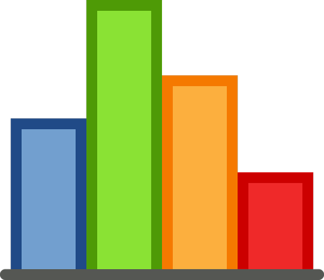
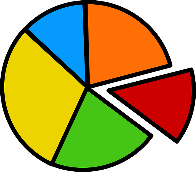
Kostelnick continues his article by examining the use of visual rhetoric throughout recent history and describing why clarity is of the utmost importance to the reader’s comprehension of the data. In discussing clarity, Kostelnick acknowledges how complex the concept of “clarity” is and looks at the rhetorics of science and of adaptation and socialization as well as the development of digital data design in creating visual rhetoric. Throughout the article, Kostelnick emphasizes the reader’s perspective, instead of the writer’s. He also considers technology’s impact on visual rhetoric. I found it interesting that bar graphs rather than pie graphs tend to be more successful in appealing to the audience. The more understandable a graph is, the higher confidence they have in the material on the whole, and I have even found this true in my own research!
The article also discusses the ability of publishers and researchers to manipulate data or represent it in a confusing and often deceptive way. It also discusses KAIROS, which I found interesting. Interpretation of any media, visual or not, is a social act largely dependent on the situations surrounding a reader at a particular time.
In high school, I attended and then later led a spiritual retreat called KAIROS. We were told that the word Kairos meant “God’s time,” which I always understood as being the rare change to step back from the chaos of life and reflect on everything and everyone in my life. However, I now understand that Kairos may be used on a much wider scale. It actually describes the relevance of a tool or event to current situations. During my time on the retreat, it was important for me to embrace the moment and focus on my life at that point. In terms of visual data, people will pay attention to graphs that have relevance and important to their current lives.
Although tables and charts may seem daunting and difficult to understand, they carry immense value if they are accurate, honest, and accessible to their audience. For this reason, it is crucial that writers and data designers convey the message as simply as possible. People spend enough time (usually) to read the text of an article or study. What visual aids should be there for is support. They should depict the data in a way that complements, not complicates, the data.