
In my last post, I described the steps that I needed to make to try to connect the streps of authors who wrote scholarly articles. I planned to do the same process to connect the trends of all nine authors, but my plans had to change once I realized that doing to the process wouldn’t work well with having so many authors that have so many lines! I discovered that the chart would turn into a confusing mess– only after I made it though.
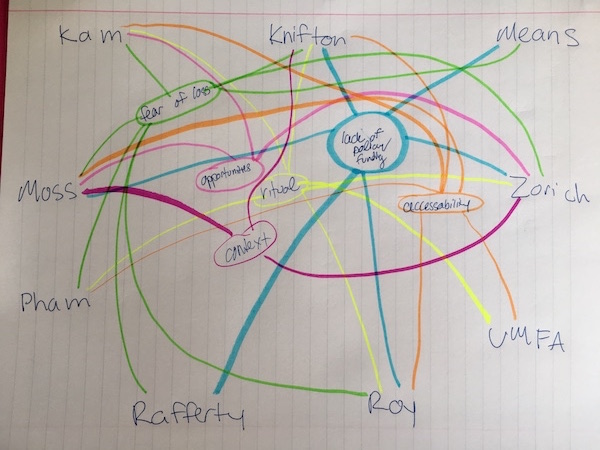
But in the process of creating my chart, I found a way to make the connections betweens the author and trends more clear. I decided to write down the authors and go through the bibliographies that I had written. The quality of my bibliographies became essential as I wrote down brief main points to make connections. The part of my bibliographies in which I drew connections were I guess reminders of the main points but were not particularly necessary to accomplish what I needed to do– which was write a brief source paper.
After I reviewed the bibliographies and wrote down the main notes of each author, I began to highlight the trends I observed.
These trends included
- experience
- policy
- accessibility
- lost artifacts
- digital future
- context
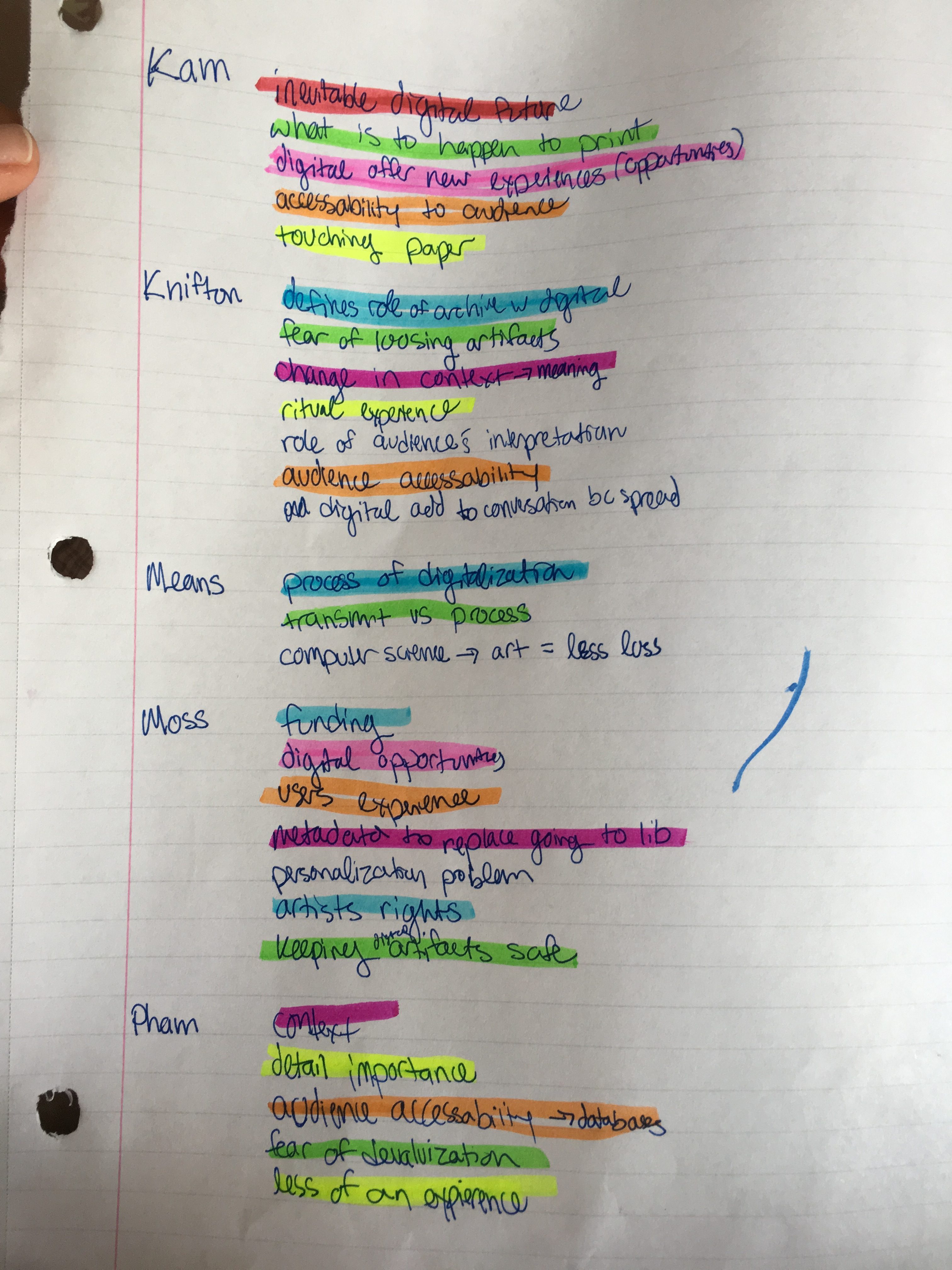
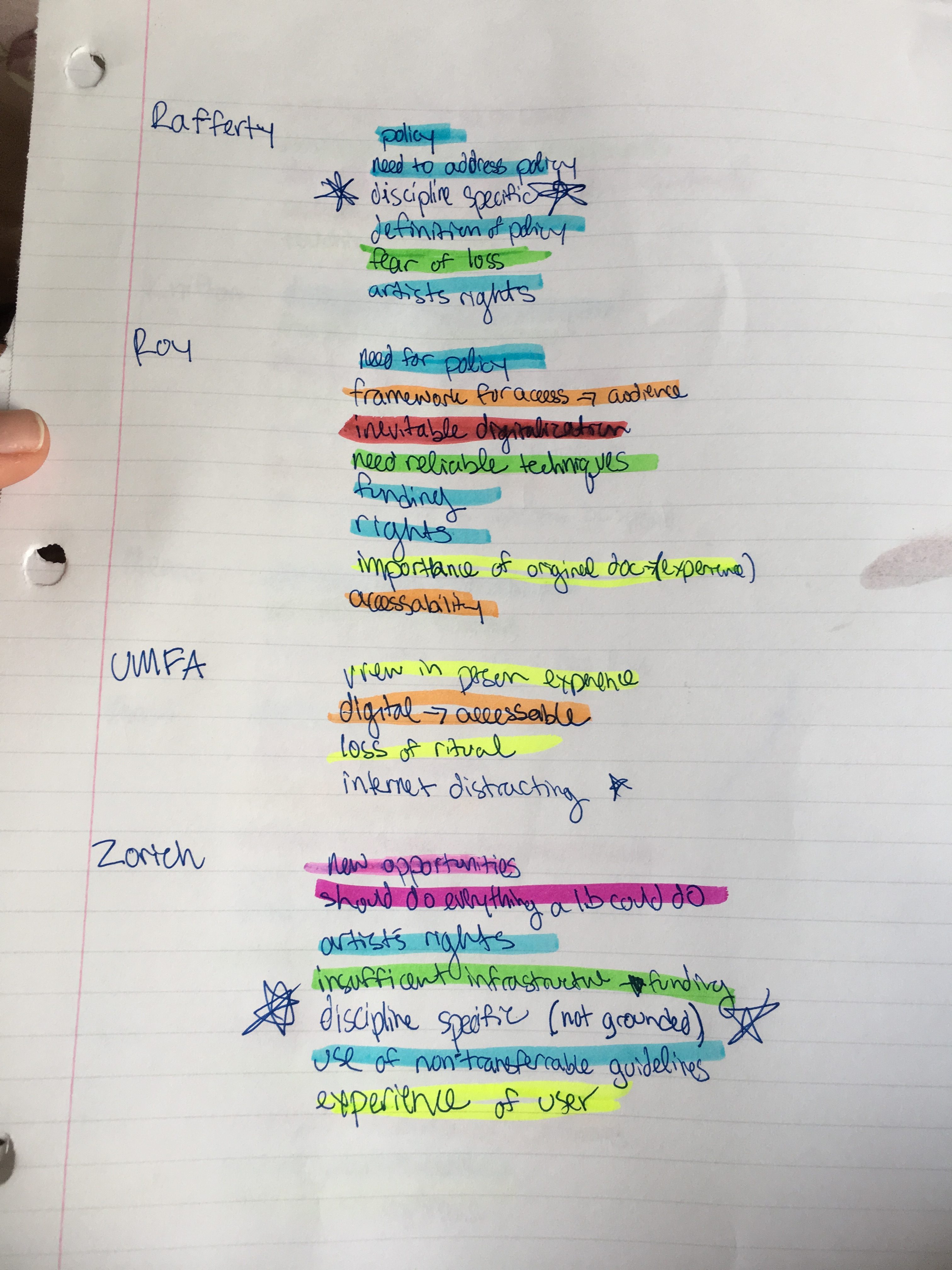 I organized the last names alphabetically then highlighted the common trends by color.
This made finding trends and connects very easy to see visually.
After I did this, I was able to make what I think turned out to be a pretty good source paper.
Until next time…