Source: https://www.census.gov/dataviz/visualizations/007/
Description: This word cloud visualization presents the information about the cities that have ever been listed as top 20 most populous cities in the country, since 1790. The size of each city name reflects the number of times that city has been ranked in the top 20.
What are the pros of using word cloud as a tool for visualization:
1. The good thing about word cloud is that it reveals the essential, that is the key words pop, and a reader can easily visualize it.
2. Making word clouds are easy and fast to make as compared to the other form of visualizations.
3. Word clouds are very engaging because their visual representation of data tends to make an impact and generate interest among its audience.
What are cons of using word cloud as a tool for visualization:
1. One of the major drawback of using word cloud is that its display emphasizes on frequency of words, not necessarily their importance.
2. Word cloud generally categorizes the words by making difference in their size, or their frequency of occurrence, but the design of the words such as white space between the characters, or use of bold font can make it appear more or less important relative to others in the cloud. This can mislead the viewer’s perspective.
Let’s move on to the critical analysis of this visualization:
1. Does the visualization fulfilling its purpose? – Since the goal of the visualization is to show the number of times these cities ranked in top 20 most populous cities in US from 1790, the use of the primary feature of the visualization, i.e., the font size, to convey that information makes sense. But, there must be a way to convey another important information about the cities which is their current population, to remove the above confusion. At the end , I have describe some ways to address this.
2. Audience: I guess it is meant for common public living in USA. If it is meant to serve US government or to help any survey like CPS, it is defeating in its purpose because of the weaknesses mentioned below.
3. Claim: This visualization claims to present the top 20 most populous cities in United States since 1790 to 2010.
4. Rebuttal includes the following points:
Misleading font sizes: Counter-intuitive relative font sizes of different cities. Explained by the following examples:
1. City with smaller font size is more populated than cities with larger font size: Even though Los Angeles is the second most populous city in US, its font size is much smaller than that of the cities like Baltimore and Boston whose population is one-sixth of that of Los Angeles. The reason is LA’s population grew recently while the data presented is historic (1870-2010). Hence, the plot does not take into account the current (or recent) population numbers of these cities. This makes viewers think that Baltimore and Boston are much more populous than LA even though the case is exactly opposite. Hence, it cannot convince its viewers.
2. Similar font sized cities differ enormously in their population: Likewise, similar sizes of New York, Baltimore and Boston give an impression that the population of these cities are comparable. However, New York is approx. twelve times more populous than both the cities. Hence, the font sizes are completely uncoordinated with the current population numbers of these cities.
Hence, I would not categorize this visualization as truthful because it is deceptive, also this visualization cannot be counted as insightful or enlightening because due to the ignorance of above mentioned details, neither it provides any new information to the audience nor it can initiate any change.
What could be done better?
The visualization has two main features:
- Font size of the cities.
- Font color of the cities.
As can be seen from the visualization, both above features are used to convey the primary goal/statistic which is the number of times these cities ranked in top 20 most populous cities in US from 1870. Cities with higher value of the primary statistic have bigger font and darker shade of green and vice versa for the cities with lower value of the primary statistic. For example, Los Angeles is smaller and lighter compared to Baltimore.
My suggestion:
Instead of using both features (font size and font color) to convey the same information, i.e., the primary statistic, use one of them to convey the recent population numbers of the cities. I would like to use font color to convey recent population numbers using a visualization somewhat like Figure 1. In the figure, font colors are varying shades of red. Darker the font color, more populated a city is. Larger the font size, greater is the primary statistic for that city. Some quick observations from the figure:
1. Los Angeles has the lowest primary statistic; hence, it has the smallest font size.
2. Baltimore has the least population; hence, it has the lightest shade of red.
3. The population of New York and Los Angeles are closest to each other compared to any other city-pair; hence their font colors are very similar. But, since, the two cities have the highest difference in their primary statistics values, their font sizes are the most differing than any other city-pair.
The advantage of this visualization scheme is that it effectively ties the primary statistic of all the cities with their recent population numbers. This puts a check on the confusion arising out of the font sizes uncoordinated with the current/recent population numbers. So, on one hand, the user sees the contrasting difference in font sizes of New York and Los Angeles and infers about the high difference in the corresponding primary statistics. At the same time, the viewer notes the striking similarity between the font colors of the two cities which should prompt him to think for a while (and read the description) to infer the closeness in the population numbers of the two cities. All these changes if implemented, can make the visualization more convincing, truthful, enlightening, and insightful.
Conclusion:
Simple is not always better: When I noticed the weaknesses of this cloud map, I realized that simple is not always better. Though the word clouds are easy to make and can be easily interpreted, but mistakes such as using two features (size and color) to represent only one dimension, may mislead the viewer’s interpretation.


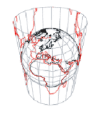
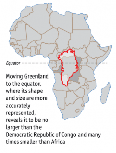 It was only after research and travelling, I got to learn about real shapes and sizes of various continents but there might be many students who leave school with such wrong perception caused due to poor visualization.