When China Sneezes, the Others Get Sick

China Import Demand Potential Effect

Description

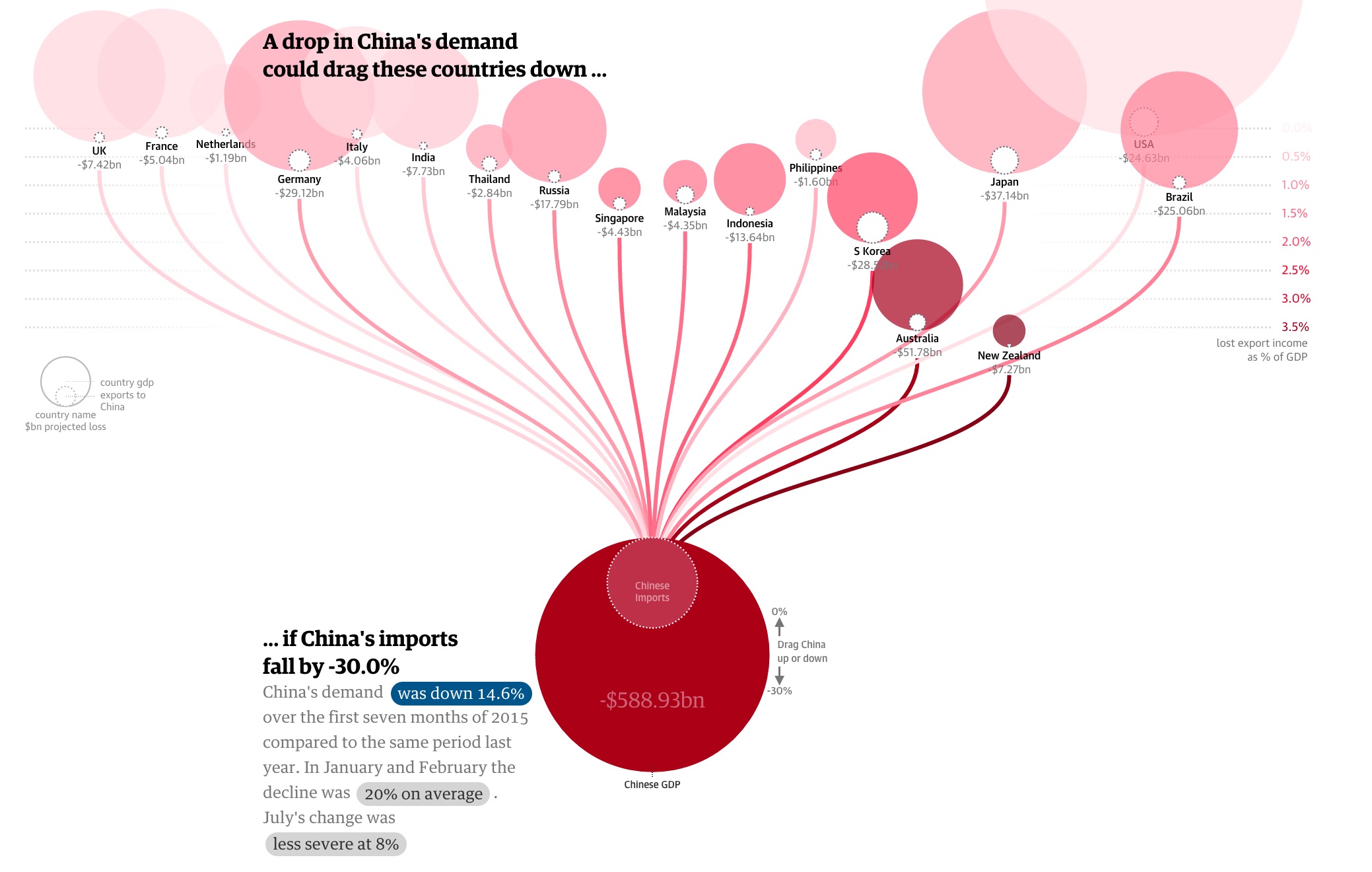
This is an interactive visualization of how 2015 China’s demand on import affects the economy of its trading partners. Indicated below, it is observed that the China’s growing momentum has started to slow down. To see how much China’s economy impacts the rest of the world, this visualization examined the relationship between China’s imports and other countries export.

The big dark red circle at the bottom represents China, and the inner circle represents China’s import demands. The China circle is connected to various trading partnering countries. By dragging the China circle up and down, we can manipulate the data to provision China’s import demand drop, from 0% to 30%, and we can observe the impact the change has on other countries shown by the export loss and its percentage of total GDP.

China GDP slowdown

What I like about this

  1. I like the interactivity aspect of this dashboard. Users can observe what impact China’s import demands has on its major trading partners.
  2. The warrant of this visualization is that China is experiencing a slowdown in growth and as a result, its import demand decreases. The graph shows exactly how big of an impact it is to other countries. This is an effective way to show how China not only is a big exporting country but also an influential importing country.

What I don’t like about this

Overall, I think this is a very good visualization. However, there is one thing I find puzzling. The size of circles representing the export loss for China’s trading partners does not change when China’s import demand changes.

To represent the changes the countries experienced in regards to China’s import demands, this graph changed the location of the whole circle (representing each country). The more percentage of GDP loss, the lower the position of the whole circle (notice in the picture how low is Australia and New Zeland compare to others). Also, the more percentage of GDP loss, the darker the circle turns into. However, it took me a while to notice the relationship of the positioning and the % to GDP loss.

A user can also hover over each country, and the graph will show you the amount of money the country loss due to import demand decrease from China. I felt the size of the import loss should also change. For example, when China decreases import demand by 30%, the export loss of the US is at $24.63bn (0.1% GDP) and Australia at $51.78bn (3.6% GDP), but the circle representing loss in the US still remains significantly larger than the one representing the loss of Australia when in actuality, Australia will lose more than half of what the US will lose.

What I Would Have Done

  1. Make the size of the export loss for each country change according to the amount of loss it will experiences when China’s import demand changes (as mentioned in the “What I don’t like about it” section).
  2. I will also put a color scale indicator along with the visualization to indicate the darker the color the circle turned to means the heavier the impact because the current scale on the right-hand side looks like it just faded out at 0.0%

References

https://www.theguardian.com/world/ng-interactive/2015/aug/26/china-economic-slowdown-world-imports

China’s Economy Slow Down is Bad for America

Function First, Form Follows

The Ice Bucket Challenge, sometimes called the ALS Ice Bucket Challenge, is an activity involving the dumping of a bucket of ice and water over a person’s head, either by another person or self-administered, to promote awareness of the disease amyotrophic lateral sclerosis and encourage donations to research.

It went viral on social media during July–August 2014. The following visualization was trying to show how much money the ALS Ice Bucket Challenge has raised compared to how few die from the disease relative to other diseases.

There are 8 different diseases/causes considered, and each one is associated with a color. The sizes of the circles are proportional to the dollars raised for (on the left-hand side) and deaths caused by (on the right-hand side) the 8 diseases/causes. The graph looks pretty at first glance, but it suffers from the following problems:

What I like about it:

The colors are eye catching, and the bubbles are vivid.

What I don’t like about it:

  1. Similar to pie charts, it is visually difficult to see the relative difference among diseases in the same category (deaths or dollars); readers are left guessing the relative sizes of the circles.
  2. Because the dollars and deaths are not aligned by diseases, it forces the reader to look at one disease at a time; it is very difficult to spot a pattern between the 2 categories by diseases.
  3. There are too many colors. I find myself going back and forth to the legend. It shouldn’t be so hard for the readers. Moreover, the colors are in no particular order; not alphabetical, not by deaths, nor not by money raised. This is way too confusing.
  4. The font could be too small. The labels and number would be quite difficult to read from a distance.


Someone redid the graph, and came out with this dot chart above. It sure is easier to trace the relationship between the deaths and the money raised. But it still make it very difficult to illustrates the difference between the death tolls of diseases and the money raised to battle them.

In efficient visualization, we don’t need to present every detail information. On the contrary, we just need to point out our claim to the audience.

Re-creating the graph: 

The simple comparison line chart or bar chart will do a better job. Since we agreed in class that “function first, form follows”. This chart does a better job comparing the 2 categories by diseases than the bar charts with faceting. If we want to make sure that this chart is still functional for color blind people, we can minimize its color choices. “Get it right, Black & White.” I like how efficiently this minimalistic graph is able to convey the relevant information.

https://drive.google.com/file/d/0BwmDkc-M_2qyTjBESklxS2NuNnM/view?usp=sharing

(I uploaded the picture of the chart onto my google drive)

Conclusion:

In efficient visualization, a lot of times “less is more”. The first priority is find out the claim, and leave out the unnecessary information. ” Function first, form follows.”

References:

  1. Makeover Monday: Where We Donate vs. Diseases that Kill Us

    http://www.vizwiz.com/2014/09/donations-vs-deaths.html

  2. Redesign: Where We Donate vs. Diseases That Kill Us [OC]
  3. https://www.reddit.com/r/dataisbeautiful/comments/2er3zq/redesign_where_we_donate_vs_diseases_that_kill_us/

Challenging Climate Change Deniers

Justin Mungal

Let’s face it, climate change is not just a debate, but a fierce fight for survival.  Those who reject 97% of scientists’ claims that human-driven carbon emissions are causing significant and catastrophic global warming are not merely “on the fence,” but rather vehemently opposed to what they categorize as conspiracy theory.  Any evidence that has more than a zero percent chance of speculation is utterly rejected by the group.  It is time to move the debate from scientific claim to scientific fact, where no ounce of speculation can be contorted into an “alternative fact.”

The journalists at Futurism have created “Five Graphics to Start a Conversation About Climate Change.” The first set of images depict what the majority of people believe, and that is that combined atmospheric temperatures are exponentially rising at alarming rates.  

While, this should be convincing enough, I no longer find it useful as climate change deniers claim that it represents normal fluctuations and that the correlation of rising CO2 emissions with these temperatures does not imply causation. This shred of speculation between correlation and causation collapses the debate into a stalemate, and so I believe that we must move the discussion into the realm of absolutely non-contentious facts.

The second set of images simply shows the rising rates of C02 emissions due to cement, gas, oil, and coal and its corresponding partitioning into the atmosphere and oceans.

This graphic is powerful because there is absolutely zero speculation and thus no room for debate.  Correlation and the (high) likelihood of causation are left off the table, and what remains is an impressive graphical representation of the massive amounts of human generated CO2 and its absorption into land, air and water.

The third graphic simply explains the science of how CO2 in the ocean can acidify its waters.

Again, there is no speculation of causation, it is merely a statement of scientific fact around the chemistry of water and CO2.  Effectively, this builds upon the second graphic, to raise the question of what impact our CO2 emissions can have on earth’s oceans.  The question is answered in the third graphic by the description of a chemical reaction summed up in the equation Dissolved C02 + Water à Carbonic Acid.  Again, there is no ambiguity or speculation – just solid scientific fact.

The fourth graphic shows how long C02 stays in the atmosphere after its initial pulse.

Seventy percent of pulsed C02 remains after one hundred years and forty percent remains after one thousand years.  Again, the graphic is not intended to show speculative correlation or causation, but rather clearly and accurately represents the fact of C02’s lifetime in the atmosphere.  Essentially, once CO2 is pulsed, it stays in the atmosphere for a very long time.  Coupled with graphics two and three, we see a picture of the massive amounts of C02 being emitted threatening the pH balance of our oceans for a long time.

The fifth graphic depicts projections of what earth’s climate might look like in the years 2081-2100.

https://futurism.com/wp-content/uploads/2017/05/5-climate-future-ipcc.jpg

The projections depict a boiling world of monsoon rains and ocean covered lands.  I could imagine that such a world would be barely, if at all, inhabitable by humans.  However, even I as a climate change believer, find this image difficult to digest.  I know that scientists find it difficult to predict the weather for a given week, so how accurate can hundred year projections be?  I do not deny that such predictions are possible considering our current global warming trends, but forecasting that far into the future seems spurious and, given the rash skepticism of the opposing side, non-provocative.

For the majority of us who believe in the work of climate scientists, graphics one and five are panic inducing.  We believe that the rising global temperatures are abnormal and humanly caused.  Moreover, the idea that the earth may not be humanly inhabitable for long if we continue on our current trajectory is not farfetched.  These two images capture that scientific consensus frighteningly well.  However, the purpose of this article, and I believe the necessary debate, is with those who reject such claims for the improbable claim that the overwhelming evidence of correlation does not imply causation.  That is why I am far fonder of graphics two, three, and four in terms of moving the debate forward.  They clearly and simply depict measurements and chemical reactions.  They cannot be negated as they do not contain any speculation over causation, are repeatable, and provable.  Thus, they can be starting points for serious debate over the current state of climate affairs and the ominous threats they imply.

What I would do to improve the graphics is include more visualizations like graphics two, three, and four.  Those engaged in the fight of their lives – the debate of climate change – need more ammo that cannot be misconstrued and discarded as circumstantial.  To spend more time creating images like graphics one and five are futile, as we know that the counterargument is to negate them as speculation and propaganda.    Unfortunately, we do not have time for visualizations whose validity is debatable – time is of the essence.

References:

<https://futurism.com/five-graphics-start-conversation-climate-change/>

The Beauty of Roses

This week I watched an old movie about Florence Nightingale. It was a really great movie, and I was blew away by how great Florence Nightingale is. She is best known as the lady of the lamp, the founder of modern nursing who cared for thousands of soldiers in appalling conditions during the Crimean war.

Later on, I found out that Florence Nightingale was also a superb statistician. In 1857, she created a revolutionary a controversial diagram, called rose diagram. It forced the British government to create better and cleaner hospitals.

This is the Nightingale Rose chart.

The charts illustrate from 1854-1856, the solder’s death in each month according to the cause of the death using different colored “rose petals”.

The message that the diagram delivered was potent and direct – hospitals can kill. It’s also fascinating that the diagram revealed that if the right improvement were made those mass deaths in the hospital could be avoided.

There are 4 benefits of Nightingale Rose chart : 1) The color is very eye catching, and the audience is willing to read more at the first sight 2) Each slice takes an equal sector of the circle, making labeling much cleaner; 3) Each slice still maintains an accurate area comparison with other slices (by making the radius of the slice equal to the square root of the value); and 4) Nightingale also put another contrasting rose chart to show that the death could be avoid with the right improvement.

Nightingale was the first to use a statistical graphic as a call to action. The diagram convinced the public that the epidemic disease could be controlled and that is the purpose of the graph. And force the British government to spend money on the sanitation.

This is exactly what we are trying to achieve in our data visualization class. The purpose of a diagram is trying to make a claim and creating value.

The Nightingale Rose chart illustrates that how powerful can a good visualization be. But it also occurred to me that the larger blue “rose petal”could be miss leading.  We cannot “cherry picking”on how we present the data. Representing raw data visually should reveal, not conceal.

Reference:

  1. Worth a thousand words

The Economist

https://www.pinterest.com/pin/128704501821544284/

  1. Did Nightingale’s ‘Rose Diagram’ save millions of lives?

http://www.florence-nightingale-avenging-angel.co.uk/?p=462

  1. Florence Nightingale — História da Enfermagem — O filme completo

https://www.youtube.com/watch?v=sYZnzt0CJtE

Visualization showcasing death rates from air pollution.

Dashboard – https://ourworldindata.org/

Description:

This area chart visualization presents the death rates across the world caused by air pollution from three sources namely indoor solid fuels, particulate matter, and ozone. The death rate numbers shown are per hundred thousand from 1990 to 2015 in steps of five years.

What I like about this dashboard:

  1. Area chart is effective for visualizing magnitudes of connected-series dataset as visible because of a filling between the line segments and the x-axis. So, a person can observe the change in growth effectively. This observation cannot be visualized so effectively in other visualization tools such as line graphs.
  2. This dashboard presents both the absolute and relative trend of death rate either in world or in any country.
  3. It is interactive in nature and includes a drop-down menu of several countries in the world. Either one can visualize the pattern of entire world or can also view the pattern in any single country by just select it from a drop-down menu.
  4. Another good feature it includes is that one can view the magnitude of death rate for any individual source of air pollution or in a combination of two or three. Such as visualizing death rate pattern only from ozone or in a combination of two sources such as particulate matter and solid fuels.
  5. It also gives the information of death rate in an absolute as well as in relative to the other regions also.

Cons of visualization tool used:

  1. Data in one segment is hidden behind the data in another segment. When I visualized the death rate pattern only from air pollution from ozone, the width of the green area was thicker as compared to its width when all the three areas are enabled. This is undesirable as it does not convey the actual trend.
  2. Generally, to get a value for a point on a curve, we look at its Y coordinate. However, in this case, to get a value, we need to subtract the upper and the lower Y coordinates of a point on an area. This makes it difficult to visualize the relative values of the three areas in first go.
  3. For the absolute trend, as one moves from left to right in the chart, the y coordinate of the green area (death from ozone) decreases which gives an impression that the actual value of the deaths from ozone is decreasing from 1990 to 2015. However, the deaths from ozone do not change over the years as reflected by the (almost) not-changing width of the green area. This is highly confusing. The confusion also arises from the fact that the green area is very thin making it appear somewhat similar to a line curve. Hence, change in y-coordinate gives an impression of change in magnitude.
  4. The shape of the entire chart (group of three areas) depends on the order in which the three areas (green, red, blue) are stacked vertically. Hence, a change in order will significantly alter the shape of the chart. For example, if the green area which is almost constant in width is kept at the bottom, the entire chart will look more stable. This is undesirable because visualizations for same data should look similar.

Let’s move on to the critical analysis:

  1. Does this visualization carry any goal, does it have any purpose?I believe that the visualization severely lacks a purpose and its goals are quite unclear. Hence, I would not categorize it as enlightening.
  2. Considering the domain, two things came in my mind, audiences and the needs. 

Audience – I am unable to identify the target audience for this visualization. If it is intended for the worldwide social or environmental agencies, I do not think that the information provided is sufficient to fulfill their needs or can help them to decrease the level of air pollution caused by any of the sources.

Let’s take an example:

Knowing the trend of deaths rate from particulate matter over the years does not solve any purpose unless it provides further information about the types/categories of the particulate matter causing deaths such as if they are man-made or natural or both, and their respective proportions in the deaths. There can be various types of particulates like the ones resulting from dust storms, volcanic eruptions, or chemicals such as oxides, nitric acids, etc. Similarly, nearly half of the world’s population still relies on burning solid fuels such as wood, animal dung, crop residue and coal for their day-to-day household needs. Therefore to get a better picture and to know the root cause of air pollution, further details providing death trends from these sub-types of particulate matter should have been included. Hence, I feel that the visualization is not insightful.

  1. Claim: This visualization does not showcase any claim, either about any particular air pollution source or any region most adversely affected by any kind of air pollution. As there is no claim, there is no warrant that provides any reasoning behind the arguments.
  2. Rebuttal: The viewers cannot throw any counter argument as there are no arguments presented in the visualization. If the designer of this visualization thinks that this dashboard is sufficient to work on the death rate numbers for any health or environmental organizations, my rebuttal would be that no this not sufficient as evident from the points listed in this blog post.
  3. The data is in the scale difference of five years, so one cannot get the actual information about the condition in intermediate years. Subjects like death rates require continuous data to analyze the situation across years.
  4. The authors have completely missed the connection between sources of air pollution and death. And, that connection is a “disease”, which is caused by air pollution. Air pollution leads to death of a person through a disease. People just do not die by inhaling harmful particles. Air pollution caused by any of the listed sources can result into a lung failure, heart problems, etc. Hence, I do not find the visualization numbers “convincing”. 

What could have done better –

  1. Use of multiple sources of data: Death rate is a very sensitive subject so designing a visualization from only one data source makes it less effective as compared to the visualization designed from using multiple data sources which includes root causes, effects and continuous information from 1990 to 2015. The continuous data would also help to make any prediction in coming years, which cannot be made currently.
  2. This visualization does not give any comparative analysis of the effect of air pollution in various regions. So, Bar graphs could have been used for this purpose.

Below are the links showcasing some similar visualizations in air pollution. I would not say that these visualizations are a perfect substitute or they address every weakness raised above, but it appears that they carry a purpose and can be helpful for fulfilling the goal of their audiences.

Redesign:

As this visualization does not carry any specific goal and any specific actions to meet that goal, it cannot be categorized in the category of visual confirmation. It can fit in a visual exploration quadrant though. I came upon some useful visualizations from the data provided in this chart.

Comparing similar visualizations:

  1. http://www.scoop.it/t/classroom-geography/p/4018472031/2014/03/27/infographic-deadly-air-pollution-where-and-how
  2. http://www.wri.org.cn/en/node/41165
  3. You can view my redesigned part here – https://docs.google.com/a/scu.edu/document/d/1X1XZyh1MgFW0B3VsvxKV1aehY2M391skNTudTDfAKg8/edit?usp=sharing
  4. Tableau public work: https://us-east-1.online.tableau.com/#/site/magarwalscuedu/workbooks/46729/views


THE US TUITION INCREASE

Once upon a time in America, students paid for college with the money they made from their summer jobs. Then over the course of the next few decades, public funding for higher education was slashed. These radical cuts forced universities to raise tuition year after year, which in turn forced the millennial generation to take on crushing educational debt loads, and everyone lived unhappily ever after.

From January 2006 to July 2016, the Consumer Price Index for college tuition and fees increased 63 percent, compared with an increase of 21 percent for all items. Competition is one reason. As schools wanted to attract top-tier students, the costs of hiring brand-name faculty members, building expensive facilities, and offering comfortable student amenities all add up. All these factors combined produce headache-inducing tuition rates at both private and public universities.

The following visualization shows the average in state tuition and fees for one year full time study at a public four-year institution from 2005/06 to 2015/16 for different American states.

Best way to analyze data is through data visualizations. Data visualization turns numbers and letters into aesthetically pleasing visuals, making it easy to recognize patterns and find exceptions.

We understand and retain information better when we can visualize our data. With our decreasing attention span, and because we are constantly exposed to information, it is crucial that we convey our message in a quick and visual way. Patterns or insights may go unnoticed in a data spreadsheet. But if we put the same information on a chart, the insights become obvious.

So  what’s good about this visualization?

  • The dashboard incorporates a significant amount of data, making it easy to compare and convey the matrix in the context.
  • The dashboard has a flow structure which effectively incorporates user to view data based on time scales such as year and identify the trend year after year.

What can be changed

  • Too much data, too close together – this dashboard doesn’t have enough room to breathe, giving users data overload. It’s also poorly structured, making it extremely difficult to interpret what information the chart is displaying, especially at a glance.
  • Confusing colors – The plain background is quite helpful as it makes the visualizations stand out, however the subtle variation in shade actually makes it more difficult to differentiate between the lines for each of the cities.
  • Make visualizations clear and precise. It is not a good idea to include all the information in a single visualization which cannot be digested easily doesn’t solve our purpose. So, it’s better to enable drill downs to navigate to more detailed information from the main visualization.

How to fix it:

  • Use of vibrant and distinct colors – colors such as green, blue, yellow, or red could be used to indicate different ranges of percentage increase.
  • Add options to drill down – drill down option could be used to represent the point where the state reached the percentage value 75%,50% or 25%.

Dashboard could be broken down to multiple dashboards to include states region wise. This makes the data easier to read and digest.

References:


https://www.geckoboard.com/blog/5-terrible-dashboard-designs-and-how-to-fix-them/#.WQPdh4jyu00


Aliens among us

For this blog post I picked up this Info graphic because I found it to be somewhat interesting. It doesn’t really have the concrete claim (like aliens are among us or aliens are not among us), but rather tries to inform us on what are people’s opinions on the matter.  Is this a good visualization? I think so, because topic itself is a bit hard to think seriously about it is good to have info graphic that has a sense of humor!

PROS:

  1. Visualization has to support the claim, since the claim is such that it just educates people on people’s opinions rather than claiming that aliens are indeed living among us I think it does support the claim very well.
  2. It looks visually appealing, the graphs and indicators are self-explanatory and don’t need any extra legend. Although some gaps could have been chosen better but I will mention it in cons section.
  3. Sources and claim are included in the graph itself so it needs no article to go along with it. In addition because graph has claim written on it is virtually impossible for someone to misuse the graph to prove their claim (unless their claim is same as the graphs).
  4. Believers and Skeptics showed on the map as well as a separate list in declining order. I think map visualization gives an interesting perspective on how neighboring countries have very different beliefs. For example Canada and Mexico are listed as non-believers while USA listed as believer.

CONS:

My main concerns are with data itself and how it was acquired, numbers are show no indication of how survey was taken and what the sample size was.

  1. One in the five people believes that there are aliens living among us. How exactly did they calculated it? Is it calculated across all of the surveyed countries or is it just based on US numbers. This is unclear and given the huge gap between believer counties and non-believer countries should be taken with the grain of salt.
  2. What was the exact question and response options? I have a hard time believing that 20% of people think there are aliens living among us. For example my grandmother saw something that looked like a spaceship long time ago but I know she never believed there were aliens on earth. Me personally; I do believe there is life somewhere in the universe, but I don’t think there are aliens living on earth. And defiantly not among us.
  3. The number of believers compared to age also seams iffy, it would be nice to know the sample size of each group. Also it seems a bit not logical how number of believers drops with age, if you believe in something that is hard to disprove why would you suddenly stop believing? Although I did find another article did show correlation saying that older man did believe less in alien’s existence compared to younger men.
  4. Pie charts on the info graph a little bit harder to read and compare, I think this graph should have been a bar graph. Bar graphs are much easier to compare to each other especially when differences in numbers are not very big.
  5. Split between believers and non-believers is not well defined 21% in Spain is not too far form 16% in UK.

http://www.newsweek.com/most-people-believe-intelligent-aliens-exist-377965

Nintendo Sales Trend Graph

This graphic is a line graph that is designed to show that Nintendo’s hardware sales have had a negative trend from 1998 to 2006 in both it’s home consoles and its handheld gaming systems. The graph shows that on the home console side, Nintendo had declining to flat sales from 1998 to 2006, with sales never moving past 10 million consoles sold. While sales spiked from 2006 to 2008, sales dropped very quickly afterwards. The graph also shows that while Nintendo had more success in selling handheld systems (consistently sold more than home consoles), even these sales saw a sharp decline from 2009 to 2016. The graph is part of an article that is making the argument that Nintendo’s future in many ways depended on whether or not the sales of its new console (the Switch) could reverse the poor sales trend. The article uses the graph to imply that if the Switch sells poorly, then Nintendo might never be able to reverse the trend.

There are several things that the graph does well. First, it starts the y-axis (sales) at 0, which helps keep it more accurate. Second, the graph is very clear and easy to understand. The two colors are easy to differentiate, and the legend and labels make it easy to understand how many systems were sold in which year. The use of alternating colors for each year also does a nice job at giving the graph a clean look without being too boring to look at. The graph does a good job documenting it’s sources (Nintendo and Statista), and specifies to the audience that its time frame is in fiscal years. Finally, the graph is extremely functional at showing it’s main objective: that Nintendo’s sales have been in decline. Regardless of which audience is looking at the graph, it should be clear to anyone that Nintendo has been in trouble, and that it needs to sell really well really soon.

That being said, there are several things that could improve the graph. First, while the graph does a good job at conveying basic information, it doesn’t do a great job at showing potentially why Nintendo has struggled. Because of this, it is a bit difficult to draw solid conclusions from the graph.

I feel that this graph would benefit by listing important events, such as when Nintendo released different consoles during this period. For example, the graph could somehow, whether on the graph, with dots and a legend, or a timeline below, mention that Nintendo released its GameCube system in 2001 (the period with the flattest home console sales, in part due to increased competition), and released the Wii system in 2006 (which caused the sudden increase and decrease in sales). Adding these events would give the reader a better picture of Nintendo’s struggles. Without knowing any of this, one might be confused as to why Nintendo’s sales have been down, or one might think that Nintendo’s lack of sales is because the company hasn’t released any new systems. The graph could also benefit if it showed the sales trend lines for Nintendo’s competitors, the Playstation and Xbox lines. Without these comparisons, the audience might not get the intended conclusions. For example, Nintendo selling a combined 25 million systems  between 2002-2003 might not sound bad on it’s own. However, if we saw that Sony had sold 40 million PlayStation 2’s during the same time period, then the audience would really get a sense of how much trouble Nintendo was at that time. Another thing that might help audiences is if it was mentioned somewhere that handheld systems are less expensive than home console systems. Again, this would help prevent audiences from thinking that Nintendo’s high sales in handheld systems was offsetting Nintendo’s troubles in home console sales.


http://static1.businessinsider.com/image/58790081ee14b6c7148b7fe9-1200/20170113nintendohardware.png

http://www.businessinsider.com/nintendo-console-sales-chart-switch-2017-1


Did you ever know this?

After writing my first blog and having discussions over Visualization for 4 weeks, I can certainly see a change of perception towards Data/Information. This deep thinking invoked me to search for many numbers of charts/reports/visualizations available all over the internet.What I exactly wanted to achieve is to find something with the help of which I can understand all the terminologies/principles/ properties and recommendations we learned from Professor Schermann. As I am always very much excited to know about new things or may be unexplored facts, this report became my end of the search and I am sure that many of you would be wondering that which country is at the top for what. So, here you go!!

http://www.informationisbeautiful.net/visualizations/because-every-country-is-the-best-at-something/

This chart is research of David McCandless along with Stephanie Smith and Esther Kersley. The original version of the research came out in 2009 which is also available on the link above. The data from which the research is derived is also attached and the spreadsheet shows all underlying information.

The author claims to represent all the countries and what they are best at. They all are divided into 9 categories altogether which includes commodity, psychology, ecology, gastronomy, economy, Nicety, humanity, technology, nasty. It makes this chart interesting enough to immediately connect with the audience. for example, I suddenly wanted to check out category humanity, especially for female entrepreneurs and Zambia won my heart. The backbone of the report is its documentation attached. We have discussed that validation is very important and documentation is something which gives us the base to rely on information. Below are some terms which we discussed in class and could be easily understood with this chart.

1. Claim: According to data, every country is the best at something. This claim is derived mostly from the data available for top ten countries in *.

https://docs.google.com/spreadsheets/d/11uifsxtHKwRysrxNxTDhvWLDHTlxQ0jYP8PODoLM2hM/edit#gid=1130095511

2. Warrant:  It is the relation you derive from data to explain your claim. Example- Australia is at the top in the world of cyber security incident and report comes from Pwc which compares the number of such incidents among countries and Australia has 9,434(highest) such incidents in comparison to other countries.

http://www.pwc.com.au/press-room/2015/cyber-security-risks-oct15.html

3. Backing: Backing supports your warrant and to validate this point I went on checking some news published on the report. An insight to all of us could be that Croatia is number one in kidney transplant the same was verified by NCBI. There is a sufficient growth in organ transplant that supports the argument.

https://www.ncbi.nlm.nih.gov/pmc/articles/PMC3610255/

4. Rebuttal: It is that counter indication which makes the claim dubious. A rebuttal here can be seen from an example of Child Bride which is claimed to be the highest in  Niger. There are six countries that do not specify a minimum age for marriage and it could possibly impact this claim. There might be no data available for these countries in this regard.

https://www.weforum.org/agenda/2016/09/these-are-the-countries-where-child-marriage-is-legal/

5.Where the claim qualifies: David reveals all of his data sources and accepted that for some countries there is no data available. Hence the claim qualifies only for participant countries and for all of these nine categories. Anything beyond which they cover could be another surprise.

Though the chart is not explaining the facts but it is very insightful. It might be very enlightening for commodity business because now they can know which country sells the cheapest Nike and Botswana is the best place to get Diamonds from. Otherwise, my wild guess would definitely be China for Diamonds. This chart is truthful as most of the facts include the information for those derivations. For example of validation, World Atlas also claims that worst country for child labor is Eritrea.

http://www.worldatlas.com/articles/worst-countries-for-child-labor.html

The last and the most crucial part is to understand the domain. Context is such powerful tool that it could turn things around. A good example is this chart showing Singapore at the top for having healthiest people. Data is driven from Bloomberg rankings and ranking is based on factors like birth, mortality rates and cause of deaths. Whereas USA today claims the same but differs in its listing putting Qatar at the top. The debate is not for who is right instead of context because 24/7 Wall St’s ranking is based on factors widely categorized as health indicators, access measures, or the economy. Here you see how the context can bring out a different picture, so be aware of your domain while claiming!

References:

https://www.usatoday.com/story/money/2015/04/03/24-7-wall-st-healthiest-countries/70859728/

and all of the hyperlinks above.

People Don’t See Social Media as an ‘Important’ News Source

“Social Media is not about the exploitation to technology but service to community”

In times like these where the world is constantly changing, keeping oneself up-to-date with current news and affairs is becoming increasingly important. Though not everything that happens around the globe has a significant immediate impact on each one of us, being aware and well informed surely holds an excellent value.

While surfing through Facebook, Twitter or say LinkedIn, I often stumble upon some very interesting news feeds, articles, blog posts. I personally must agree that I spend more time on these sites than on any of the official new websites. Hence, for me, social media happens to a chief source of news. It is really thought provoking as to how social media brings together news, trends and best practices from various parts of the world. Facebook and Twitter also provide platforms that host live videos and real time updates.

Having said all this, recently I came across an article which left me wondering. The article –  People Don’t See Social Media as an ‘Important’ News Source claimed that one in ten US adults get news on Twitter and four in ten get news on Facebook. It had a couple of pie charts which showed that 17 % of US adults use Twitter and 10% get news from Twitter. On the similar lines, it showed that 66% of the US adults use Facebook and 41% get news on Facebook. Reading through the entire article, I learnt that it also provided some more information like the importance level of these sites and how do the younger generation perceive them.

Here’s my analysis over the visualization and the data presented in this article.

What did I like?

  • The caption of the figure itself summarizes the findings the pie charts want to convey.
  • By putting the numbers in a scale of 10, we can easily interpret what role Facebook and Twitter play in conveying news to the adults in the US.
  • It also gives a quick comparison of the popularity of two of the biggest platforms which social media offers today and how adults contemplate them.

What more could it include?

Audience: Giving a thought on which group of users would find this information useful, it would be perhaps website hosts (Facebook and Twitter), news networks (having their official pages and accounts on FB & Twitter) and lastly the general curious public (like me!). As professor has been mentioning in class, every claim must promote some action. This chart is not actionable as it does not really provide much details as to what action each of these audience categories could take for their benefit. If it provided some details on the specific new channel accounts/pages are being followed/liked by those 10% of users(Twitter) and 41% of users(Facebook), it would then help in understanding the demand of various news networks. It enables a news network to take appropriate decisions to improve their visibility. It would also give Facebook and Twitter an opportunity to work on their algorithms of recommendations/suggestions for people.

Important Level: The table included below the graph depicts 3 levels of importance cited for FB and Twitter as a source of news – most important, important, not very important. If this information was included in the pie chart itself, the chart would have been more descriptive. Apart from that, the math being done seems to be incorrect because the percentage breakdown for Twitter users exceeds 100.

Age group: The chart only focuses on the US adults. However, the article also mentions that the younger Facebook and Twitter users tend to see the services differently than their older counterparts. As a viewer, I would also want to see the statistics for the younger generation since they have a comparatively better hold on technology. Hence it makes me ponder if the article title really holds true?

Other sources: The author could have also included data regarding what other sources are people considering to catch up with the news, if not Facebook or Twitter. Hence to me the chart is not completely functional.

Aesthetics: Using bright relevant colors and a bigger font would help reach out to a larger audience. The colors being used also plays a role in engaging the viewers.

Better Design – The author could have also furnished more insights of their research by doing something like this:

http://www.journalism.org/2013/11/14/news-use-across-social-media-platforms/5_profile-of-the-social-media-news-consumer/

The above visualization released 2 years back has a similar domain and is way more descriptive as it also categorizes the audience, news sources and social networks into different classes.

Redesign –  In the below link, I have tried to redesign the visualization to present my ideas based on the data the author must have had post the research.

https://drive.google.com/a/scu.edu/file/d/0Bz_BJfR_3JJDVGhaTEJEUjM0Qm8/view?usp=sharing

Conclusion: The article does provide some very interesting insights. But the charts included did not seem to be complete and are less instructive. Working more around the charts and the visualizations would empower the audience to act in a specific direction!

References:

https://www.gooddata.com/blog/5-data-visualization-best-practices

https://www.digitalready.org.au/training/social-media/why-have-an-online-presence/the-importance-of-social-networking