Word Cloud from Resume

Word Cloud

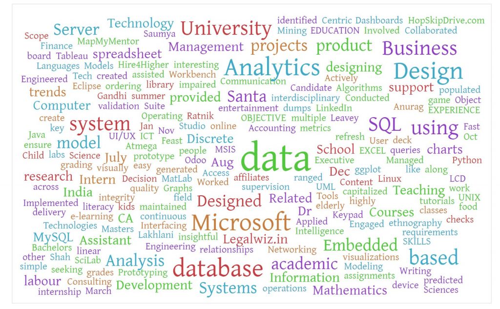
This is the quarter when I am applying for internships. After speaking to the career counselor at school , she suggested me to generate a word cloud out of my resume. I tried to create a word cloud via an online word cloud generator. I used https://worditout.com/word-cloud/create to create the word cloud.

For creating the word cloud , I copied the text of my resume and clicked on generate. Essentially, word clouds represent the frequency of the words used , higher the frequency bigger the font of that specific word.

This is the visualization which resulted from my resume. I am interested in data analytics and new product development, hence words like data, analytics, business, design, database, SQL are used more, and that is reflected in the cloud.

Upon first look , I was able to spot the words data, analytics, and Microsoft. It can be inferred that these words are used the highest number of times in the text on my resume. This word cloud gives an overview of the words and my interests out of my resume. By simply looking at it, certain domains can be identified within a second, where as it takes time to read through the whole resume document.

How Executive Dashboard are changing the Way Business is done

Dashboard can have a significant economic impact on business because it reduces the amount of time to process analytics and increased efficiency and effectiveness in marketing.

Better information = better planning = increased ROI

With real-time information, executives can view reports of KPIs from different departments. The high-quality data can help executives to better make decisions and adjust plans to changing conditions quickly and efficiently .

Dashboard is not just for executives. Dashboard can breaks down the report into different levels of employees in every organization. Executives can use dashboard to communicate missions to every employee.

Reference:

http://bigdata.cioreview.com/cxoinsight/how-executive-dashboards-are-changing-the-way-business-is-done-nid-23528-cid-15.html

The Top 5 Business Benefits of Using Data Visualization

By 2015, the global annual rate of data production is expected to reach 5.6 zettabytes, double the rate of growth in 2012, according to IDC. Data visualization tools and techniques offer executives and other knowledge workers new approaches to dramatically improve their ability to grasp information hiding in their data. Here are the top five benefits that data visualization offers to decision makers and their organizations:

1. Absorb information in new and more constructive ways. A May 2013 survey by Aberdeen Group finds that managers in organizations that use visual data discovery tools are 28 percent more likely to find timely information than those who rely solely on managed reporting and dashboards. Moreover, 48 percent of business intelligence users at companies that use visual data discovery are able to find the information they need without the help of IT staff all or most of the time.

2. Visualize relationships and patterns between operational and business activities. One of the key benefits of data visualization is how it enables users to more effectively see connections as they are occurring between operating conditions and business performance. In today’s highly competitive business environment, finding these correlations among the data has never been more important.

3. Identify and act on emerging trends faster. Using data visualization, decision makers are able to grasp shifts in customer behaviors and market conditions across multiple data sets much more quickly.

4. Manipulate and interact directly with data. Unlike one-dimensional tables and charts that can only be viewed, data visualization tools enable users to interact with data.

5. Foster a new business language. Simply it means to tell a story through data.

Engaging executives with data visualization can open up new ways of looking at business and operational data, enabling senior management to scale new heights in business performance while enabling a much broader audience of analytics users in the quest for greater performance.

References:

http://data-informed.com/top-5-business-benefits-using-data-visualization/

Welcome to Dashboards, Scorecards & Visualization

This course introduces the theoretical fundamentals, design principles, and visualization techniques to design data visualizations that help you to understand, analyze, and solve business problems in a data-rich environment. Effective data visualization enables you to uncover insights in data, to transform insights into actionable messages, and to communicate these messages effectively.

The course is centered around three fundamental questions:

  • Why is a data visualization sometimes worth ten thousand words?
  • Why are some data visualizations more effective than others?
  • How to design an effective data visualization for a given business problem?

Mastering this course will equip you with a moderate level of data literacy. Data literacy is the ability to interpret, construct, and convey meaning through the functional and truthful visual presentation of data. You will practice your data literacy by creating data visualizations using visualization software and web-based visualization frameworks.

Data literacy is a vital skill in our data-driven world. The chances are high that you will be interpreting and designing data visualizations throughout your career. The level of data literacy offered through this course allows you to establish a competitive advantage in Silicon Valley and the global marketplace.