Interpreting Syria issue with an effective visualization

I am not a political person, so I do not usually comment on politics. Part of the reason is that it is hard to consume all the particular political information and data with busy life event. I know there’s a big issue is still going on in Syria, but I never properly understood who is fighting whom in Syria. However, good visualization can organizing complicated data sets, analyzing the data set and helping readers to get right information in a given time.

syrian-war-relationships

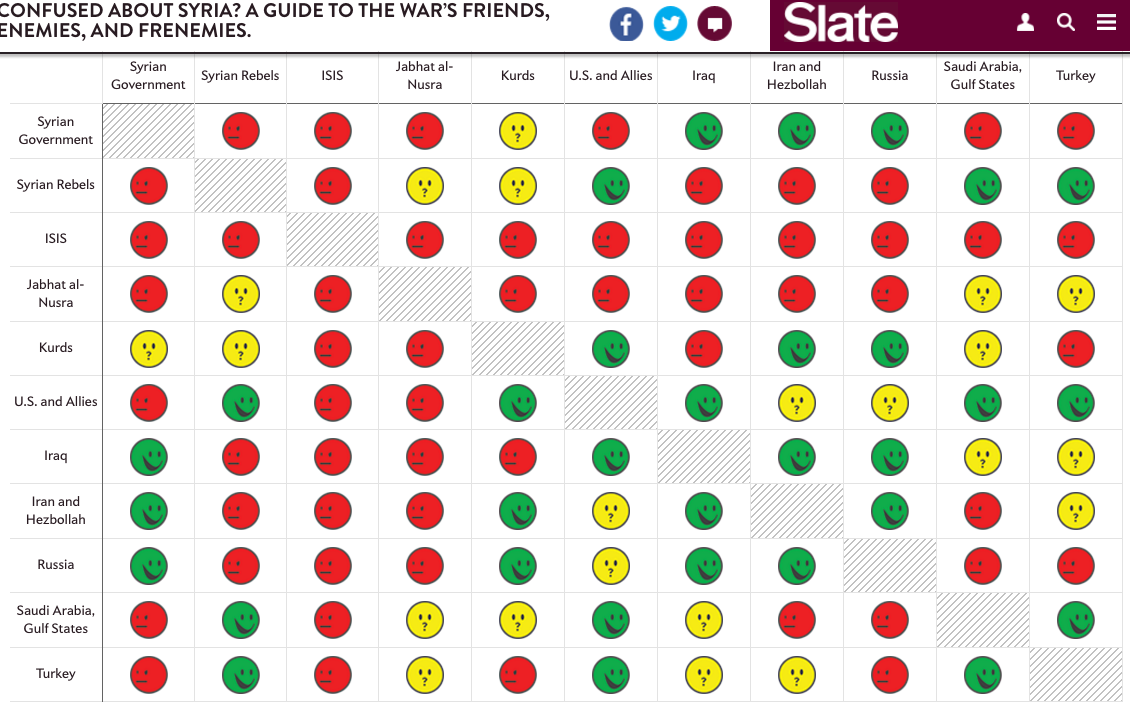
Without even reading the article I could already understand who is fighting whom in Syria by the nicely created visual explanation.

syria 2

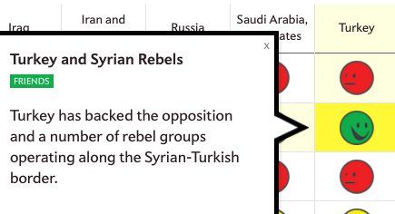
Surprising point of this visualization was not only the vivid facial explanation with different color. By simply clicking any of the facial emotions, there is concise explanation of the two parties relationship.

If I am understanding right, this visualization is falling into Visual discovery category of Scott Berinato’s chart that we learned from our class this Tuesday. Personally, I think this is well designed visualization example and the explanation is applicable for many different age/education range. Replacing numbers or words with emojis can be an effective way to design a good visualization.

Follow up:

Friend or foe? A visual guide to understanding who’s with whom in the Syrian War.

Reference:

  1. http://www.slate.com/blogs/the_slatest/2015/10/06/syrian_conflict_relationships_explained.html
  2. https://blog.hubspot.com/marketing/great-data-visualization-examples#sm.0001sic7vahzeevyxpr1ezq5s2kg1
  3. https://hbr.org/2016/06/visualizations-that-really-work


Deceptive Visualization

In the real world, visualizations are usually accompanied by a message, hence, it is interesting to study how visualizations lead to a message level deception. There are various ways to visually deceive viewers even at the message level, e.g., presentation of deliberate misinformation, distractions, information overload, or through deceptive techniques applied on the level of visual encoding. Starting with complete data, two broad classes of message level deception – Message Exaggeration/Understatement, and Message Reversal, can be identified.

Message Exaggeration/Understatement

This kind of deception happens when the fact is not distorted, however, but the extent of the presented fact is tweaked, i.e., the fact is exaggerated. For example, if a chart compares two quantities – A and B, where A is bigger than B, but the users are presented with the fact that A is bigger than B, but the ex- tent is exaggerated. This type of deception affects the “How much” type of questions, such as “How much do you think is quantity A bigger than quantity B?”

Message Reversal

This type of deception happens when a visualization encour- ages users to interpret the fact in the message incorrectly. For example, if a chart compares two quantities – A and B, where A is bigger than B, the users perceive the message as A is smaller than B. Thus, users perceive the incorrect message due to a distorted visualization, even though the actual data is presented. This type of deception affects the “What” type of questions, such as “What does the chart show?”.

References:

https://medium.com/@Infogram/study-asks-how-deceptive-are-deceptive-visualizations-8ff52fd81239#.f89mt9glu

http://lsr.nellco.org/cgi/viewcontent.cgi?article=1506&context=nyu_plltwp


Heat map system

I would like to share my previous working experience about the application of heat map in generating business insights.

One area where the heat map techniques were widely use is to measure the foot traffic in certain locations and find the time that peak flow of passengers or customers occur, so that company can make the decision about when and where to throw tons of outdoor ads. For example, like the figure below shows in Shanghai, Disneyland is the most attractive location in sub-urban area. As the result, the advertisers can make full use of the ad space in this place.

屏幕快照 2017-01-15 20.45.43

Another widely used application is to use heat map to find out which parts in your website/app works well and which are not attracting at all. As the figure shows below, blue points stand for less click, while red points means more clicks. Another cool application that alike click map is attention map, showing that which areas of the page has been viewed most by user’s browser or smartphone. There is no doubt that such techniques has significant meaning of analyzing and optimizing web designing.

crazy_egg-1 CE-Scrollmap-Report

(reference:https://conversionxl.com/heat-maps/)

Insights from the political polling

There is a political forecasting website called fivethirtyeight.com that has been famous since it correctly predicted the winning result for President Obama in 2008, with various sources of data collected, calculated and visualized in an easy-understanding way. However, the forecasting result for the 2016 election was not near correct, as you can see here(https://projects.fivethirtyeight.com/2016-election-forecast/?ex_cid=rrpromo). Because I have been interested in the power of statistical polling, and I have friends working as data scientists, they were quite surprised about the deviation from the prediction to the reality. For this course, let’s leave the statistical part aside, and talk about the visualized data.

We have two main candidates, Hilary Clinton for Democrats, and Donald Trump for the Republic, the supporters for them are displayed in blue and red respectively, and from the depth of color, we can decide whether a state has more Democrats or Republic supporters, and if most supporters are for one party. Those colors can also be used to present the candidates’ popularity over time, the swing probability for each state, the importance for the candidates to win a particular state, and so on. This gives me some insights on how to build a meaningful data visualization. Given a dataset, I need to firstly find out the parameters and their relationships with each other, what the dataset is about and how to display it. I can do it with time, do it with geography, with histogram or bubbles, maybe add some animations or not. The website fivethirtyeight.com can be useful for beginners of data visualization, to get started by learning and imitating. In the end, it’s not just easy-understanding that matters, it’s the way to present authentic data that will make the visualization good. 

DATA VISUALIZATION – HOW CRITICAL IS IT?

In the era of computers and the internet, it is hardly surprising that we are exposed to a startling amount of data on a daily basis. Most of the data is presented either in a clutter or in the forms of complicated graphs, pie charts, balloons and tables which would prove to be a challenge for the unprepared mind. To make things worse, an almost unlimited access to computers and the web has already set the tone for the exchange/sharing of a huge amount of information. If one is to tackle this problem efficiently, there need to be certain methods to sort out and arrange the information into a more organized pattern.  Renowned journalist David McCandless acknowledges this problem in his TED talk and presents his viewers with a unique and practical approach towards mitigating the same.

To make sense of the myriad of information, start off with the obvious – Use our eyes more, but use it with purpose. The importance of this is laid bare in a study which shows that around 75% of the information entering our brains for processing is through the eyes. Evolution has designed eyes in such a way that it can detect patterns, colors and shapes ‘in the blink of an eye’. This would allow us to concentrate on the important aspects more and to put aside the frivolous information.   

Context is extremely important when it comes to making sense out of data. The importance of this is made obvious by comparing and contrasting the absolute and relative figures. While an absolute figure shows the data as a whole, relative figures take into account a lot of factors and provide a more detailed analysis of the same. This brings to our attention an important point – Data without context can be misleading and may result in confusion.

Organized data may be made much more useful by building on a large database of information and converting it into an interactive application which sorts out and projects the information necessary for the user. This reflects positively on how a clutter of data may be organized and programmed into providing a lot of useful information if worked on in the right way.

Source : http://ed.ted.com/lessons/david-mccandless-the-beauty-of-data-visualization


Tableau Desktop Dashboard

Tableau Desktop tool is an extremely popular and widely used tool for BI and is reviewed by BI professionals very highly overall. Tableau Desktop is really a successful tool because of its uniqueness or it is just popular because of its ease of use?  What are the pros and cons of such a widely used tool? How is Tableau Desktop better than its competitor tools, and where might it lag behind them?tableau

Pros :

  • Dashboards are easy to publish and share dashboards
  • Critical, time-sensitive ad-hoc reports can be generated within minutes
  • Dashboards can be automated
  • Root causes issues can be identified and resolved by using simple steps
  • Easy trending and other data cuts
  • Using Tableau operational expenses can be reduced.
  • Best part is data connectivity, tableau provides a wide range of sources to connect with data ranging from very basic method of storage of flat files to more advanced method of storage of online servers
  • Tableau’s data visualization suggests best practices for all kinds of data to users

Cons :

  • It is not possible to put multiple metrics on the secondary vertical axis.
  • Complex joins and formulas require custom SQL coding as metric calculations are SQL based.

References :

Tableau Desktop Tool

Digital Evidence Dashboards

Digital forensics has been one of the reputed branches of forensic science for years. But with the advancements in technology and the huge amount of data being collected daily, digital forensics needs newer process to investigate crimes. The recently talked about solution involves combining digital forensics with big data analysis. But another new project has been initiated by certain companies in this field. The project is called Digital Evidence Dashboard. The idea behind DED is organising digital evidences for faster resolution of crimes. The project aims to reduce the turn-around time for investigations to help law enforcement reduce bottlenecks. DED would enable case manager, detectives, digital experts and investigation teams to perform their individual investigations on the case and still be able to collaborate with each other through features like continuous reporting and progress monitoring. By requesting an account on this dashboard, even common man can help the forensics in solving a crime. DED holds the potential to increase investigation capacity and get faster results by aiming for bulk cases and looking for clues relevant to entire investigation. And hence, might just prove to be the much-needed boost in digital forensics.

The proposed design for DED includes:

Analyse FIQ Search Digital Media Start


Demonstration Website link: https://www.digitalevidencedashboard.com

Reference: http://www.ey.com/Publication/vwLUAssets/EY_-_Forensic_Data_Analysis/$FILE/Forensics-Data-Analytics.pdf

Global Warming “Spiraling” Out Of Control – Data Visualization

Global Warming has been a “Hot” topic around for some time now. With all the ambiguity surrounding the topic, one almost always hears some contradicting statements about the climate getting hotter or not. On one side we are given some scientifically calibrated data while on the other hand, we hear about colder and prolonged winters on most of the part of the world. While people try to understand global warming relatively, it is a fact irrespective of where one stays that “We are living in a hot world which is getting hotter!”

To give an evident revelation about Global Warming, Dr. Ed Hawkins, a scientist of the National Centre for Atmospheric Science at the University of Reading, gave this mesmerizing visualization on what’s exactly the situation is on global warming giving an excellent overview.

Global Warming Visualization spanning 150 years
Global Temperature Change spanning 150 years

The above visualization appealingly shows the undeniable trend of the growing temperature spiraling out since 1850. It very aesthetically shows month wise temperature change observed till 2016 with the baseline of 1.5-degree celsius and 2-degree celsius which are goal limits of global warming according to international standards. It clearly depicts how the global warming has accelerated in the past few decades.

Reference : http://mashable.com/2016/05/10/visualization-global-warming/#rrBnE43gIgqT

What does an American do at any given point in the day?


1

2
The visualization shows the tasks which Americans are engaged in at any given point in the day. The basic concept being each dot represents a person. The data is for 1000 people surveyed in 2014. The study of the data will help us to know daily habits of Americans and assist us in determining why so many are still in bed at 8:00 in the morning.

The activity beehive shown above is intended to be animated. As in, it changes every minute and updates the activities being carried out by people.
The result may help in determining problems with daily routines.

Good Points about the visualization:
• Easy clustering observed: The clustering of points easily shows what most of the people are doing
• Coloring segregation: Each activity is assigned a color, making spotting different clusters easier
• Color changes: The dots change color before switching from an activity to another. This makes it convenient to see how many are about to get to another activity from the current one.
• Minute data: The data is displayed per minute, which is a good precision considering there are 1440 minutes in each day.
• Visualization speed: An option to modify the transition speed is given. This makes it customizable for the user to look at leisure as well as a highlight, whatever suits.

Points for improvement in the visualization:
• Too dynamic: the data changes every second even in the slowest mode, which may not be desired in case the end users need time to process the visualization.
• Alternative: This type of visualization needs more area and dots moving from one point to another. We could use dynamic bar graphs changing to indicate comparative activity study. Pie charts could also be suitable as the total area remains constant with just the sub-sections changing.

Conclusion: It is a fair representation given the changing points in time, although some slight improvements could be made depending on the intended audience.

Source : http://flowingdata.com/2015/12/15/a-day-in-the-life-of-americans/
Reference : http://www.scribblelive.com/blog/2015/12/28/9-best-data-visualization-examples-2015/


Creating a compelling stories from your datasets

The real challenge as a data scientist is to turn a beautiful visualization into something more meaningful. Every data has a compelling story behind it. Its simply a matter of presentation. To create compelling visualization, we focus less on the actual visualization and more on what’s behind it: a well crafted story.

Create a narrative: Whatever the dataset you’re visualizing, there’s a story that comes out of it. This can be as simple as the change over time- what is important to realize is that it’s not just numbers. it’s representing a point in a larger narrative. You just need to figure out exactly what that narrative is.

Every Story Needs Conflict: A compelling story hinges on conflict. There needs to be some sort of tension in the story. While that might not play out in terms of “character development” or a plot arc, there is still a way to convey this tension—that something is wrong, or broken, or being fixed. There is significance to the data beyond it simply presenting something new.

Identifying The Narrative Elements: The five main elements of a narrative are the character, setting, conflict, plot, and theme. We do not present a solution, that’s for the audience to conclude themselves

Build On Your Story: The challenge for most data storytellers, however is that they’re not working with “compelling” data. You could be working with cell phone customer data in China, or consumer behavior based on eCommerce search queries. So how do you make that into something persuasive and beautiful?

Keep It Simple, Keep It Safe: The key is in simplicity and patience. Arguably the greatest teacher of non-fiction writing, William Zinsser, had a lot to say about simplicity that apply to data visualization, notably: “writing improves in direct ratio to the number of things we keep out of it that shouldn’t be there.

Whatever data it is that you’re presenting, you have the ability to make it interesting. It’s a matter of discovering the conflict that’s within the numbers—taking the time in your analysis to decide not just what the conclusions are, but also the implications of the conflict for your audience.

Source: https://www.import.io/post/how-to-build-compelling-stories-from-your-data-sets/