The American Energy Spectrum

large


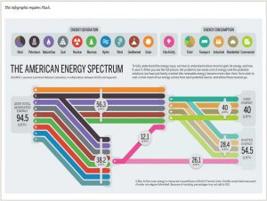
The visualization is about amount of energy generation, consumption and energy wasted in US in 2009.  Each energy generation and energy consumption source is represented pictorially using different colors and symbols.

The visuals on the left-hand side shows all different sources of energy generation with help of different colors. The total energy generation for US is 94.5 QBTU.  This energy generation is segregated to – energy used and energy wasted which is 40 QBTU and 54.5 QBTU.

Takeaways from this visualization:

  1. Coloring segregation: There are around 14 source of energy generation and consumption. Each source has been assigned a different color to distinguish visually.
  2. Simple to understand: All the complicated details have been shown in a simple manner. For example, Total electricity is generated from 8 different sources of energy. This has been clearly captured in pink line in the visualization.
  3. Highlights the problematic area: The most important point to keep in mind whether your visualization clearly depicts the underlying problem or motivation to make the visualization. This visualization clearly shows that out of total energy generated, 54.5 QBTU is wasted which is more than 50% and this needs to be addressed to utilize energy efficiently.

References: http://www.informationisbeautifulawards.com/showcase/444-the-american-energy-spectrum


Types of Deceptive Visualizations

Deceptive Visualizations can be broken down into two different types of deception. The first is message reversal and the second is message exaggeration or understatement. A message reversal deception happens when a chart or image causes the viewer to understand and view the chart/image in the wrong way. Figure 1, shows an example of message reversal where someone would perceive the data in the chart as flowing negatively while in fact it is actually flowing positively.

Fig01

Figure 1

The second type of deception is where the message is exaggerated or understated. For example, you can see in Figure 2 that the quantity in Y is bigger than X by only a little bit in the Control Chart. While in the Deceptive Chart there is a larger difference because the same data is exaggerated due to the starting value of the vertical axis being changed.

Fig02

Figure 2

Little changes such as these can create a great deal of misunderstand. Most make the basic assumptions that on a vertical axis, the positive direction would be upward and negative direction would be downward. Also that the beginning value of an axis would usually be starting at zero. Because of general assumptions like these, people are easily able to deceive others into believing whatever they would like them to believe.

Source: http://www.cs.tufts.edu/comp/250VIS/papers/chi2015-deception.pdf

Need some time-management ideas?


This is a visualization of how some of the most creative people utilize their time throughout the day. This type of a chart is called a Gantt chart. A Gantt chart is a chart in which series of horizontal lines depict the amount of work done/utilization over a period of time.  These type of charts are used to depict time frames and utilization.

From the above given visualization we decipher the time frames creative people give to daily tasks. Out of the 26 people illustrated here, only 4 of them sleep beyond 8 a.m. No wonder there is a bedtime fable, Early to bed, Early to rise, Ready to Shine. Taking enough rest is important to rejuvenate the mind and come up with fresh ideas.

21 out of these 26, like to work till the late hour, or wake up early to work. The Gantt chart is not similar for any of these people. It turns out that everyone has their own specialty and a different style of working.

I specifically liked this chart because we can select different activities and that gets highlighted.

Get inspired, and go pick your idol to make the most of your time and shine on!


References – https://podio.com/site/creative-routines

Changing Face of America – Extraneous Background


Screen Shot 2017-01-20 at 11.35.40 PM

The above visualization shows the racial and ethnic divide of the US from 1960 to present and predicts till 2060. Though the visualization is pleasing to the eyes and looks innovative at first, I believe that the information is wrongly represented and the visualization can be improved

  1. The visualization is confusing as it appears that the states consist of the races depicted, i.e., california appears to be 100% white.
  2. The scale of the map is not consistent throughout. 85% and 64% appear to share the same area. White race has a negative slope as there is a decrease in percentage of population, similarly Black race have a negative slope even though there is an increase in percentage of population.
  3. The year 2010 seems to have almost no Asian population which is misleading. Similarly there is no “other” representation in 1960. This leaves the audience to speculate whether there are no other races in 1960 or it is left out of the map as Asians in 2010.

I think the above visualization tried to be innovative but it failed in representing the information accurately due to a map of the US in the background, a simple line/bar graph would have sufficed.

Source – http://visualnews-wp-media-prod.s3.amazonaws.com/wp-content/uploads/2015/11/06160000/1404demographics.jpg

Let data help you figure out wether to rent or buy a house.

When asked wether to buy or rent a house, people find it difficult to make the final decision. The Upshot(find link at the bottom) is a website that provides the reader to figure out, to buy or to rent an apartment, which is the better idea.

This website is inspiring since it provide the reader a comprehensible and user-friendly calculator to help people to resolve varied and complicated financial problem. Technique used behind the website is D3(Data-Driven-Documents, A open source JavaScript library for manipulating documents based on data).The tool is so clear and beautiful so that it can convey complicated information and make people enjoy at the same time.

Below are some basic factors you need to take into account, such as house price, mortgage details, closing cost and maintenance and fees.

屏幕快照 2017-01-20 17.52.48 屏幕快照 2017-01-20 17.52.17

After input those data, you will get accurate and clear suggestion about which approach is more economical and practical. The system will calculate the purchase cost and the equivalent renting fees based on the information you give.

屏幕快照 2017-01-20 17.56.30

The most interesting thing I find from this site is the user can interact with the page (by simply drag the button )and get feedback very quickly, which leads to a very rich user experience. That’s the reason why I strongly recommend you guys have a look at it, very interesting. 

Reference: https://www.nytimes.com/interactive/2014/upshot/buy-rent-calculator.html?_r=1

Fast Food Menu of Calories

This visualization shows the “Distribution of calories vary by fast food restaurant”. The basic meaning for each dot is one individual fast food in different fast food restaurant. All of these dots are assigned into five different categories, yellow represents beverage, green represents salad, light blue represents side dish, dark blue represents main item and purple represents dessert. In this visualization, horizontal line shows calories from 0 to 1,200 and scale by 200 calories. Vertical shows label for different restaurant. The study data will help us understand distribution of calories by different fast food and might give us a guide to consume relative healthy fast food.

Good Point in this data visualization:

  • Clear Map: This visualization gives us a clear view on distribution of calories vary by different fast food restaurant.
  • Color Segregation: Each category is represented by different color, making spotting different category easier.

Potential improvement point in this data visualization:

  • Categorize by more different colors: Even though different fast food items are categorized by different colors, which are purple, dark blue, light blue and yellow, it is not that obvious to identify different items. Perhaps more different colors such as yellow, red, blue and green would make this visualization more easy to read.
  • More details on each items: This visualization only gives item name when hover on each dot. It is better give more information such as specific calories for each item.

Source: http://flowingdata.com/2016/12/12/calories-in-fast-food-menu-items/


Getcastor lets you create the dashboard relevant to your everyday life

Dashboard is not only used by companies executives, it can also be used by users for everyday life. GetCastor enables users to create a dashboard from the data such as calendars and the weather. Users can create or select widgets and adjust their importance by their preference. The application then retrieves the data via the user’s web and updates the dashboard.

The dashboard can be shown in TVs or tablets or phones. With this application, users can view their dashboard once they wake up and they can see their schedules of the day as well as some other important information.

Source: http://betakit.com/getcastor-lets-you-create-the-dashboard-relevant-to-your-everyday-life/


Out of site, out of mind

pic

This is a dynamic interactive visualization of the fatalities in drone attacks on Pakistan in the time frame of 2004 to 2015.  As the title suggests after 1 or 2 weeks, the news goes out of mind. But the plight of the people lingers, despair over lost ones, destroyed homes. This stunning visualization illustrates the frequency of drone attacks on Pakistan which increased drastically after 2009. As a result, a lot of innocent children and civilians lost their lives.

This infographic dramatically brings to light disturbing facts that should not go unnoticed. In order to eliminate high-profile targets innocent blood is spilled. Only 1.6% of the population killed constitute terrorists compared to 5.7% children and 16% civilians. Can this be justified in any way? A description pops up giving detailed facts of the attack when one hovers over a particular point on the visualization. The replication of bombardment as a technique narrates more than what words can express. Also, use of red color to symbolize the blood of innocent children is very thoughtful. This visualization is really captivating and generates serious thoughts about the people living in Pakistan, fearing their impending doom.


Please refer to view the full interactive visualization: http://drones.pitchinteractive.com/

Something interesting about your birthday!!

Would you like to know the rank of your birthday? Here you can check with this interesting heat map plotted with days and months. It represents the number of babies born in the United States between 1973-1999. (Non-US citizens please ignore your rank!)

Screen Shot 2017-01-19 at 4.44.49 PM

Here heat map is the best suitable visualization and it is made using Tableau. Following are some interesting insights.

  • If you hover over your birthday, you will see rank and exactly where it stands.
  • Along with the rank top 10 and bottom 10 ranks are displayed separately.
  • The orange colored palette helps reader to easily distinguish between dates.
  • September month has many of the top days where as January is least common.
  • Around major holidays, fewer babies are born.

Heat maps are well-suited for visualizing large amounts of multi-dimensional data and can be used to identify clusters of rows with similar values, as these are displayed as areas of similar color.

Source: http://www.vizwiz.com/2012/05/how-common-is-your-birthday-find-out.html

Image-source:  http://public.tableau.com/views/MostCommonBirthdays/MostCommonBirthdays?:embed=y&:loadOrderID=0&:display_count=yes&:showVizHome=no


Its time for Trump

With just a day left for Trump to take the Presidential oath, here is an interesting comparative analysis based on a survey conducted by Gallup. This showcases how much Americans are confident that Trump will be able to handle his presidential duties as compared to his predecessors – Obama and Bush.

1

The visualization presents that Trump has a much lower favorable rating of how he would be able to prevent major scandals, handle an international crisis and even defend U.S. interests abroad as a President as compared to his predecessors.

This visualization may be misleading to a few, unless one looks at it closely. This survey does not actually show the presidential capabilities and success of the Presidents in their respective offices. The results are based on the responses of how Americans predict his Presidency would be, before the President actually takes the office.

This is due to political polarization and low trust in the government that has created an opinion that is more challenging for Trump as compared to the predecessors. Looks like Trump will begin the office with much less support from Americans. But this is in no mean a parameter to estimate the success of Trump’s actual Presidency.

Source: http://www.gallup.com/poll/201158/skeptical-trump-handle-presidential-duties.aspx?g_source=Politics&g_medium=lead&g_campaign=tiles

https://www.statista.com/chart/7394/will-trump-get-a-handle-on-things/?utm_source=Infographic+Newsletter&utm_campaign=156ba881b2-InfographicTicker_EN_Early_00004&utm_medium=email&utm_term=0_666fe64c5d-156ba881b2-295733669