Time spent on the chart

This chart was published on the Economist in 2011 and talks about how people (in the age groups 15-64) from different countries spend the hours of their days. The author uses this to quantify and justify some ideas that we have about stereotypes at the national level. The author also uses a donut chart to show the constituent hours.


I started out by trying to understand what key points the author was trying to justify using the above chart.

Some key points that were very obvious were –

The french spend a good deal of time eating and sleeping; while the Japanese as a group are among the hardest working people spending on an average 9.8 hours in a day working on paid jobs and on the contrary spend the lowest number of hours in unpaid work (Understandable since the Japanese love automating jobs that are too mechanical, after all).


So after this, I went on to analyze the dashboard in terms of the key components:

  1. Is the visualization Truthful?

Based on the underlying OECD report (Data Source can be found here: http://www.oecd.org/std/47917288.pdf), the visualization is indeed truthful in what it depicts but, one point of concern might be that it may not be telling you the entire truth. The above report has a drill down by smaller age group buckets and is also dissected by gender. When we summarize this number over the entire population, it may not be entirely true. After all, sometimes summarization is only as good as sharing half the truth.

Also, when you look at the data, it gives you the data for all the 35 member countries. But, the author decided to only visualize 6 of them! Why?

2. Is the visualization Functional?

Yes, it is. It does a fair job of showing the trend even though a better representation might have been desirable.

3. Is it Beautiful ?

It is a clean and appropriate representation. But, it makes it a chore to look at the different nationalities based on a given color. Also, the colors being from a common palette and very identical makes it a bad choice since, identifying which color represents which component becomes a chore.

4. Is it Insightful?

While it does the basic job of depicting what it is meant to, it also shows us some new trends like -The Japanese people spent the greatest number of hours in grooming closely followed by the United States (This might also explain why the cosmetics and grooming industry is thriving in these two countries). So, I believe it is insightful.

However, showing this trend at a lower granularity and by gender would have made it more insightful.

Also since there are 35 countries under OECD,  a representation grouped by region or showing all the countries, might have been more desirable and could have also led to more insights.

5. Is it Enlightening ?

Looking at the visualization from an audience perspective, I believe the visualization just picks on data to prove a point and does not go far to call for action based on this.This is a major set back for this dashboard!


What could have been better?

Like I had said, it would have been better had the author decided to use a filled bar chart and showed the number of hours as percentages than as number of hours in a day and all of it summing to 1 or 100%. Also, showing the different activities as distinct colors would have done the trick of showing the contrast.

https://drive.google.com/open?id=0B0buBv_pWnS4NEkxQWJyYXpOYms


The lifetime risk of Maternal Mortality: An Overview

Bikram Patnaik

Visualization Link: Fertility vs Life Expectancy

Maternal mortality is much higher in developing than in developed countries- Mahler, 1987

“The world is still ‘we’ and ‘them.’ And ‘we’ here refers to the Western world and ‘them’ is Third World. And what do you mean by Western world? Well, that’s long life and small family, and Third World is short life and large family.” – This is a podcast conversation that I heard last week playing in my friend’s car.

Well, the importance of quantifying the loss of life caused by maternal mortality in a population is widely recognized. In 2000, the UN Millennium Declaration identified the improvement of maternal health as one of eight fundamental goals for furthering human development.

Going by the old school definition, maternal mortality ratio (MM Ratio) is obtained by dividing the number of maternal deaths in a population by the number of live births occurring in the same time interval. It depicts the risk of maternal death relative to the frequency of childbearing.

With the help of this visualization we will discuss if we can justify our main claim with proper evidence or is it just a regular misconception which should only interest health experts and statistician. The visualization reviews data from 150 countries and compares Life expectancy (maternal mortality rate) vs maternal fertility for the past 2 centuries. The vertical axis shows the average maternal life span in each country ranging from 10 – 80 years, where high up= longer life, to the bottom= shorter life. The horizontal axis shows the total fertility rate that ranges from 2- 9 children per woman. It’s interesting to see the usage of bubble chart for this, which is primarily used when you represent data that has three or more data series (In this case Life expectancy, total fertility and size of the population) and each containing a set of values.

UNDERSTANDING THE DATA:

Here each country in the world is a bubble,the size of the bubbles represent the population size and color represents regions of the world (see on top right side).Before rolling the years, we notice that in 1800 all the countries had a life expectancy less than 45 years and the children per woman ranged from 4-8 (on an average- 6 children) in a family. For further discussions let’s understand that high mortality rate means less life expectancy and vise-versa. Developed countries like France had a low fertility rate( 4.4- which means they had smaller families) and a life span of 34 yrs where as the developing county, Iran with a smaller population had a high fertility rate (7.1- meaning larger family) and the life span barely crossing 25 years. We see there is a significant difference between the developed and developing countries in terms of both mortality and fertility rate pertaining to factors like lack of adequate medical care, the greater prevalence of infectious diseases and higher incidence of pregnancy. This might seem to be a promising warrant that we want to verify our claim.

BUT!! let’s see what happens when years pass by. Till the 1940s there was no significant difference between the countries on the visualization. Only after 1950, there is a change that is noticeable. China starts moving with better health and improves steadily. All Latin American countries start to move towards smaller families. The blue ones are the Arabic countries,and they have longer life, but no larger families.In the ’80s, Bangladesh still remains similar to the African countries. But then the Bangladeshi imams start to promote family planning and pull the country higher up the life expectancy ladder. And in the ’90s, there was a terrible HIV epidemic that takes down the life expectancy of the African countries and all the rest of the countries move up where there are longer lives and smaller families, and we have a completely new world.

Let me make a comparison directly between the United States of America and Vietnam. In 1964, America had small families and long life; Vietnam had large families and short lives. The data during the war indicate that even with all the death, there was an improvement of life expectancy. By the end of the year, the family planning started in Vietnam; they went for smaller families. While United States had longer life, keeping family size. In the ’80s, Vietnam gives up Communist planning and goes for market economy, and it moves faster even than social life. And today in Vietnam, we have  the same life expectancy and the same family size as in United States, 1974, by the end of the war. With this all the previous warrants fails and now this comparison acts as a strong rebuttal against our original claim.

DRAWBACKS:

Undoubtedly the visualization is amazing in itself, but there are few snags which can alter the statistics if taken into consideration. First, the data collected are only with respect to inter-countries. But what it doesn’t include is the scope to look at the differences among the maternal mortality within the regions of a given country which would give different insights. Second, there is no mention of various age group of women who face higher mortality rate; so that those age group can be targeted for special medical care during pregnancy. Third, there is no comparison with the actual vs target MM ratio data for any given country. There is a high probability that when these factors are combined together it might give us a different picture altogether.

FROM A CRITIQUE’S VIEWPOINT: 

The number of different parameters presented on the interactive dashboard are overwhelming and seems far less from being user-friendly. For a new user it becomes hard and confusing, instead a simple drop down could be introduced to give the audience the flexibility to play around with their desired set of parameters.The simpler it is, the easier it becomes. Second, the visualization doesn’t allow us to see the change in MM Ratio across various countries as year passes. This is very crucial for any government health organisations to plan ahead of time. Third, though we see a bubble comparison between inter-countries but the total mortality figures/data over the years for a particular country is not seen ( neither it’s total comparison with the World data).

ALTERNATIVE APPROACH/MODIFICATION:

Though it’s visually appealing there are certain hiccups with this bubble charts visualization as well. It can be further enhanced and made simpler by adopting certain techniques.

  1. The bubble chart earlier didn’t give us a change in MMR for different countries. So, as a modification I would recommend to use 2-D clustered bar graph to show the deviation of MMR across the various countries over a period of time. This is a simpler alternative to visually represent a change in data, as you can see this in below visualization.

2. In this following modification, we make changes to the graph as pointed out in drawback section. Using a simple line chart  we try to contrast two different projections for a given country. In the below visualization, we see the target MMR of Mexico and a comparison of it’s actual stats.

3. Further, we discussed that a bubble comparison between inter-countries is seen in the visualization but there is no individual mortality figures/data for a particular country over the years ( neither it’s total comparison with the World data).. The modified version looks like the below visualization.

4.The following visualization segregates the maternal mortality into different age groups and makes it easier to understand the impact over the spectrum.

CONCLUSION:

We could clearly see from the comparison between countries that in the modern era, all the developed as well as developing countries have the same mortality and fertility rate. Studies suggest that 45% of the potential number of maternal lives saved in developing countries is attributable to fertility decline and 55% of the potential number of maternal lives saved are because of safe motherhood initiatives.

If we don’t look in the data, I think we all underestimate the tremendous change in Asia, which was in social change before we saw the economical change.So rather than over simplifying the fact that only maternal mortality is higher in the ‘Them’ countries as compared to ‘We’ countries, we should try to embrace the changes happening around the world.

References : Princeton, NCBI , Encyclopedia Iranica, Quora, WHO, Mamaye, Wikipedia

The Economist tries to fool its educated readers!

The claim made by this article is that the daily newspaper circulation is falling in the West (in countries like USA, Europe etc) and rising in the East (in countries like India, China etc).

A few statements from the article – “Since 2008 circulation in America has fallen by 15% to 41M while advertising revenue has plummeted by 42%, accounting for three-quarters of the global decline in advertising revenue in the same period.”

“Looking further east, though, things look brighter. Circulation in Asia has risen by 10%, offsetting much of the decline elsewhere. With 114.5M daily newspapers, China has surpassed India to become the world’s biggest newspaper market.”

Audience – This chart and the article were published on The Economist whose readership includes highly educated people many of whom are influential executives and policy-makers.

Measures

1. Percent change in newspaper circulation
2. Daily newspaper circulation per 1,000 population

Lets break down the visual –

Color – The chart uses stacks of newspapers to denote the percentage change. Usually unnecessary beautifiers (like 3D cues) do little if not nothing to convey the message and this chart is no different. The only save in this case is the choice of colors for the negative and positive changes in percentage.

Chart Icons – The author has taken care to keep the number of papers on the stacks reasonably proportionate to the percentage change they represent. Numbers are rounded either up or down, so a 5.3% change becomes 5 newspapers and a 0.5% change becomes one newspaper on the stack.

Layout – The structure and layout is simple and clean. The negative and positive directions (of change) are clear and immediately apparent to the viewer.

Unfortunately the most important part of the chart, the numbers, are way off and the chart is found to be misleading upon close examination.

Problems –  At first glance, it seems as though the numbers in the grey boxes (Daily news paper circulation per 1000 population) are denoted by the height of the corresponding newspapers stack. But the heights are related to the colored numbers directly on the stacks. This is confusing and the author could have left out the grey numbers since they don’t contribute to the message of the visualization.

Lets look at the second claim stated above – “Looking further east, though, things look brighter. Circulation in Asia has risen by 10%, offsetting much of the decline elsewhere. With 114.5M daily newspapers, China has surpassed India to become the world’s biggest newspaper market.”

The measures in the chart;

China – 106 daily newspaper circulation per 1000 population
33.2% increase

India – 139 daily newspaper circulation per 1000 population
7.8% increase

This information, without actual population numbers of those countries, is not reliable. Lets look at the numbers and see the actual results for four countries on the positive side of the scale on the chart.

2012 Population Newspaper circ./day/1000 Percent change Newspapers in circulation/day
China 1350700000 106 33.2 143174200
India 1263600000 139 7.8 175640400
Lux. 530,946 711 19.8 377502.606
HK 715460 609 5.3 435715.14

Lets compare China vs India and Hong Kong vs Luxembourg.

China vs India

Luxemborg vs Hong Kong

The charts above show that the article had made a wrong claim that China had overtaken India in the newspaper market. In addition, Hong Kong with a less percent change and less newspaper circulation/day/1000 actually has more newspapers in circulation than Luxembourg in contrary to what the article and chart depict.

Reading through the comments for this article I was intrigued to find that not many people had found out the chart’s deceptiveness. This just goes to show how easy it is to manipulate visual depiction and spin a seemingly plausible story in a direction that best serves ones interest.

References –

Article – http://www.economist.com/blogs/graphicdetail/2013/06/daily-chart-1

The population data was taken from the world bank – https://www.google.com/publicdata/explore?ds=d5bncppjof8f9_&met_y=sp_pop_totl&idim=country:CHN:IND&hl=en&dl=en#!ctype=l&strail=false&bcs=d&nselm=h&met_y=sp_pop_totl&scale_y=lin&ind_y=false&rdim=region&idim=country:CHN:IND:HKG:LUX&ifdim=region&tstart=1210575600000&tend=1336806000000&hl=en_US&dl=en&ind=false

WWE Network Subscriber Visualization

This is a graph that shows the number of subscribers to the WWE Network from 2014 to 2016 (by quarters). The article that this graph is part of is a summary of WWE’s business, as well as it’s main sources of revenues over the past several years. The graph combines a bar chart with a line graph to show the number of subscribers at the end of each quarter, the average number of paid subscribers, and number of people who use the Network’s free trial period at the end of each quarter. The graph also shows when WrestleMania (the WWE’s most marketed and mainstream event) has occurred during the time period. From the graph, we can see several trends. First, it seems clear that WrestleMania is one of the main reasons why more people subscribe to the Network. In addition, we can see that the retention rate of the Network is fairly strong, the number of subscribers didn’t drop too much between WrestleManias. In addition, we can see that in a few years, WWE has increased it’s subscription base by around one million people. However, we can also see that the Network has struggled to grow between Wrestlemania events, and over the past few quarters. In addition, we can see that more people are using the free trial periods as opposed to paying, which doesn’t guarantee that they will stay subscribers. As such, the article argues that over two years, one can neither say that the WWE Network has been a success or a failure.

The graph seems to by trying to hit a broad audience. It could be aimed at wrestling fans trying to get a better understanding of WWE, or at business people trying to get a better understanding of WWE’s financials over the past several years. The makers of the graph don’t seem to expect the audience to be big wrestling fans, but do seem to expect at least a little understanding of what WWE is and does.

The good:

To start with, I like that the graph starts the y-axis at 0, which keeps the information more accurate. In addition, I do like that the graph tries to convey many points of related information in a single graph. Instead of just showing subscription numbers, the people who made the graph took into consideration that WWE offers free trials, which changes how the total subscription numbers look like. In addition, by using both bars and a line, the audience gets both the trend , and the total quarterly numbers. If the graph didn’t have the line, the reader might assume that the number of subscribers didn’t change at all from Q1 2012 to Q4 2012.  The graph also lends itself to forecasting (it seems clear that the subscription numbers could be flat for the next several quarters), and easily allows readers to draw conclusions (WrestleMania alone may no longer be an effective way to drastically increase the number of subscriptions). Another the graph does well is that it allows readers to come up with causality. By mentioning which quarters WrestleMania have taken place in, the graph explains why WWE has seen sudden spikes in the past. The graph also shows that the free trial periods have less of an effect as time goes on. Because the graph offers causality, the audience is allowed to come up with different arguments, such as that the WWE need to ramp up marketing, promote new wrestlers, or seek new markets.

The bad:

One of the biggest problems of the graph is that it doesn’t make it clear whether or not the number of subscribers and quarterly trends are actually that good. The reasons for this is that the graph doesn’t compare the network subscription numbers to any other value, such as revenue, cost of running the network, or profit. Another reason for the lack of clarity is that the graph doesn’t establish what the KPI for subscriptions actually is (for the record, it’s initial goal was to hit 1 million subscribers by the end of 2014). By adding a horizontal line at the one million mark, the reader could have had a better understanding of how successful WWE has been with the network. In addition, the graph appears to lack proper documentation and doesn’t use multiple sources.

From an aesthetic point of view, the graph might have an information overload problem, and might be too busy for some readers. Part of the reason for this is how cramped and close together a lot of the visual focuses are. I probably would have made the WrestleMania logos smaller, and aligned them all at the top of the graph. Alternatively, I might scrap the logos and instead change the color of the bar with WrestleMania, and added a new label in the legend. This way, the same info could be conveyed with less visual clutter. Additionally, it is not initially clear if the dark blue number boxes (which possibly should be a different color from the boxes) are referring to the top of the bar, or the points on the line. The 2015 Q2 bar is particularly confusing, since the point is at the top of the free trial bar. So, it is not clear if the 71,000 is referring to the number of people using the free trial, or the number of average subscribers in the period. One possible way to make this more clear would be to have the free trial bar be inside the total subscriber bar, instead of on top of the bar. This way, you could better see the number of total subscribers in a period, and the proportion of total subscribers to free subscribers, without having to have extra number boxes.

———————————————————————————————————–

http://www.voicesofwrestling.com/2016/05/19/a-beginners-guide-to-wwe-business/

http://fansided.com/2014/04/07/wwe-network-one-million-subscribers/amp/

Native vs foreign born Americans without a high school diploma.

Blog link: https://www.census.gov/dataviz/visualizations/035/

Introduction:

This visualization represents the comparative analysis of percentage of people of different race groups, without a high school education among native and foreign born Americans spread across various regions in USA.

Evaluating Bar-graphs as a tool for visualization:

  1. Bar-graphs is an excellent tool for showcasing the comparison among various segments. One thing I liked about this chart is its simplicity. It showcases the comparison across four segments that are nativity, gender, region and ethnicity without making the visualization cluttered and complex.
  2. The general quality of bar-graphs is that are accessible to a wide audience and they permit visual guidance on accuracy and reasonableness of calculations. However, in this visualization, there are certain weaknesses, which makes it difficult for its audience to interpret. There is no information provided about how the percentages of population are calculated.
  3. Use of different colors makes trends easier to highlight and interpret, however purple and blue both have lighter shades of their color and a person having a color blindness could easily misunderstood the categories. 
  4.  It is difficult to see the differences because there are too many graphs plotted. It is difficult to interpret the difference between the two far away groups.
  5. One of the most basic requirement missing in this visualization is the absence of timeframe for which the bar-graphs are plotted. I am unable to figure out whether the graph plot is a snapshot of these statistics on a particular time or aggregated/averaged over a period of time. The visualization completely misses the timeframe information.

Moving on to the critical analysis….

  1. Goal: This visualization clearly displays that foreign-born population irrespective of gender and ethnicity, lags behind native Americans by a substantial margin in attaining high school education.  However, various sources [1] suggest that the percentage of foreign population in attaining college level education is higher than the corresponding percentage in native Americans and that Immigrants in USA are considered to play a vital role in its economic success. It is very enlightening for the viewers to know that despite this, the foreign-born Americans lag behind in the high school education.
  1. Audience: I am unable to find the target audience for this visualization. This visualization may not be sufficient to help any category of audience (native or foreign born) because it fails to expose key assumptions, causes, and impact on the life of people who either have attended the high school or have not attended the high school. For example, the high percent of non-high school diploma may be because of poor living standard or other social conditions specific to the region/race. The visualization does not provide any insight about these details. Therefore, I would not categorize it as insightful because it lacks details.
  1. Claim: This visualization does not present any claim either about the Native Americans vs foreign born, about their work-life success or their earnings. As there is no explicit claim, there could not be any warrant backing the claim.
  1. Rebuttal: As there is no explicit claim or arguments, one cannot throw any counter arguments. The only evident information appearing from the graphs is that the overall high school attendees in native born America is much higher than foreign born. If the designer wants to conclude from the above information and present an argument that natives are more successful then I can come up with counter arguments against it. First, there is no information about the population in the data source for this visualization. We don’t know the proportion of population of native Americans and immigrants at the point of time when this graph was plotted. Secondly, the number of immigrants in USA is increasing at a very rapid rate as compared to the population of native born Americans. So, I cannot categorize this as either insightful or convincing.
  1. Key performance indicator: There are four segments taken into the consideration in this chart that are nativity, gender, region, and ethnicity. But this does not provide any information about the set of quantifiable measures that can be used to gauge of any indicator’s performance over time. For example, the performance of any ethnicity group such as Hispanics or Blacks over time. Is the percentage of population without any education is widespread among particular group of ethnicity or region.
  1. No information about any particular location in a region: The visualization provides statistics at the level of geographical regions (south, mid-west, northeast and west), which is at a very high level. To get a better insight, the numbers should have been provided for state/county levels. The reason is the population of certain races may be concentrated in few states/counties (of a region) and the high percent of non high school diploma people for those races may be because of less number of schools in those areas or some other factors. Having statistics at a more geographically granular level (i.e., states/counties) would un-earth such details and make statistics less prone to loosing such fine details due to adding/averaging the numbers across states/counties of a region.

What could have been done better:

  1. Firstly, using stacked bar graphs would have reduced the number of graphs. The most striking difference is seen between native and foreign-born Americans. So, the nativity dimension can be clubbed using stacked bar graphs to reduce the number of bar graphs from sixteen to eight as illustrated here. This would ease the comparison of percentages across native and foreign-born Americans as both statistics are on the same bar now. Reduction of graphs would help users to make sense of the information.
  2. Bubble chart could have been used to clearly showcase the %age of population in males and females in both the categories. This would help to identify if any particular region and ethnicity is most prone to less education.
  3. Use of multiple sources of data: To come upon certain critical comparisons, data should be captured from multiple sources, this increases the authenticity of the visualization designed.
  4. Aesthetics could have been made better by using very different colors rather than similar shades.

You can view my some more redesigns here:

https://us-east-1.online.tableau.com/#/site/magarwalscuedu/workbooks/57227/views


References:

  1. http://www.breitbart.com/education/2016/03/31/census-foreign-born-adults-less-likely-high-school-degree-native-born-likely-advanced-degree/


What Murder Says About the Society It Exists In

Homicide refers to the unlawful killing of one person by another. It is vicious and impacts our life severely. So many organizations and volunteers are supporting the cause “Calling for peace” but on a broader note, is it important to get into the stats and analyze these numbers? Certainly, if someone is looking for relocation in countries other than their home country, yes! this is a big concern. While hunting for visualization this chart from our world in data caught my attention:

https://ourworldindata.org/homicides/

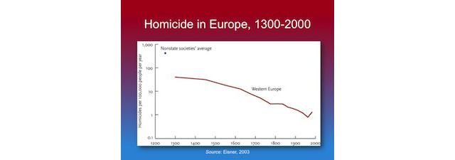
Homicide rates in five Western European regions, 1300-20102 : This chart is created by Max Roser talking about homicide rate in five Western European regions for a time period between 1300 to 2000. The data is derived from a study of UNODC(United Nation Office on Drugs and Crime) and Eisner(2003). The author represents that European homicide rates have dramatically decreased over the last millennium and have remained steadily low over the past 50 years.

Why is this chart winsome?

The only good point, I found about this chart is that it is interactive and it is real fun and easy to use interactive charts. The bullets all over the chart are showing exact numbers and year for respective countries. As we know that numbers are insightful, it certainly wins some points for the author and his efforts.

An additional point which I will leverage to the author is the illusion of simplification through the visualization. If you will look at the data source, it is very messy and certainly, he cleaned this data up to a great limit to represent five regions.

Overview of Analysis on the Visualization:

Domain: Data source of the chart includes many countries and region but for this particular visualization author has chosen Five western European regions though there is no explanation given as to what is the specific reason behind this selection. Hence I would say that domain seems little dubious in presenting why and how questions.

Audience: This visualization is available under Violence and rights category so I can assume that the visualization is made for general public and who so ever is concerned with this particular information. Moreover, it could be anyone who wants to find out that which place is safe to live if they are considering relocation.

Claim: This chart justifies the claim that the rates of homicide are dramatically decreasing which is a good sign. Though whether the claim is derived accurately becomes an ambiguous spot if you will look at the data source. Below is the part of data set representing statics for all the countries over the years:

http://www.unodc.org/gsh/en/data.html

Loopholes in the warrant of this Visualization:

Author calculated an average of all countries for the region more than one country but there is no justification provided for choosing specific countries.How come an average of two countries can be accountable for the whole region without representing the real difference among them.

Timeline of the visualization: In the given chart Scandinavia has no data for 1300 from where the chart is starting and there is no data available for Italy after 1300 and before 1550. This makes it very inconsistent approach.

Even the numbers are doubtful. Looking at the original data source and derived data sheet, numbers seems questionable.

The chart claims comparison among western countries though accounting Italy which is in Southern Europe and England from Northern Europe arise so many questions on the integrity of data.

Rebuttal: The author seems least bothered about the missing data which could be a potential rebuttal. Another rebuttal here is the unidentified base of numbers. Real data talks about count and rate and which is not comparable with other countries. To crosscheck the fact, look at the data source. Even if the rate is lesser the count is greater than another country whose actual count is lesser but the rate is higher. This needs a proper justification!

Backing: The backing of the data fails severely here and there is no documentation available to clarify a little bit about the claim and its warrant. This makes this visualization deceptive which poorly fails to reach its goal. Hence on the properties of a good visualization, the chart holds as below:

1. Truthful – No, but deceptive 100% 🙁
2. Functional – 100%  at least for what is claims 🙂
3. Beautiful – 70% (as it is so clean and colorful) 😐
4. Insightful – 50% only if you don’t do any analysis otherwise 0% 🙁
5. Enlightening – 20% only if you don’t care 🙁

Additional Disappointments about the appearance of this chart:

Even if a forget about integrity and faulty derivation of data plotting a line chart is not a good choice. These numbers are attractive and they should actually plot it through horizontal bars representing real numbers for each country. Overlapping of bullets for the later years doesn’t look good and clean as well.

What could have been a worse visualization for this situation:

For such sensitive topic a visualization that talks about nothing, a complete disappointment from EDGE organization

If I were to redesign this visualization:

Considering above information, I decided to redesign this chart but when I tried to relate the information with this chart, it became so cumbersome. The reason is over simplification of information. It raises the need of an optimal cleansing of data in order to guard against information tailoring. Due to lack of dataset for the given timeframe, I cannot recreate this visualization but I would certainly try to include below points to make my chart Insightful for the audience who wants to grasp the reality and trying to make a decision (example- relocation) out of it.

1. A bar graph for the easier comparison among countries over years keeping years of y-axis and number of homicides at the x-axis. I will choose a color differentiation for including an average scale to differentiate among bars that are more than average for respective countries.

2. I will display exact numbers for each country rather aggregating them because there is no base which subsides the real reason of not differentiating among countries.

3. A proper color coding is required for easier recognition and probably green for lower than average and red for greater than average would be a good choice.

A similar graph on this situation is a better choice from Dailymail UK news:


The graph clearly shows the numbers of countries accountable and could be a better choice to have a perception over peace index of countries:

What is the most enlightening visualization for above situation:

Another chart from Daily mail UK helps people to decide whether to which country is considered safer by showing exact numbers. A decrease or increase in crime tells a lot about the situation and can help one to reach to their decision.

References:

http://www.dailymail.co.uk/news/article-2313942/UK-Peace-Index-Rate-murders-violent-crime-falling-faster-Western-Europe.html https://www.edge.org/conversation/steven_pinker-a-history-of-violence-edge-master-class-2011 http://www.unodc.org/gsh/en/data.html

Internet Worldwide

There was an estimate of 3.5 billion internet users worldwide in 2016. This means about 45 percent of the global population accessed the internet that year. The majority of global internet users are located in East and South Asia, while China is the largest online market in the world. In 2016, China had over 721 million internet users, more than double the amount of third-ranked U.S. with nearly 290 million internet users. India ranked second in number of users; Brazil and Japan complete the top 5. English is the most common language on the internet by share of users, followed by Chinese and Spanish.

The previous class we spoke about how aesthetics and the look and feel of the dashboard are important and how it is even more important to convey the critical information to the audience in a way they can understand it easily. Aesthetics are an important element of dashboard design but to be effective a designer must first take the time to explore three key points: the purpose of the dashboard, who their audience is, and how they will use it.

Let’s look at the following visualization.

Visualization link:

https://infographic.statista.com/normal/chartoftheday_2647_Global_Internet_Usage_By_the_Numbers_n.jpg

What is good about this visualization

The visualization is beautiful and aesthetically pleasing, provides a greater context of information and some rich comparisons.

This visualization represents an amalgamation of graphs which are beautifully represented in vibrant colors and captures the audience.

The visualization supports the overall claim of internet worldwide by giving us details of the increase in worldwide internet users, regional distribution of internet users worldwide, segments in internet traffic and internet traffic contributed by mobile users.

What can be changed…

who is the audience?: It is better to understand who are you designing it for. It is important that we take into consideration the user’s tech savviness so that we can implement some UI elements that are common or known to the audience. The first graph in the visualization, it would take the viewers some time to associate the various components and make sense out of the graph.

Needs to be intuitive: Labeling of metrics can be done in a better way.  Adding clear, concise labels to the visualization and maintain uniform text font throughout thus removing any cognitive barriers.

https://www.statista.com/chart/7246/the-countries-with-the-fastest-internet/

Option to drill down: the graph that represents the regional distribution of internet users worldwide could accommodate information on other continents and also provide country wise information on internet usage on drilling down so as to keep the visualization simple at the same time accommodate as much information as possible.

https://www.statista.com/statistics/249562/number-of-worldwide-internet-users-by-region/

Story Telling and flow in visualization: The visualization depicts a story connecting various aspects of internet worldwide but would make more sense if the various graphs were for the same year making it easier for comparison and contract the graphs.


Conclusion:

Understanding the various data visualization options and redesigning and incorporating the above-mentioned changes will make the visualization better.

Since dashboards often express dense information and visualizations that are imperative to an organization’s success; good visual design implemented in a dashboard needs to be clear, practical, and elicit proper emotional responses.


References:

https://www.infragistics.com/community/blogs/ux/archive/2015/03/06/user-center-dashboards-a-visual-design-approach.aspx

https://www.tableau.com/sites/default/files/whitepapers/dashboards-for-financial-services.pdf

https://www.geckoboard.com/blog/dashboard-design-what-makes-an-effective-kpi-dashboard/#.WRZh_Wjyu00

American Dream disappearing before our eyes.

Housing in the richest American cities is increasingly becoming unaffordable to the American middle class occupying these cities. Income tends to remain stagnant while home prices are on a steady increase.

The article (https://www.theatlantic.com/business/archive/2014/10/why-are-liberal-cities-so-unaffordable/382045/) attempts to establish a relationship between the median house hold income and the percentage of home affordability by the middle class in the metropolitan cities


The problems with the graph:

  1. Line graphs are good at showing trends; they declutter the graph and provide a visual that emphasises on the trend as opposed to individual data points. The consequence of this property is that the contribute to loss of visual information when the inspection of data points are actually necessary. In the graph under consideration, the aim of the author is to match the increasing pay trend in the richest metros against the decreasing affordability of housing. What the author ends up losing in the graph is actual information about median household income and percentage of homes reachable to the middle class.
  2. For the sake of comparing trends in median household income and affordability of homes, the author normalises two very different quantities and presents them on the same y-scale. In an attempt to make a point about trends in opposite directions, the author forces a visual perspective on the user for two correlated but independent quantities.
  3. The graph is not easily comprehensible for comparable data points. For example, it is hard to say which of the two cities, Bethesda or Washington, DC has higher % of homes accessible to the middle class. Underemphasis on labelling data points leads to comprehension issues with the graph.
  4. While the aim of the author is to present trends, the data is essentially discrete. The author presents discrete data in a continuous graph format and makes no attempt to visualise the discreteness of the data. Both the median household income and the percentage of affordability are discrete data points corresponding to each city and the author has created a continuous line graph without explicitly marking the data points.
  5. The author has ordered the top 25 cities in order of median income. What is unclear is if the cities are also ordered by their richness.

How have I Improved the graph?https://public.tableau.com/views/medianincome_affordability/Sheet1?:embed=y&:display_count=yes

  1. Implementation of a dual axis graph: When multiple quantities are being compared on the same graph, especially when the quantities are on different scales, the best approach is to plot them on a dual axis chart. The modified graph presents on the left side of the y-scale, median household income and on the right side of the y-scale, affordability for the middle class. This way, both quantities are represented in their own units and a visual perspective is not forced onto the user by modifying their values to fit a scale.
  2. Explicit Labelling: Labelling of data points is important when visualising discrete data. It enables the reader to perceive differences in data points especially data points that have small differences. In the modified graph, the user can now easily tell that the city of Bethesda is 1% less in affordable homes for the middle class when compared to Washington DC.
  3. Discretization of data: The author wants to present a trend using discrete data. How can we present the trend and at the same time not lose the discrete quality of data in the visualisations? We do this by presenting one discrete quantity in the standard format for discrete data, i.e. bar chart and the other discrete quantity in the author’s continuous line format, but we explicitly add markers for the discrete data points for clarity. This contributes to us being able to observe the intended trends while still being able to visualise the discrete data.
  4. Color Coding: The bar chart and the line chart are color coded with complementing colors. Color coding visually brings out the difference in scales and trends of the two axes which makes it easy for the user to interpret the graph.

References:http://www.governing.com/gov-data/economy-finance/housing-affordability-by-city-income-rental-costs.html

https://www.usatoday.com/story/money/business/2014/05/13/housing-affordability-worsens/9034185/

767% Of Favorite Pizza Toppings

I was hungry, saw this graph and it caught my attention, but made me even hungrier :(. The graph supposed to show the distribution or perhaps popularity of pizza topping among UK people. One nice thing about this visualization it is grabbing attention very well; the picture looks very sharp and vivid. However that’s about only good thing about it. Upon closer inspection I started noticing things that are not right about it.

  1. It appears to be a bar graph made to look like pizza, the idea is cool but, using different pizza toppings as slices creates optical distortion so user will not be able to tell the different percentage accurately. It might seem as a good idea to show a picture of category rather then put a simple label. However they still needed to write labels in order to represent their data. Also it is possible that slices become small enough so it is hard to tell what kind of pizza toping it represents. Is it piece of bacon or ham?
  2. Categories do not add up to a 100% or to some defined total number of something. You never use pie chart if the pieces do not add up to a 100% or a total amount of something whole. In this graph they do not. What is even more confusing is that some categories have 2 sets of percentages. How do you interpret that? Is it percentage of a whole or just split to subcategories within category?
  3. Also on the bottom of the page there are even more categories that were not included in the diagram at all. What is the purpose to do visualization if not all data is included, especially trying to represent it as pie chart.
  4. Does the graph add any clarification to the information? No, it is actually making it confusing. The data presented probably needs to be visualized via series of bar graphs. Putting data in pie chart format just conditions the brain to think in a way that makes it hard to understand the data.
  5. The biggest revelation her is probably the graph was there just as picture not a bar graph at all. However such beatification is not acceptable! Faking the graph drastically changes people’s perception of presented information.
  6. Graph also presents false data correlations; For example, ham and pineapple are put together on one slice, however they are reported separately by different percentages. So in theory people who voted pineapple might not have selected ham, but the image implies that it is a bacon pineapple combo pizza to reader of the graph. Even better example is olives; they are present in 2 different kinds of pizza but reported only in one.

To summarize this review I think it is fair to say this graph creates more problems than it solves, just reporting categories using simple text line by line would create much less confusion  for the reader .  But would it have captured my attention? Is a whole different question to consider.

India’s Daughter !!


India !! One of the fastest developing nations! The nation is growing they say, an ever growing progress rate is seen they say, we are reaching places they say, less conservative and more open they say ….and yet the women here are unsafe in their very own motherland. Its a man’s world indeed ! “Save the girl child” is the motto for the anti-female foeticide/infanticide campaign ,and they saved her or did they?

Women are subjected to violence on a daily basis. Not only do they fear getting out due to eve teasing, molestation, assault, acid attacks , but also the horror of domestic violence shatter their soul. The above graph tells us how the women in each state of India are treated. It gives us the percentage of domestic violence , minor , severe violence and sexual violence. It tells us the sob tale of India’s Daughter.

The Chart definitely shows us that the author is here to spread her word, she has done her research and wants to share it with the world in the hope for a better tomorrow. The intent and motive truly inspires me however the visualisation fails to do so. The data visualisation must tell us a story , it must be the picture that is worth a thousand words but instead the chart in itself feels like a thousand words. A bar chart is a simple way to showcase a point but when the criteria and data exceeds a limit it becomes task to read and interpret the story causing a loss of audience.

Today Data visualisation is seen as a form of art and by the looks of the graph the author is definitely no artist. The looks isn’t appealing and the overflow of data strains the viewers eyes. The colour selection also fails to impress when using distinct colours was the least that could be done. The order in which the states are placed in the x-axis got me puzzled, its isn’t is ascending or descending order of its location(ex.north to south) or its status of development or anything. It seems to be placed in descending order of the violence by the husbands, leaving the other causes scattered all over the place. Clearly aesthetics doesn’t exist here so lets check on the objective dimensions.

The chart does tell us its description : Violence against women in Indian States, although it fails to answer us when did this story occur? What year is this data from? Is it recent or old? Leaving the audience wonder is this India now or way back in history. The graph will explain you how women faced violence, was is domestic, sexual, minor or severe. And while no chart or form of visualisation can help us explain why India, a country where they worship multiple Goddess’, fail treat their women right, this visualisation doesn’t help the audience make any prediction either. For example , does this have a trend or pattern, which parts of the country do the women suffer more, is the south safer than the north? So with the available data if i were to portray the story I would simply map it. Below is the link to my recreation:

https://public.tableau.com/views/ViolenceonWomenIndia/Sheet4?:embed=y&:display_count=yes

Using the filled map feature that tableau provides we can highlight the region where the violence percentage is high giving us an idea as to what is happening where. It doesn’t overload us with data at the same time doesn’t hide any of it, hovering over the states will give us the stats for the same. This way we can put light to whats important while still including all the data. Also this way of visualising the data reveals that the south, west and extreme north provides a better environment for women while women in the mid, north and east still need help. It is perfect to spread awareness and call for help, showing us the states coloured with the blood of these women.

I would like to conclude this by saying that intent, motive, research, data are not enough to spread the word. You need to catch the eye of your audience and thats when aesthetics comes to the rescue. Saying that make sure your visualisation is truthful, functional, beautiful yet insightful and enlightening. Master the art of data visualisation and your story will spread across like fire in a hay farm.

Graph picked from Article : http://www.ideasforindia.in/article.aspx?article_id=105