Game of Thrones, Visualized, Simplified!

https://flowingdata.com/2016/06/03/game-of-thrones-discussions-for-every-episode-visualized/

When I tell someone today that I don’t follow or enjoy Game of Thrones, GOT as popularly known, because it confuses me, they treat me like an outcast. GOT is one of the most popular shows right now. With so many things happening in each episode it is pretty easy to get lost somewhere.

This is an interesting network graph, which represents the connection of all characters mentioned in an episode. a network graph shows the connection between two things. There are nodes and if they are related, they are joined by a path. Here, each character is a node and the connections are the lines joining them. The color represents the affiliation of each character. The size of the node represents  how frequently each character was mentioned. More so,it is combined with the twitter analysis and it also shows the smiley used most frequently with each character.

For example, in this episode, Robb and Walder were mentioned together and it symbolizes a heartbreak over Rob. We see the big red node; indicating that Daenerys was mentioned for the maximum number of times.

What I did not understand is the size of the lines joining the characters.  Some are joined with thick gray lines, some with red, some with light purple and that is something I was not able to interpret why.

References – https://flowingdata.com/2016/06/03/game-of-thrones-discussions-for-every-episode-visualized/
 

If you insist on using Pie Charts

We have learned that you should never use a pie chart to visualize your data. Unfortunately, there are some people that just want to use a pie chart to visualize their data. Whether it is because they love pie’s or just because they have always used it, there are some guidelines that should be followed when using pie charts.

  1. Don’t Use Pie Charts (But if you want to, follow steps 2- 6)
  2. Limit the data represented to no more than six
  3. Present the data from largest to smallest in a clockwise direction
  4. Only use pie charts when visualizing data about money or percentages
  5. Label Carefully
  6. Keep the pie chart simple

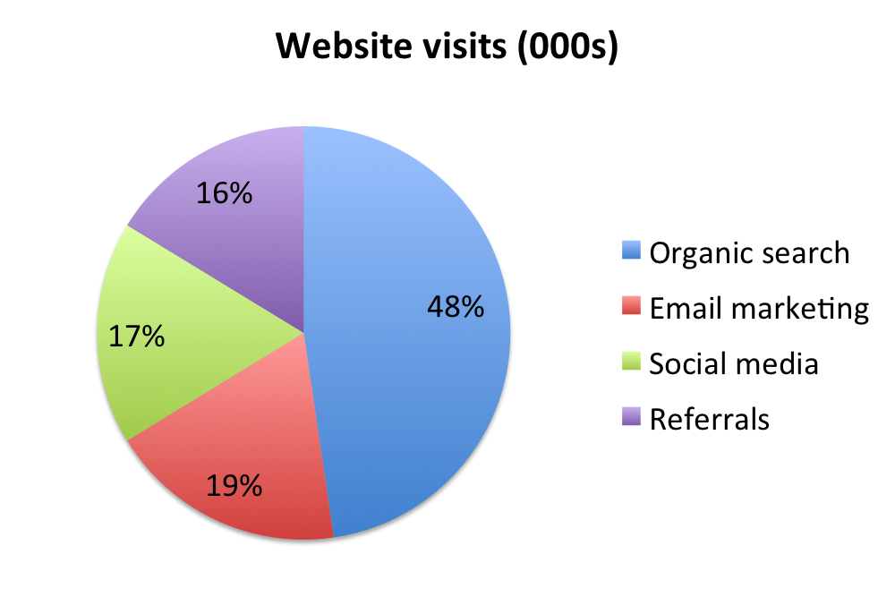
The chart above is a good example of a pie chart that is not the pyramid pie chart. The data represented is less than six which allows a user to easily get an impression of what the pie chart is trying to convey. The size of the data goes from largest to smallest in a clockwise direction. This can be used to help the user identify the differences in size between each segment if it was not labeled correctly. The data represented is using percentages and is labeled carefully in order to not misrepresent the data. Finally, the pie chart is simple without that many excess flare that it would not be an eye sore to see. While this pie chart is not as great as the pyramid pie chart, it does follow some basic guidelines that helps reduce the clutter and complexity that so many people seem to add to pie charts.

References

http://www.sandhills.edu/academic-departments/english/wordguide/chartadvice.html

TradeGecko – A good Inventory Management Software Program

Before dashboards were introduced, all major organizations maintained their data in spreadsheets. A lot of time would be spent on these spreadsheets which eventually would affect the working of the organization. Frustrated with spending entire day in spreadsheets for mundane business administration, Carl Thomson, a former fashion designer shut down his clothing company in 2011. It was out of this frustration that TradeGecko was born in 2012. TradeGecko was one of the newest entrants in the Inventory Management System’s market which was filled with poorly designed archaic IMS software. Following the principle “Good Design is Good Business”, TradeGecko stepped up in the UI department, making some tedious inventory management processes less painful and much easier to eyes.

Thomson launched TradeGecko with a goal to offer clean and intuitive IMS to small business owners. Its flat and sparse design, as opposed to traditional IMS, allows easy visualization of inventory levels, sales statistics, and others. The dashboard uses on screen cluttering, presenting only essential information. Also, its cloud-based platform ensures that information stays updated in real time.

In the market where many software designers ignored the essentials of a good design IMSs for retailers, Thomson brought a positive change. His software today is considered as one of the few well-designed program for IMS.

Reference:http://www.softwareadvice.com/inventory-management/spotlight/user-interfaces-2014/

Comparing cooking oil

The infographic in the below link compares around 40 different cooking oil based on criteria : % Saturated, %Polysaturated, Ratio, %Monosaturated and % Transfat.

http://www.informationisbeautiful.net/visualizations/oil-well-every-cooking-oil-compared/

Any visualization that requires the user to scroll down more than once to get a glimpse of data, has failed. By the time I scroll down to Safflower oil, I don’t recollect what were the first 5 oils that I read about. This info-graphic could have been represented in a simple spreadsheet since the visualization does not anyway present the insights in a readable manner. The oil data is not ordered based on %Transfat or any other criteria. For every criteria, the info-graphic represents what is good and what is not, for eg. For % SATURATED : high = bad, but why is OMEGA-3 vs 6 represented without numbers. It is tedious to count the number of boxes to know what is the ratio of OMEGA-3 vs 6 for Corn oil. When I look closely, I realize I don’t have to count the boxes since it just represents the ratio between the prior values. How do you identify whether the oil flavor is strong, gentle or neutral? Based on the different shades of black color font used for the oil name. How complicated!!

15 JavaScript frameworks and libraries (part 1 first 4 libraries)

JavaScript is one of the best open source stance and the top programming language with number of repositories on GitHub. There are several useful libraries to share.


  1. Augular.js

It is a JavaScript framework used by developers to create complex web applications. It supports MVC architecture. It uses data binding as one of the main concept and users can interact with the interface. When a new interaction is performed by the user, the view is then updated with the new values and turn the interaction with the model to be synchronized. The DOM is updated after the underlying logic.


  1. Backbone.js


It is normally used to build simpler web application frameworks. And is ia a great fit for new beginners to lean web app development. It also supports MVC and it suppoets RESTful APT, proper state management and so on .


  1. D3.js

It is a great to create complex and rich web applications with data manipulation features. It applies SVG, HTML, and CSS to build dynamic webpages. It can also bind data to DOM and enable data-driven events. It can create high-quality data –drirven web pages.


  1. React.js

It is ideal to build highly scalable front-end user interfaces. It is build on a virtual DOM which acts as mediator between client-side and server-side and use it to improve performance. The changes on virtual DOM match with the server DOM, and make process faster than a traditional UI update.


https://opensource.com/article/16/11/15-javascript-frameworks-libraries

Top 100 Lyrics – But why?


The Visualization

The visualization  shows the lyrics of top 100 songs in a tree map. Each word has its own cell, with size proportional to the number of times the word appears. The cell is  further divided by the song.

What I don’t Like

I believe the visualization is just another pretty tree map without any claim. Also the words like ‘the’, ‘you’, ‘I’, ‘a’ etc are included and these words don’t teach/tell us anything  as against the words like ‘love’ or ‘crying’ which might give the context of what kind of emotions are felt in the song.  

What I like

Division of the words in cells and subdivision by song and highlighting of the entire song when a  word from the song is selected.

Improvements

I believe the author should have first removed all the common words by the usage of any natural language toolkit and then did the same analysis. By following this he might have had better analysis about the emotions of the top most heard songs.

I believe by taking into account each and every word there is no claim to the visualization, This is a classic example of a fancy visualization without any message.

Source – https://public.tableau.com/en-us/s/gallery/top-100-songs-all-time-lyrics


GitHut: A visualization about GitHub statistics.

GitHub is the most widely used source code management and version control tool available on the web. With its increasing user base and code repositories, GitHub repository can help in identify trending programming languages. This trend has been captured by a project called GitHut by combining repository statistics and Git specific trends on programming language.

What I liked –

  • The active repositories chart gives a quick overview of the growth in the number of active repositories over time. The intent of the visualization is not to analyze the growth in repositories, but to give the user a detailed picture of which programming languages are contributing towards this growth. This chart, even though, placed right at the top does not sway the user’s attention too much because it’s sized-down, when compared to the repository language chart.
  • The repository language chart displays a wide range of information in a very easy to analyze manner. The wide range of parameters being analyzed, such as active repositories, number of pushes and forks, year first publishes, and open issues, can be easily tracked for each programming language by mouse-hover functionality over the language. This tracking works by mouse-hover over any of the data points, making it easy to track based on the parameter most useful for analysis. We can also compare multiple languages by selecting them with mouse-click. This functionality will highlight all the data points for the selected languages to be compared.
  • The top active languages chart section consists of 50 charts. This section can be analyzed based on percentages or total value, which is a good way of allowing users to compare statistics. Also, the scales for the 49 charts are dynamic i.e. when the user brings the mouse over the chart, the scales are shown. This helps in keeping the entire visualization clean.

What could have been done differently –

  • The top active languages section displays a separate chart for each programming language. Since the time scale under consideration (Q2/12 to Q4/14) and the repositories scale (1K to 100K) are same, I think a single chart with a filter would have sufficed. The following are the advantages by doing this:
    1. The author could have saved space.
    2. Eliminated the need for the user to scroll up/down.
    3. Given the ability to compare two, or more, languages based on active repositories.

References:

http://githut.info/

Domestic violence in Spain

This interactive dashboard provides a comprehensive information about murders of the woman due to domestic violence in Spain. It contains 5 simple separate visualizations to convey the story.

  • First one provides a line graph representing the deaths of woman per year due to domestic violence. Although the rate was quite high in 2008 and 2010, currently it is going down.
  • The second one depicts the count of murders per month. It has a color range of different shades of violet depicting an indication of the count.
  • Third one indicates the same information but on the map of Spain.
  • The fourth one is a bar graph denoting the number of murders by either partners or ex-partners.
  • Fifth is also a bar graph depicting the age range of the dead women in Spain.

Each chart is very simple on its own, but together with the others, they portray a holistic picture of the murders in Spain. The use of the same color range helps to connect faster with this visualization. We can easily identify that Andalucía and Cataluña are the most violent regions. Users can also perceive that woman are mostly murdered by their live-in partners and are usually in the age range of 31-40.

Reference: https://public.tableau.com/en-us/s/gallery/domestic-violence-spain

50 Years of Crime

This interactive visualization created using Tableau presents information about decades of crime data across the United States. This interactive dashboard provides options to either view Property crimes or Violent crimes. In addition, this dashboard provides flexibility to the users in interacting the data. This dashboard consists of 3 charts:

  • A heat map with different shades of violet indicating the severity of the crime rate in each state.
  • A line chart indicating the different crime rates across time starting in the 1960s to 2012 for each state.
  • A scatterplot of crime rates versus state population.

Things I liked:

  • All 3 charts are interconnected and when one particular state or line graph is selected all the chart shows information about that state.
  • The crime rate versus population chart gives the users a deeper understanding where users can identify states which have low population but high crime rates.
  • In the line graph, users can select one state and hover over the others to give an indication of difference.

Things that can be improved:

  • Holistically the first graph provides a lot of insights into the data without having to filter different states. But the line graph is on a whole quite clumsy and doesn’t convey information without filtering.

Reference: https://public.tableau.com/en-us/s/gallery/50-years-crime-us

Why Should I use D3.js?

In the past two weeks, we have discussed concepts of D3.js and also worked on a couple of visualizations. There was one thought that was continuously present in my mind – we can create these visualizations using Tableau in seconds. This is too much work.

SO WHY ARE WE EVEN USING D3.js? That is when I decided to do some research. D3.js is time consuming but provides some really cool features.

  • Easy Integration with web – Data visualizations created with D3.js work on web. We can interact with any part of the DOM giving it the flexibility to accordingly change. (Eg – https://bost.ocks.org/mike/uberdata/)
  • User Interface Features – D3.js can be used with applications to create advanced user interfaces with charts, analytics etc. directly built into them. It not only gives flexibility to the developers but also provides them with a huge list of libraries that can be reused to create visualizations.
  • Customization – What to do when you need to create visualizations that are not available with prepacked solutions? D3.js allows you to be as creative as you want to be and create visualizations that you want to use and that represents your data best.
  • I don’t want to share my data – Use D3.js. It is best to create visualizations for clients that are external to the company and want to interact with specific information, using D3.js. You can control what they can see and how much they can interact with a visualization.
  • Interactive Visualization Online – With D3.js, you can create visualizations that deal with smooth data transitions without having to refresh views, clicking multiple buttons etc. With D3.js we can transition from one data view to another and with so much ease – D3 Show Reel Demonstration . The data is parsed easily making it interactive and meaningful.
  • Community  Support – D3.js  boasts of a very strong open source community support to help people when they are stuck as well as learning resources.

Source – https://www.linkedin.com/pulse/why-you-may-want-consider-powerful-open-source-d3js-data-guerino

– http://www.scribblelive.com/blog/2013/01/29/why-d3-js-is-so-great-for-data-visualization/