The Story of English Premier Football League

The d3.js visualization built by Anna Powell-Smith displayed story of the English Premier Football League since 1993. The interactive visualization enables users to select the season years and rank basis (position and points). So it’s easily to review the results of the game for each season.

When you move the mouse pointer to different lines and dots, it will give you an clear view of the team’s performance in that your. For example, when I move my pointer to the line representing Leicester, it will be automatically highlighted. The rank of Leicester dropped down since game five and got back to the top tier in game 15. In addition, when  I move my pointer to dots on the line, it will pop up the information about that specific game. So it’s a really cool interactive visualization using d3.js tool.

The link to this visualization: http://thestoryoftheseason.com/

Hans Rosling: What I learnt from his visualization!

After professor posted the video link of visualizations created by Hans Rosling, I saw the video. It indeed was a very different way to show visualizations and present data. To me, it seemed more like a movie with changing visualizations that made sense, were easy to understand and portrayed what they were supposed to show clearly.

I went ahead and searched for some of his interactive visualizations – Gapminder.com . I just concentrated on the visualization for Life expectancy over years (although there is so much more data that can be added and information that can be viewed).  Here are some of the things that I really liked –

  • Use of bubble charts – In this week, we had discussions about using the right idioms to represent data. While a bar chart seems right to me about almost everything, I liked how bubble chart was used in this visualization and conveyed the meaning of the data.
  • No Trend lines – The first thing that comes to my mind when I have to represent data over time, are trend lines.  Using bubbles to change sizes and show trends (move up or down to show increase or decrease) across years to represent data was very innovative and interesting for me.
  • Interactive Visualization – This visualization can be customized and interacted with in so many different ways. It gives you a chart to show data over the years.  You can filter it and view data, compare data across countries, regions etc. It adapts quickly when a selection is made and transitions quickly.
  • Just Enough – You can interact with individual piece of data and even though there is so much information in this visualization, it is not overwhelming. They have displayed and organized it appropriately.
  • The video feature is super cool! Definitely check this out!

Best Practices for Designing and Building Great Dashboards

Dashboard is used to provide relevant and timely information to its audience. It is not used to display designer’s artistic and technical capability. Therefore, keeping it simple and focus on the core message is the primary goal for the designer.

Avoid some visualization components that are not directly contributing to the message:

  1. Logos
  2. Navigation
  3. Non-essential Text: to minimum labeling and instructions.
  4. Too much color
  5. 3-Dimensional objects
  6. Horizontal or vertical guide line: when overuse, may detract attention from the data.
  7. Too much detail

Keep these practices in mind:

  1. Who are you trying to impress: the most effective dashboards target a specific group of audiences and present data specific to that use case.
  2. Select the right type of dashboard: what kind of information that audience want to take way from the dashboard.
  3. Group data logically: use space wisely. Because of western language, our eyes usually start from the top left-hand corner and move to the right. Hence, letting audiences discover something new at the top-left-hand corner.
  4. Make the data relevant to the audience

  1. Present the most important metric only: be clear, simple, and effective.
  2. Present up to date data

Keep dashboard simple and focus on the core message are primary goals. The dashboard below showing effectiveness and simplicity.

  • Simple color: users are not overwhelmed but understand at one glance.
  • Number and change: it summarizes important number to sales department and lets users know the details of the change.
  • Story: the graph on this dashboard deliver a clear story of US monthly sales. All the important KPI are included. This helps decision maker to develop strategy. Moreover, graphs are grouped logically. From left to right, it moves from big picture to details and each supports previous one. Although there is no description, it delivers a clear story.
  • Filter: although it is the details information less important putting on the right-hand side, it clearly shows the background of the story.


Reference:

https://www.geckoboard.com/blog/designing-and-building-dashboards-data-visualisations/#.WJ5VcBIrImo

https://www.geckoboard.com/blog/building-great-dashboards-6-golden-rules-to-successful-dashboard-design/#.WJ5UkhIrImo

https://public.tableau.com/en-us/s/blog/2013/10/dashboard-layout-and-design


Dive into Tableau Calculated Fields

Last week, we discussed in the class of how to simplify complex visualizations in Tableau by creating new data from existing data through calculated fields.

Though it is best to prepare our data as much as possible before it gets to Tableau, there are many reasons to leverage the calculated fields functionality in Tableau. Few of them are:

  • To segment your data in new ways on the fly
  • To prove a concept such as a new dimension or measure before making it a permanent field in the underlying data
  • To filter out unwanted results for better analyses
  • To take advantage of the power of parameters, putting choice in the hands of your end users
  • To calculate ratios across many different variables in Tableau, saving valuable database processing and storage resources

As we know it is important to understand the data before making any visualizations. Understanding the data also includes knowing the nature of the data based on which we can decide in which family of calculation our data belong. There are three major families of calculated fields in Tableau:

Non-aggregate calculations 

These are the simplest type of calculation. Non-aggregate calculations are performed for each row in the underlying data, rather than being performed on aggregated data (such as you would find in a pivot table or Tableau view).

It is a calculated field which does not use any functions from the ‘Aggregation’ function group. For example: [Sales] – [Cost] would be a non-aggregated calculation.

Aggregate calculations

Aggregate calculations are those that use aggregate functions.  Examples of aggregate functions are SUM, AVG, MAX & MIN (there are a few others). Therefore an example of an aggregate calculation would be: Profit Ratio = SUM(Profit) / SUM(Sales).

When we drag and drop a measure in Tableau, it is automatically aggregated. The default is sum. The primary difference between aggregate and non-aggregate calculations is that aggregate calculations often can’t be sensibly calculated for each row in the underlying data set – it normally only makes sense to calculate them when the data is aggregated.

Table calculations:

Table calculations allows us to compare two or more separate measures in our data set, it allows us to compare a singular measure to itself (the only way to compare a measure against itself).  These are the calculations which are applied to the values in the entire table. For example, for calculating a running total or running average we need to apply a single method of calculation to an entire column. Such calculations cannot be performed on some selected rows.

When writing any calculation, make sure to know exactly what you want to do. There are many functions and table calculations within the powerhouse of Tableau which can be utilized to create the calculated fields for presentation of data in a pictorial or graphical format. Keep exploring. Keep learning.

Sources:

http://www.clearlyandsimply.com/clearly_and_simply/2010/10/calculated-fields-in-tableau.html

https://www.tableau.com/about/blog/2017/2/top-10-tableau-table-calculations-65417

Tableau Fundamentals: An Introduction to Calculated Fields


Do not apply Eenie, Meenie, Minie, Moe technique to graph selection

We have already discussed in class, that we should not randomly select your idioms. Also, while doing my last assignment I spent lot of time in “design dilemma”. While figuring out which graph to use, I happened to read an article by Stephen Few in which he mentions about best means to encode quantitative data in graphs. He states that, there is a procedure to follow while creating your visualization.

Step 1: Understand the relationship/message you are trying to present
Step 2: Select the best suitable graph
Step 3: Format your chart

He mentions that almost all typical business information can be addressed by either one or combination of the below mentioned 7 quantitative message types (off course there are exceptions to this) and he has suggested suitable encoding methods which can be a quick cheat guide during our design dilemmas.

Disclaimer: There can be other choices as well, this is just one of the few.
1. Nominal Comparison: When you have to compare between one or more measures in any order.
Suitable Graph: The best encoding method is using either a horizontal or a vertical bar chart, but for large data sets it is better to use simple data points.

2. Ranking: When you have to communicate the order i.e. either highest to lowest or vice versa
Suitable Graph: Again, bar charts are most suitable for this.
Extra tip: For highlighting highest values sort in descending order and for lowest values, sort in ascending.

3. Time Series: When you want to convey how things have changed over time.
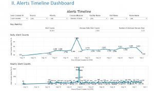
Suitable Graph: Line Chart: When you want to stress on the trend and shape of data
Bar Chart: When you want to stress on comparison between individual values
Points + Line chart: To show individual values and simultaneously highlighting shape of the data.

4. Part-to-whole: When you want to represent some values as ratios or part of the whole
Suitable Graph: Bar charts are suitable to represent this relation.
Caution: Do not use pie chart for this, it is difficult to compare size of slices of a pie.
Use stacked bar chart when you want to display both the parts and the whole.

5. Correlation: When you want to compare 2 values and see if there is any relationship between them.
Suitable Graph: Trend line and points (scatter plot) are suitable for this type of relationship.

6. Deviation: To show difference between 2 sets of value
Suitable Graph: Only when displaying time series and deviation together
Line Chart – To stress on shape of data
Points + Line chart – To stress on both on individual values and simultaneously highlighting shape of data

7. Distribution – If you want to measure counts of values per interval along a quantitative scale
Suitable Graph: Histograms are a good fit to emphasize individual values
Use lines to emphasize on shape of data

Reference: https://www.perceptualedge.com/articles/Whitepapers/Communicating_Numbers.pdf

Healthcare Data Visualization

Today’s healthcare reporting tools have incredible powers to tell stories about patient health—whether individual patients or entire populations. But simply showing the visualizations won’t be enough. The present reality is that not many physicians use these tools to such an extent. There are several factors that can affect their ease of use, starting with acquiring the actual data.

Collecting and directing the flow of information: It would be nice if physicians, researchers and other clinicians could just shepherd the needed data into a simple dashboard and quickly go about their business of curing the world of what ails it.

Turning different data formats into one for all: Once the data has been acquired it must be made usable. And here’s where the time-tested computing principle of “garbage in, garbage out” applies. Data must be scrubbed, normalized and aggregated into a standard format all can view and manipulate.

Presentation: Data visualizations must be easy for business users to access.

  1. Make the reports/visualizations relevant based on the user’s role, identity and concerns. Each set of users—clinical, financial, executive, IT, marketing, etc.—requires different metrics.
  2. Begin with the end in mind. This may seem an obvious piece of advice, but be sure to communicate with business users what they need to see or want to accomplish in advance of structuring the report. And as a general rule, aim for no more than three to five key performance indicators.
  3. Make visualizations easily accessible by users. Circling back to our observations about today’s mobile healthcare landscape, this is especially important for physicians and nurses who are constantly on the move.
  4. Make sure you are HIPAA-compliant. It will be far easier to obtain data from outside data sources if you can demonstrate that it will be well-protected within your organization—in storage, in transit and in the way it is presented.
  5. Create reports that can lead to action. The more information that can be acted on, the better.

An impressive example of visualization in healthcare would be Santa Clara capstone project in the Kaiser Permanente in which students have been developing a Clinical Alert Notification system (CANS) manages alerts from all physiological devices and nurse calls. This application holds large amount of data, which can be used not only for making business decisions but also for reducing alert fatigue. A screenshot attached to this blog shows how an interactive visualization in Kaiser project is designed how it can help stakeholders.


Alerts Timeline Dashboard


References:

https://www.healthcatalyst.com/healthcare-visualization-benefitshttps://www.healthcatalyst.com/healthcare-visualization-benefits

TV Dashboards/ Wallboards

A TV Dashboard (or a wallboard) is a tool used to display key business metrics in real-time. TV Dashboards have evolved over the years from office whiteboards to office monitors that continuously display a business’ data.

They give businesses a clear view into their KPIs and allow all employees to have a better understanding of performance. Dashboards can dramatically improve a business.

The benefits of TV Dashboards include:

Transparency: It helps to maintain transparency at all levels in the company. Each and every employee, no matter what his/her position is in the company, is able to see the same metrics and this helps to reach the goals clearly.

Real time business decisions: The changes in the metrics are real time and this helps to take business decisions immediately whenever any improvements/changes have to be made.

Metrics driven: Decisions are made according to the changes in metrics and not any gut feeling. This improves the results of the decisions.

Here is the link to an image of a sample wallboard of a company:
https://www.klipfolio.com/images/content/dashboard-examples/dashboard-example-marketing-performance.png

Reference: https://www.klipfolio.com/resources/articles/what-is-a-tv-dashboard

An Ambiguous Representation

Due to the increasing amount of data and the increased use of data representations, it is natural that mistakes and ambiguity creeps into many of the representations. This most likely arises from the fact that in order to look distinct and striking, the designers tend to use shapes, figures and representations which look ornate and fanciful, but fails to do what it is designed to do – To give the viewers a good understanding of the data it is based on. Given below is an example of how trying to look distinct may tarnish the purpose of the representation.

The representation is designed to show the number of EU scholarships grants made available for students. The footnotes mention that a total of 270000 students were given the scholarships this year(2012-13) – highest since its inception. Which brings us to the first problem faced by the representation. The representation does not show/mention the total number anywhere. Even if we tend to look past this particular data omission, we are faced with another question. What parameter is used to illustrate the figures? Line length or the angle?

A careful analysis of the representation points towards line length as the parameter used to represent this data. But, the human brain is wired in such a way that it notices patterns and colors before raw data and numbers. As such, a cursory glance might confound the viewer into assuming that the parameter in use is the angle. Perhaps more important is the almost unavoidable error which may arise while trying to make sense of this representation. Take the case of Germany and Turkey, for instance. From the statistics provided to embellish the representation, it is clear that the number of scholarships for students from Turkey is less than 1/5th of the number of scholarships for German students. But it is nigh impossible to come to the same conclusion by looking at the representation.

The only word I can use to describe the representation for Spain is – strange. It looks like it has gone around the circle by 280 degrees, but in reality, a bit has been broken after ninety and have stuck it at the left.

In conclusion, even though the ‘bar chart’ looks distinct and different to the viewer, the information it has been designed to portray comes out as confusing, misleading and frankly, wrong. Upon further reading, I found that this type of representation is aptly named the ‘racetrack’ representation where the inner tracks are shorter than that outer ones, which results in the designer having to stagger the starting positions. I can safely say that it would be quite some time before I use this to represent data.

Source: http://junkcharts.typepad.com/junk_charts/2017/01/race-to-the-top-erasmus-edition.html

http://www.ibercampus.eu/-270-000-students-benefitted-from-eu-grants-to-study-or-2076.htm

World Values Survey

World Values Survey is a research project that focusses on changing values and beliefs and how social and political developments impact them over time. This survey involves people from over 60 countries and shows understanding of the importance of the select group of values with respect to each other: Family, Work, Friends, Leisure Time, Religion and Politics.

This plot graph will help the sociologists, economists, and political scientists to understand how the factors like GDP, diversity in population and culture influence the beliefs of people.

This visualization uses dot plot to show the relative importance of the values from the most important being on the circumference and tapering down in importance towards the center. The colors used are distinct which help to distinguish between the values represented in the plot. As the size of the dot decreases sequentially, it is easy to interpret the importance of values for the countries involved in the project.

The center dot plot shows how the world ranks the values comprehensively from most important to least important on average. We can certainly observe that about 75% of the countries rank family higher than other values while politics is universally the least important value. It also shows which countries are affected by the religion they follow.

The visualization makes it effortless and straightforward for a layman to perceive the graph and precisely shows the result of the survey. But as the graph represents data relatively, the size of the dots should not by directly connected to the percentages associated with the values and that is a disadvantage of this graph.

Source: https://knoema.com/infographics/hxpxvpg/world-values-family-work-friends-leisure-religion-and-politics

The Wizards’ shooting stars

In any game of basketball, shooting points ultimately boils down to taking and making shots. The Wizards have been known for their offense. Their average offensive rating is 103.0 points per 100 possessions which have put them in a three-way tie for 16th position in the 30-team NBA. The Wizards have had efficient shooters around the basket and from behind the three-point arc in the last season. The Wizard’s Shooting Stars dashboard has been designed to represent the performance of the team’s shooters. The dashboard has the list of all the Wizard’s players for last season with their best shots, their shooting range, performances in different shooting zones, shot distribution etc. The dashboard creator has used an appealing way to represent the shot trajectories for the shooters categorized as missed and made shots. Also, he has used a unique way of representing their shooting percentages based on varying distances and linked it to the actual figures of missed and made shots. The dashboard has a UI which is easy to understand for the users with an attractive view. Overall, this dashboard can be considered as a good example of well-designed visualization.


Reference – http://www.washingtonpost.com/wp-srv/special/sports/wizards-shooting-stars/

The Wizards' shooting stars
The Wizards’ shooting stars