Is a Waffle better than a Pie?

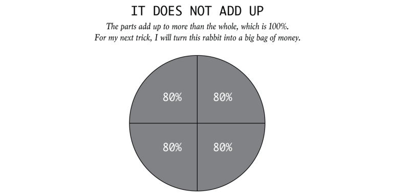
Through our class and blogs, we have discussed as to why pie charts are best left alone. One of the reasons for avoiding pie charts is the difficulty in judging the area of each slice, since it is dependent on the angle at the center. So the question now is, if we were to remove the angle element from a pie chart, would the resulting chart be more useful?

To start answering this question, let’s first identify a name for this resulting chart and look at some of its characteristics. The resulting chart is called a Square Pie Chart or more commonly known as a Waffle Chart. The waffle chart is represented as a square/rectangular block consisting of small tiles. Each tile in the block contributes to the entire sum/percentage of the block and is weighted equally. Therefore, the waffle chart manages to provide a balance between the visual aspect and the ability to synthesize the data. The biggest advantage of using a waffle chart, over a pie chart, is the ability to synthesize data down to 1%. This is possible by comparing the various parts (area) of the waffle (which in most cases is a square, thereby making calculations easy – number of cells in row multiplied by number of cells in column).  Even when compared to a bar chart, a waffle chart looks more interesting and can answer questions such as “x is y times greater/smaller than z”.

However, just like in the case of a pie chart, we need to be cautious when deciding which visualization to use. The critical factors to keep in mind will be the number of categories being described and the value difference between each measures. In addition to these two factors, we also need to tailor the visualization according to the audience, the context/setting, and the message being delivered.

References:

http://tableaulove.tumblr.com/post/56368410545/yummy-yummy-tableau-waffle-charts-from-jesse

http://bl.ocks.org/XavierGimenez/8070956

https://community.tableau.com/thread/125926

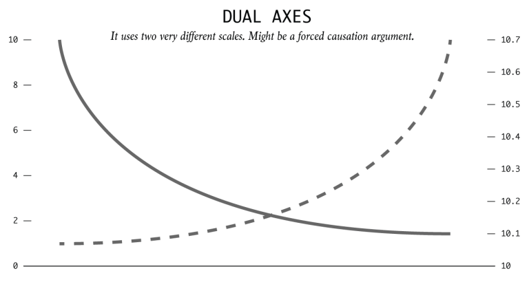
http://junkcharts.typepad.com/junk_charts/2008/06/the-right-scale.html

Connected Cars (3D Really?)

We all know that IoT aka Internet of Things is one of the most talked about topics today. You’ll be amazed to know that approximately 23 million vehicles around the world have internet access and big data such as engine controls, driving behavior and automatic crash notifications are going and getting uploaded on the cloud. It is predicted that by 2020; 152 million vehicles will be connected via internet.

Let’s look at this visualization and see if it has succeeded in what it is trying to convey.

Visualization link: Connected Cars

While 3D visualizations can provide rich information, many people have trouble comprehending them. This visualization presents an amalgamation of graphs which are beautifully represented in vibrant colors and each one utilizes different forms. However, the fundamental issue with this visualization is that this uses unjustified 3D graphs. In this, 3D is offering no increase in viewer comprehension. The first four dashboards are still easy to decipher, however, the major problem lies with the last two.

For instance, the fifth graph represents two features merged into one i.e the most innovative car maker for communication and the most innovative car maker for drivers assistance based on an index score. Firstly, the graph shows no mathematical correlation between these two indexes.Secondly, the graph is presented in overlapping 3D triangles with the values labeled with long lines placed close to each other making it difficult for the audience to compare two companies on this index (eye beats memory!!). This representation actually confuses the audience in terms of judging the depth, size and position of objects and could be presented in relatively simple bar graph comparative.

Finally a pie chart is used to represent driver’s willingness to share the connected car data with OEMs, that too in 3D (double mistake). The colors used also overlap and interfere with the interpretation. If observed closely, the 34% drivers who anonymously want to share the data and 31% who wish to share data in lieu of an incentive has only a percentage point difference of 3; however, on the graph it seems that the difference is more because of the unnecessary 3D effects poured in the pie chart.

This visualization can be improved by rotating the axes to make its cross section perpendicular to the planes of presentation. Any suggestions from the readers are also welcomed on how to improve this visualization.

References:

https://www.tableau.com/sites/default/files/whitepapers/dashboards-for-financial-services.pdf

http://onlinelibrary.wiley.com/doi/10.1002/meet.2011.14504801345/pdf

Building Interactive Dashboards With Tableau Actions — Embed A Youtube Video

Last time, I introduced how you can use Tableau Action Filters. This time, you will learn how to embed a video from an external source into your dashboard to highlight something interesting.

First of all, you need to get the youtube video URL you like. To do this, go to a youtube video and click “share > embed”. Copy the source link in src=”…”, like the highlight in the picture:

Next, you should save your Youtube URL in your source data file as an column just like other regular attributes.

Go to the “Dashboard > Actions> Add Actions > URL” in the top navigation from any dashboard view. Click the arrow that appears next to the empty URL box. You should be shown a list of options including the URL field in your underlying data. Click the URL field so that the video associated with a particular record will start when the action is run.

WX20170214-175952@2x

This is a example dashboard embed youtube videos for “MLB Integration by team”. If Clicking on any hall of fame player, represented by a blue Gantt bar, it will load a short biography of that player on the scoreboard.

TO BE CONTINUED…

Reference: http://www.evolytics.com/blog/tableau-201-3-creative-ways-to-use-dashboard-actions/

Three dimensional effect

For this week, I’d like to introduce you the latest technology of making a three-dimensional effect in visualization. The first figure shows the what American paid for gadget lust in the 90s, 00s, and the recent decades, respectably. As we can see, the vertical axis which shows the different times is a downward sloping trend line instead of a commonly seen horizontal line and the horizontal values which show the money spent shows in a three-dimensional effect. That makes audiences feel closer to the data.

st_infoporn_f

Another similar design: The map of foreclosures (New York Times, 2008) displays multiple variables in a striking 3D graphic.

20080406_METRICS_SUB_GRAPHI

I think this pattern of design is worth being studying from.

Reference:

1.The Cost of Living on the Bleeding Edge of Gadgetryfigure https://www.smashingmagazine.com/2008/01/monday-inspiration-data-visualization-and-infographics/

2.In the shadow of foreclosures by the New York Times, April 5th 2008http://mapdesign.icaci.org/map-examples/

Difference between Tableau and D3.js

Tableau is a data visualization software that connects easily to the majority of databases be it corporate Data Warehouse, Microsoft Excel or web-based data and allows for instantaneous insights by transforming data into visually appealing, interactive visualizations called dashboards. It is a Business Intelligence tool with drag and drop interface which makes it fast and easy to use.

D3.js is a Javascript library for creating data visualizations in the browser and is built on top of common web standards like HTML, CSS, and SVG. D3.js helps you attach your data to DOM (Document Object Model) elements. Then you can use CSS3, HTML, and/or SVG showcase this data. Finally, you can make the data interactive through the use of D3.js data-driven transformations and transitions.

Differences between Tableau and D3.js:

  • Tableau: It is a proprietary tool and can be expensive if not using the basic Desktop Application.
  • D3.js: It is a free and open-source tool.
  • Tableau:Development time of dashboard is in minutes due to it drag and drop interface. Learning it becomes hassle-free.
  • D3.js: Development time can be from hours to days as hard coding is required and can be difficult to learn without prior knowledge of web development tools and languages.
  • Tableau: By applying user filter or row level security feature, restricted data access can be provided to different users.
  • D3.js: Concealing data from User can be accomplished but restricted access among different users in difficult to achieve.
  • Tableau: Variety of built-in charts and maps are available to utilize but out of box visualizations are not possible.
  • D3.js: Any imaginable visualization which is codeable is possible, but every chart has to be built from scratch.
  • Tableau: It is able to identify dimensions and measures and can handle gigabytes of data.
  • D3.js: It is struggle to handle large datasets of gigabytes in size.

Use Cases & Key factors:

  • Tableau: Internal Analytics Platform, Public Data Viz work, Need Answer fast, Speed to delivery, for internal use and great visualizations.
  • D3.js: Public Data Viz Work, Embedding into a product, real-time interactive web, control over display, for external use and great visualizations.

We can conclude that for quick and easy visualizations involving commonly used charts and maps, Tableau is suited and D3.js can be utilised when there are extraordinary charting requirements or high interactivity requisites.

Source: http://www.je-lks.org/ojs/index.php/Je-LKS_EN/article/view/1128/1030


Spot Visualization Lies – Part II

Odd Choice of Binning

Instead of showing the full range of variation in a data set, someone might try to oversimplify a complex pattern. It’s easy to transform a continuous variable into a categorical one. Broad binning can be useful, but complexity is often what makes things worth looking at. Be aware of oversimplification.

Area Sized by Single Dimension

Most of time human’s eyes can not accurately tell how much is a square or a circle. When data are linearly sized an area-based encoding, like a square or a circle, they might be sniffing for dramatics.

Variation with Area Dimensions

Maybe someone knows how area as a visual encoding works, and then they go and do something like the above. Theses fill the same amount of area, but they look very different and still dramatic.

Extra Dimensions

When you see a three dimensional chart that is three dimensions for no good reason. It is worth to question the data, the chart, the author and everything based on the chart. That extra dimension could be nothing but just a distract factor.

Important: It does not absolutely mean a visualization is lying just because it exhibit one of the previously mentioned qualities. With that in mind, make sure you have the right reaction before you call someone a liar.

As rule of thumb, scrutinize charts that shock or seem more dramatic than you thought. 

https://flowingdata.com/2017/02/09/how-to-spot-visualization-lies/

Introduce great visualization TED Talks and Gapminder

This week I have focused my research on data visualization on renowned statistician Dr. Hans Rosling, a scientist with a great sense of responsibility by making the world better with datasets that will change people’s mindsets. May he rest in peace in heaven.

I started watching a TED talk by David McCandless, the founder of website “informationisbeautiful.net”, who mentioned the meaning for visualizing data—-compressing the overload information to reveal patterns or connections that matter.  And Mr. McCandless regards Dr. Rosling as his master.

Then I found out Dr. Rosling’s talk, the one ranked as one of the top 500 TED talks, that he gave to the US State Department on the topic of developing countries’ health issues. Dr. Rosling used his animated visualizations to illustrate the changes of children’s death rate, people’s lifespan and HIV carrying rate of people living in different countries over time. Dr. Rosling was an enthusiastic scholar that cares about improving the overall health status of the world, and I greatly respect him for that. Also I have discovered this awesome website that Dr. Rosling had founded.

As people can fastly comprehend information conveyed in a picture, and as the size of data right now is so enormous,  the way to use data visualization is inevitable. Just like programming is the way to communicate with computers, data visualization will become a common language and a tool, to interact efficiently with people’s mindset. For now, the resources above are enough for me to go over as a rookie visualizer, and I’ll need more knowledge in data mining, data processing and statistics. Hope that one way I can express dataset freely that will catch people’s eyes and make them ponder. And then I can proudly call myself “a data artist”.

Spot Visualization Lie – Part I

Lying with statistics has been a thing for a long time, but charts tend to spread far and wide theses days. Some don’t tell the truth. So it’s all the more important now to quickly decide if a graph is telling the truth. This is a guide to help you spot the visualization lies.

Truncated Axis

Bar charts use length as visual cue, so when make the length shorter using the same data by truncating the value axis, the chart dramatizes differences. Someone wants to show a bigger change than data actually tells.

Dual Axes

By using dual axes, the magnitude can shrink or expand for each metric. This is typically done to imply two events which actually independent with each other are correlation and causation.

It Does Not Add Up

Some charts specifically show parts of a whole. When the parts add up to more than the whole, this could be a problem.

Seeing Only In Absolutes

Everything is relative. You can’t say a town is more dangerous than another because the first town had two robberies and the other only had one. What is the first town has 1,000 times the population that of the first? It is often more useful to think in terms of percentages and rates of relative factor rather than absolutes and totals.

Limited Scope

It’s easy to scope dates and time frames to fit a specific narrative. So consider history and proper baselines to compare against.

Due to words limited, to be continued next week…

http://flowingdata.com/2017/02/09/how-to-spot-visualization-lies/


How NOT to use Tableau

1) Replicate a report or chart designed in another tool:

One cannot use Tableau to exactly replicate a visualization designed using another tool. It could be a very simple visualization, but Tableau may not be meant to do that exactly or it might be too difficult to visualize. Instead of trying to replicate a report or chart, one must understand the underlying purpose of the visualization and redesign it using Tableau’s best available features. In fact, this may give a whole new perspective to the original dataset. Undoubtedly, Tableau has some great features but it is not meant to exactly mimic other viz tools.

2) Try to show tons of data on one screen with a dozen (or more) quick filters:

Sometimes the dataset in hand is quite huge with several attributes and dimensions, no doubt Tableau can visualize large datasets. However, it is up to the user to decide what is important and what is not. Visualizing all possible combinations with multiple filters can be a failure. ‘One size fits all’ does not help. Building interactive views which take a user to different desired granularity levels of detail gives a much more holistic understanding and solves any issues surrounding displaying too much info on one screen.

3) Spend way too much time on formatting:

Tableau is a quick tool to visualize your data. There could be corporate design standards that one must follow while creating visualizations using Tableau eg- Using a particular font or certain color coding. It can be fun to explore different colorful representations of an info-graphic. Tableau supports formatting through a variety of dashboard objects, controls and formatting options. However spending too much time on formatting is not advisable. Tableau is not for “pixel-perfect” reporting.

4) Connecting to already summarized data:

A summary report is a natural way for a human to read data, but not for machines. Tableau wants to connect to a RAW data format, rather than data that has been manually classified and summarized into a table. The user might think that Tableau can visualize data more effectively if it is already aggregated and summarized. But Tableau is meant to do this and we are not saving any time or making the visualization any better by feeding it summarized data. Tableau needs raw and clean data, not summarized data.

Reference:

www.theinformationlab.co.uk/2013/08/27/how-not-to-use-tableau/

Interactive Data Visualization

Static visualizations can offer only precomposed “views” of data, so multiple static views are often needed to present a variety of perspectives on the same information. Dynamic, interactive visualizations can empower people to explore the data for themselves.

  1. The Novice User. Even novices must be able to examine data and find patterns, distributions, correlations, and/or anomalies. They must be able to build and use tools that enable faster decisions based on real-time information. As the National Research Council of the National Academies of Sciences states, even “naïve users” should be able to “carry out massive data analysis without a full understanding of systems and statistical uses.”
  2. Driving Processes. The solution must allow the user to establish KPIs that provide the rules that drive processes. These must be displayed visually—for example, by color—in real time based on defined thresholds. Likes its architecture, Interactive Visualization is a means to an end – to stimulate informed action.
  3. Data Must Tell A Story. An intuitive, visual workplace that it easy to master is based on easily digestible interactive patterns. Data must tell a story that instantly relates the performance of a business and its assets. Almost every Interactive Visualization narrative takes place across multiple layers. Users must thus be able to select data elements and filters, and then highlight and modify options to change data perspectives – from high-tech overviews down to the most granular detail.
  4. Data Correlation. The user should immediately know not only of hot spots that require attention, but also effortlessly find trends based on the dynamic relationship between multiple data streams and the data derived from them by means of predictive analytics.
  5. Prescriptions: “What should happen next?”World-class Interactive Visualization and underlying analytics capabilities surpass that standard by offering prescriptive analytics(“What should happen next?”) to drive real-time asset behavior modification.

Picture below is one the best interactive visualization of 2015 according to experts. The visualization is about machine learning. To find a complete description about this please look at: http://flowingdata.com/2015/12/22/10-best-data-visualization-projects-of-2015/

Screen Shot 2017-02-20 at 12.14.19 PM

References:

http://www.forbes.com/sites/benkerschberg/2014/04/30/five-key-properties-of-interactive-data-visualization/#a5efa2344eb0

http://chimera.labs.oreilly.com/books/1230000000345/ch01.html#_why_interactive

Frontiers in Massive Data Analysis(National Academy of Sciences 2013)

10 Best Data Visualization Projects of 2015