Visualizing Texas hold ’em

This interactive visualization is about the probability perspective in Texas hold’em. It was created by a software engineer named Chris Beaumont. The visualization shows us the first two hand win rates by enumerating and computing all possible (nearly 1.3 trillion) combination of hands. There are three graphs, which represent Average Hand Strength, Hand Frequencies and Weighted Hand Strength respectively. Our focus here is the last one because it is the most important part for players.

The VIZ only use cube (totally 13x13x4=676 cubes) as mark and color/satuation as channels. For any pair of two hands, the deeper blue represents the higher win rate and the deeper red represents the higher loss rate. Overall, it is simple and easily to understanding. But the contrast is low, you will be hard to differentiate which pair of hands has 60% win rate between other pair with 40% win rate.To be more distinguishable, it could use more channels, such as more color/satuation or more shapes to represent the win rates.

Reference:

http://chrisbeaumont.org/holdem_odds/#8H+QS

https://www.fastcodesign.com/3042982/infographic-of-the-day/a-data-nerds-guide-to-winning-texas-holdem


The Changing Nature of the Middle – Class Jobs

jobs

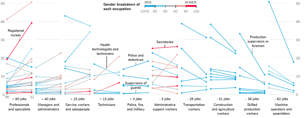
The visualization is that about the changing nature of the types of jobs, the jobs that pay the salary between $40,000 – $80,000. The types of jobs that pay wages as stated above in 2014 dollars — have shifted since 1980 is the claim of this visualization. The visualization depicts that few job positions are male dominated production occupations while some of the job positions out in the market are female dominated. The x-axis of the visualization shows the number of increase or decrease in the jobs in various domains. The y- axis shows the percentage share of each occupation and the line plot shows different occupations which contributed to the increase or decrease in that domain.

  • One of the best parts of the visualization is that it clearly shows the gender breakdown of each occupation. The legend for the plot shows that the plot uses stepped colors to show the percentage of male or female dominance in a particular occupation. For example, the first section of the visualization shows that in professionals and specialists domain people can be dietitians and nutritionists; Librarians, archivists, and curators etc. and the color of the plot shows that whether that job is male or female dominated.
  • Another feature of this visualization is that it also depicts which occupations are the biggest gainers and losers by showing the occupations which have gained and lost share; the increase in jobs per 1,000 middle – class jobs; and also, the percentage change in their share.
  • The best feature of this visualization is that it shows which industries have the majority share in the jobs per 1,000 middle – class jobs and which sex dominates it.

Reference https://www.nytimes.com/interactive/2015/02/23/business/economy/the-changing-nature-of-middle-class-jobs.html

Weather Matters.

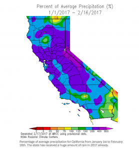
As we all know, this has been one of the wettest years in California in a long time. People have had evacuation notices due to high chances of flood and reservoirs overflowing. This has been the strongest storms hit since 1995. When I was going through daily news, I found this visualization and it looked very interesting. Though it looks like modern art with so many colors splashed, it makes a lot of sense when closely looked at.

Screen Shot 2017-02-19 at 12.06.18 AM


The visualization presents the precipitation (rain or hail) in % over the last month and half. I particularly liked this one as it shows all the exact points and helps understanding the most affected areas. The color scale being diverse does not collude and merge with each other and shows discretely the areas of regions. Even though this might be breaking one of the rules of thumb, of presenting in black and white. I understand that it is very helpful in this situation.


For our upcoming assignment of interactive dashboards, I feel this has created an impact on me to use what matters. When you want to understand the big picture to its core details in a couple of clicks, it helps to know what exactly is the message you want to convey to the audience.


So find the message you want to put across and enjoy the assignment!

https://www.washingtonpost.com/news/capital-weather-gang/wp/2017/02/18/historic-storm-pounds-southern-california-with-high-winds-and-record-rain/?utm_term=.13262146b08f

Simplifying maps to make sense

https://medium.com/@tviit/the-new-york-city-subway-map-redesigned-9a3f776c7627#.32dju0mli

Over the long weekend, I was traveling to NYC for some work and needed to use the subway system for commuting. For non-newyorkers it is a task about what line goes where and how many connections overlap each other.

This is a visualization I came across while reading more about the subways systems. The left hand side shows a simplified version of the original map that is being used by the metro.

There are multiple lines which have been assigned multiple colors.

For example, R,N and  Q lines signify the yellow color and these lines run on several stations. But Q doesn’t go beyond 57th street. That is clearly seen on the redesigned chart on the left.

This chart also shows the junctions and the intersections. On the 42nd street station, all the lines 1,2,3,R,N,Q and S intersect. This can be seen clearly on the redesigned chart, while it takes a bit to decipher that from the original map.

The different thing that they have done is they have visualized multiple lines for each color. Like yellow runs through R,N and Q, they have made 3 separate lines to visualize the yellow R ,N and Q lines as compared to a single line in the original map. These multiple lines makes it easy to track.

On a first glance, the redesigned map looks much simpler, cleaner and neat. Though it has the exact same amount of information as the original map, the new one is simpler to read.

In creating visualizations it is very important to keep in mind a sense of simplicity. For someone who is looking at the visualization for the first times, congested visualizations become difficult to interpret.


References :  https://medium.com/@tviit/the-new-york-city-subway-map-redesigned-9a3f776c7627#.32dju0mli

Difference between Metric and KPI

While creating visualizations showing the Key Performance Indicators (KPI’s) for any business, it is extremely important to understand that not all metrics are KPI’s and hence are not useful in evaluating the business.

What is the difference between metrics and KPI’s?

A metric denotes the numeric value of the measure, whereas a KPI explains what is being measured. A metric can be a calculation of different metrics eg average. KPI uses quantifiable metrics to evaluate the business goals. They help to make calculated business decisions based on the metrics obtained.

KPI helps business owners to understand basic business profits like break even points. A balanced scorecard can be created to evaluate the different operating elements like financial growth, customer satisfaction and business processes. This helps business owners to track the progress of their business.

KPI’s help the business owners in the following ways-

  • Design good lead strategy
  • Choose an effective marketing method which is cost effective
  • Define an appropriate pricing strategy for its products.

By combining KPI’s with useful metrics a company can communicate its performance with the internal or external stakeholders. This helps them to identify the areas to work on and improve for the business to do better. It gives the picture of performance against the goals set by the company.

Sources- http://yourbusiness.azcentral.com/differences-between-kpi-metric-24392.html

http://experience.stratusinteractive.com/blog/whats-the-difference-between-a-metric-and-kpi

http://www.bscdesigner.com/quantification-measure-metric-kpi.htm


To be Interactive or not?

When looking for information on an upcoming assignment, a question came to mind. This question is, “When should interactive visualization be used and when should it not?”. We all know that for a visualization to be good, it needs to tell a story and use the data shown in the visualization to support this story. However, with interactive visualizations that story becomes more fluid instead of static and the results may not be what you expect or want it to be. So why do we use interactive visualizations if this is what can happen? I went looking for information on this and surprisingly I did not find a lot of information on this. What I found however does bring up some good points. Interactive visualizations should only be used in certain cases. First and foremost, the best use of interactive visualization is that it should only be used for yourself when exploring the data. This allows you to freely see what the data is and allows you to explore the stories that lie within the data. Interactive visualizations should never be used as a prop for presentations since the data that in presentations need to be static and should convey your charts story to the viewers. If you give the option of changing the data points and other variables to the viewers, then the presentation will never finish.


Reference: http://stats.stackexchange.com/questions/7048/when-is-interactive-data-visualization-useful-to-use/7098

Defining and using KPIs in a successful business intelligence system

Key performance indicators (KPIs) can aid in measuring BI and analytics performance. The key challenges for creating a KPI is to meet business objectives, and use knowledge to generate value form a successful business intelligence system. Dashboard is to present this KPI in a form for management review. Dashboard will provide real-time presentation of KPIs and allows for drill-down.

In my option, the KPI shall not be limited to presenting the business process and results. It shall also make recommendations for actions to improve business process. After some actions are implemented, the dashboard can reflection the changes of KPI based on those actions. Dashboard shall adopt more machine learning and deep learning algorithms. In this way, dashboard can be more intelligent to make recommendations for senior executives.

http://searchbusinessanalytics.techtarget.com/feature/Defining-and-using-KPIs-in-a-successful-business-intelligence-system

Oscar Dashboard

Here is the dashboard representing number of Oscars presented since 1929 (when it was started) till 2014. There is no such strong claim to make from this visualization but instead of just staring at list of Oscar winners, you can play with it for different categories and ratings for each year.

Dashboard: http://www.antivia.com/decisionpoint-excel/samples/oscars.htm

Good things about the visualization:

  • Less is more. The dashboard is simple and clean with two bar graphs and a block calculating percentage distribution.
  • Right choice of idiom. If we want to find what category of films has highest Oscars then bar graph is best suitable. And it is sorted by the number of winners which grabs users attention to the top category of film.
  • Effective use of filters. When it comes to movie, we have different categories, genres, artists, ratings, release year. All of these characteristics are included in this dashboard using filters.
  • Information follows the inverted pyramid. The most important and substantial information is at the first view followed by significant details by applying filters and then general background information.
  • The percentage calculation for each category gives performance of each category with respect to all categories.

Improvements:

  • They could have represented trends in each category over those years. For example, how is the demand for documentaries or animated films for each year.
  • It has many filters however it would be tedious for user to select all those filters and find the required information.

To conclude with, this provides valuable insights into trends in industry throughout the years which is much better that scrolling through the tables with multiple columns and millions of rows!

Source: http://insidebigdata.com/2015/02/21/visualization-week-ultimate-oscars-dashboard/


What do I like about ‘Inflation Dashboard’

While dong redesign project I had chance to explore Eurostat-a Directorate-General of the European Commission. Among the various visualization tools, I specifically like inflation dashboard tool that they are using for EU inflation rate.

Here are the four features that I like about this tool.

  1. Be able to simultaneously choose two line charts, a bar chart and a map

The four charts show the overall and specific EU member states’ inflation information. The four tables are interactively changing based on what information users want to read.

  1. Choose three simple light colors

The main three colors they choose are very light and simple. The colors are eye friendly and also distinguishable enough for readers to get specific information at the first glance.

  1. Be able to read the individual stories by time range

Readers can choose the time range they want focus and the duration of display so that the website will play the inflation trend automatically.

The tool also allows readers to view data as map, chart or table.

It is a good visualization for governments or companies and individuals to think about when it comes to present a time based interactive inflation visualization.

Reference:

  1. http://ec.europa.eu/eurostat/inflation-dashboard/
  2. https://www.frbatlanta.org/research/inflationproject/dashboard.aspx
  3. http://ec.europa.eu/eurostat/help/first-visit/tools

KPI Visualization Analysis

Since this week we are introduced what is a KPI and how KPI consists of. I choose to analyze a mediocre KPI design.

http://www.dashboardinsight.com/dashboards/tactical/perpetuum-money-maker.aspx

This dashboard is supposed to help traders report all their activities to their customers: when the traders sell or buy, customer daily profit, market KPI’s for exact date and time, risk level. So, customers get a clear idea of what was a situation and why the trader performed in this or that manner. Here are some key changes that this dashboard needs to change:

— Remove all the 3D segment in the graph. We have talked about 3D data visualization in the previous class. Most of the time, it does nothing other than confusing the audience.

— The top right table contains too many raw data and detail. Actually, the data is not even visualized in the dashboard. The author should follow the rule: KPI = metric + goal + action + time frame. A gauge with a leveler graph will work.

— Unidentified figure in the left bottom corner.

— Un identified figure in the Day Result table. what does the figure “81” and “245” mean? Properly label widgets should be added to this dashboard, ensuring the viewer quickly knows the meaning of them.

Reference:

Perpetuum Software’s Personal Moneymaker Dashboard

http://www.dashboardinsight.com/dashboards/tactical/perpetuum-money-maker.aspx