Is U.S. about to hit recession?

“Next year, we will hit recession”, calls Chad Shoop, Editor, Pure Income.

In his recent article, Chad states that the trend in durable goods for the year 2016-17 is an indicative of the country on the verge of recession. According to Chad, durable goods orders can be considered as a measure of company’s confidence in its growth. Rising orders shows confidence that the economy will continue growing, while falling orders shows shrinking economy and curtailed spending.

The durable goods trend has shown a fall only twice over the past two decades. Once before the 2000-2001 recession and second time during the midst of global financial crisis of 2008. For the remaining years, i.e. from 1992-2000, from 2001-2008 and from 2009-2016, this graph has rose at a choppy but steady path. There is a pattern here. Each time this graph has turn lower, it has been a signal for imminent recession-today is no different.

The U.S. Census Bureau News generate these graphs every year. It is a simple line graph with trends lines indicating the rising trends in it order patterns over the last two decades. The figures to the right show the amount invested by companies in the durable order goods over the years. The graph makes its claim very clear in a very simple way, warning us about our future.

Hence, we need to prepare ourselves for a recession like investment- environment. We need to find a strategy to make profit from declining stocks before it is too late. Because, as Chad states, “Crash is coming. It’s just a matter of when, not if.”

Reference: http://thesovereigninvestor.com/us-economy/new-signs-economic-recession/

Knowing your audience is the key

Last week we were struggling to create interactive visualization for the audience of our choice. Many of us experienced the difficulty of choosing the audience. But once our user was fixed,  we forgot about the audience while creating the visualization and were more focused towards creating some interactivity in our Dashboards.

Audience plays most important role in any visualization. The best visualizations don’t make your audience work too hard to understand them. Showing your readers the actual data and explaining what it exactly means will increase their comprehension and will encourage them to spend more time with your data, amplifying its effect. Following points will help us to enhance our analytics skills and ability to approach any data.

It is important to match your visualization to your viewer’s information needs. You should always be asking yourself: “What are they looking for?”

1. Understand your audience before designing your visualization

What type of decisions do your viewers make? What information do they already have available? What additional information can your charts provide? Do they have time (and interest) to explore an interactive website, or should you design a one-page handout that can be understood at a glance?

2. Your audience determines the type of visualization you prepare

Spend some time thinking about your dissemination format before you sit down at the computer to design your visualization. Give a glance at what viewers what, it can be visual reports, executive summaries, live presentations, handouts, online reporting and more.

3. Remember that the key is to keep your audience engaged

Ensure that your audience is looking where you want, when you want. Keep it simple but at the same time it should be informative enough to engage your audience in visualization without any confusions.


Sources:

Why Your Audience Matters in Data Visualization

https://www.maptive.com/use-data-visualizations-win-audience/


Fantasy Football Dashboard Advantages and Disadvantages

http://overflow.solutions/special-projects/2016-fantasy-football-dashboard/

This Dashboard shows the creator’s Fantasy Football Draft. There are four graphs in the dashboard: Player listing sorted by project score, points by rank, box plot of projected FF points for each player by position, and points by position and team. All the four graphs are interactive, and i believe the interactiveness creates better understanding of the data visualization as well as confusing the audience.

Audience: Anyone interested about the fantasy football, and want to be successful in it.

Purpose: Help the audience to choose a good pick.

Advantage: They are many information in this dashboard. The interactive part makes it easy for audience to filter the data. The use of color help the audience understand the role of players.

Disadvantage:

  1. In the points by rank graph, it is hard to distinguish the cross, circle, square, and etc. in the small interface. Also, in the dashboard we do not know the difference between the symbols.
  2. The audience may get confused by so many filters. Maybe do not group them together and put them closer to the graph.
  3. Do not like the player search option, there are not so many player in the database. Barely use it.

To sum up, is you are new to the fantasy football, this graph will confuse you. If you are a addict player, this data visualization may help you a lot.

Reference:

2016 Fantasy Football Dashboard

http://overflow.solutions/special-projects/2016-fantasy-football-dashboard/

It is pretty! But is it required?

My this week blog is about how “visual noise” deviates the user from interesting data. Even a credential source like The Economist Magazine falls into trap of beautifying their charts to a level that they lose their purpose.

In their edition “The world in 2012” they published the following chart
The above chart basically matches price of gold to yield of bonds. To somebody who reads The Economist, the above correlation holds substantial value but the visual noise created by distracting image (coin), extremely enlarged chart and microscopic font deviates the attention of the reader.

Following is another such example:
In this chart too, it is difficult to concentrate on the plotted columns while ignoring the cranes and workers that litter the chart. These irrelevant decorations just compel the reader to work harder than they otherwise should to discover the meaning hidden in the data.

A designer should understand that making a chart beautiful to the level that the data looses its integrity actually works against the designer. It makes the chart non effective and fail to provide give quick insights that aid decision making.

The most common chart junk items include:
1. Cartoons or irrelevant decorations: These meaningless decoration do not excite reader about the data rather just add work on user’s side.
2. Dark grid-lines: They often tend to deviate user’s attention. The best practice is to use soft grey grid-lines or eliminate whenever possible.
3. Bright and bold colors: Bright colors are too tiring to look at and also one should be careful about color blind audience.
4. Uppercase: Uppercase should be used only when an element requires special attention.
5. 3-D effects: Three dimensional effect just adds to confusion in readers mind than adding relevant context.

In conclusion, I would state that a good practice after creating a chart is to step back, identify unnecessary items and remove them. Also, one should repeat this process until nothing else can be removed and the visualization has a purpose and supports the objective.

Reference:
http://www.exceluser.com/blog/1133/good-examples-of-bad-charts-chart-junk-from-a-surprising-source.html
https://www.blue-granite.com/blog/data-visualization-remove-chart-clutter-and-focus-on-the-insights


Programming Platforms for Interactive Visualization in Web Browser Based Applications

Introduction:

Browser based application are very popular wherever interactivity with users is a requirement. However, most of application use classical user interfaces (UIs). In Information Visualization (InfoVis), there are several powerful and versatile applications that are well known among experts, but designed to run natively in operating systems (OSs) only. In this post we compare 3 most popular programming platforms for developing browser-based InfoVis applications.

Java Applets

Strength:

Java requires the application to do the rendering on its own, targeting the client area in pixels. However, among the free libraries available for Java, several renderers exist which free the developer of this work. Some renderer libraries for Java provide features supporting animation. When providing user frame selection, it is possible to fire a manual drawing event. Java on its own has reached a very stable state.

Weaknesses:

The installed version of the VM differs among clients. Incompatible versions can prevent the Java applet from running. There are also problems embedding applets in some operating system or browser configurations. The use of Java applets has declined during the last years with the increasing flexibility of Flash.

Flash

Strength:

While the Flash drawing functions are similar to those of Java, they do not actually perform the drawing directly. In fact, they cache the graphics primitives and the drawing is performed in a renderer thread independent of the user code. Flash not only supports timer events but also has timeline support already built in the platform. Flash is very stable inside the browser.

Weaknesses:

For Flash debugging is more complicated because the compilation does only run in the plugin and a special debugging plugin is needed. ActionScript is a language based on the ECMAScript, which causes several compatibility weaknesses, like poor type safety.

Silverlight

Strength:

In Silverlight graphics primitives are defined in a description language. They can also be modified or complemented with additional graphics primitives using code. In Silverlight, there are no timer events but timeline support. Drawing separate frames is possible as in Java and Flash, but you can also modify existing objects instead of drawing new ones. 

Weaknesses:

Like in Flash, caching the renderer output is not possible, so user frame selection requires firing a manual draw event. For each site that requires Silverlight, there are thousands of sites requiring Flash. This is due to the fact that it is very difficult to introduce a new technology into an established medium, especially, if something has to be installed that normally is not part of the environment.

Conclusion:

No technology is superior to all others in all situa- tions. Developers need to consider the environment and user group they address as well as their requirements. These prerequisites define the priorities. Therefore, even the platform-independence of web applications is limited.

References:

E. Burnette. Is Flash better than Java?, April 2007. URL http://blogs.zdnet.com/Burnette/?p=286.

http://www.oddhammer.com/ actionscriptperformance/set4.

https://publik.tuwien.ac.at/files/PubDat_217968.pdf

Executive Dashboards

What is executive dashboard? It is a visual representation that gives executives a quick and easy way to view their company’s performance in real-time.

Executive dashboard nowadays uses API (application programming interfaces) to connect with its existing system sources such as accounting software, CRM system, and email system. It can directly pull out those data and transform that information into visualization that can be viewed and manipulated in different ways based on the users’ need.

There are several benefits of executive dashboards:

  1. Visibility: a snap-shot for the audiences lets them get a clear picture of what’s going on.
  2. Ongoing Improvements: measure the performance and let the audience know what to improve it.
  3. Judge Performance Against Business Plan: show what’s company performs compared to business plan and the goals from the business plan versus actual real-time results.

There are two examples of executive dashboard:

Marketing Executive Dashboard

Salesforce
  • Let the directors and VPs know whether they are creating efficient campaigns and generating and converting leads.
  • Relevant information about leads and campaigns such as Campaigns by ROI and Top Marketing Channels by Campaign.
  • Set time smartly. There are quarter and month data. It can get the big picture and details.
  • There are tables supporting charts on the dashboard.

Sales Executive Dashboard

Salesforce
  • Let the audiences to know their organization going this month.
  • Set conditional highlighting to show the audience what perform above average or below average.
  • It uses headers and footers smartly. They efficiently support what charts and tables want to say.


Reference:

https://www.forbes.com/sites/davelavinsky/2013/09/06/executive-dashboards-what-they-are-why-every-business-needs-one/#7c83efd837d1

https://resources.docs.salesforce.com/206/latest/en-us/sfdc/pdf/salesforce_dashboard_samples.pdf


UBER ENGINEERING’S DECK.GL FRAMEWORK

Uber’s engineering team open sourced deck.gl, a WebGL-powered framework specifically designed for exploring and visualizing data sets at scale. Uber can explore GPS traces for a given trip to get full context if there’s an accident on the road. Uber also can communicate plans to city authorities by visualizing pain points if there are pain points around pickup locations in a city.  The engineering team developed deck.gl to meet the needs that the data should be web-based, real-time, and shareable.

deck.gl’s set of features adapts to a wide range of use cases, including mapping. It enhanced map-related visualizations in many different mapping environments. Here’s an example of mapping use case. deck.gl  dealt with large data sets: 2M points and 36K taxi trips in NYC with live GPU interpolation.If you are interested. you can check demo here. It’s amazing.

Reference: https://eng.uber.com/deck-gl-framework/

Tableau ‘Show Me’ tab – to use or not to use?

We all struggle to present the data in the most impressive visualization in Tableau. Most of the times, the ‘Show Me’ menu comes to our rescue. One of the most common mistakes in designing graphs is choosing the wrong graph type from this menu. Below are its possible issues:

  • Upon selecting the parameters when you click on ‘Show Me’, it stops you from thinking out of the box and limits your creativity.
  • Few very useful chart types are never displayed. Chances are that once you select the measures and dimensions; the tab gives you a bunch of options and neither fits the claim.
  • Sometimes, it portrays chart types that should never be used. For instance, for creating the visualization of the market share, it shows the options of pie chart, which might display a complete misleading claim that the you want to tell.

This can be substantiated by looking at the following visualization:

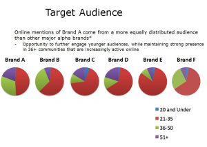
audience-pies

Issues with this visualization:

  • It has perceptual problems as no labeling of the shares is done
  • Very difficult to make comparisons for the same age across multiple brands
  • Results are conveyed but cluttered with long text
  • It uses multiple pie charts

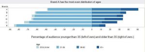
How this graph is improved:

brands1

  • It facilitates age comparisons much better than the multiple pie charts and enables the audience to see the age distribution of each brand
  • The color scheme is subtle yet powerful. The color intensity increases with increasing age, so one need not refer to the legend at every brand
  • The legend and labeling is clearly shown with age groups
  • The intended message to be sent across to the audience is displayed clearly

One needs to think of the best way to put across the claim of the visualization without limiting to the existing charts. 

Reference:https://www.forbes.com/sites/naomirobbins/2011/11/29/thinking-outside-the-chart-menu/#1b4d7b59171a

The power of visualization for golf

Visualization is helping golfers to improve their movement. The visualization can help to compare a real and imagined action and the golfer can stimulate the same muscle that would use to perform the read action. To visualize a shot, a golfer need to get a clear picture of the path the ball will travel on to reach the target. The other way is to visualize is to actually see himself or herself hitting the shot. The visualization can also help a golfer to make swing change to create new neural pathway and make the change part of “muscle memory”.

In my option, visualization shall not be limited to the use in business but also extend its use into sports training. I personally have been took a visualization class and it helped me to show how different I swing each time with statistical charts. I also try to memory my position and strength of the best swing as the visualization pointed out. In all, I believe the visualization is a great way to enhance performance of the sports training.

http://www.businessmirror.com.ph/the-power-of-visualization-for-golf/

Data Visualization in Political and Social Science

Abstract: In this post I will briefly discuss data visualization in political science and how use of visualization in social science can be risky.

Data visualization in political science takes advantage of recent developments in computer science and computer graphics, statistical methods, methods of information visualization, visual design and psychology.

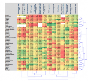
There are two main types of numerical tables that can be a subject of data visualization. The first one is called “object-feature” table, where every row represents an observation or an object and every column correspond to a numerical feature or indicator commonly measured for the whole set of objects. An example of such an “object-feature” table is a factbook for a set of countries, where the objects are countries and the features are numerical indicators such as GDP per capita.

Screen Shot 2017-02-20 at 12.38.18 PM

Source: https://arxiv.org/pdf/1008.1188.pdf

The second type of numerical tables is called connection or distance tables where both rows and columns correspond to objects and at the intersection of a row and a column a numerical value is found characterizing a link between two objects. A typical example of a connection table is the table representing the migration rates or the mutual volumes of export and import of goods for a set of countries.

Data visualization problems and risks: 

There are different sets of problems regarding data visualization in political and social science. First, the problems can be induced by the designer (intentionally or unintentionally) or by the user of the diagram. Second, these problems can be classified into cognitive, emotional and social ones. Cognitive problems can be connected to inappropriate use of graphical elements, lack of clarity, over- simplification or over-complexification of the graphical display, or induced by heterogeneity of target user groups. Emotional problems can be connected to a repellent content of graphical design. Social problems can be connected to cross-cultural differences of users. Another source of problems in data visualization comes from the use of categorical or qualitative measurements for which no standardized and well-established graphical displays exist.

Conclusion: Similar to other fields political and social science has been used data visualization to clarify their message. But using data visualization in these areas is more challenging since we are dealing with a lot of qualitative data and factors that can not be visualized easily. To improve our visualization in social science we need more insight on data beside technical capacities. 

References:

1. Bresciani, S., Eppler, M.J. (2008). The risks of visualization: a classification of disadvantages associated with graphic representation of information. ICA working paper #1/2008.

2. https://arxiv.org/pdf/1008.1188.pdf

3. LeGates, R. (2005). Think Globally, Act Regionally: GIS and Data Visualization for Social Science and Public Policy Research. Esri Press.