Is it the Earth’s Orbit ???

bloomberg-climate-change

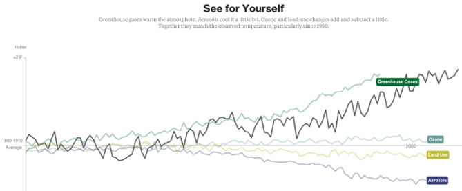
In our course, we have been taught to tell stories through our visualization, rather than simply showing the data. That is exactly what Bloomberg Business has achieved through their visualization. Bloomberg has come up with a story telling visualization to list down the various factors which might be the reasons behind global warming. Each screen of this visualization lists on of the many factors, starting from Earth’s orbit, sun, deforestation, to Greenhouse Gases; and shows the effect of temperature of all these factors over the years since 1880 to 2000. All the information is displayed in a very informative fashion with the help of line graphs and trends lines moving along the time line. Also, there is an explanation for each of the graphs mentioning why the developer has considered a particular factor as a reason for global warming. There are also graphs combining and comparing two or more of the above-mentioned factors with each other.

In my opinion, Bloomberg has done a great job in telling their story. The visualization is both interactive and informative. The developers have been able to establish a perfect balance between the two by creating attractive visualizations and also focusing on the main purpose of visualization, which is giving information.

Reference: https://www.bloomberg.com/graphics/2015-whats-warming-the-world/

How Walmart uses data visualization to convert real-time social conversations into inventory?

Data driven decisions at Walmart is more like a norm than a exception. WalmartLabs analyzes the data from the social network sites through their tweets, pins, shares, comments and so on to get retail related insights.

In an age where sharing of information has been made easy, social media is paying a vital role in creating better understanding of consumer likes through social buzz. Such social buzz typically precedes all important product launches. People are frequently expressing their views about the latest smartphone or the coolest video game to be hitting the shelf. WalmartLabs taps this social buzz and helps buyers plan their inventory and assortment.

Consider the following visualization of Sony’s Android phone Xperia Z showing a spike in social activity that helps its buyers to make smarter decision ahead of time.  Walmart’s buyers also get a sense of what they should stock online and in stores by checking out pins on Pinterest. Top pins feed into a social-media analytics dashboard for buyers. So do the reports from Twitter that engineers have created by visualizing and analyzing Twitter feeds. Buyers can see when the number of tweets on, say, gel nail polish peaked and see which colors were the most popular in which locations.

Such humongous amounts of social data are generated online, and it is crucial for retailers to transform it into meaningful information. These insights is what enables the buyers to understand the customer demands and plan their inventory accordingly.


Source: http://www.fusioncharts.com/whitepapers/downloads/Towards-Effective-Decision-Making-Through-Data-Visualization-Six-World-Class-Enterprises-Show-The-Way.pdf

Meteor Showers: Celestial anomaly mechanics demystified with visualization

Meteor showers on Earth are caused by streams of meteoroids hitting our atmosphere. These meteoroids bits of rock that were once released from their parent comet. Comets can produce debris by water vapor drag. As a comet orbits the Sun it sheds an icy, dusty debris stream along its orbit. If Earth travels through this stream, we will see a meteor shower. Although the meteors can appear anywhere in the sky, if you trace their paths, the meteors in each shower appear to “rain” into the sky from the same region.

We always wonder how the meteor shower work and also where and how do the originate. This visualization tracks their path and origin and also the day of the month it will occur.This new 3D experience offers a great way to understand the journey of the meteoroids and the sources of meteor showers on Earth. All major meteor showers are mentioned in this visualization. The different functionality like viewing the meteoroid shower from the earth or following the earth in its orbit, provided in this visualization helps the user understand the actual dynamics of a meteoroid shower and also tracks the time of occurrence.

This visualization shows these meteoroid streams orbiting the Sun, some stretching to the outer regions of the solar system. It lets you select the meteor shower in the menu to see the corresponding meteoroid stream in space.

Visualization: Click Here

Note: Their meteoroid orbits are based on those measured by NASA’s CAMS video camera surveillance network and were calculated by meteor astronomer Peter Jenniskens of the SETI Institute and NASA Ames Research Center.

Reference: Click Here

Know your Audience

Over the years, dashboards have evolved as a powerful tool that enables business users to make better and faster decisions backed by data. It serves as an important communication tool to transmit complex information about your business performance. When creating a dashboard, the first and foremost question to keep in mind is: Who is the intended audience? If the audience is not defined clearly, the message that is communicated may not be effective.

Audience Spectrum

Imagine a spectrum of audience for a dashboard. On the left side, we have data-hungry analysts and scientists who want as much information as possible. To cater to this audience, several dimensions in the data need to be squeezed into a tiny amount of space in the dashboard – so it’s vital to keep the graphic as clean and compact as possible. Rather than portraying a specific story and guiding the audience, we simply present the information in an easily consumable fashion giving the user full control in navigating the information.

On the other end of the spectrum, we have an audience that’s not as data savvy and would like the storyline presented with highlights and conclusions. The audience here is not familiar with the information and neither do they have a lot of patience to pore through it. One needs to advertise the data and explain it as efficiently and as quickly as possible with a primary focus on the conclusions.

These are the two extremes of the audience spectrum and there are varying degrees in between. It’s important to understand where your audience stands on this spectrum, and how much data do they need to see. Follwing is a link to one of the visualizations that I think might be appealing to an audience
across the entire spectrum:

https://www.nytimes.com/interactive/projects/vancouver2010/medals/map.html

References:

www.klipfolio.com/blog/first-rule-dashboard-design-audience
blogs.forrester.com/ryan_morrill/13-11-11-data_visualization_catering_to_your_audience

Interactive data visualizations – why and how they should be used!

Last week we learnt about interactive data visualizations and its prominent highlights-how effortlessly and conveniently it merges and presents data based on different topics with the help of one common factor that binds them together. Interactive data visualizations are special types of info graphics that let the use play around, explore and essentially “interact” with the data and with what the visualization presents. However, like most other data visualizations, they have their own purpose and strengths when it comes to certain topics. In most cases, I have observed interactive data visualizations to be used in places where there is a lot of information associated with a certain data field (consider example of “state”) and cannot be adequately represented with one pie chart or line graph. This data is further sub-divided into related fields that tell us some more information about the “state field” like income or sex ratio, which would be further divided into income based on region or gender or occupation or sex ratio based on age group etc. While I was working on the project on interactive data visualizations, I realized that the entire essence of a good interactive diagram is the choice of field that would bind the two visualizations together. A field that is selected to be used as a filter, should relate the two charts in such a way that clicking on it would expand and bring forth more information about the concept. At the same time, we must be careful that the “filter / highlight action” on the dashboard is not repetitive of what the first chart does, instead the “action” functionality should bring to light additional information about the same field that could be completely represented using the first diagram.

2017-02-26 (1)

2017-02-26

P.S. I have referred by own assignment for this week- Interactive data visualizations to put forth my opinions for this blog.

Mental Model for Home Health Care providers

Before we create dashboard, we must endeavor to learn the process by which our internal and external customers use data to make decisions about the work they do. This done by asking questions on what is needed. Using below questions as discharge manager’s mental model as a guide three interactive dashboards to display, highlight, and clarify data are created. (Refer example)

  • are patients who might be at increased risk for readmission within 30 days – receiving referrals?
  • which providers are geographically closest to a patient’s home?
  • how well do different agencies perform by quality-of-care measures?
  • how do patients rate different agencies on satisfaction surveys?

First dashboard filters for a hospital and desired date. The top section displays summary metrics that drill down by hospital service line. The map pinpoints the ZIP code locations of home health agencies with referrals, while a bar graph quantifies referrals per agency.

Second dashboard shows concerning patients who may be at risk for readmission and for whom home health care may help reduce that risk.

Third dashboard shows how HHA’s perform on publicly reported quality metrics.
Often, we blame ourselves when we can’t make any sense of the information given in a dashboard Most of the time, the data analyst has failed to understand the mental model.

Reference: http://www.healthdataviz.com/gallery-transition-of-care/

Netflix Infographics Data Visualizations

This infographic shows the importance of infographics and the idea behind using them. Infographics are used to portray a specific message to the viewers that are difficult to comprehend from complex data, for example, survey data. One of the key purposes of an infographic is to raise awareness about a cause, its severity and what can be done to support it.

The purpose of this infographic is to convey features and performance indicators of a product or its service’s operations, show its uniqueness and the competitors in its field.

Netflix

The advantages of an infographic are clearly observed by looking at this image.

  • It makes the information more appealing: By using the color coding of Netflix, it is easily relatable to it and makes it more appealing to the viewers.
  • It’s easier to understand: As the infographic is segmented and clearly labeled, it is easy to understand what it wants to convey.
  • They are more engaging and more persuasive: The viewer is more open to accepting the message infographic wants to portray. The use of pictures corresponding to the popular brands adds to the value of product or service.
  • They are accessible: They transform complex data into visuals that can be easily understood by a layman which makes them more accessible and why they are utilized in marketing and social media.
  • They are easy to recall: Using visuals pertaining to Netflix and its services, the information is absorbed effortlessly by the viewer which makes it easier to recall.

The disadvantage of this infographic is it does not mention the data sources with relevant links. The links allow the user to dig deeper into the information and makes it verifiable, as a reader can draw wrong conclusions without relevant data.

So, Infographics can be effectively used to deliver complex information in its entirety and appeal to the public by using proper visualizations.

Image source: https://www.behance.net/gallery/20892755/Netflix-Infographics-Data-Viz

Source: http://www.business2community.com/infographics/why-how-and-where-to-use-infographics-01407374#zFD1OV411xcHk6Bh.97

Building Interactive Dashboards With Tableau Actions — Google Image Search

Doing a google search or google image search from a dashboard is another action that we should try. So, what is the benefit of it? In the visualization, users can explore news stories or related images by following links provided within the Tableau dashboard for thousands of different data points.

Here is a good example provided by the following link:

https://public.tableau.com/shared/BCTCC8K6H?:toolbar=no&:display_count=yes

Clicking on any location will open a new browser with a Google Image Search for that location. Then how to do it:

  • Google search the images of the locations and copy the URL that appears in the browser. (e.g: the link of Kansas City is https://www.google.com/search?q=kansas+city&source=lnms&tbm=isch&sa=X&ved )
  • Go to any of the dashboard ‘Dashboard>Actions> URL’. Paste the URL you just copied. Replace the actually useful portion of the URL for the query, which is the text immediately following the “?q=”, with a field from your data.
  • Add the field from your data source (e.g: I want to change the city location) , for which the information you want to change interactively by clicking the arrow that appears next to the empty URL box.

  • Finished! If you click on any location point on the map, a Google Image search is executed with the name of that city (from my underlying data) as the search query.

Reference: http://www.evolytics.com/blog/tableau-201-3-creative-ways-to-use-dashboard-actions/

Visualization Chart Decision Tree

One of the main issues that I have seen when trying to make a visualization is selecting the proper chart for the visualization. Most of the time when we create a visualization, we tend to use chart types that we are familiar and comfortable with instead of using the chart type that is appropriate for what we want to show. In order to properly determine the type of chart to use, we need to first determine how we want to present the information. In order to do this, we need to choose one of the basic presentation types. There are four basic presentation types that we can use to present information.

– Comparison
– Composition
– Distribution
– Relationship

After determining which presentation type to use, the decision tree in Figure 1 can be used to choose which chart is the best one to use based off of other criteria.

Figure 1 – Chart Selection Decision Tree

Reference: https://eazybi.com/blog/data_visualization_and_chart_types/

14 Billion Years in 1 Data Visualization

The Histography project is an interactive visualization which records all events in our history into a singe page. It was created by an interactive designer named Matan Stauber.

The visualization use dot as mark. Each dot corresponds to a historical event. There only channel of the mark is its size. Some important events have larger size. All the data come from Wikipedia entries. When you click on a dot, the detail information of this event will show up.

There are many different ways you can browse the Histography. Either you can use the bottom slider to explore the events in a range of time or you can then filter down by category: for example, by music, religions, inventions. However, the data could be further categorized and adopting different levels of filters. It could help user target the events they interest in more easily. Also, the whole page could be zoom in and zoom out and applying more channels to encode the data. For example, it could reference another history Viz called ChronoZoom, which has the zoom in/out feature and a classified timeline.

Reference: 

http://www.citylab.com/design/2015/10/14-billion-years-in-1-animated-data-viz/410323/

http://histography.io/

http://techcrunch.com/2012/03/16/explore-13-7-billion-years-of-cosmic-history-in-your-browser-with-chronozoom/

http://www.chronozoom.com/#/t00000000-0000-0000-0000-000000000000@x=0