Data Visulization with Google Data Studio

Data Studio is the newest free reporting tool from Google. It’s great for doing analysis on a variety of data sets, including MySql databases, Google Sheets and several Google products like BigTable, AdWords, YouTube, Analytics and DoubleClick. As with most Google products, direct integrations with the other big players are sorely missing, and for agencies, that means there’s no integration with Bing Ads, Facebook Ads or others that compete with Google for advertising dollars.


In my option, this data visualization and analysis tool is very beneficial for business analyst to analyze advertising revenue and cost with data integration from Google products such as AdWords, Search Console , Youtube. It will be more beneficial to integrate with other ads sources. In all, I think it is a great tool to boost some daily work tasks for analysts.

A review of free PPC reporting solutions from Google

The Top 100 Defense Contractors in the US by Country and the Money US Pays them

You can find the data visualization here: https://www.reddit.com/r/dataisbeautiful/comments/5wzqtw/since_were_looking_at_defense_spending_heres_the/

Audience: Anyone is interested in How many companies are helping the US defense

Purpose: In the data list, the audience can only see the rank, and sort each column by clicking headers. Using charts or graphs to visualize confusing data is easier than poring over spreadsheets or reports. In this case, the visualization can easily show which company contribute the US defense.

Advantage: Audience can easily see which country has the most companies.

Disadvantage:  The audience can read only about 50% of the company names on here. Need a better way to label.

I know the color code represents the country. However, in the right bottom corner, it is a little confusing for the audience to extinguish the difference.

Some possible solutions:

I will switch the color code from country to continent, it will be easier for the audience to group them. Also. it will give extra information about US’s relationship among those countries. Also, put some company details in the graph will be good.

Reference:

http://people.defensenews.com/top-100/

Horizon Graphs – Yes or No?

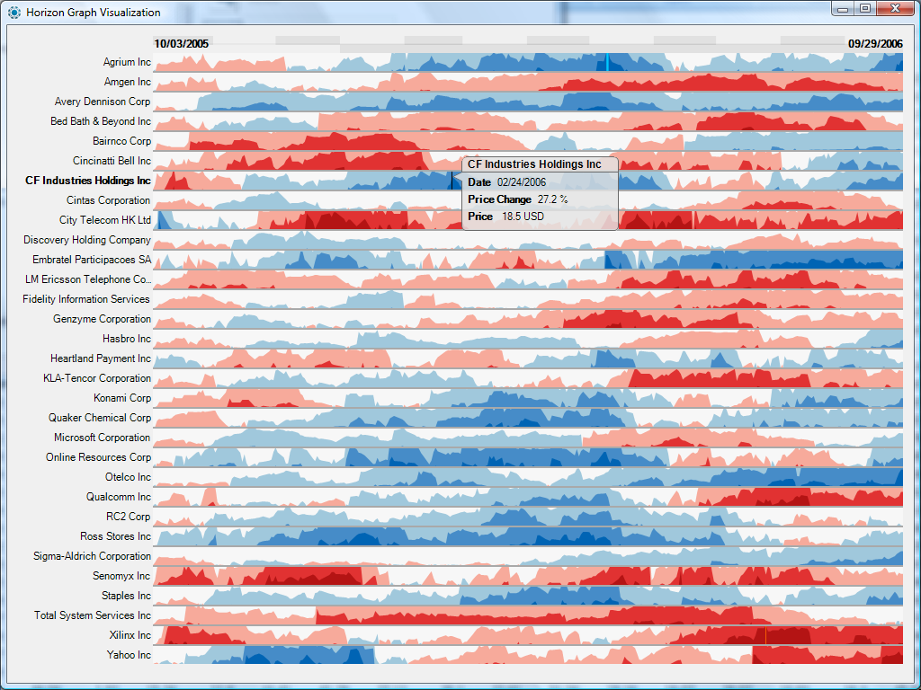
This week I found an interesting dashboard. Lets step back for a second and try to understand what’s going on here.

This is a Horizon graph. This is another way of representing time-series in a visualization. Created by a company called Panopticon, it allows users to display 50 or so sets of time series values that can be compared against each other. They are space efficient and quick to analyze once you get a hang of them (that’s what some people say)

Lets have a quick analysis –

  • The visualization uses different shades of blue and red colors to show positive and negative values and different shades of these colors to show bands.
  • By mirroring the chart, flipping negative values and using a different color the height of the chart is cut into half.
  • Using bands also reduces the height leading to the ability to show more data on one graph.
  • Easy comparison can be done between different multiple charts without scrolling, going to multiple pages etc. Remember, eye beats memory.
  • It can successfully deal with increasing data densities by adding bands (2,3 or more)

For me, It is extremely overwhelming. For a person who has never worked with Horizon graphs before they seem challenging to understand and analyze. I feel there is too much information that is being visualized here which can lead to lost clarity and incorrect interpretations. There can be errors in estimating data and how does one ensure accuracy? I feel I will be going back and forth a lot just to confirm that I am reading the right values.

But as many people have said, Horizon Graphs take some time getting used to but once you know how to use them, they works well!

What are your thoughts?

Source- 

Horizon Graphs Revisited

How to define KPI in visualization

Abstract: While KPIs are critical for every organization, they are often misunderstood or misrepresented, leading to inefficient decisions. In this blog post we will discuss about different types of KPIs that can help your visualization.

What is KPI:

A Key Performance Indicator (KPI) is a measurable value that demonstrates how effectively an organization is achieving key objectives. Organizations use KPIs to evaluate their success at reaching targets.

Various types of KPIs:

  1. Quantitative KPIs are straightforward, since they are made up of measurable numeric metrics and help you track clearly measurable progress.
  2. Qualitative  KPI: KPIs aren’t always about measuring quantitative aspects of your organization. You may also want to track some qualitative aspects.  quantifying qualitative data using the Likert scale or other similar tools, greatly helps in measuring and tracking qualitative KPIs.
  3. Process KPI: sometimes, when different processes feed into each other, a funnel view is a better way to understand the overall flow than tracking individual KPIs for each process.
  4. Combined KPI: when you have too many interdependent metrics to track, you can use statistical models to combine a bunch of similar metrics into a score and then visualize them in the form of scorecards. Scorecards give a quick snapshot of what is going right and what isn’t. Your dashboard could then have drill-downs into each scorecard to help you dig deeper into the root causes of the problems that need fixing.

Conclusion: KPI visualizations are becoming an essential part of the way organizations track their metrics and use those to develop nimble strategies for the future. Categorization of KPIs and finding what kind of KPI you are dealing with will help you make sure that you are getting the most value out of your KPI visualizations.

References:

https://www.klipfolio.com/resources/articles/what-is-a-key-performance-indicator

https://www.socialcops.com/kpi-visualization

http://unilytics.com/5-steps-to-actionable-key-performance-indicators/

http://unilytics.com/top-7-tips-for-dashboard-visualization/

Visualization Tool – QlikView

This blog is about comparing Tableau with another tool called Qlikview, for creating visualizations.

These days the performance driven executives only have a few seconds to convince a skeptical audience. The most effective way to convince an audience is by using graphs, visualizations and interactive dashboards that tell a story. The visual elements that one uses should have clarity and easy comprehension to complex business messages. These days with the intervention of big data, people do not want to just have the graphics, they want to create business insights from that data and analyze the trends and patterns.

For this, there are three tools in the market – Tableau, QlikView, D3.js which are worth mentioning. These are known to have gone beyond the average capabilities of the text and present ad-hoc reports. These tools have the capability of giving the user easy access to manipulation with the data and present some business intelligence advantage and create interactive analytics. However, I want to discuss more about QlikView as it has not been discussed during this course.

QlikView is a more specific Business Intelligence or BI tool which is now expanding at a rapid rate globally. It offers an integrated BI platform and comes bundled with demos, training manuals and tutorials. It also comes with the ease of deployment and configuration. It has a patented technology called ‘associative technology’ which can help in deriving intelligence and insights on demand. Another point of distinction is that it loads all the tables into memory to enable interactive queries and create reports. However, QlikView seems to lack the logical structure and GUI is not as impressive as Tableau. Also, the visual outputs are time intensive and not intuitive as Tableau.

Reference: https://www.experfy.com/blog/qlikview-vs-tableau-review-two-visualization-giants

Big Data and Data Visualization

Why Visualization is the most significant “V” for Big Data?

Big Data Analytics is the analysis of huge data sets with large volume, variety, and velocity. But as the term says, the information extracted from it will be large in size which is not beneficial in decision making. Big data Analytics should be focussed on understanding the relationships between people and processes and then defining patterns that will lead to outcomes that are user specific and determined. Data Visualization helps in identifying the data that is important to produce graphs and charts that are relevant to get insights from Big Data.

Challenges with Big Data Visualization are Visual Noise, Information Loss, High rate of Image change or Data Change and Performance Requirements- Scalability.

Some probable solutions are:

  • Veracity: Reliability of the data sets is important as the analysis will not yield good results if the integrity of the data is questioned. Data Visualization helps in checking the quality of data following data governance. It also helps to deal with outliers- to remove them or to highlight them using another chart.
  • High-Performance Requirements: Increased memory and powerful parallel processing can be used for high dimensional data. By performing Interactive Visualization: selection, linking, filtering and rearranging or remapping, Big Data dashboards can be used to display meaningful results.

The most effective Big Data Visualization techniques with their Big Data class are:

  1.  Treemap and Circle Packing: Applicable to hierarchical data.
  2. Sunburst: Volume & Velocity.
  3. Parallel Coordinates: Volume, Velocity & Variety.
  4. Streamgraph & Circular Network Diagram: Volume & Variety.

Data Visualization is the most significant way Big data will be accessible to large and wider audience and will be essential to transforming analysis and reporting to effective decision making.

Source: http://pubs.sciepub.com

Interactive visualization can make five-year drought disappear fast

It is a good year of 2017 for California because most of drought cleared out in the beginning of this year. With interactive visualization we can experience the drought disappearing process in California faster and clear.

  1. Color tells the intensity- Dark Red. Red as universal color meaning stop or severe. In this interactive visualization they choose dark red as most intensive level. With the universal color no further explanation is needed and it makes the visualization clear and meaningful.
  1. Only one focus- California. The focus in this visualization is very clear. It only focuses on one state in the U.S., neither more general nor more detail information is needed. Readers can just focus on how the drought is changing in the state.
  1. Well-defined time period- Five years. The past five years are meaningful because during the years California has been experienced severe drought, more time period or less would not bring the visualization result as effective as this visualization.
  1. Clear time sequence- 2011 to 2017. Readers can see the changing of time sequence and can stop anytime to check the drought intensity. Maybe the single data itself is not meaningful but when the data is in the time-sequenced visualization, there is more meaning in each single data.


Reference:

https://ww2.kqed.org/science/2017/02/24/watch-how-fast-a-five-year-drought-can-disappear/

Google Flights

Ever wondered how many things move in the sky daily? Well, Google Trends came up with an answer to our question with their Google Flights Visualisation. Google Flights is a visualisation designed to show the flights moving over U.S. one day before Thanksgiving, 2015. The visualization begins with the start of the day and shows all the flights that have crossed U.S. in that one day till midnight. While the visualization does not give the flight details, users can easily understand which times of the day are more popular for international and domestic flights and, for flights to and from different hubs around the country. The visualization does use different color codes for various airlines but due to the fast-moving inbuilt timeline, users cannot make the most use of this feature.

In my opinion, though the visualization is very attractive, it is not very informative. No real data can be inferred from just looking at the screen. There is no option to filter out the data based on international or domestic flights, or based on different airlines for any given point in the day. The zoom-in and zoom-out feature also doesn’t seem to be of much help since no new data is visible even after zooming in on a particular point. According to me, this visualization could have been better if the user had tried to represent more data than focusing on animations.

Reference:

http://googletrends.github.io/iframe-scaffolder/#/view?urls=Thanksgiving%202015%7Chttps:%252F%252Fgoogledataorg.cartodb.com%252Fu%252Fgoogledata%252Fviz%252Fbf595f4c-7381-11e5-9ec5-42010a14800c%252Fembed_map&active=0&sharing=1&autoplay=0&loop=1&layout=narrative&theme=red&title=A%20day%20in%20the%20life:%20US%20Thanksgiving%20on%20Google%20Flights&description=The%20day%20before%20Thanksgiving%202015%20shown%20in%20US%20domestic%20and%20international%20air%20travel%20booked%20with%20Google%20Flights

PRINCIPLES OF DESIGNING A DASHBOARD

The advent of dashboard designing software has made dashboard designing quite a simple task. Data collection, refinement, quoting the references and linking the same constitute most of the work to be done before dashboard designing. It should be kept in mind that a dashboard is a tool that makes it easier for the viewer to make sense of the plethora of data and complicated relationships which has been assimilated in it. Hence, a dashboard should be simple, user friendly and eye-catching. Anybody would be able to design a near-perfect dashboard if they imbibe and put into practice the following few principles:

  1. Right Chart Type: This might seem pretty obvious but it has the scope to destroy all the work previously done on the project. Selection of the right type of the chart has to be the foremost consideration before designing any dashboard. Different charts have different strengths and weaknesses and as such, care must be exerted in choosing among them.
  2. Overcrowding the representation: A dashboard loses its purpose and becomes meaningless if the target audience cannot easily grasp the information given in that. That is exactly what happens when too much data is squeezed into a particular chart. The idea of making dashboards must to be to make the data representation lucid and not to put every bit of information together.
  3. Playing with colours: Colours are great at commanding attention to the representation, but care needs to be exerted while choosing them. Intense colours may be used to highlight something of importance, but it might not be a good idea to use multiple dark colours as this may overwhelm the senses of the viewer and deflect the attention from the important things. Moreover, for comparison studies, it would be a better idea to use different gradients of the same colours.
  4. Providing context: A dashboard is just a nugatory collection of figures, shapes and colours if no context is provided. Therefore, providing context is the most important part of any dashboard and should be at the top of the checklist. Some of it may seem obvious to the designer, but it is always a good idea to provide context for everything that the designer wishes the audience to know.
  5. Consider the audience and the venue: Another easy to ignore, but a potentially tricky factor that to be considered is the type of audience, the venue and the media that is used to view the dashboard. Each dashboard should be tailored to suit the particular user group it is designed for.

Source : http://www.datapine.com/blog/dashboard-design-principles-and-best-practices/#

And the Oscar goes to….

This year’s Oscar Ceremony, as always, has attracted the interest of a great audience, including the Hollywood, mass media and movie lovers. When I was back in China like five, six years ago, I would watch the real-time streaming Oscar Ceremony in the afternoon, and can name about what prize goes to whom or which. This year I was just waiting to read the media’s post. Except for the “funny mistake”(not funny at all) of announcing La La Land as best picture but actually the prize belongs to Moonlight, making some fast media quickly post the final wrong full Oscar result, this Oscar’s winning result fits with most of the prediction on fivethirtyeight, as you can see from here and here.

Firstly, let’s go to the prediction article. The author has collected the points of each nominee for different categories from multiple movie guilds. As we can see, all the predictions except the best picture one turns out to be right. This is a simple data visualization, just ranking the Oscar nominees by their total points from each source in a table. Although we did not know how the author get the data from those sources and what he or she did to get the result numbers. Anyway, these predictions are making Oscar less to be expected. Please also refer here to see the model used in these predictions, this is simply math.

The other article calculated the probability predicted by the betting organization. It has also borrowed the result from the first article. The visualization in this article is a set of line charts, that carefully record the implied probability based on Paddy Power betting odds. For the main categories, we will again find that La La Land supporters will lose the bet at best picture to Moonlight.

At last, I should say those visualizations are very concise and easy to understand, no fancy tables or animations. Also in my opinion, Oscar is about art, but art is very difficult to evaluate nowadays, in this sense, I think I trust data more, which is relatively more impartial. As long as we have data, we can visualize it, and make it as a living. 😀 Thanks, data, thanks, Oscar.