Valuable Sports Franchises

This visualization is about the Top 50 Most Valuable Sports Franchises. This visualization has a unique contribution in the sports space.

  • The visualization has taken into consideration the data sets of years competing and a number of championships which is the best thing about this visualization because the serious fans will be able to recite about their favorite team.
  • Another great thing about this visualization is that the creators have tried and distributed static visual content, but mixed in engaging formats that journalists are excited to share.
  • The brand value or the franchise value is shown as the circles having the size equal to the franchise value.
  • If anyone is interested in watching any sport, then the sort by sport functionality helps anyone to view franchise value for that particular sport.
  • The bottom axis highlights the number of years a franchise has been competing.
  • On hovering over the circle gives us the details about the franchise such as the name of the franchise, Forbes rank of that franchise, franchise value, number of championships won and number of years competing

This interactive visualization has gathered huge engagement numbers, sparked passionate conversation among fans around the world. Visualizations like this help any journalist teams to inspire stories across top-tier and targeted sports blogs.

Reference – https://www.columnfivemedia.com/work-items/interactive-most-valuable-sports-franchises

Image Reference – https://www.columnfivemedia.com/work-items/interactive-most-valuable-sports-franchises
Customer Segmentation using RFM Model


While planning for marketing spend, or formulating a new promotion, retail marketers need to be careful about how they segment and target customers. The idea is to identify customer’s needs or issues and use them as a solution via various campaigns and promotions. One of the techniques for targeted campaign is to do RFM Analysis (Recency-Frequency-Monetary)

Recency: Recency of who is more likely to respond to an offer. Customers who have purchased recently from you are more likely to purchase again from you compared to those who did not purchase recently.

Frequency: How frequently these customers purchase from you. The higher the frequency, the higher is the chances of them responding to your offers.

Monetary: Amount of money these customers have spent on purchases. Customers who have spent higher are more likely to purchase based on the offer compared to those who have spent less.

How it works:  Divide each parameter into various ranges depending on your data and assign scores to each parameter. By combining 3 scores, we get the RFM scores.

Steps: http://gain-insights.com/solutions/retail-analytics/customer-segmentation-using-rfm-analysis/

Insights:

  • Customers with overall high RFM scores are loyal customers and need to provide loyalty points and offers to continue their engagement.
  • Customer who have high recency but low frequency score are ones who look out for offers. For these customers, the company needs to run different discount offers.
  • Customers who have a high frequency score but a low recency score are those customers that used to visit quite often but have not been visiting recently. For these customers, the company needs to offer promotions to bring them back to the store, or run surveys to find out why they abandoned the store.

RFM analysis is one of the most powerful technique to help you identify your best customers and create better targeted campaigns.


The Trends in Adult BMI in 200 Countires

The Trends in Adult BMI is an interactive visualization which show the changes in BMI (body-mass index) in 200 countries for the past four decades.

The visualization conveys its meaning effectively by using appropriate marks and channels. The X-axis is the timeline, from 1974-2014. The Y-axis is the percentage of population, from 0-100%. It uses only one marks and two channels, with the area as mark and the color/hue as channels. All population were categorized into 7 different levels of obesity, with the deep red as highest BMI level and deep blue as the lowest.

The visualization has two filters, one is filtering by gender and another is filtering the order of countries by different ways, such as obesity or underweight. Since the main audience of this visualization shall be some one like researcher, it will be better it could provide more ways of interaction which allows user do some further discovering. For example, a practical filter is filtering the data by people’s age. It could also filter the data by countries or continents.

Reference:

https://public.tableau.com/en-us/s/gallery/four-decades-prevalence-adult-bmi


NYC Street Trees

NYC Street Trees

The NYC Streets Trees is an interactive visualization created using jcanvas and jquery.

The visualization shows the numbers of different trees present in the five boroughs of NYC. The reason I wanted to talk about this visualization is because its creativity and use of customized idioms which i believe is mainly possible due to the usage of  jquery and jcanvas.

The visualization shows the different variety of trees present in NYC streets segregated by boroughs. Each borough is represented by a bar, the length of which represents the number of trees and  each bar is in turn is divided by the volume of different trees. The visualization is also interactive, if we select one tree then that tree is highlighted across the visualization.

Each tree is represented by a picture of the tree which would help the audience in identifying the tree when they walk the streets of NYC. We can clearly see that Queens has the most number of street trees and Manhattan the least which can be expected. Most street trees are Maples.


I believe that the visualization is unique in its usage of idioms which are customised by using jquery and jcanvas. I believe a similar visualization in Tableau would have restricted the author.


To Summarize even though the visualization is missing some key elements of claim, action, audience the author has done an excellent work in visualization using jquery and jcanvas and I could relate this with the discussion in class about using programming languages and separation of tool and task.
Source – http://www.cloudred.com/labprojects/nyctrees/#about

What’s next? What lies on the future of visualization

As we are approaching the end of this class, we have had insights on what data visualization exactly means, how to create a good data visualization, how to distinguish between types of data and where to use which visualization. It brings all of us to a very logical question- what next? What more is to be explored in visualization and presentation of data? Industry experts and analytics enthusiasts feel like Sociograms and 3-d or multidimensional visualization will be the most sought out thing in the future. Sociograms in terms of data analysis, are essentially graphs that depict great amount of interactivity and relativity between its elements and understanding the way elements are connected to each other. Network theory has been an integral part of data analysis and Sociograms and coming-of -age network diagrams have made it easy to understand co-relation between seemingly non-related elements – for example crime and spread of diseases.

Another visualization that I can predict to take on the future of data visualization would be multi-dimensional figures and charts. Some of the research institutes are currently working on this technique that visualizations data in more than conventional 2-3 dimensions to show an in-depth insight into things. One such diagram that I found very interesting was a 5-D colorimetric diagram of the brain activity that can be seen on the page of  the reference link  below. Combined with interactive diagrams and high-level processing functionalities we might be able to predict and understand data patterns like never before.

References: http://analytics-magazine.org/data-visualization-the-future-of-data-visualization/
https://en.wikipedia.org/wiki/Sociogram

Finding the Right Color Palettes for Data Visualizations

In this blog, three rules of thumbs have been provided:

  1. Have a wide range in both hue and brightness

To have palettes which are varied in brightness, so that the audience can distinguish the information easily. If you use bright color or hue color only, people who are color blind will have difficulties cannot be able to tell the difference, and those ordinary audiences will also be suffered from

2.   Follow natural patterns of color

Sometimes nature can give you the most inspiring instinct. if you look at the landscape below, a sunset or the spring in a forest, you will see the beauty of palette of a light green to a purplish blue or an orange-brown to cold gray…that color makes you fell pleasant when you see natural view will give you similar feeling when you design your own visualization work.

3.  Use a gradient instead of choosing a static set of colors

To extract from the gradients will make your color seems more natural and pleasing. By use of grayscale and grid, designers will be able to switch color by descending hue easily.

Finally, here are some useful links for you guys to make as references when choosing your color palette.

Tools

Color Picker for Data — a handy color tool where you can hold chroma constant and pick your palette with ease

Chroma.js — a JavaScript library for dealing with colors

Colorbrewer2 — a great tool for finding heat map and data visualization colors, with multi-hue and single-hue palettes built in.

gradStop.js — a JavaScript library to generate monotone color schemes and equidistant gradient stops

Color Oracle — a free color blindness simulator for Window, Mac and Linux.

Other Resources

And here are some other good color palette resources we found and loved. While they are not necessarily designed for data visualization, we think you would find them useful.

ColorHunt — high quality color palettes with quick preview feature, great resource if you only need four colors

COLOURlovers — great color community with various tools to create color palettes as well as pattern designs

ColorSchemer Studio — powerful desktop color pick app

Coolors — light weight random color palette generator where you can lock the colors you want and swap out the others

Flat UI Colors — great UI color set, one of the most popular ones

Material Design Colors — another great UI palette. Not only does it provide a wide range of colors, it also provides different “weights” or brightness of each color

Palettab — a Chrome extension that shows you a new color palette and font inspiration with every tab

Swiss Style Color Picker — another collection of good color palettes

reference:

https://blog.graphiq.com/finding-the-right-color-palettes-for-data-visualizations-fcd4e707a283#.iumxfns41

Interactivity in Tableau (continued)

This week we will take a look at sets and groups feature in Tableau. Let’s start with sets –

Sets are user defined fields which help in viewing a subset of the entire data. We can create sets on dimensions using conditions or specific data points. It is interesting to note that whenever the underlying data changes, sets are recomputed based on whether they are constant sets or compute sets. Seems quite similar to filters, isn’t it? Yes, a lot of the functionality is same, such as dynamically obtaining a subset of the data and the ability to be applied across the workbook. However, the differentiating point is that sets can be used in other calculated fields. This is particularly useful, when creating a subset of the data, using a set or filter, is just the starting point of your analysis. Let’s take a look at how we can create sets:

  • Constant sets: This option is similar to that of the Keep Only/Exclude option while creating filters. Using this option, the user can select the data points which he/she is interested in and then keep those only in the visualization for further analysis. The important point here is that once created, the data points in the set do not change dynamically. This can be achieved by selecting the data points in the visualization and selecting the Create Set option in the Tableau prompt. There is also an option to perform a negation operator by selecting the “Exclude” option in the following prompt. For our speed violation data set, if we have a map of violations in the map for Chicago with the addresses marked as per violations reported, the user can create sets based on areas of interest or select the top three violations and just focus on those.
  • Compute sets: Using this option, the user can create sets which dynamically change when the underlying data changes. To create such a set the user can select a dimension and select the create option. There are three options to create sets – general, condition, and top. The general tab allows the user to view the entire list of data and choose from it. The condition tab allows the user to create a condition based on which the set will create the subset of the data. The third tab, known as “Top”, is probably the most used for numerical analysis. This tab has options for the user to perform Top N or Bottom N analysis. For our example data set, we can use a set to create a Top N analysis of addresses with the highest number of violations. This can be extended further by making the “N” value as a parameter, allowing the user to specify how many addresses he/she wishes to see in the “Top List”.

As a final point on sets, it is important to mention the IN/OUT option which helps the user switch between the subset and the rest of the data.

Groups are similar to a set and help to organize the data better in a visualization. They help to create hierarchy within dimensions, thereby helping the user organize the data items within a dimension. We can create a group by manually selecting the data items in the visualization and then choosing the Group icon which comes up in the Tableau prompt. This way the group that is created gets automatically added to the shelf/card. You can also create groups by selecting a dimension and performing right-click and then create option. If the list of members is huge, like similar to our data set containing a huge list of addresses, the create group option also gives us a “Find” option using which we can do a search on the dimension members. For e.g. if we want to create a group for addresses with the name “N WESTERN” in it, then just search using this string and the members get highlighted from the entire list. Another interesting use case for groups is to use it for data standardization. We may have encountered data sets which contain the same data member spelt in various ways, such as “Santa Clara University”, “SCU”, “Santa Clara Univ.”, etc. This kind of data set will create problems when we want to aggregate measures for Santa Clara University. This problem can be solved by grouping the above mentioned items into a single group since they represent a single entity.

We will take a look at actions in the upcoming blog!

References:

The art of truthful rhetoric in visualization

Rhetoric is the art of effective and persuasive communication. Data is rhetorical by definition and can be used for truth finding as well as truth hiding, hence it it is a double edged sword. To ensure we develop a sound argument from data, here are few tips:

Context and Data Provenance:

There is hidden context in many visualizations, and this context helps give an accurate depiction of the data, even if the viewer is unaware that the context exists. One must ensure the visualization shows as much context as is reasonably possible. For example, if a survey had a sample size of only 10 participants, it is important to put that information on the chart for readers to gauge the magnitude of the impact of survey results and to evaluate our story.

Rhetoric in Truthful Storytelling with Data:

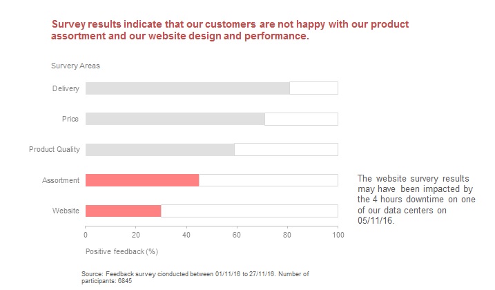
Let us consider the simple info-graphic that represents the results of a survey conducted by a company to review the worst performing areas of their website. There is clear indication of the source of the survey at the bottom, which includes the date of survey and number of participants. The color coding highlights the two weak areas. The most important piece of information here is what could have had a significant impact on the performance of the website – downtime in one of the data centers. Finally the conclusion is represented in the title of the visualization enabling the reader to quickly grasp the key take away from the visualization.

Representing uncertainties of data:

Most visualization techniques have been designed on the assumption that the data to be represented is free from uncertainty. Challenges with representing uncertainties:

  • Uncertainty tends to dominate certainty.
  • Uncertainty introduces a new direction to the story.
  • Uncertainty propagates quickly and could confuse the audience.

Though I have understood the challenges in identifying uncertainties, I am still exploring if one should always represent the uncertainties of data and how to best represent uncertainties without rendering the visualization less effective.

References:

https://faculty.washington.edu/jhullman/vis_rhetoric.pdf

www.daydreamingnumbers.com/blog/rhetoric-in-visualization/

http://www.scribblelive.com/blog/2012/06/07/context-in-data-visualization/

http://www.comp.leeds.ac.uk/kwb/publication_repository/2012/uncert.pdf

Eyeo Crowd Cloud

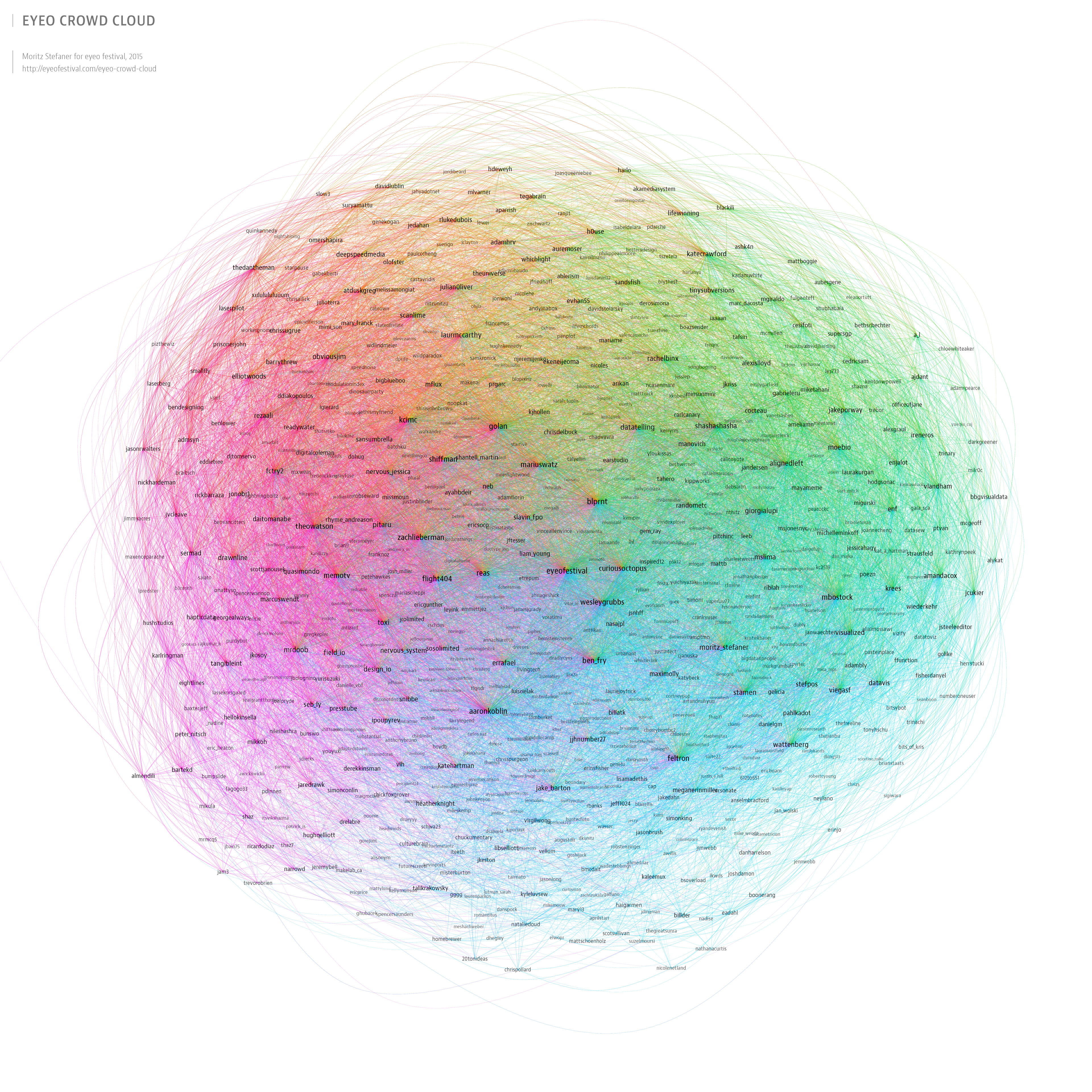
Since 2011, the Eyeo Festival is bringing together creative coders, data designers and creators at the intersection of data, art and technology for inspiring talks, workshops, labs and events. The idea behind the festival is inspired by the notion that we live in a decade of an exceptionally exciting time to be interested in art, interaction and information. Following on this principle, Eyeo has managed to gain a large number of followers over the past 5 years. Looking at its increasing popularity, Moritz Stefaner created an Eyeo Crowd Cloud for 2015.

He created a network map based on 852 twitter accounts of various registered speakers, workshop presenters, panelists and attendees from 2011-2015, related to the Eyeo Festival. Though network is a good way to show the followings for different speakers, it is difficult to different between a speaker, a presenter or an attendee by just looking at the visualization. Also, because of the large number of followers and following incorporated in one network, getting exact figures of data is not possible from this network. Though, Moritz has used different font sizes for account holders based on their number of followers, there is no solid claim reflected here. In my opinion, using graphs and trend lines to show the increasing popularity of the festival and the speakers over the years would have told a better story and would have been more informative.


Reference: http://eyeofestival.com/eyeo-crowd-cloud/

Changes Over Time

One of the most useful ways of using visualization is to show the change of data over time. There are a lot of great visualization techniques like the line graph, scatter plot, bar chart, and many more. While there are many ways to show it, choosing the right way is very hard. Below are a few of the visualization types that you can use to represent changes over time.

Line – The most common time series graph. It is best used when you have a lot or just a few of data points. Use this when you need to place multiple data series on one graph.

Scatter – Scatter plots are best used when you have a lot of data points. They are useful when the data is not nicely structured.

Bar – Bar charts are best used when dealing with time scales that are evenly spaced out and the data set is distinct.

Stacked Bar – Same as the bar chart, but for when there are multiple categories.

Stacked Area – Stacked Area charts are best used when there are a lot of data points and there is not enough room in the visualization for bar charts.

Reference:

http://flowingdata.com/2010/01/07/11-ways-to-visualize-changes-over-time-a-guide/

https://datavizchallenge.uchicago.edu/sites/datavizchallenge.uchicago.edu/files/styles/slideshow-larger/public/uploads/images/game-genres.jpg?itok=viChdbPU