Is your marketing dashboard lying to you?

Marketing dashboard could be misleading when you analysis all the different variables and get the data visualization towards your direction in mind. Here are a few ways your dashboard may be lying to you.

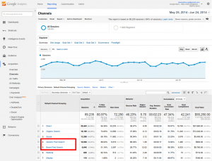
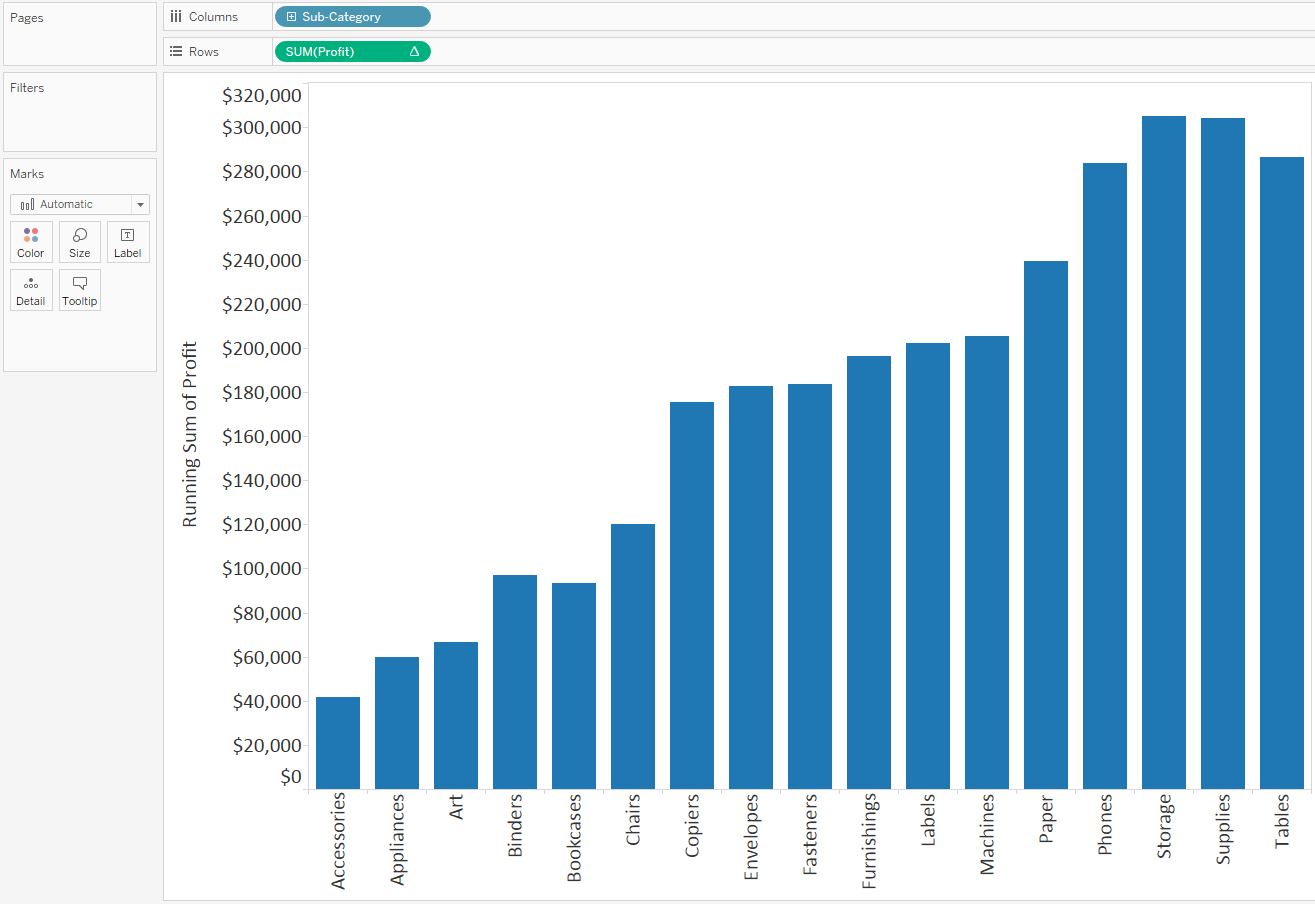
Ambiguous or poorly captured metrics: There’s nothing more dangerous than a dashboard that does a poor job of collecting data. Data integrity is the key to dashboard success and ambiguous inputs can send an entire company into a tailspin. What’s most dangerous is the fact that ambiguous data can easily pass for accurate insights.

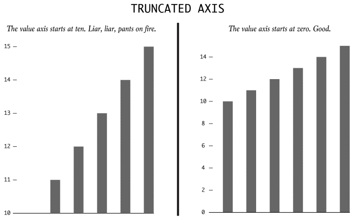
Oversimplification of data: There’s something to be said for simplifying data so it’s easy to digest, but there’s immense danger in oversimplifying the information that matriculates through the dashboard. In most cases, this is the result of a lack of context.

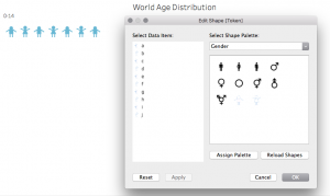
Hidden biases in the design: Humans design dashboards and the algorithms that cause them to function. Humans make mistakes all the time. This occasionally leads to hidden biases in the way dashboard systems are designed. The result is skewed data that causes you to act in a certain way.

In my option, it is very important to keep eyes on those points that could makes dashboard lying. There are a variety of dashboard technologies to make data more honest and accurate. We shall apply models to clean our data from the source and then try different methods to discover the data. When we design the data visualization, we should minimize our biases by switching positions and claims.

http://www.campaignlive.com/article/marketing-dashboard-lying-you/1424653#1eehRyDuqIpYzAVY.99

Google Analytics & data visualization tips from it for Tableau

Google Analytics is a free web Analytics service that provides statistics and basic analytical tools for search engine optimization and marketing purposes. Its main features are Segmentation for Analysis of datasets like transformations and conversions, Data Visualization tools like dashboards and Scorecards, custom reports and communication through email-based sharing. It’s integration with other Google products like Adwords, Public Data Explorer, and Website Optimizer makes it very suitable for small and medium sized retail websites.

Google Analytics dashboard allows users to save profiles for multiple websites and see details for default categories or select custom metrics to display for each site. One of its advantages is that it is available through a plugin or widget for embedding into other sites. google-analytics

There are many practices that are followed in Google Analytics that should be followed while creating a dashboard and are particularly helpful in Tableau:

  • Use a maximum of 12 dashboard objects or widgets so that designers and analysts are able to focus on the relevant KPIs and pertain to the Story of the Dashboard. “Keep it Simple.” “Less is more.”
  • Improve User experience by leveraging Dashboard actions like highlighting sparklines to display underlying trends and show extra detail for respective data points.
  • Allow End users to change the Date aggregation of Line Graphs: Hourly, Day, Week, Month.
  • Keep Crosstabs width to a maximum of Ten Columns.
  • Use a vertical navigation in the left column to display the prioritized content to the top-left view of the dashboard.

Source: http://www.evolytics.com/blog/10-tableau-data-viz-tips-i-learned-from-google-analytics/

IDENTIFYING MISREPRESENTATION IN DATA VISUALIZATION

Data representation has evolved significantly in the past couple of years. There has been a monumental increase in the use of different visualization methods to depict data in efficient and more lucid ways. This has revolutionized the field of data representation beyond measure. But there is a flipside to this – an increasing number of visualizations that knowingly or unknowingly mislead the audience. To exploit this ever-improving field more, it is imperative that the viewers have a fair idea about the ways data representations mislead them so as to avoid the potential landmines.

Truncated Axis

trunc

There is a high likelihood of the viewer being misled by the bar graph above if he/she was looking just at the bars and not at the axis. The one on the left has been truncated so that the values start from 10 instead of 0. Implication? Values larger than it actually is.

Dual Axes

dual

Typically used to represent correlation and causation, the take-away information from the representation above may not be an accurate depiction of the data since the scales to which the lines are drawn are different on either sides.

More than a 100% ?

This is usually seen in pie charts and wedge diagrams. The sum of all the wedges might show a value which is more than 100%. A perfunctory glance might not be enough to make out the error and as such, like in bar charts, the data represented might actually be more than it actually is.

Absolutes and Relatives

absol

Another major flaw in representing data can be seen in the representation above. The darkened areas purportedly show the number of crimes(and by extrapolation, the danger levels) of various cities of the USA. A casual glance at it misleads the viewer into thinking that the darkest areas are the least safe because of an increased number of mishaps but in reality, the map has not been adjusted to account for the population in the cities.

Taking things out of context

taking

The bar chart on the left, in isolation, says a vastly different(and obviously deceptive) story to the actual context. A casual glance shows an increasing trend, but in reality, the data shows a minimal increment in comparison to the time period before and after it.

Using illusions to deceive

dimen

The area of the third box is actually three times the area of the smallest box. But a data representation involving these boxes seem to give a vastly different picture as the area of the biggest box seems to much more than the actual three times.

Source : http://flowingdata.com/2017/02/09/how-to-spot-visualization-lies/

Data Visualization process in D3

The visualization in D3 (or basically any visualization tool) is carried out in the following steps:

1. Data acquisition – Obtain the data from a source (disk or over a network).
2. Parse – Give it a structure for its meaning and then order it into categories. The amount of data might be immense, but it is necessary to put it in a structure to make it easier to convey the message to the others.
3. Filter – Only keep the data that matters, which is in the interest of your claim.
4. Mine – Apply methods from statistics or data mining as a way to discern patterns or place the data in mathematical context.
5. Represent – Choose the idiom that fits to represent the data. Eg – bar graph, scatter plot, map, etc.
6. Refine – Improve the basic representation to make it more clear and which better give the insights by looking at it. You can change the color scheme or change the entire idiom.
7. Interact – Add methods for manipulating the data or controlling what features are visible. D3 is very powerful in this section.

To start implementing in D3.js, you can follow the tutorials given on the website:
https://www.dashingd3js.com/d3js-first-steps

Reference:
https://www.dashingd3js.com/the-data-visualization-process

Solving problems with patternicity during visual confirmation.

Problems in visual confirmation arises when there is no clear and specific claim defined for ending, and having no claim to start with. One of the typical problems in taking this approach is with patternicities.

Patternicities are finding meaningful patterns in meaningless noise. Proximate cause of this is due to priming effect, in which our brain and senses are prepared to interpret stimuli according to expected model. If we fall into this trap, we land up in visual discovery. During this process, we proceed towards the claim by comparing it with our mental model. This is a random approach with a hope of finding a meaningful pattern in a meaningless noise.

Therefore, we find ourselves in investigating and exploring the problem, instead of investigating and exploiting the problem. Solution to this problem is that we have to proceed systematically by first clearly defining the claim-the visual confirmation, and the claim to start with. Then we approach this way in a continuum basis by finding the differences in between those claims.

If there is no differences then this leads to confounding situations that need to be addressed systematically as well. We have take the divergence approach by first listing out all the options that can possibly lead to our claim, We have to then test each of those claims by matching to our final claim. Now we prioritize all the options we have tested and converge to the final claim to give the final visual confirmation.


Source: https://www.scientificamerican.com/article/patternicity-finding-meaningful-patterns/


Use your own shapes on Tableau

As I was doing the redesign project the other day, I found the need for me to introduce some new shapes into the sheets. Therefore I designed my own vector graphs through online tools like Vectr, and followed this article inserted those graphs in “png” file type into Tableau. The final result was displayed in designated color.

Also I discovered a tip, that when you want to make a parameter into shapes, you just simply drag it across the shapes feature in “marks” to the blank board below, choose the shapes from multiple categories, including the one you have just inserted(if it’s not there, try the reload button).

You can also look for existing png files online and insert them to Tableau instead of making them by yourselves. Using customized shapes will make your visualization more unique and specific to the data you want to present. Below it’s a simple example from me:

(The png files are located in “My Tableau Repository/Shapes/Gender”)

screenshot1

(This is where to find the customized shapes and use it in sheets)

screenshot2

Hope it helps!

How To Make A Waterfall Chart In Tableau

A waterfall chart helps understand how positive and negative values of dimension members are contributing to a total.

Here is an example visualizes how each Sub-Category in the Sample – Superstore dataset is contributing to total profit:

  • Create a vertical bar chart, make profit as measure, sub-category as dimension. Add a table calculation to the Profit measure so that it calculates a ‘Running total’ on ‘Table (Across)’.

  • Change the mark type from ‘Automatic’, which is currently bar, to the ‘Gantt Bar’ mark type, like below:
  • In order to get the Gantt bars for each dimension member to properly line up, you first have to create a new calculated field which takes the measure in the waterfall chart multiplied by negative one. (e.g: -[Profit])
  • Once this calculated field has been created, this is the measure that you drag to the Size Marks Card to create the waterfall effect as we showed in the beginning.

Reference: http://www.evolytics.com/blog/tableau-201-make-waterfall-chart/

5 Steps to Better KPI Graphs

In the business community KPI graphs are often shown to represent important metrics related to performance. Here are few important tips to remember while making KPI graphs-

  1. Don’t have distracting backgrounds: While showing important statistics it is important to not have background which may distract the viewer from the underlying message. Bright colors should be avoided while creating graphs as they might be distracting. Use of gridlines should be done wisely as they might make the chart feel too clustered.
  2. Use titles and labels: Efficient use of titles and labels can help the viewer understand the chart better. With proper labeling the user can immediately understand what is being measured against a certain parameter. Chart titles give the overall description of the issue being addressed in the graph.
  3. Use dual axes: The use of two axes is that it allows the user to measure two values against each other with proper measures. If the two metrics have different scales it is important to show them on different axes. Showing them on the same axis can give an altogether different meaning to the graph.
  4. Too much data is bad: If too much information is added to the graph, it may confuse the user. The reader can get overwhelmed by the amount of information and the meaning of the graph may not get through. Hence the graphs should be separated and only relevant information needs to be shown.
  5. Pick the chart wisely: While deciding on the graph, the designer should be careful on the chart selection. Pie charts and donut charts must be avoided as they might not communicate the correct values of the data. They can create a wrong impression on the viewer and can be misleading. Simple bar charts and line charts should be used instead to convey information.

Source: https://www.targetdashboard.com/blog/125/5-Steps-to-Better-KPI-Graphs.aspx

Virtual Reality for Data Visualization

We are living in the age where there is so much abundance of data that we have started referring as ‘Big Data’. With such tremendous amount of data, it is the need of the hour to visualize this data using cutting edge technology which will help Big Data visualization easier.

One such technology is Virtual Reality. With VR as the medium to visualize data, we will be able to immerse ourselves in the data, have more natural interactions and view multi-dimensional data in a much easier way. Some of the reason which conveys the exact reasons to use virtual reality for data visualization are mentioned below –

  • More Space –

Imagine yourself completely surrounded by the visualization of the data. It’ll give you a 360-degree view in which the data can be visualized in a more visceral way.

  • Lesser Distractions –

When your all your vision is covered with the visualization there are lesser possibilities of the distractions to deviate your attention from the main objective.

  • Multi – Dimensional Data Analysis –

By adding different senses of sound and touch we can visualize data in various dimensions. With the current technology development, it is actually achievable to feel data by wearing the haptic feedback gloves.

  • More Natural Interaction –

Keyboard and mouse interactions would be replaced with touch and movements. This will help us better perceive the data as we will be using more than one senses to visualize and analyze data.


Reference : http://pwc.blogs.com/analytics_means_business/2016/08/5-reasons-to-use-virtual-reality-for-data-visualisation-.html


Make Dashboard Readability

A major factor to keep in mind when creating a dashboard is where it will be viewed. Will it be on a TV screen in an office or conference room?

Some design elements that affect readability are:

Excessive precision – Depending on the end user, precise figures can be distracting or overwhelming. Rounded metrics and simplified details may be more appropriate for the dashboard.

Consistency – With dashboards, consistency is key for easy navigation. Keeping functions, filters and other options in the same areas for each dashboard will allow users to find features quickly and easily. Applying the same font, color palette and style will give your dashboards a more cohesive look.

White space –  Without any white space between objects or widgets, your dashboard will look cluttered. This makes it hard to distinguish what information is the most important, as well as difficult to understand the information.

Visualizations – When visualizing metrics, don’t use multiple visualizations just because you can. Choose the best chart or graph to portray the information clearly.

  • Number + Secondary Stat – To display a single measure
  • Bar Charts –  Showing data over a related series of data points
  • Line Charts – Showing the relationship of data in the same series of data points
  • Sparklines – To display a trend for single data point
  • Bullet Graphs – To display multiple data points in a small space
  • Pie Charts – NEVER USE PIE CHARTS

https://www.betterbuys.com/bi/dashboard-best-practices/