An Atlas of Suffering: Barriers to the American Dream

While looking for data for an individual project I came across this interesting project done by the students of UC Berkeley. I found this project quite interesting as we all know that certain group of American have different access to different set of resources but we don’t know how much is the inequality. The visualizations mentioned in the blog shows areas of unequal access and which gender and ethnicity are affected more. The data used in graphs is grouped by race, black/white and by sex, male/female.

Let me explain how the Radar/Spider chart works. Charts mentioned below demonstrate the degree to which one group is suffering in relation to the others. Larger the score in the circular chart, more is the suffering. Score 1 on the chart represents that the group has the largest barrier to success in this category, while a score of zero means that the group is least likely to suffer. For example, in the below graph, black men the as highest number of barriers to realize the American dream as the size of the polygon is large and “Bigger the polygon, more are the barriers”.  Life expectancy and College Degree values are 1 which means they have a very low life expectancy, least likelihood of earning a college degree while suicide is around 0.32 which means they are less likely to commit suicide.

Barriers for black men - Radar Chart
Barriers for black men – Radar Chart

Things I like about visualization:

  • Use of Radar Chart to show functionality: Radar Chart is a good way of comparing multiple quantitative variables, which makes it useful for seeing which variables have similar values or if there are any outliers amongst each variable. Radar chart provides functionality to the visualization and shows how different people suffering in different categories.
  • Use of multiple variables making the graphs truthful: In this visualization, the author had considered multiple variables to support the claim that what are the barriers to the different people and how they are suffering in all the given category.
  • Use of unique colors resulting in beautiful visualization: Use of unique colors which is not making them difficult to identify when we stacked them on top of each other in the combined graph and making visualization beautiful.
  • Insightful and Enlightening: Based on the information given in combined visualization which is the degree to which one group is suffering compare to other groups and how much is the suffering in each category, we can take effective steps to prevent the suffering and minimize the barrier to the American dream.
Combined Radar Chart

Things I didn’t like about the Visualization:

  • Comparison of positive and negative dimension in the same fashion/manner: In the radar map, many dimensions are getting displayed, for example, poverty and life expectancy. But poverty is a negative factor while life expectancy is a positive factor. If we compare both the factor on same radar and both has same value for e.g. 1, it interprets like it has very good life expectancy and high poverty but in facts, it shows very low life expectancy and high poverty.
  • Misleading information: The displayed score is on the scale of 0 to 1, 1 means that the group has the largest barrier to success in this category, for example for White man, based on the graph we can say overdose and suicide are equal barriers. But is it true?

How the visualization can be improved:

  • A broad range of values: Instead of showing 0 to 1 values in radar chart, we should show actual value or scaled value in range 1 to 100 to Cleary identify the difference in the value in each category.
  • Additional chart to support the claim: Radar chart is not so good for comparing values across each variable so along with radar chart we should show bar graph which provides the comparison among each category.

    Supporting chart for better insights
    Supporting chart for better insights
  • Renaming of the confusing categories: Renaming of some of the categories which are difficult to identify as the positive or negative effect on the barrier. For example, life expectancy can be rewritten as poor life expectancy.

Conclusion: Radar Charts are useful for seeing which variables are scoring high or low within a dataset, making them ideal for comparing performance across multiple dimensions. But we should limit the number of polygon and variables in radar chart as having multiple polygons in one Radar Chart makes it hard to read, confusing and too cluttered. Many variables create many axes and also make the chart hard to read and complicated. So, it’s good practice to keep Radar Charts simple and limit the number of variables used and provide additional graphs along with radar chart.

References:

  1. Blog Reference: https://ikesmith.github.io/Priv_Git_Smith/index.html
  2. Good example of radar chart: https://www.tableau.com/about/blog/2015/7/use-radar-charts-compare-dimensions-over-several-metrics-41592
  3. Effective use of radar chart: http://www.msktc.org/lib/docs/KT_Toolkit/Charts_and_Graphs/Charts_and_Graphics_Radar_508c.pdf


Curious to know about your governments spending’s?

As a citizen of a country and a tax payer one should always be curious to know how their government is spending. Usually, government spending includes all government consumption, investment, and transfer payments.

Every government releases their annual expenditure report and few of their visualizations can be misleading. Let me introduce to a viz called packed bubble chart, the size of the bubble represents the scale of a metric. Simply, larger the bubbles –  larger the values.

Image 1.0 is a reference to a government’s spending in a year. They have spent close to $3.7 Trillion, yes it’s trillion it involves 12 zeros. That’s the huge amount spent by a government body, you could put 8.33 million people through all four years of college with $1 Trillion.


Image 1.0 – Expenses Viz


There are multiple drawbacks of this visualization, the amount spent varies by a scale that is thousands, millions, and billions. In image 1.0, all the expenditure are plotted on a single scale, it’s quite hard to visualize or know what kind of expense it is? The expenses which are in thousands or millions look quite small on this chart.

Secondly, targetted audience should be analyzed before preparing a dashboard. In this case, an FP&A (Financial planning and analysis) head will like to have a bird’s eye view. Where an HR manager would focus on headcount expenses. So, it’s better to who are your targetted audience in advance.is no category of expense, such as defense, administration etc.

There is no proper segmentation of departments. For an instance, there are multiple defense expenses and they all scattered. It’s quite tough to compare the overall drop or increase in defense segment.

The red color in the viz denotes that it has the highest drop in expense compared to last year. There is quite a long range of colors used and it’s difficult for us to interpret them in numbers.

How can we make this viz better?

Creating segments of expenses and form clusters to group them together. Legends should have only three to four to distinguish the scale of expenses so we can simply classify. Prepare dashboards based on targeted audience and restrict them to their respective departments to be accesed.

Source of the article: https://www.pinterest.com/pin/490822059366478830

Effects of banning handguns

Here are 2 visualizations from Liz Fosslien blog that depict the effect of handguns on murders. First chart shows murders per 100,00 people of European nations that banned handguns compared to the nations that have not banned. The second graph shows the relation between 

Murder rates in European countries


Homicide rate versus average number of firearms per 100 people

Audience and the intent – The charts is intended for general public. The intent is not clear but the chart portrays that the murder rates are higher in countries that have banned handguns. Additionally, a simplistic interpretation would claim that banning handguns is futile, and may even have an adverse impact on murder rate. The second chart conveys that possession of firearms is a potential reason of increased homicide rates. 

Critique 

Validity : There are several questions regarding the validity of what is shown in chart 1. Europe has 44 countries so showing the murder rates of only a selected number of countries seems to be an attempt obscure the comparison rather than to reveal anything.

Deceptive : Chart1 is a snapshot at a given point in time and does not reveal anything about the causality. What if the case was such that, due to the high violence the countries had banned handguns. If so, then the chart is comparing apples to oranges because the countries with handgun ban is a  self selected group. The current country selection is clearly biased by the omission of significant countries like the United Kingdom since UK is one of the larger examples of a country where handguns were allowed but are no longer allowed.

Unclear grouping : It is not clear how the countries are ordered within each group in chart1. Certainly, the effect of putting Russia last in the ‘Handguns banned’ area, right next to the very-low Poland data point, has the effect of heightening the contrast between the two groups.

Incomplete data: The bubbles in chart 2 does not give any detail about what are the other countries being considered. Also, there is an outlier similar to USA with higher homicide rate and lower firearm ownership. This makes the analysis much harder because the U.S. is really in a class of its own and when if compared to other countries, countries with similar values for per capita income etc have to considered.

Betterment of representation and analysis –

For chart1, compare the murder rates over time within each country. Also plot violent casualties due to handguns so that handgun usage for violence is captured in the statistics. Also, create a chart such that in addition to capturing murder rates over time, the chart also depicts the violence rates before and after handgun ban. As mentioned, include all the countries in Europe to have a holistic view such that the relevant details are not obscured. This before and after comparison removes a lot of the inherent differences among countries and directly addresses the question.  As far for chart 2 is concerned, the scatter plots are a good way to show to show visualization involving two dependant variables (bivariate distributions) but a better way would be consider countries with similar per capita income, education levels and development index rather than comparing with underdeveloped countries.  Also each bubble has to show the corresponding country name.

How do Schools Perform and Compare Statewide?

https://www.caschooldashboard.org/#/Details/43696664337200/1/EquityReport

The California Department of Education publishes performance numbers on schools statewide including suspensions, test scores, and graduation rate. This data is publicly available at this link: https://www.caschooldashboard.org/#/Home . According to the small print on the main page the data is maintained every semester, however making the visualizations and cadence of data more of a scorecard instead of a dashboard.

Some of the topics do appear to require some knowledge of the education system or at least prior knowledge or research. There do seem to be some assumptions that the audience is familiar with the education system either as an educator, someone working in the school system, or a parent.

What I liked

There wasn’t a whole lot to like here from a visual and usability stand point, however it did help to have words – “low”, “very low”, etc to indicate how something ranked relative to what the expectation was (especially when an average user might not be able to recognize the performance level if they are just looking at a number in a chart). There are also multiple tabs to separate metric and score card groups so they are not all grouped together as different users may be interested in different sets of metrics at different times.

What I didn’t like

This does serve the function of a true score card. It shows performance at individual schools for a given time period. It even will say what performance is like for a certain attribute, measuring it against some sort of benchmark (although what that value is or why it was chosen is not [[disclosed—it may be in small print that is hard to find).

Several metrics are displayed as icons which represent a pre defined scale (small pie chart icons). This seems misleading because it is hard to tell if you are supposed to try to read the icon for a value or if they are just supposed to be an indicator icon.

As I experimented more and more with the tabs I realized that there was an extra layer of options in the detailed reports that was hard to see until further investigated.

How I would improve it

If I were to change this I would do the following:


  • Highlight what the high level goal is of the school should be, what they should want to achieve for each tab so the user has a starting point for viewing the data. There is the assumption that the user knows something about the world that the data is from, but the author can frame where the data is coming from to help put users from various ranges of knowledge on the same page before jumping into analysis.
  • Call out and communicate to the user what the benchmarks are and how they were calculated (can be in a separate chart)
  • Simplify the icons used as indicators – the current use of color is good, but the icons cannot themselves be a chart type unless they are meant to be a chart, it can cause confusion. Use an icon type that is solely an icon.

The dashboard is in link form: https://www.caschooldashboard.org/#/Details/43696664337200/1/EquityReport

As images were unable to be posted in this bloghttps://www.caschooldashboard.org/#/Details/43696664337200/1/EquityReport

Health Insurance in United States

Introduction

The visualization shares information on the population without health insurance during 2008 to 2015 across all states in the United States. Be it treatments, medications, consultations with doctors, hospitalization – all these charges could be wisely managed by selecting the right insurance package based on medical history. Being uninsured in a country like United States is a nightmare, when your hard-earned money goes into drain when you need any kind of medical attention!

Audience: Health Insurance Providers to ensure maximum coverage of the US population

Claim: Despite of free medical care, people prefer fines over premiums. If unable to pay medical bills, it can be waived off if a person is declared bankrupt or income is too low and so on. Hence, targeting right set of of population becomes important inorder to match them with the coverage that suits their requirements.

Analysis

What I like about the visualization?

  1. Doesn’t require human intervention to see the changes over the years (but it doesn’t serve the purpose to the user)
  2. Data is trustworthy.
  3. The color palette gives it a good look and feel.

What I don’t like about it?

  1. It’s too fast, just before the user could collect any information it changes.
  2. Lacks depth.

What would make it more useful?

It shares very limited information with respect to population without health insurance coverage. It lacks depth as which age group, race and ethnicity are insured/uninsured. Some pointers on how it could be improved.

Addition of filters: Reveals more insights state-wise.

  1. By Age-group
  2. By Gender
  3. By marital status
  4. By Race-ethnicity
  5. Type of plan (Private plan-Employment based, Direct purchase; Government plan-Medicare, Medicaid)
  6. Median Annual Income
  7. Employment Status
  8. Education level
  9. Number of health plans (One or Multiple coverage types)
  10. Nativity (Native born citizen, Non-citizen, Naturalized citizen)

With addition of these filters, more insights will be revealed. For example, the employment rate in every state reveals what percent of people are insured under Private plan. Working-age adults are the most likely to be covered by private health insurance, which provided coverage to 71.1 percent of the population aged 19 to 64 years. And they might have lowest rate of coverage through the government.

On the other hand poor people or unemployed do not wish to be insured because of limited resources. Millions of Americans qualified for Affordable Care Act, but for whatever combination of reasons didn’t make use of the act.

Redesign

If I were to redesign I would also include bar graphs along with world map which will then depict more information on the above mentioned pointers.

https://drive.google.com/a/scu.edu/file/d/0B08_JvsnmpGTZXFJNDBKdWtvZzQ/view?usp=sharing

These bar graphs could be made interactive with the world map to see the trend across different states in United States.

Conclusion

Existing visualization needs to imbibe more details. By adding above mentioned filters, it is easier to find out which state and which set of people need to be focused on. In order to keep the premiums affordable for everyone else it is necessary the young people who are generally healthier and cheaper to insure should sign up for coverage. Hence, it becomes essential to know the age category that needs to be focused. Insurance providers would be then able to target right set of people to get them insured.


References:

https://www.census.gov/dataviz/visualizations/health_insurance/

33 Million Americans Still Don’t Have Health Insurance

https://www.census.gov/content/dam/Census/library/publications/2015/demo/p60-253.pdf

http://www.healthline.com/health-news/why-some-people-dont-buy-health-insurance-071315#4


Sleeping Cycle of Newborn

An Australian Redittor Andrew Elloitt had a fascinating idea of quantifying his child’s first few months of life using Baby connect iPhone app. Using the app, he built a comprehensive database of his daughter’s sleep and wake cycles for every single day of the first six months of her life.  He then created a stunning visualization using  CAD package Rhinoceros and Adobe illustrator which looks like this:

The above visualization represents six months of wakefulness and sleep – indicated by yellow and blue patters respectively.  Birth is at the center of the spiral. As she gets older the spiral pattern wraps in outward direction with each full revolution of circle representing 24 hours. This means if we imagine this as a clock, midnight is at the top and noon is at the bottom.

What I liked about this visualization?

  • This one continuous thread shows six months of baby’s sleep and wakefulness
  • The visualization is able to show the baby’s initial life- the chaos in the middle; as the baby alternately slept and woke during day and night.
  • After few months, we can see that things start to smooth out. the upper right quarter begins to stay blue prominently, while the rest turns mostly yellow.
  • We can see dark blue strips in between the yellow part representing naps.
  • One of the important takeaway from this visualization is that-it represents general patterns in newborns sleep and wakefulness. This is highly useful for parents who have recently had their first child and are going through that initial terrible and frightening time.

What I don’t like about the visualization:

I think the insights from the visualization are somewhat difficult to get at the first sight. You have to look at it carefully and understand

Considering that the audience of visualization are parents of the newborns, they wont have much time to sit and decipher this cryptic looking life cycle of new born baby.

What might be better: 

The above chart clearly shows that newborns alternate rapidly between sleep and wakefulness. As they get older, those sleep cycles begin to consolidate. By toddler age a child may get by on one or two naps a day. Heading into late childhood and early adulthood, naps tend to vanish altogether.

Conclusion:

Each newborn is different, of course, especially when it comes to sleep. Part of the reason why parents are scared in the initial period is that their babies don’t know how to sleep. Babies are yet to sync their internal clocks to the daily rhythms the rest of us use. The visualization surely gives crucial insights but if we consider the audience to be the parents of new born babies, it fails to convey those insights effectively to the audience.

References:

http://thebrain.mcgill.ca/ https://www.reddit.com/r/dataisbeautiful/comments/5l39mu/my_daughters_sleeping_patterns_for_the_first_4


Changing face of America

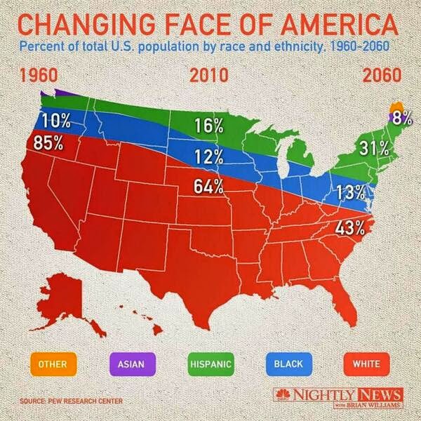
America is a land of immigrants. From centuries, People all over the world have migrated to this country to live American dream. Many have also become American citizens and contribute in the prosperity and development of the country. Recently I read an article “Changing Face of America” which shows the distribution of Americans belonging to different race and ethnicity as percent of total population over a period of time.

Distribution of race and ethnicity in the U.S. from 1960 to 2060

What I like about the graph

1] This is a perfect example of how a bad, deceptive and wrong visualization looks like.

Wrong – Because the data has nothing to do with the 50 states in US. The data is all about population distribution over 50 years,. Only the author can tell Why is the US map is used to show the percentage distribution of population

Deceptive – This is extremely confusing. It gives an impression that all the Asians Americans use to live in either Northern Maine or upstate Washington while South Dakota is an excellent place to be black. The best/worst part is There is not a single Hispanic within a thousand miles of the Mexican border

Bad – Another problem with this chart is that none of the percentage seem to add up to 100%. For the left and right extremes we can maybe assume that the numbers for the upper regions are simply too small to be displayed. But how do we explain the middle section? There are only three colors and the three numbers add up to 92%

A correct and better version of this data representation is

What I like about this graph

1] US map is not used, which makes life easy for audience.

2] It is easy to read and understand the distribution of population as per race/ethnicity from 1960 till date and the prediction till 2060.

3] Vertical line separating the past (exploratory data) and the future (prediction)

4] Good color combination for different entities

5] Numbers are marked even for smaller areas of graph. Users are not kept guessing about the numbers

How will I change the graph

1] Create a bar graph showing percentage of population of different races/ethnicities over a period of time

2] Create bins for years, so that general trend can be viewed. This also helps to convey lot of information (1960 to 2060) in small space

Learnings from class

1] Understand the claim – It is very important to make the correct claim. The above visualization had no claim and so it was up to the audience to interpret the results.

2] Select a right context – It is imperative to select known and standard graphs for particular patterns. Example can be to use bar graph/line graph to show growth trends over time. Choosing a US map completely changed the context of the graph and showed deceptive information

3] Visual confirmation – Check if the graph conveys the right information. Scan through all parts of the graph (and change the filters) to check if it displays the right information

4] Careful use of infographics – Do not make simple thinks complicated. Though visualizations can be appealing, they can be harmful/deceptive. Be careful while playing with numbers. (example – percentage should add to 100)

5] Identify your audience – Visualizations are used to convey information in a clear/better/correct way. Deciding the audience of the visualization helps to decide what kind of infographics to use.

references – 

http://cartonerd.blogspot.com/2014/04/changing-face-of-america-bravo.html

http://digbysblog.blogspot.com/2014/04/

http://livingqlikview.com/the-9-worst-data-visualizations-ever-created/

Green Dashboard Effect

We all have read about the “greenhouse effect” in our science class. That’s something damaging our planet.. right ? The dashboard below has a similar effect on our eyes. Jokes apart, lets critique what’s wrong in the below dashboard and how can we improve it.

What’s wrong:

Too much usage of colors: Too much colors are used in this dashboard, which is highly distracting and hides the information from the metrics.

Green and Red- not a good combination: This combination of colors works well when we want to convey the message of accept/reject. In this context the color combination doesn’t fits. Besides that, this color combination is not appropriate for the audience who are color blind.

Too much data in a tight space – This dashboard doesn’t have enough room to breathe. Due to this data overload, it is difficult to identify the most important data or trends and deviates the attention of user.

Bad Design Structure: A good dashboard is build using a hierarchical and structured template, but this dashboard lacks clear visualizations and appears to be blocks of green.

Wrong choice of chart:  This dashboard basically provides the health status of the system. However, it doesn’t encompasses all aspect of a health monitoring system like how the health changes over time. The choice of charts are too simplistic and therefore doesn’t provide inherent insights.

Fonts are difficult to read – The font size is too small and the labels are not clear enough to read. The metrics are small as well, and if this dashboard is displayed on a screen it will be really difficult to read.

What can be done to improve this ?

Reduce amount of color. Meticulous use of color makes the dashboard more appealing. Instead of big blocks of green/red, we can use up/down icons which would clearly convey the same message of being on/off target. This also gives us more space in the dashboard and is better for color blindness.

Create blank space: We can create some white space between widgets. This helps user to easily read and understand the information conveyed.

Prioritize the information: More is not always better. It is important to identify the right KPI for the business. Limited, but important information should be displayed that will make the dashboard more efficient and less crowded.

Using relevant charts: Any monitoring dashboard should not only have the current status of the health, but also helps users to get the trend or comparative status too. So identifying relevant data and presenting them in a trend line or a bar chart can produce more important insights for the end users.

Consistent and larger font size: This improves the readability and makes the labels and metrics clearly visible when displayed on a TV or a big screen.

Conclusion

While creating a dashboard, the primary focus should be on displaying the right data and getting those metrics to the right people. The above dashboard tries too hard by using flashy color, adding complexity, confusing visualizations, and failing in the main purpose of effectively communicating the crux of the information to its end user. Following dashboard principle of simplicity we can not only make an efficient dashboard, but also help end users to make efficient decisions.

Visualizing Financial Markets

Introduction

When messing around with the aesthetics of my individual project, I came across Tableau’s built in “treemaps” feature. I really liked the way treemap graphs looked, but I found that the beauty of the charts heavily outweighed the functionality (at least for my individual project). With too many data points, I was unsuccessful in finding a way to incorporate this type of graph in my final product. I even began wondering if there was much functionality behind treemaps whatsoever, or if they were a mere ploy of manipulating data visualizations with little truth to present attention grapping beauty.

My biased opinion of treemaps was put to the test when I stumbled across the following visualization while doing financial market research on http://finviz.com/map.ashx?t=sec&st=w52.

At first, I was very skeptical when exploring this data visualization, but after further review, finviz successful persuaded me in the actual benefits of treemaps by utilizing the categories below.

Visual Problem Solving

With the problem statement of: “Visualizing Financial Markets”, the author immediately gains attention from a very large audience. Market researchers, investors, businesses, and students can benefit from a successfully visualized financial market. To implement successful visual problem solving, a visualization need to include an objective dimension and a subjective dimension. This visualization successfully targets an audience with style (subjective) and utilizes truthful/persuasive data (objective).

Objective

To visualize the entire financial market, the author was faced with a very difficult task. He ultimately broke the market into categories- Technology, services, financials, etc. and further broke those categories into individual markets like: internet, software, hardware, etc. for technology. With this specified data, he could now make his “claim”, or in this case- his visualization produce truthful yet enlightening results.

Validation

Does the visualization contain a domain, data, and a task? The answer is yes. The author successfully integrates his financial data to his domain by creating business comparisons based on market KPI. The combination of his goal and his supporting data results in a convincing task that is actionable to the audience.

Aesthetics

            Finally, the most intriguing part of the visualization. The author boldly chose to implement treemaps, and could not have made a better choice. His task of visualizing financial markets is successful by his artistic way of comparing markets, industries, and businesses by their size. He allows users to see their KPI change over time, and delve into each market if desirable. Ultimately, he successfully developed a visualization that allows his audience to explore the product and come up with insightful results.

Layered Donuts with extra fats and oils – not too healthy!

Sourcehttps://www.ers.usda.gov/webdocs/publications/82220/eib-166.pdf?v=42762

This visualization is from a report from USDA (United States Department of Agriculture). The report is about U.S. Trends in Food Availability and Dietary Assessment of Loss-Adjusted Food Availability, 1970-2014. The graph under consideration for this blog, is the 2nd Figure in the report and the first figure under the Findings category. It is a layered donut chart that shows the per person calorie consumption for each of the food category: Fruit and vegetables, Grains, Added fats and oils, Meat, eggs & nuts, Added sugar & sweeteners, and Dairy. The layered donut has two layers, inner layer for the per person calorie consumption for each category in the year 1970 and the outer layer which shows per person calorie consumption for each category in the year 2014 (except for Added fats and oils for which the outer layer shows consumption for the year 2010). Each category is color coded to identify the region demarcations in the donut layers and the numbers within each region indicate the calorie consumed per person for that category.

Things I liked about the visualization:

  • Visualization is simple and easy to understand. It depicts what the figure title says clearly, calorie consumption per person for 1970 and 2014 for each food group.
  • The graph is well labeled. The calories consumed in each category is clearly visible in contrast to the color of the region for each category.
  • The colors chosen are bright and appropriate, there is no overlapping of color shades or similar colors that would make it difficult to understand consumption of each food group.
  • The regions are aligned for both years, one in front of the other. This makes it easy to see the difference in calorie consumption for each group for the 2 years.

Things I did not like about the visualization:

  • The calorie consumption for Added fats and oils is shown for the year 2010 and not 2014 as data for that category was available till 2010 only. But it has been placed in the outer layer of donut with the rest of categories which depict calorie consumption for 2014, and the title says that outer ring says that outer ring depicts calories by food group for 2014. This is misleading.
  • The use of a layered donut chart looks like it is intended to give an idea of the proportion of each food group consumed in both years, with respect to each other. But, there is no indication of the percentage of each food group consumed. One has to try and figure out the proportion of each food group consumed from the relative portions of the donut. This may not give the exact idea of the proportions to the viewers.
  • I am not sure I like the idea of layered donuts for comparing the food group consumption for both years. The difference in proportions is not clear by just comparing the concentric rings. The choice of visualization does not do justice to the intent of the visualization.
  • Not including the percentage value of each food group may mislead the audience as they may relate an increase in calorie consumed between both years to an increase in proportion of food group consumed, which may not always be true(as in case of Added sugar and sweetners).

Critical Analysis of the visualization:

Let’s analyze the subjective dimension of the visualization:

  • Beautiful: I would definitely not call this a very beautiful visualization. The use of a layered donut chart does not seem to be the optimal choice for the purpose. It is not easy to compare the proportion of consumption of one category to the others for one particular year. It is also not easy to compare the change in proportion of food group consumed between the two years. For instance, it is not easy to determine the exact percentage of the food group Dairy’s consumption in year 1970. The use of a stacked bar graph for both years or line graphs would have helped visualizing these details better.
  • Functional: The functionality of the visualization could be improved. The current visualization labels only the calories consumed in both years, leaving the viewer to decipher the relative proportion of food group consumed by the size of the donut rings, which is not easy. The functionality could have been improved by separately visualizing the change in relative proportion of food groups consumed with respect to each other, along with the calories consumed. As change in proportion of food group consumed is equally important in deriving any useful insights, it should have been included as well.
  • Insightful: The visualization does a fair job in terms of being insightful. The ordinary audience (someone like me) will not necessarily have knowledge of the changing trends in food group consumption and this visualization gives a good idea of how food consumption trends has changed between 1970 and 2014. But this can also be improved. One way of improving could be by including age specific consumption of food groups, which gives a much clearer idea as to which age groups have shifted more from eating healthy food like fruits to consuming more calories of added fats and oils by eating more junk food. The second way is by including information for dietary guidelines for consumption of each food group. This would make the visualization more insightful, as the information on consumption of food groups will now have a context and give more useful insights.
  • Enlightening: The entire report is about changing trends in food availability and dietary assessment. But this graph only shows the change in calories consumed among the different food groups. Just by looking at the changing calorie consumption of each food group one cannot initiate any change as there is no clear indication of any impacts of changing calorie consumption on one’s diet/ health. The graph also does not give much information regarding the changing food availability to make any useful decisions regarding the availability of food choices.

Does this graph have a claim?

  • No I don’t think so. As mentioned earlier, this graph serves as a blanket visualization for the report which explains the change in trends of food group availability trends from 1970 to 2014. As it is the first graph and is expected to give an overview of all the information that is further explained in the following graphs, this graph needs to give an overview of the intended claim of the report. The report is intended to inform the audience regarding the changing food availability trends and an assessment of the diet of Americans. But by just looking at this graph, we do not see any claims for food availability or diet assessments.

Validation of data:

  • We do not know the change in consumption of each category over all the years between 1970 and 2014. Providing the information of just the start and end year may mislead the audience if the trends for the years in between show significant variations, as data can be cherry picked to make it look the way you want. The omission of data on years between the start and end years raises a question on the shown trends, since the results of one particular year can well be an anomaly and thus not indicative of a trend.

Redesign of the visualization:

As I mentioned earlier, the use of a layered donut chart is not the right choice for this visualization. The visualization intends to give an idea of change in calorie consumption per food group per person. I have redesigned the given visualization to give a better understanding of change in calorie consumption between 1970 and 2014. I have also visualized the change in proportion of each food group consumed, to give a clear idea of the change in trends of food group consumption.

Link to redesigned visualization:

https://docs.google.com/a/scu.edu/document/d/1Y4gUVDlOQPDrc7cviZpLI77NWSlO61DDwsa2vkNlyho/edit?usp=sharing

References:

Why not to use Pie/Donut charts:

http://geographymaterials.blogspot.com/2015/08/advantages-and-disadvantages-of-pie.html

Using the right chart for comparing values over time:

https://www.cardinalsolutions.com/blog/2016/05/data-visualization-best-practices-part-two-mistakes-to-avoid