Would you create a resume like this?

Michael Anderson is a web designer and this is his resume. While a resume like this will definitely catch the recruiter’s attention, is it serving its purpose?

Firstly, by looking at the resume, we can see that this guy has definitely used an innovative approach to portray his designing skills. He explains what he did from ’95 to ’98 in terms of employment and academia, his primary skill sets and his behavioral skills using different types of idioms ; but is it helping the audience to derive the required conclusions?

As professor mentioned and as we all can see, the 3-D charts used here are quite confusing. Both the daily intake & output and primary skill sets charts are difficult to understand and analyze.

I do not understand how the different fields in the daily intake and output are related w.r.t. each other. The scale and the values are not clear. Does having less coffee increase his productivity, humor, communication etc. or they are individual graphs mapped across time independently without any relation.

Similarly,  for primary skill sets, the idiom used is a donut and its 3-D – it breaks two main rules of visualization. The comparison that he is trying to show is not clear. It is mapped according to his % personal time invested in these skills. But we do not have a scale or any way to actually get the number of percentage.

For the area chart, I do not understand the usage of color. What does the different shades of a color signify? Do the overlap of area charts mean that he had multiple responsibility during that time?

Also, on the first glance, the usage of color across the resume confused me as well. I was trying to identify if there was any connection between similar colors in different charts.  Apparently, there isn’t.

This resume is definitely interesting and different. I feel its attractive yet meaningless. What are your thoughts?

Michael Anderson’s Website – http://theportfolio.ofmichaelanderson.com/

Data Visualization Charts from the U.S. Congress Floor: The Good, the Bad and the Ugly

This article analyzes how data visualization charts are used in United States Congress. It gives good, bad, and ugly examples to give the idea that not all congressmen are good at data visualizations, and sometimes, they fail to convey their ideas to their audiences.

Audience: Congress, CSPAN audience, public who concern about this topic.

Purpose: Using data visualization to show how important their proposals are, and influence them voting for them, not voting against them.

Advantage: A simple and powerful bar chart will represent the data clearly and convey a simple idea to the audience. For example, the first bart chart in “The Good” part created by Senator Dianne Feinstein send a clearly message: “Two-Thirds of Gun Owners want to renew the assault weapons ban.”

Disadvantage: Since the article is written in 2014, probably most of them are lack of data visualization knowledge. I see two bar chart and two hamburgers in this blog post. From this class, there should never be bar charts in the congress. They should consider  using tableau instead of drawing cars like the last visualization. Since the data visualization technology is developing fast nowadays, i believe it is better for congressmen to take one or to data visualization class.

Reference:

http://www.scribblelive.com/blog/2014/05/12/data-visualization-charts-form-the-u-s-congress-floor-the-good-the-bad-and-the-ugly/

Expected Life Span for Gun Murder Vicitims

Periscopic, a Portland, Oregon-based data visualizing firm designed an eye-catching a dynamic visualization to depict the remaining years for each person might have lived if their lives hadn’t been cut short by a bullet. They used FBI gun murders data in 2010 and 2013 and U.S. mortality data from the World Health Organization for the visualization. Golden or red arcs across a black screen and fades to gray, it showed ages of victims died when the arcs turn to grey and showed the ages of these victims might have lived when the arcs touch the horizontal line. Also, you can see the count of stolen years for these victims at the right corner.
When exploring the source code generating the graph, you will find javascript codes were used to create this amazing visualization. If you are interested in the graph, you can visit  http://guns.periscopic.com/?year=2013

Here’s the link for other amazing work the firm did. http://www.periscopic.com/our-work

Reference: http://www.periscopic.com/our-work/more-than-400000-stolen-years-an-examination-of-u-s-gun-murders-in-2010


Make Dashboard Have Focus

The metrics chosen for a dashboard are metrics that an influential person thought were interesting. This is how a data puke gets created.

When choosing the core metrics to include on the dashboard, it is important to consider the dashboard’s audience and objective.

Once you have selected the core metrics, you have to create a hierarchy for the information. This can be done with the following practices:

Sizing widgets/sections accordingly – The point of a dashboard is to share complex company information in a way that’s easy to understand. Start by putting the most important information in the largest section and making the other sections smaller accordingly. You should use at most three relative sizes of widgets to make sure the dashboard isn’t overwhelming.

Group data logically – Grouping like data together will allow users to navigate through the information easily, especially when multiple users from different levels or departments are looking at the same dashboard.

Dashboards are great data management tools. However, it takes a more than putting a bunch of data points in one spot. You have to present the data effectively to make a dashboard a useful one.

https://www.betterbuys.com/bi/dashboard-best-practices/


Art of visualizing data

Every new visualization is likely to give us some insights into our data. Some of those insights might be already known (but perhaps not yet proven) while other insights might be completely new or even surprising to us. Some new insights might mean the beginning of a story, while others could just be the result of errors in the data, which are most likely to be found by visualizing the data.

What can you do to get more actionable insights from your data?

Analyze and interpret data:  Learn something from the picture you created. You could ask yourself: What can I see in this image? Is it what I expected? Are there any interesting patterns? What does this mean in the context of the data?Sometimes you might end up with visualization that, in spite of its beauty, might seem to tell you nothing of interest about your data. But there is almost always something that you can learn from any visualization.

Document your insight and steps: I really think that the documentation is the most important step of the process; and it is also the one we’re most likely to tend to skip. It’s a good idea to start the documentation by writing down these initial thoughts. This helps us to identify our bias and reduces the risk of mis-interpretation of the data by just finding what we originally wanted to find.

Transform Data: Aesthetics are important when it comes to data visualization, but this doesn’t mean that the graphs and charts need to have a ton of colors and effects. Here, we can subscribe to the old adage that “less is more.” Less may be more, but that doesn’t mean you should completely forgo any effects. Play around with one or two effects to see what best represents your data or most helps the viewer understand the data.

Have Someone Else Take a Look: Even if you’re pretty clear on what you’re seeing, get another set of eyes to take a look at your charts and graphs; one person can’t always see everything. You’ll get clean and clear insights as to what your data is saying.

Double-Check Your Data: Be skeptical with your data. Question what you’re seeing and look at it in as many different ways as possible to make sure you are understanding it correctly and interpreting it how someone else might see it. You don’t want to unintentionally mislead anyone, and you certainly don’t want to intentionally deceive.

There’s a lot you can do with visualizing data, but the real artistry comes in displaying it in such a way that brilliant, actionable insights emerge where they weren’t previously visible.

Sources: https://datahero.com/blog/2015/02/26/art-visualizing-data-find-actionable-insights/

http://datajournalismhandbook.org/1.0/en/understanding_data_7.html

 http://www.scribblelive.com/blog/2014/07/18/self-verifiable-visualizations/

Parameters and Filters in Tableau: When to use them

Global Quick Filters

Global quick filters are very useful when creating dashboards that contain worksheets that all use the same data source. For example, in a dashboard that displays the dataset in both text and visual forms, global quick filters give the flexibility to present the filter in a variety of formats: single value dropdown, multiple values list, wildcard match, etc. They also allow the user to show an aggregation of all marks with the “(All)” filter.

Disadvantage of global quick filters is that if the analyst has a dashboard with worksheets that each use a different data source, they do not work.

Filter Actions

Filter actions are best used when the user should interact with a specific sheet that acts as the “control. A filter acts directly on a dimension or measure and restricts the domain of the field.

There are a lot of options for filters. You can include or exclude members of a dimension, use a wildcard for the member name, choose the top N, given another measure, or use an condition (essentially a true/false calculation) to choose what is in and what is out. You have a fair number of UI options for filters: radio buttons, check boxes, drop down lists, sliders, and more. On top of that, you can choose what sheets the filter applies to.

Parameters:

Parameters are more powerful and more complex. A parameter, is like a variableYou can then use that variable inside calculations to change the calculation. If you filter by a calculated field, you essentially have a parameter controlling a filter. Parameters have almost the same UI options as filters, but they are single valued, so you have options for radio buttons, but not check boxes. There are also sliders and drop downs. Parameters are global, so can affect calculations for all data sources and connections in a workbook.

Unfortunately, parameters have their own limitations. Whereas global quick filters have seven ways to be represented on a dashboard, parameters only have four. Parameters cannot make multiple selections in a filter, e.g., with a list of checkboxes, and they do not have the “(All)” aggregate choice of quick filters. While the inability to select multiple items in a filter cannot be circumvented, the data can be structured to include an “All” row that aggregates the relevant data for that mark. This is not optimal, since the analyst must make this consideration when preparing their data for use in Tableau, but it is the only workaround we have come across.

Sources:

http://stevensanne.com/tableau-tutorial-3-filters-and-parameters/

http://www.wmanalytics.io/blog/filters-and-parameters-tableau-when-use-them

https://community.tableau.com/thread/144158


Student Debt at Colleges and Universities Across the Nation

This visualization provides a complete picture of the student debt across different universities in the USA. Firstly, this visualization provides two chart options – a scatterplot and map to visualize the same data. I feel that the map representation is better than the scatterplot as we can identify the universities by their location and it helps us to have e better perspective of the different universities in each state.

Things I like:

  • Firstly, the visualization is interactive and provides data for a five-year period when the play button is used.
  • A lot of filters are present to drill down the universities thus helping to get insights on different categories like type o institution, enrollment size, graduation rate, graduates with debt%. We can easily identify the universities with high tuition fees and high graduate debt rate which should be avoided.
  • The size of bubbles is depicted by enrollment size.
  • An option is provided for searching a particular university.
  • A detailed description of graduate’s debts appears when clicked on a particular university

Room for improvement:

  • Filtering cannot be performed on the basis of more than one category at a particular time. This hinders in providing a detailed analysis of the different universities.
  • Also, an option should have been provided to depict the bubble size based on graduate debt.

Reference: http://www.nytimes.com/interactive/2012/05/13/business/student-debt-at-colleges-and-universities.html

New York Taxis Rides

This interactive visualization made using Tableau visualizes the preferences of NYC residents when it comes to commuting either using the old fashioned yellow cabs or Uber. This dashboard consists of two visualizations.

The first visualization shows a detailed view of the traveling habits of NYC residents. It is further divided into two subparts. Part A is a bar graph showing the average taxi rides for each one hour in a day and we can see that 6 pm to 7 pm is the busiest hour with people returning from offices. Part B focuses on the average taxis rides per day in that particular hour. The interconnectivity among the two graphs is excellent. Also hovering over each bar or point shows the details.

The second visualization focuses on the percent difference in rides of Uber, yellow taxis and other services over time. There is an evident shift in preferences of the NYC residents towards Uber. The curve for Uber is rocketing compared to yellow taxis and All other which are plummeting. One excellent feature of the visualization is that the audience can see the value for all the three line curves at a point in time when hovering. But this visualization only focuses on data of a short period of July to September of 2014. More insights can be gained if we can have the recent data on this as it might be possible that the craze for Uber has subsided.

Overall, we get a complete picture of the traveling habits of NYC residents.

Reference: https://public.tableau.com/en-us/s/gallery/new-york-taxis 

Using heat map for tracking a website

Heat maps are useful for a website tracking mechanism. These days it is the analysis of eye versus mouse tracking. Here is an interesting fact, analysis shows that only 10% hovered over a link and then continued to read the page looking at other things. A heat map is used to show which areas of the page are viewed most by the browser user.  Following are some interesting types of heat maps on a website:

  1. Algorithmic heat maps – gives low traffic sites and idea of how people use their site
  2. Click heat maps – gives an idea where people are clicking and where they aren’t
  3. Attention heat maps – help you see which parts of website are most visible to users
  4. Scroll heat maps – Scroll maps are interesting way to till what limit users scroll down and where users tend to drop off. This helps business to prioritize the content.

Heatmap tools are used with interesting algorithms to analyze the user interfaces. Analyzing user interface takes into account colors, contrast, visual hierarchy etc. The analytics tells the business what is working and what is not, further, helps them to optimize their website. If business wants to introduce something new on the website, the heat map can be used what could be the best place for it. This is helpful for business to enhance the areas that are getting more clicks and removing the areas not getting enough clicks.Text can be altered to see what is holding the attention of visitors

Disadvantages:

  1. Business uses it for support instead of illumination
  2. Ignoring some data inaccuracies can open up to a completely different results
  3. Heat maps can be helpful at a high level and as a way to communicate problem areas to less analytically savvy in the organization.

Overall, this is a great tool for optimization of a web page but should not be used as the only source of determining project and test planning.

References: https://conversionxl.com/heat-maps/

https://www.linkedin.com/pulse/20140915173712-76871428-what-are-the-benefits-of-using-a-heat-map-for-a-website

How Visualization Fool You

Abstract: Evolutionary pressure has made us visual beings. Because we respond so strongly to visual cues, charts and graphs have the power to move us in a way that other ways of presenting data can’t match. Therefore data visualization as one of the most important tools we have to analyze data can be misleading as well. In this blog post we’ll take a look at 3 of the most common ways in which visualizations can be misleading.

Charts can mislead us into believing things that aren’t true. Sometimes this is accidental, but other times we are being deliberately manipulated. Sometimes it’s easy to spot what’s wrong, but other times the sleight of hand is very subtle.

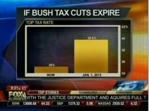
Dodgy Diagrams: The most notorious of the data visualization deceiver’s tricks is to use chart axes that don’t start at zero. We’re very good at comparing the lengths of objects, so choosing a non-zero axis can greatly magnify small or meaningless differences. Taken to an extreme, this technique can make differences in data seem much larger than they are.

misleading1_fox


Cumulative Graphs: Many people opt to create cumulative graphs of things like number of users, revenue, downloads, or other important metrics.

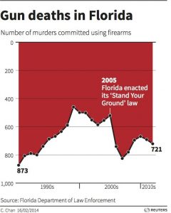
Ignoring Conventions: One of the most insidious tactics people use in constructing misleading data visualizations is to violate standard practices. We’re used to the fact that pie charts represent parts of a whole or that timelines progress from left to right. So when those rules get violated, we have a difficult time seeing what’s actually going on. We’re wired to misinterpret the data, due to our reliance on these conventions.

misleading3_deaths

Conclusion: Here are some simple rules we should use to keep our work virtuous.

    • Always start your plots from zero, unless doing so would be misleading.
    • Use a linear axis scale – avoid different sized categories and log plots unless there are good reasons to do otherwise.
    • Never, ever forget that correlation is not causation. No matter how tempting it is, don’t do it. Bear in mind that your audience will almost certainly see correlation as equaling causation, so be careful.
    • Maps are beautiful, but they can be powerfully misleading. Never use them alone and always consider the unintended message you might be transmitting.

References:

http://data-informed.com/whats-wrong-picture-art-honest-visualizations/

http://www.cs.tufts.edu/comp/250VIS/papers/chi2015-deception.pdf

http://avoinelama.fi/hingo/kirjoituksia/misleadingvisualizations.html

http://www.citylab.com/design/2015/06/when-maps-lie/396761/