Blog Post 1: Paid Paternity Leaves across countries.

Source

Description:

This visualization was part of a Forbes article- Why Paternity Leave Is Just For The Rich. It is relatively a simple visualization which attempts to show the number of paid paternity leaves across different countries with USA being in center. And noticeably, there are no paid leaves granted to new fathers in the US.

It can be called variant of a pie chart with slice sizes being indicative of the number of leaves; more the leave duration, bigger is the slice size.

Critique:

Things going well:

  • Clarity: With country names and leave duration clearly mentioned, the visualization is quite clear in conveying the information it intends to.

Things not going too well:

  • Consistency: It misses out on consistency with respect to following aspects:
    • Leave duration: Some leave duration are in months, some in weeks and the rest in days.
    • Country representation: The purpose of putting US in the center of the graph and all other countries around it is unclear. Does it mean that the US provide no paid paternity leaves?
    • Color scheme: It could have been per country instead of duration. UK, Denmark, Australia, Venezuela, and Kenya seem like part of one country.
  • Completeness: There is no mention as to why only these specific countries are present, this makes the information seem incomplete.

Redesign:

https://docs.google.com/a/scu.edu/document/d/1z8GG1ZDTENt-xmmc2cfFNu2yZydmGPUBCBSic7LeqSM/edit?usp=sharing

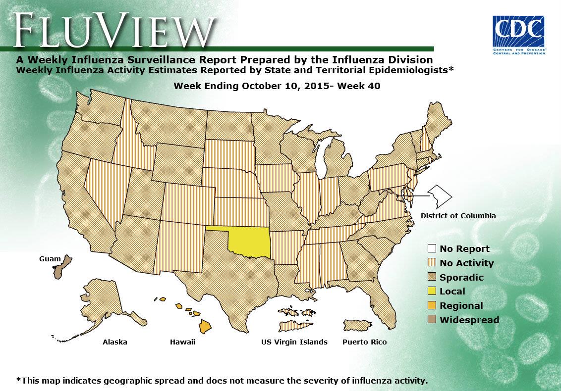
CDC FluView

https://www.cdc.gov/flu/weekly/WeeklyFluActivityMap.htm

CDC chart shown here is to show the spread of flu at a given week over USA territory state by state. It has various levels of spread from no activity to widespread. Washington DC is the only one entity that has no data reported. I think in general this visualization does what it was made to do however there are  few drawbacks.

  1. Presentation of the chart itself: if you have noticed the chart dates back to week 40 of 2015, why is this particular date? Well it is simple that is the chart that you get when you click on the link of the smaller current chart named “View Larger”, so instead of current spread levels you expect you will always get this chart (week 40 of 2015). And if you not careful you will take this chart as being current.
  2. Colors and patterns: they look a bit confusing some are patterns some are colors and they represent levels (a scale which is better represented by commonly accepted standards green to red or light to dark) , without reading the legend it is hard to understand and after reading the legend it is hard to remember which means what. With that being said even reading a legend and remembering doesn’t help much if you look at the chart from the distance (graph presented on projector), it is hard to tell sporadic from widespread in some situations.  Also when looked up-close on the monitor patterns create some kind of visual artifacts that causes eye discomfort.
  1. Explanation of various levels of spread are not clarified on the page where graph appears and requires some link clicking and navigation to find.
  2. Usefulness of the visualization; the graph does what it says it should do but is it as useful as it can be? It repots spread levels by state, but it is not very realistic viruses don’t stop on state borders and in real life the spread is more of a gradient rather that level shift along the state border. Also this map is not very informative when levels are local, regional or sporadic. For example: California is pretty big and prolonged state so having local flu spread in San Diego and having no activity in Eureka is more than possible. So knowledge of local activity is not very useful for people within the state, and CDC probably does have this data.

So instead of doing state by state they can do a grid and use hotspots, but then it will be a different visualization.

Flight Patterns

We will not be able to make sense of this endless ocean of information, unless we pay attention to the basics of handling data and presenting them in aesthetically pleasing ways. Aesthetics is what makes this visualization stand out.

However, designing this visualization is not as easy as it looks. Ample amount of experiments and researches have led to the visualization that we see here.

The Flight Patterns visualizations are the result of experiments leading to the project Celestial Mechanics by Scott Hessels and Gabriel Dunne.Here is an example of beautiful visualization that can be produced using the processing programming environment.

Flight Patterns

It’s easy to forget just how many planes are in the skies above us but this visualization reminds us of exactly that and effectively maps the traffic between the various cities of United states. Data from the US federal aviation Administration is used to create animations of flight traffic patterns and density. FAA data is parsed and plotted using the Processing  programming environment. The frames were composited with Adobe After Effects and/or Maya.

The visualization shows flights as glowing dots on a black background and its interesting to see how the geography becomes visible as more flights paths are drawn. This visualization allows us to see the frequency, connections, and opacity of the trails that the flights leave behind as they crisscross around The United States of America. At the very glance the traffic density in and around United states can be captured through this visualization.

However, there are some fundamental problems with this visualization. To start with there is no text or legend representing what the visualization is about. There should be a mechanism to measure or differentiate on the basis of color, thickness, and degree of shading of the connecting lines. Secondly further details regarding the aircrafts or the altitudes etc. cannot be figured from the visualization. The goal here is to facilitate reading and you are forced to justify all your options so as to make it sensible for the viewers.

So, dashboards hold a lot of promise to make sense of the world around us, but only if we think through what data goes into them and how the visuals we are building need to grab our audience. A highly efficient visualization should provide real-time updating, interactivity, and collaborative features. User should be able to decompose charts, drill through measures, zoom in or zoom out on time lines and reveal new things.
References:

http://insights.wired.com/profiles/blogs/lost-in-visualization#axzz4eA6OxVBc.

http://users.design.ucla.edu/~akoblin/work/faa/index.html

Why not use to 3D graph and multiple colors

http://www.businessinsider.com/the-27-worst-charts-of-all-time-2013-6#wow-multicolor-3-d-cylinder-bar-charts-are-a-really-really-bad-way-to-articulate-relatively-simple-data-19

The above graph wants to see the trend of mortality rate in a relationship with epoetin dose and hematocrit group range. Within each hematocrit group, as the epoetin dose increases the mortality rate trend is increasing and the highest mortality rate being for hematocrit group range of <30%. Within each epoetin dose quartile, there is an increasing trend in the mortality rate as the hematocrit group range decreases.

Issues in the above graph:

1. Use of 3D chart: The use of 3D charts is confusing as well as deceptive to our human’s eyes. 3D graphs misrepresent the data which makes it difficult to determine the correct value. Analyzing the 3D charts requires additional brain processing which shouldn’t be the case. It’s not easy to understand the trend or insight of the mortality rate with respect to epoetin dose and hematocrit group. In more than 39 hematocrit group bar, Q2 and Q4 seem to be same.

2. Multiple colors: Use of multiple colors is distracting. Adding more colors makes it hard to read the graph.

How can be the graph improvised:

1. Convert 3D to 2D: Using bar graph, it helps to determine the values correctly as well as understand the trend of the mortality rate in a relationship with hematocrit group and epoetin dose. Deception about values for Q2 and Q4 for “>39%’ being same is eliminated.

2. Use one or two colors.

https://drive.google.com/open?id=0B_RLPSpuvXY1LUREek1vaG41Yjg

Data Visualization: A HIT OR A MISS!

Data visualization allows us all to see and understand our data more deeply. That understanding breeds good decisions. It can be a great way to drive numbers home and give them a visual weight mere statistics don’t have. At least, that’s what happens when they make sense. However, sometimes visualizations may look good but are simply unnecessary and miss the point completely. To take an example, we have the following visualization from the Washington post article, showing 100 years of hurricanes hitting and missing Florida.

https://www.washingtonpost.com/graphics/national/one-hundred-years-of-hurricanes/

The above visual aims to depict every single hurricane over a period of 100 years that had hit or missed Florida. Each line in the above visual represents a hurricane.  However, it is unclear as what is it that the visual is trying to achieve as it doesn’t show the number of  storms that missed of hit Florida over the past 100 years. Let’s analyze the given visual on two main visualization criteria that it completely fails on:

CLAIM: All visualizations must answer a question, make a claim or provide some insight that wasn’t available or accessible without the visual representation. The article using the above visualization claims that Florida is the landmass of choice for storms. However the visual doesn’t provide any support for the claim. It doesn’t tell the number of storms that have hit or missed Florida and nor any correlation with time or location.

VISUAL AESTHETICS:  From a customary look it simply looks like a child was let loose with a pen in his hand and was told to have a go at it. “Florida” which is the center of the discussion is not even visible with the white base and white lines demarcating Florida and its neighbors. The lines depicting the path each hurricane followed are all overlapped and do not provide any helpful information to predict the path of any future hurricanes. The darkened line depicts the latest

A Better Depiction… “Tracking the Paths”

http://pparker.org/hurricanes/hurricane_history.htm

The above visualization depicting similar information regarding storms  that have hit Florida over a period of time and the path they followed, despite being visually unappealing is still much better than the previous one as it provides useful information that can be acted upon to make certain decisions. The above visual clearly represents the year of the storm (category 3 and above) and the path it took. The highlighted region in the center of the map depicts the counties most affected by the storms and thus provides useful information. For example, while developing evacuation plans the counties highlighted can be prioritized.

In conclusion, while it is important for the visualization to be appealing with pretty colors, fancy charts, and cool pictures in order to capture the interest of its audience, but if the visualization doesn’t give quick insights that aid decision making, it’s not really very effective and defeats its very purpose.

The cost of healthy eating – A comparison

This is a graph from the New York Times in May 2009 that was published to substantiate a claim that healthy food options were growing more expensive while junk food options were growing cheaper. It uses change in price of items relative to overall inflation  as the measure to substantiate this claim.

http://www.nytimes.com/imagepages/2009/05/20/business/20leonhardt.graf01.ready.html

As we all know, the visualizations beauty is in the eyes of the consumer!

The following are some keen observations from the end-users/consumers perspective.

Who is the end user of this visualization and what is the intent?

The end user of this visualization is the reader of the newspaper to whom the author is trying to convey a trend that the food industry is moving towards. The author uses the consumer price index as a proxy for measuring the cost and compares it relative to the overall inflation. The author does a good job at conveying that healthy foods are growing expensive more rapidly (higher slope) than the unhealthy options that are growing expensive at a “less-rapid” pace. (smaller slope).

However, please do not let the visualization fool you into believing that beer is growing cheaper 😛 Even if beer rises at 0.85 times the inflation, its price is still increasing, not falling!

The snippet in the top also states that the cost of unhealthy food has fallen in the last few years and can be misleading.

How does he do it?

The author uses a trend line to show the upward movement in the cost of healthy options in food choices and downward movement of the unhealthy options used.

The authors choice of graph to describe the year over year growth is good. However, his choice of point of comparison -overall inflation in goods is a little hard to perceive unless the person takes the time to understand the metric.

What makes a good metric ?

Since the consumer of this information is anybody who reads the news, the metric would be easier to assimilate if it was simple and stupid. So rather than contrast the value in comparison to overall inflation, the author could have used the absolute increase in prices as the metric.

It is because of the same reason that there might be a tendency for the consumer to perceive the downward slope as a drop in price rather than a less steeper increase in price.

What could have been done better in the visualization?

Trend rather than plot the absolute values: Rather than show the trend line, the author could have focused on the overall trend that shows whether the cost is moving up or down. This would have conveyed the same meaning and would have been simpler to understand.

Consistency in what you are representing : Comparing fresh fruits and vegetables to specific items in the “unhealthy” list provides a good comparison but, its clearly not an apples-to-apples comparison. Ideally if you are comparing two objects, we need to make sure we are comparing identical objects. In this case the comparison is between a basket of objects(fresh vegetables) and a single object like butter etc.

Also, the fresh fruits option had a percentage while the remaining items did not contain the percentage making it inconsistent.

Choice of colors: The choice of colors goes a long way in creating certain associations in a persons mind. Colors like green and shades of yellow are usually associated with positive things while colors like bright shades of red are associated with caution and danger. The choice of colors that have been used in the graph is consistent with what the author tries to prove using his argument.

Conclusion:

While the graph does  a good job of proving the point, when we look closer it is not conclusive to prove that healthy foods are getting more expensive and unhealthy foods are getting cheaper. The author could have done a better job simply by opting for a simpler metric to report and comparing similar objects.



Discover beer and say cheers!

– Ekta Ratanpara

I am very fond of beers and like to try out different kind of beers. While doing some research on which beer I should try next, I came across “Beerviz” site which is created by students of UC Berkley.

Chord Graph showing similarity relations between beers

The site displays interesting Chord graph showing similarities between different brands and types available throughout the world. It also has some graphs displaying how the data is distributed and top five beers by type i.e. Dark, Medium and Light. While I loved a lot of features they incorporated in the visualization but few factors are misleading as well. Below image shows the high-level analysis shown on beer popularity.

High level analysis of beer popularity
High-level analysis of beer popularity

I will try to summarize what I believed works well and what could be improved.

What works well:

  1. Choice of the graph to display similarities between beers: Chord graph works pretty well when inter-relationships between values of multiple types of data points needs to be visualized. It makes easy for the viewer to see relationships between different types of beers and their popularity.
  2. Categorization and Filters: Two level categorization of beers is really helpful to narrow down the exact kind and type of beer you want to explore and its similarities. The website asks the user to select the malt of beer and type of beer is shown in the legend for a user to identify which color is related to which type. And to further narrow it down, they have given filters as attributes of beer like appearance, taste and aroma of the beer.
  3. Graphs showing high-level analysis of data: In addition to showing similar beers in chord graph, they also have few graphs showing ratings by attributes, popularities, and top beers which adds further value to the overall analysis by providing user instant choices and help explore the similarity graph.

What can be improved and how:

  1. Factors to decide popularity: Instead of only number of ratings, a combination of number of ratings and average rating should be used based on which user can make an informed decision. There are a couple of problems when showing popularity based on the number of ratings or average rating. This post on xkcd website sums it up best (click here). For example, beer A has 10,000 ratings but average rating is 1.5/5 and beer B has 5 ratings but average rating is 4.9/5. In both cases, using only number of ratings or average rating will lead to an incorrect conclusion. In this case, if number of ratings is used, beer A is better while if average rating is used, beer B is better. Instead of this approach, I would use a weighted average in addition to adding smoothing factor or a constraint of having a minimum number of ratings that can reduce the misleading factors of a ‘5-star’ rating system.
  2. Top 5 beers based on a combination of the number of ratings and average ratings. In the “About the Data” section, the top 5 beer graphs are based on a number of ratings. As I mentioned in point 1, number or ratings can not be a deciding factor to identify popularity and the same alternative can be applied here as well.
  3. The size of chord graph: Some of the names on the graph are not displayed in full and is cut in the UI which creates the negative user experience. When doing testing, this issue should have been resolved or a drill up – drill down approach should be taken where on selecting a beer, a new graph will show relations of only selected beer with other beers.

Overall, the visualization is quite attractive but if above-mentioned things are implemented, it can drastically increase the usability of the dataset and information provided through the graphs.

Reference:

  1. Beerviz | Discover Beer & Say Cheers!
  2. Beerviz – Work Report 
  3. XKCD Comic on Problems with averaging star ratings

Are you interested in Infographics or Artifacts?

Nowadays many visualization enthusiasts are coming up very innovative graph and charts to depict data to their targeted audience with the right information at right time. But a question that arises is, are these viz enthusiast trying to compress lots of information into a single viz that looks like an artifact rather than an infographic.

To better understand this, let me introduce you to a viz which looks super sexy and appealing to the human eye.

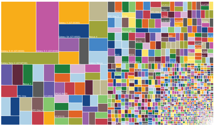
Image 1.0 – Android phone Release and Sales

What’s the first impression one get’s by looking at this chart? Wow! that really looks cool. A famous idiom “A picture is worth a thousand words“, which tells complex ideas can be depicted using a single image. Any clue what does image 1.0 depicts?

The viz is a snapshot of Android phone release and their sales. The treemap depicts multiple things, by going from right bottom to left top of image 1.0 the size of each rectangle indicates the market share of an Andriod phone model, that signifies the dominance of a specific model and company which has several phones in the market.

Background on Treemap, this is a type of information visualization which is used to display hierarchical data using nested rectangles.

The best part of this viz is that a layman can a understand that Galaxy s3 was having lead in the market but there were many android based phones which cover at least half of the market. If we try to show the same information in a pixel perfect report it would have occupied at least ten pages.

To be very honest, without any description or brief about the viz it would be quite difficult to digest as it has lot’s of information compressed. To better understand or viz this data I would first try to understand who are the audience? How much data do they want to see? What is the granularity at which they want to analyze? Once we have all this question answered, we can decide what is a suitable chart or graph to represent data. For an instance, let’s say a sales guy from Andriod team wants to use this data. Now, we can start thinking what would be the best way to show data.

For an instance, let’s say a sales guy from Andriod team wants to consume this data. Now, we can start thinking what would be the best way to show data. I would create three buckets of all the Andriod phones and classify them as small, medium and large segments and assign a market share of <10%,>15%,>30%. By using this technique a user can better analyze the data which is present in the right half of image 1.0.

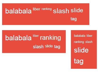
Now we can viz these buckets in many ways, First way: Use word cloud for all the three buckets and portray in a single frame. In this viz all the major companies each segment can be evidently showcased.

Image 1.1 – Sample word cloud with three segments

Second way: Using bar charts and the same concept to split data into three segments. These

Image 1.2 – Sample bar chart by splitting data into multiple segments

As we discussed before, more information in a single viz which cannot be digested easily doesn’t solve our purpose. So, it’s better to enable drill downs to navigate to more detailed information from a main viz.

To conclude reports or charts like image 1.0 are visually attractive but they don’t fulfill business needs and decision making information.

So, Now you can comment whether you’re interested in Infographics or Artifacts?

Reference Article for Treemap (Image 1.0) – https://www.theguardian.com/news/datablog/gallery/2013/aug/01/16-useless-infographics#img-6

Paradox of Choice

Pooja Kotian

Excellence is never an accident. It is always the result of high intention, sincere effort, and intelligent execution; it represents the wise choice of many alternatives – choice, not chance, determines your destiny.

-Aristotle

In today’s world, options are not something we lack. Years of research and ever growing technology have given us the luxury of doing complex things in just a few clicks. The same applies to data visualization, multiple tools have been built to help us create charts which were a tedious task in earlier times. But is more actually less? Lets take the below figure as an example to further discuss this:


The above chart uses the dual-axis combo feature that tableau provides.Tableau makes data visualisation a cake walk. It provides many features making it easy for users to build charts , graphs, etc. But making the right choice is the key.

What is interesting about the chart is how it clearly distinguishes its data. Reading into the chart will tell you what it’s trying to tell you. It answers the two of the main description question : What (furniture, office supplies, Technology) and When (year 2011 to 2014) and explains how much sales were or discounts given for those products over time. However, is this the right choice of presenting the data?

While the graph tells us quite a bit, some pieces still remain unknown leaving the viewer puzzled. It fails to answer us ‘Who'(which company) and ‘Where'(location). All we can say is that the company sales were x dollars in a particular year and discount percent in that year was y%. Also the time axis seems repetitive, simply using different colours for different products would make it simple and precise.

There are many more ways of representing the data in a more effective manner. But what to choose will always remain the question. When we have technology by our side we often tend over complicate stuff. In the above example, a simple method of having two graphs (one for sales and one for discount) side by side would do the trick.

In conclusion, I would like to say that there may be multiple solutions to a data visualisation but what we choose must serve the purpose in the most effective way. The data visualisation must be truthful and functional while being beautiful and insightful and most importantly be enlightening. The audience must be the key factor of our decision making process.

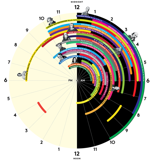
Sleep Habits of Geniuses

Usually any visualization or an infographic is created with intent to give the audience a one-shot view of the subject matter, then the content associated with it elaborates the first level view. However, some charts fail to communicate the information effectively. The chart considered for this blog is an example of such infographic.

The above chart depicts ‘sleep schedules’ of geniuses. In terms of my comments, I would start with things I like about this graph, then things I didn’t like as much and ways to improve it.

Some of the things I like about this visualization are:

  • The color distinction of black and white for the AM and PM times is very apt, that way audience can quickly notice the change in time.
  • The round shape resembles shape of the ‘clock’, this shape helps quickly visually associate the numbers with hours.
  • This visualization is insightful, gives out new set of information and combines it in one visualization

Things I disliked about this visualization are:

  • I would say this visualization is not aesthetically pleasing. Though the color selection of hours is good, the schedules shown have many colors and in some cases, the same color is used to depict schedules of two different people which creates some confusion. For example, one may think that there might be some link between those names.
  • This visualization can’t be termed as Functional, it contains a lot of information but it’s not conveyed effectively. Additionally, this visualization does not intuitively show any comparison between sleep habits of these people and doesn’t help readers infer anything.
  • For few people, faces are attached the information while few people just have names written which creates some visual inconsistency.

Better Way of Representation:

I believe, a better way of representation could be the one where differentiation or variation in the sleep times is immediately visible. A timeline chart/ Gantt chart may be a right choice here. (currently, as there is a lot of information reading the various rings is very difficult). Alternatively, in a timeline or a Gantt chart, Every column  would be associated with an hour in a day and every line item would correspond to an entry of sleep schedule of a person in hours. Every line item would also show Name of the person on the side. This way a clear association between the name and hours will be established and this chart would intuitively bring out comparison in sleep habits of different people .


Reference: http://junkcharts.typepad.com/.a/6a00d8341e992c53ef01a3fd25a481970b-pi