Exploring EPL Dashboard

Let’s first look at a dashboard talking about premier league.

https://public.tableau.com/profile/cognitive.dissonance#!/vizhome/EnglishPremierLeague_0/EPLStory

  1. League table and Played Opponents In Prior Seasons: You can pick up any team in the table, it will show previous fixtures and upcoming fixtures, also you can see the comparison (avg. points, goals, goals against, winning%, draw% and loss% of playing against same teams in the league in recent eight seasons (It excludes teams promoted and regulated). Comparing same fixtures in prior season is a fair to see how a team is really getting worse or better in one way. The author has a distinctive idea. However, too much information to spread to audience. After I reviewed a couple of clubs, I failed to see the difference between clubs and the change of one club — Data does not change too much. Evidently,  the author did not realize how the data is changing through the seasons. The tiny change proves the dashboard is a fail. It looks like the author give audience a maze to find a exit.
  2. Season Progress By Fixture: Comparison is a nice skill in showing dashboard. Here you can compare your club with League Winner, Championship League Line (Top 4 can get through Championship next season), Europa League Line (5th – 7th can get through Europa League) and Relegated Line. Also, it can select a few variables: points, goals conceded and away wins. Comparison by time could make it easy for audience to get the turning point. For example, if you choose Arsenal, and compare with League Winner, you can easily figure out before fixture 22, it’s pace was as good as League winner, but after that, they ran out. So it’s not painful as a previous dashboard. We do not need to find exit in maze. However, this is still not a perfect dashboard. The author only pick up three variables – Points, Away Wins and Goals Conceded. Does he want to spread a message: those are most important measurements? How about goals? Home Wins? Games against major clubs? Why he neglected those indicators? Incomplete information would probably bring incomplete conclusion.
  3. Final Standing and Points:  It’s hard to guess what the author is going to claim. Maybe he wants to let us see the trend of points by times? No. The X-Axis is not year. It’s not a trend how a team is going to be. I am getting confused why the author picks up final standings and points as x and y axis. And the several trend lines (totally four lines) also confused me what the author is going to represent. This is not a maze, not too much data. But, this is a vague dashboard, the audience cannot get the clear claim from the author. So, do not take it for granted that your audience knows what you are thinking. Clearly give it out.

Let’s look at another dashboard taking about Premier League:

https://public.tableau.com/en-us/s/gallery/premier-league-15-16-so-far

  1. Who plays Where: If want to show a player’s activity zone, it would be better to show a zone, not one spot. Giving an average spot would lose other important information. Usually we could see a player’s hot spot: deeper the color, frequent the activity of a player. And that’s useful to do some analysis of a player: why he played more in that area? where is his favorite area? Especially when coach changed his role, for example from winger to midfielder. The “average” position is useless to get any conclusions.
  2. HOW DO THEY PLAY? The beautiful lines spread no information. The author gives too much information in a tiny tiny space. Lines across each other, it’s beautiful but totally none functional.

Finally let’s look at an interesting dashboard:

https://public.tableau.com/en-us/s/gallery/premier-league-ranking

It’s a beautiful chart. But, the author wants to say: Which teams unexpectedly snatch more than their fair share of points from sides above them? I did not find the answer. Do you want to count how much green cubes above a team, and divided by all cubes above a team? No one wants to do that. Besides, since Liverpool is in 3rd place, there’s less to compare. The better way is comparing a team’s winning% with top six and bottom six, then you would find the answer, in fact, Liverpool played best against top teams this season, but it’s hard to figure this out through the little cubes.


Fantasy Premier League Player Analysis

Sometimes a nice Tableau dashboard visualization does not need to give some prediction. It just gives you the fact, but audiences can easily use it, inspect the data in their own ways, get the conclusion, and make the decision themselves. Here is such a beautiful and powerful viz:

https://public.tableau.com/en-us/s/gallery/fantasy-premier-league-player-analysis

Why this is a wonderful dashboard?

  1. It meets all five requirements: trustful, functional, beautiful, insightful and enlightening. Filter feature on every measurable variables give you unlimited possibilities to do deep research on the players, and meantime its clear but not complex.
  2. Audience usually have their own favor. Do some prediction on players is not wise. So, this dashboard does not give any pinpoints or predictions on players, it just give you the actual data, fact is better to convince different group of audience than predictions.
  3. Audience can define KPIs and do analysis themselves. You can do a  price-points analysis, which give you a clear look at price–performance ratio to make decision,  you can also view ownership%-points sheet, and make prediction of future price of the player you are looking at.

At the bottom-half part, you can see the player comparison. This gives you a detail look at two players when the dashboard on the top-half can only show two measurements at one time, but here, you can see all the measurements in one sheet. Also, some useful viz like player’s price and points trends-view posted on the detailed sheet too.

No dashboard is perfect, here’s a little issue from my view:

  1. The red/black color is hard to understand. I cannot understand why some players are red, but others are black.
  2. Historical data is lack. Player performance comparison between years, months, days and player performance against one certain team historically are also important and helpful. But this viz did not make it.

Here’s another Data Viz on fantasy premier league:

http://public.tableau.com/views/PremierLeagueFantasyFootballWDC/PlayerSummary?:embed=y&:tabs=n&:display_count=yes&:showVizHome=no

This one does a detail analysis on player. The most powerful thing is, now you can compare a player with his previous seasons. But this viz is hard to use. Why? You need to remember one player’s data in your mind, and look at another…I am sure when you are looking at the 10th player, you must forget what the first one look like… And, compare the player’s points with average points, it is not that useful…Whether you look at a very good player, or some potential one, you know you are looking at different measures. not points.

Source:

http://public.tableau.com/views/PremierLeagueFantasyFootballWDC/PlayerSummary?:embed=y&:tabs=n&:display_count=yes&:showVizHome=no

https://public.tableau.com/en-us/s/gallery/fantasy-premier-league-player-analysis


MVP Debate


If you are interested in who is going to make teammates shooting better in the regular season, this picture may give you some clue. X-axis shows the usage rate and Y-axis shows the true shooting percentage. Evidently, Curry does much better than other key players.


This picture also shows Curry, James and Westbrook have big influence on their teams, while Harden and Leonard does not. After you reading those two pictures, do you really want to change your mind for voting Curry but not Harden?

Data is not deceivable, but the man who made it is deceivable, because he must have the “Goal” or “Point” before starting drawing the picture, the title of the article is “The case for Curry the MVP”, also you can find another article called “The case for Harden the MVP”. And so on so for. If you really want to make a “fair” decision on voting the MVP, you may need couple of days or weeks to research huge amount of data, analyze them from varieties of angles and make conclusion. And even if you can do this, do you really hope every fan would do the same things as you? Impossible. In fact, Fans get used to easily understood data such as raw data (points, rebounds, assists) to pick up MVP, that’s the domain they agreed (At least most of them). Althrough these reports are really good, telling stories from different angles, they are not convincible to different groups of audience. I like those reports and you can say I am the audience of the article, but not all of us. That’s what I want to say,  certain analysis report only suitable to its certain audience.

Source: https://fivethirtyeight.com/features/the-case-for-stephen-curry-mvp/

The Case For James Harden, MVP


Formula 1 Data Viz


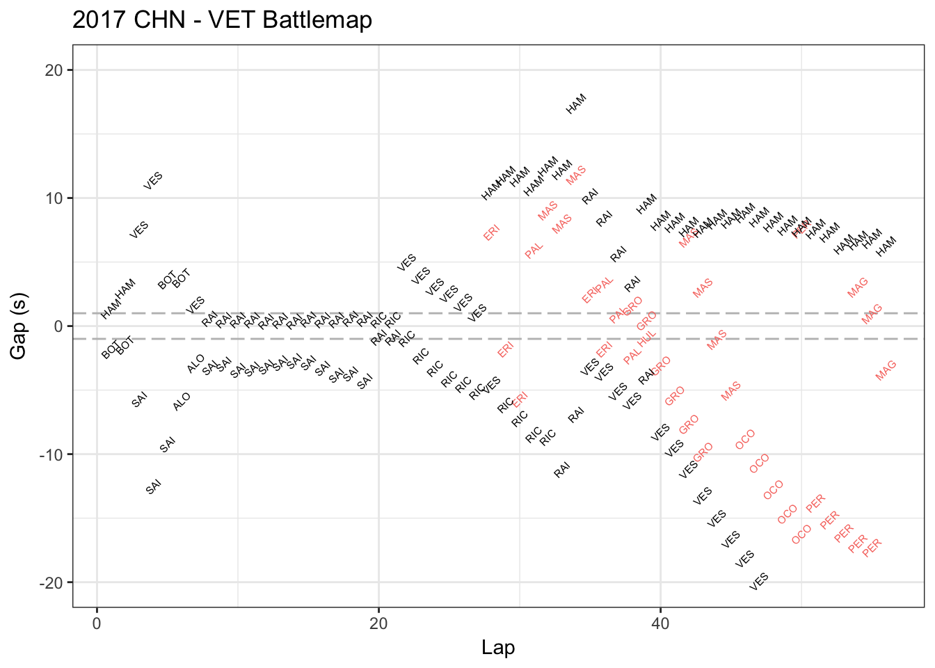
This is Vettel’s race battle map in China Grand Prix in Apr.9 2017. This map shows who’s ahead or behind Vettel and how much the seconds in each lap. The red data represents the players lapped by Vettel.

This map is not beautiful to me. Showing the player names again and again in the charts causes me dizzy. Also, I took over 3 minutes to understand what it is talking about, even I am familiar with Formula one and watched China Grand Prix.

It’s not functional to me, either. This graph only shows the closest one player ahead of Vettel and one behind Vettel, which makes me hard to compare key players (for example, Hamilton was the key player compared to Vettel in that game but he “disappeared” in some laps). Also, it did not show when Vettel stopped and how many times he stopped, which is very crucial because you may misunderstand the data (for example, BOT (Bottas) was ahead of Vettel around lap 3-4 because Vettel stopped but Bottas did not).

I got a functional viz in my mind: compare the lap time of two close players (for example Hamilton and Vettel), including tire types and its condition changes (mid, soft or super soft) using gradually transparent color when we show the lap time bar. This will give us a lot valuable information and reasonably to guess when and why there’s a lap time difference. Also, we can tell the difference of team strategies (Ferrari and Mercedes). Besides, there would be other interesting thing to watch like when they had similar tire conditions, who was the faster one?  Or we break lap into three sections and do some precisely comparison.

Sadly I cannot find players’ lap times data in that game, but I think they did – http://www.f1datajunkie.com/. Hope you can build some interesting viz to our F1 fans!