The Emotional Highs and Lows of Donald Trump

We all know that Donald Trump is very emotional in his public speeches. Periscopic engineers used ten of the major speeches he gave from July through December to visualize his rise and fall of intense emotion: anger, contempt, disgust, fear, sadness, happiness and surprise.

It shows Donald Trump’s anger faces when he’s in rage. Then the visualization shows Trump’s cumulative emotion in a speech, indicating the change of emotion in the speech. After that, we see how Trump’s emotion go ups and downs in difference speeches. The visualization also breakdown and quantify Trump’s emotions in four different categories. It’s an interesting way to depict an emotional president and how he expresses his emotion.

Reference: http://www.periscopic.com/our-work/the-emotional-highs-and-lows-of-donald-trump

Expected Life Span for Gun Murder Vicitims

Periscopic, a Portland, Oregon-based data visualizing firm designed an eye-catching a dynamic visualization to depict the remaining years for each person might have lived if their lives hadn’t been cut short by a bullet. They used FBI gun murders data in 2010 and 2013 and U.S. mortality data from the World Health Organization for the visualization. Golden or red arcs across a black screen and fades to gray, it showed ages of victims died when the arcs turn to grey and showed the ages of these victims might have lived when the arcs touch the horizontal line. Also, you can see the count of stolen years for these victims at the right corner.

When exploring the source code generating the graph, you will find javascript codes were used to create this amazing visualization. If you are interested in the graph, you can visit  http://guns.periscopic.com/?year=2013

Here’s the link for other amazing work the firm did. http://www.periscopic.com/our-work

Reference: http://www.periscopic.com/our-work/more-than-400000-stolen-years-an-examination-of-u-s-gun-murders-in-2010


Marketing Metrics and KPIs

Marketing Metrics and Key Performance Indicators (KPIs) are measurable values used by marketing teams to demonstrate the effectiveness of campaigns across all marketing channels. Social media is one of the many channels that marketing team widely use and keep track of. Here’s an example how to use KPIs to measure the performance on twitter.

The dashboard above first offer a glance of the total number of current followers and how far it is to the target number. Then it lists some key metrics in past 30 days and the trend of them (increased or decreased). The right side of the dashboard shows the trend of visits in past 30 days, which offers real-time monitor to marketing employees to see how things are going. Therefore, visualization is a powerful tool when you understand the business, pick the appropriate metrics and use the right way to present it.

UBER ENGINEERING’S DECK.GL FRAMEWORK

Uber’s engineering team open sourced deck.gl, a WebGL-powered framework specifically designed for exploring and visualizing data sets at scale. Uber can explore GPS traces for a given trip to get full context if there’s an accident on the road. Uber also can communicate plans to city authorities by visualizing pain points if there are pain points around pickup locations in a city.  The engineering team developed deck.gl to meet the needs that the data should be web-based, real-time, and shareable.

deck.gl’s set of features adapts to a wide range of use cases, including mapping. It enhanced map-related visualizations in many different mapping environments. Here’s an example of mapping use case. deck.gl  dealt with large data sets: 2M points and 36K taxi trips in NYC with live GPU interpolation.If you are interested. you can check demo here. It’s amazing.
Reference: https://eng.uber.com/deck-gl-framework/

Modern Approach for Data Visualization

There is a variety of conventional ways to visualize data such as bar charts, pie graphs, and pivot tables. Actually, we have some other creative options to visualize data which is a lot more fun. This blog will show some example of this amazing ideas of visualizations.

  1. Trend map

The trendmap presents the most popular website under different categories and how they link to each other.

2. Visual hills for density

The graph above uses visual hills (spikes) to emphasize the density of American population in its map. It is clear that the population density is high in the northeast are and Chicago.

3. Heat map

This visualization uses heat map to show visitors behaviors. Sectors highlighted with more “warm” color are more popular, which means visitors click them more often. It’s an interesting and more straight forward way for web analysis.

Reference: https://www.smashingmagazine.com/2007/08/data-visualization-modern-approaches/

The Story of English Premier Football League

The d3.js visualization built by Anna Powell-Smith displayed story of the English Premier Football League since 1993. The interactive visualization enables users to select the season years and rank basis (position and points). So it’s easily to review the results of the game for each season.

When you move the mouse pointer to different lines and dots, it will give you an clear view of the team’s performance in that your. For example, when I move my pointer to the line representing Leicester, it will be automatically highlighted. The rank of Leicester dropped down since game five and got back to the top tier in game 15. In addition, when  I move my pointer to dots on the line, it will pop up the information about that specific game. So it’s a really cool interactive visualization using d3.js tool.

The link to this visualization: http://thestoryoftheseason.com/

How to make visualization deceptive

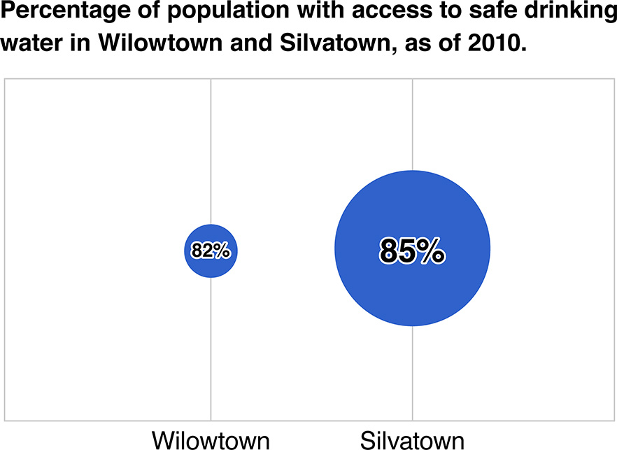
Manipulation of the facts or deception of the reader can be both intentional and unintentional. The data would be distorted which lead to misleading to audience. There are several ways to present misleading visualizations.

1.Truncated Axis.

2. Area as quantity.

The two graphs above allures the audience to feel that the difference in percentage is huge.

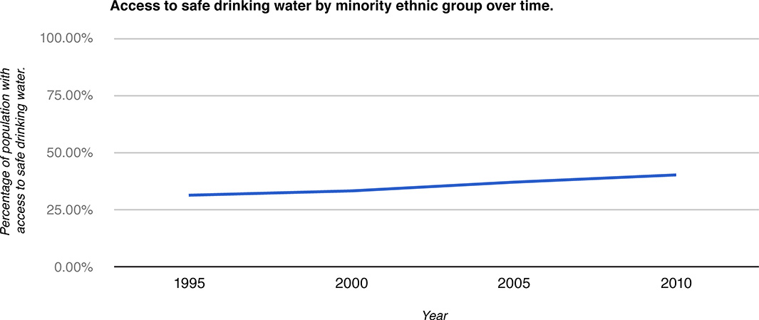
3. Aspect Ratio.

The aspect ratio of the chart has been distorted by stretching the X-axis, which mislead the audience to feel the change was not significant by the flattened line.

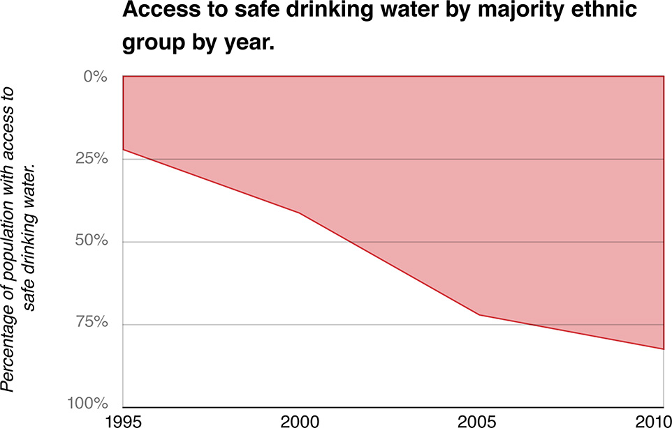
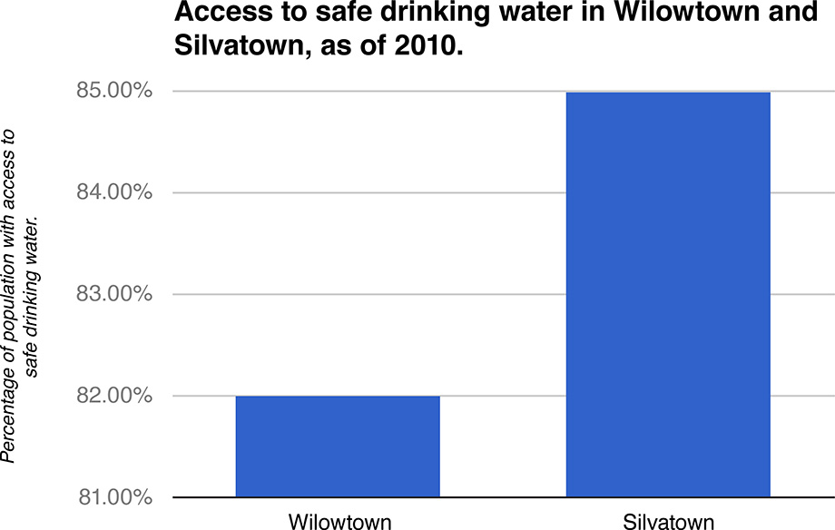
4. Inverted Axis

The Y-axis has been inverted, hence, creating an illusion that the access to safe drinking water has declined.

Countdown of Top 10 Reasons to Never Ever Use a Pie Chart

An Oracle blog listed 10 reasons that why we should get rid of using pie chart.

Number 10 – Pie Charts Just Don’t Work When Comparing Data

Number 9 – You Have A Better Option: The Sorted Horizontal Bar Chart

Number 8 – The Pie Chart is Always Round

Number 7 – Some Genius Will Make It 3D

Number 6 – Legends and Labels are Hard to Align and Read

Number 5 – Nobody Has Ever Made a Critical Decision Using a Pie Chart

Number 4 – It Doesn’t Scale Well to More Than 2 Items

Number 3 – A Pie Chart Causes Distortions and Errors

Number 2 – Everyone Else Uses Them: Debunking the “Urban Legend” of Pie Charts

Number 1 – Pie Charts Make You Look Stupid and Lazy

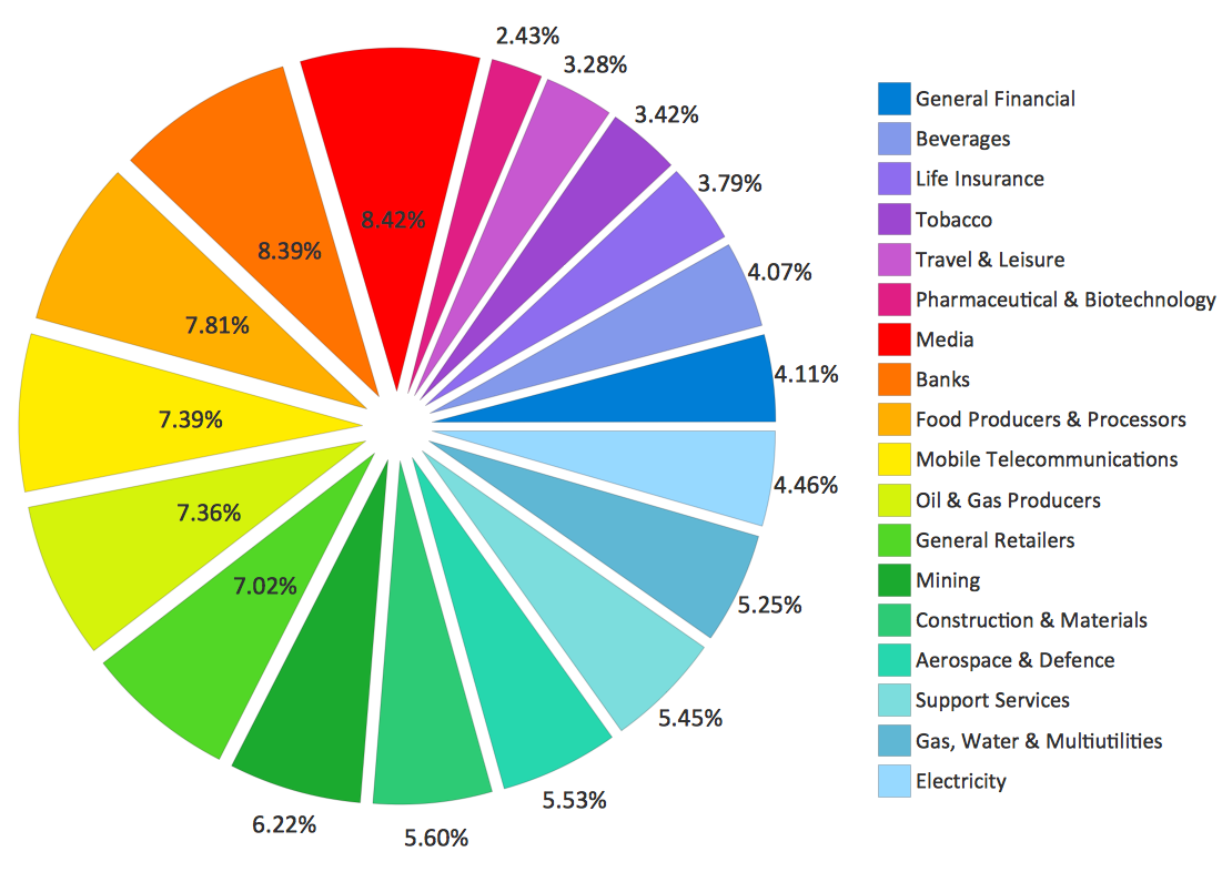
Here’s an example which shows how bad the pie chart in visualization. First, the pie chart did not display information in an elegant visual form with some numbers placed inside the pie while others placed outside. Second, it’s hard to catch the point of what the visualization wanted to express because we have to take time to check all the numbers and scan the legend to say that the biggest section is media and the smallest section is electricity. Also, people may be confused with the close colors as such as those light blues. Therefore, this is an inefficient visualization.

Reference: https://blogs.oracle.com/experience/entry/countdown_of_top_10_reasons_to_never_ever_use_a_pie_chart

Overview of Global Workforce

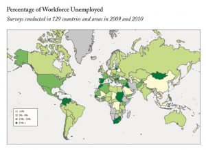
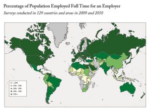
Gallup created three key indexes: Unemployment, Underemployment, and Employed Full Time for an Employer to measure the global workforce in terms of employment. The metrics are based on Gallup data collected since 2009 in 129 countries.  We can quickly get the idea by looking at the two graphs below.

1

2

In 2009 and 2010, Mongolia, Sudan, South Africa, Spain, Columbia, and Venezuela had high unemployment with a rate of more than 15%. China, Germany, Belarus and some African countries had unemployment rate as low as less than 5%.  When we looked at the percentage of population employed full time, we can read a different story. China had a low unemployment rate but only a small portion of these employed people were working in full-time basis. The percentage is even low in many Africa countries with not bad unemployment rate. On the contrary, in most western countries, the full-time rates are much high which indicated a more stable and secure work environment.

The two visualizations did a good job in telling the message of the global workforce in terms of employment by using the map distribution and color segmentation.

Public Healthcare Data Visualization

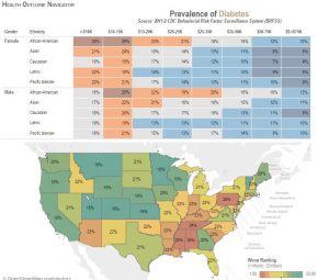
Nowadays data plays an important role in public healthcare management. To better understand what stories large volumes of data tell, we need accurate and clear data visualizations to uncover the actionable insights.  Below is an example of data visualization created by Ken Patton and Dr. Heather King, which analyzes health outcomes by prevalence across a number of demographic factors including geography, gender, age, and activity levels.
Diabetes

The cells displayed in different colors and percentages immediately convey the messages that African-Americans and people with annual income between 10-15k have higher prevalence of diabetes. The distribution map indicated that diabetes are more prevalent in Pennsylvania and Southern States. The appropriate use of colors enhanced the story telling. It is accepted that colors have meanings. The warm colors (i.e. red, orange) usually describe danger or worse situations while the cool colors (i.e. light blue) usually indicate safe or less worse situations.  So it’s a good design of data visualization as it’s easy to catch the points and very intuitive.

source: http://www.tableau.com/stories/workbook/tackle-government-data-public-health

reference: http://www.healthcareitnews.com/news/best-practices-healthcare-data-visualization