New York Times Does a Great Job on Data Visualizations and What We Can Learn From?

One of the secrets to why New York Times keeps its success is synthesized design processes. Below are the ten characteristics that they use to make its data visualization article powerful and successful.

  1. Clarity of context and purpose: New York Times establish the goal and clarify the audience’s need before design a visualization. It would ask:
    1. Does it interact with the audience and let them feel connected?
    2. Does it enhance a specific editorial perspective?
    3. Which format is the best to deliver the message?
  2. Respect for the reader: New York Times makes its subject accessible. It not only delivers clarity but also presents simplicity. Let the readers can get quick access. Moreover, New York Times would adjust immediacy based on the level of the subject. For example, it wants its audiences to put more effort and get rewarded with the insight derived as a result. It would increase complexity.

    NYT
    NYT
  1. Editorial Integration: combine the graph with the article. Let them coherent and support each other.
  2. Clarity of questions: the format of visualization effectively and perfectly aligned to the questions they are answering.
    NYT
    NYT


  3. Data research and preparation: it makes a lot of effort on cross departments research and development of programming libraries to get rich and deep data resources, and offer multi-dimension information.
  4. Visual restraint: deploy right color, catch reader’s attention, and let them recognize immediately.
    NYT
    NYT


  5. Layout and placement: whether it is full columns, double page spreads or dramatic diagonals, the Times ensures each graphic has the perfect stage to amplify the impact of the visual’s relationship with an article.
  6. Diversity of techniques: its interactive graph shows immense flexibility and versatility. No repeated representation and each piece is built attentively and informatively.

    NYT
    NYT
  7. Technical Execution: multiple formats of chart display.
  8. Annotation: well use of labels, description, and text explanation to help readers understand graph.
    NYT
    NYT

    Reference: http://www.scribblelive.com/blog/2012/04/02/10-things-you-can-learn-from-the-new-york-times-data-visualizations/

Data Visualization of Recession Reshaped the Economy

In 2009, great recession overwhelmed the United States’ economy. This data visualization clearly shows the performance (jobs number and salary number) of each industry in this ten years.

How the Recession Reshaped the Economy, in 255 Charts By JEREMY ASHKENAS and ALICIA PARLAPIANO Updated: JUNE 6, 2014

Visualization Link

The first visualization gives a big picture of the overall domestic performance and gives the overview of the performance of every industry in the United States. It uses color to categorize how industry performs and also gives the details information of ten years performance of each industry.

  1. The second visualization highlights the data from the low-paying job such as fast food and high-paying job such as consulting. It finds that both sectors are growing.
  2. The third visualization highlights medical industry and especial those in middle-wage industries.
  3. The fourth visualization displays Housing industry. It is seriously suffering until now.
  4. The fifth visualization shows the manufacturing industry. It compares each sector with another.
  5. The sixth visualization shows oil industry performance. Almost all of sectors in this industry grow dramatically.
  6. In this ten years, we also face digital revolution. The seventh visualization compares traditional media industry with IT industry.
  7. Last but not least, it shows the hottest and fast growing industries’ performance in the United States.

This Visualization did a great job at grouping the data, using color to classify the performance, and arranging, for example, it put poor performance industry at the lower part. Moreover, it tries to look at the same data from different angles and makes story interesting.

Reference: https://www.nytimes.com/interactive/2014/06/05/upshot/how-the-recession-reshaped-the-economy-in-255-charts.html?&_r=2&abt=0002&abg=0


Data Visualization transforms Organic Valley

Organic Valley is one of the nation’s leading organic farm cooperatives, which not only provides milk to wholesale such as Wholefoods, Trader Joe’s, and Costco but also produces milk related product. It faces several challenges.

  • Where do them put the milk?
  • What do they do with the excesses of milk?
  • How fresh is it?

Organic Valley applies SAP Lumira data visualization software to get insight of their business performance and unveil hidden areas of opportunity. The profits visualization tool brings are:

Figure 2: One of the recently released features of SAP Lumira is the ability to combine multiple visualizations into a
Figure 2: One of the recently released features of SAP Lumira is the ability to combine multiple visualizations into a “story board.”
  • Milk comes out of cow at 4% butterfat and skimming yields skim (1% and 2% milk). Most of the profit is in whipping cream, half and half, and butter. Organic Valley got the idea how to better use of their raw elements.
  • Define most profitable customers, satisfy their need, and prevent their purchase products shortage. Visualization reveals hidden data and gives them a big picture, which shows various dimensions and highlights the group of customers they want to reach.

Visualization tools give Organic Valley a new way of thinking. First, visualization tools facilitate communication. Veterinary farm experts and dairy supply experts can give an effective showcase to the senior leadership and help them executives make data-driven decision. Moreover, Organic Valley also applied BI visualization in its IT department to examine and allocate its spending such as telecommunications and digital data communications overtime.

Reference:

http://searchsap.techtarget.com/feature/Organic-Valley-milks-insights-with-SAP-data-visualization-tool

http://searchsap.techtarget.com/feature/Give-SAP-Lumira-data-visualization-software-a-good-look-says-expert


Executive Dashboards

What is executive dashboard? It is a visual representation that gives executives a quick and easy way to view their company’s performance in real-time.

Executive dashboard nowadays uses API (application programming interfaces) to connect with its existing system sources such as accounting software, CRM system, and email system. It can directly pull out those data and transform that information into visualization that can be viewed and manipulated in different ways based on the users’ need.

There are several benefits of executive dashboards:

  1. Visibility: a snap-shot for the audiences lets them get a clear picture of what’s going on.
  2. Ongoing Improvements: measure the performance and let the audience know what to improve it.
  3. Judge Performance Against Business Plan: show what’s company performs compared to business plan and the goals from the business plan versus actual real-time results.

There are two examples of executive dashboard:

Marketing Executive Dashboard

Salesforce
  • Let the directors and VPs know whether they are creating efficient campaigns and generating and converting leads.
  • Relevant information about leads and campaigns such as Campaigns by ROI and Top Marketing Channels by Campaign.
  • Set time smartly. There are quarter and month data. It can get the big picture and details.
  • There are tables supporting charts on the dashboard.

Sales Executive Dashboard

Salesforce
  • Let the audiences to know their organization going this month.
  • Set conditional highlighting to show the audience what perform above average or below average.
  • It uses headers and footers smartly. They efficiently support what charts and tables want to say.


Reference:

https://www.forbes.com/sites/davelavinsky/2013/09/06/executive-dashboards-what-they-are-why-every-business-needs-one/#7c83efd837d1

https://resources.docs.salesforce.com/206/latest/en-us/sfdc/pdf/salesforce_dashboard_samples.pdf


Identify True Factors That Lead To Success

Key Performance Indicator is a measurable value that demonstrates how effectively a company is achieving key business objectives. Companies use KPIs to evaluate their success at certain action. Well designed KPI dashboard provide greater structure and context to the organization, and let them know how performance of certain KPIs impacts other KPIs. However, identification of right KPIs for the business is challenged. There are three bias that may lead to ineffective KPIs:

  1. Overconfidence: people are so confident in their judgments that their abilities are in conflict with the reality. For example, the managers of a fast-food chain, found customer satisfaction highly relating to profitability and believed low employee turnover can keep customer satisfaction, but when they made effort lowering overall turnover rate it didn’t help. The truth is that turnover only is relevant with manager position.
  2. Availability: people assess the cause or probability of an event on the basis of similar examples coming to mind, follow certain pattern, and overestimate other important information.
  3. Status quo: most people would stay the course rather than face the risks that come with change. Executives would stay on existing metrics instead of changing to suitable ones.

How to avoid those bias: just like designing dashboard, First, define the objective. Second, develop cause and effect, and identify the drivers of objective. Third, identify the specific that the audience can do to achieve that objective. Last but not the lease, regularly reevaluate the statistics.


Reference:

https://www.smartsheet.com/all-about-kpi-dashboards

https://www.klipfolio.com/resources/articles/what-is-a-key-performance-indicator

https://hbr.org/2012/10/the-true-measures-of-success


Best Practices for Designing and Building Great Dashboards

Dashboard is used to provide relevant and timely information to its audience. It is not used to display designer’s artistic and technical capability. Therefore, keeping it simple and focus on the core message is the primary goal for the designer.

Avoid some visualization components that are not directly contributing to the message:

  1. Logos
  2. Navigation
  3. Non-essential Text: to minimum labeling and instructions.
  4. Too much color
  5. 3-Dimensional objects
  6. Horizontal or vertical guide line: when overuse, may detract attention from the data.
  7. Too much detail

Keep these practices in mind:

  1. Who are you trying to impress: the most effective dashboards target a specific group of audiences and present data specific to that use case.
  2. Select the right type of dashboard: what kind of information that audience want to take way from the dashboard.
  3. Group data logically: use space wisely. Because of western language, our eyes usually start from the top left-hand corner and move to the right. Hence, letting audiences discover something new at the top-left-hand corner.
  4. Make the data relevant to the audience

  1. Present the most important metric only: be clear, simple, and effective.
  2. Present up to date data

Keep dashboard simple and focus on the core message are primary goals. The dashboard below showing effectiveness and simplicity.

  • Simple color: users are not overwhelmed but understand at one glance.
  • Number and change: it summarizes important number to sales department and lets users know the details of the change.
  • Story: the graph on this dashboard deliver a clear story of US monthly sales. All the important KPI are included. This helps decision maker to develop strategy. Moreover, graphs are grouped logically. From left to right, it moves from big picture to details and each supports previous one. Although there is no description, it delivers a clear story.
  • Filter: although it is the details information less important putting on the right-hand side, it clearly shows the background of the story.


Reference:

https://www.geckoboard.com/blog/designing-and-building-dashboards-data-visualisations/#.WJ5VcBIrImo

https://www.geckoboard.com/blog/building-great-dashboards-6-golden-rules-to-successful-dashboard-design/#.WJ5UkhIrImo

https://public.tableau.com/en-us/s/blog/2013/10/dashboard-layout-and-design


Spurious Correlations

In statistics, spurious correlations is a mathematical relationship in which two or more events or variables are not casually related to each other, but it may be wrongly inferred they are, due to either coincidence or the absence of third reason.

It’s well known that correlation doesn’t imply causation. However, when lines, bars, and points have similar trend, we start to believe that one may be the cause and one may be the result.

There are several ways would cause spurious correlations:

  1. Axis scales: either x or y axis scale that measures different values can’t be paired in a single graph especially those showing similar curves.
  2. Change scales: although x and y axis measure same value, the scale of either event change and the proportion and range is different. The graphs below obvious show that in different range those two events highly relate to each other. However, in same range, those two events are irrelevant with each other.
  3. Ifs and thens implying cause and effect: comparing two unrelated data sets together may lead to a misunderstand of causation. We can use to different present skills to examine the causation:

If Pandora loses less money, then more music is copyrighted.

However, this graphs doesn’t show that correlation:

Reference: https://hbr.org/2015/06/beware-spurious-correlations

San Francisco Uber Commuters’ Route

Uber did an interesting study of San Francisco’s Commute flow. They raised a question: Where do people work and play?They created a map chart showing the probability that a ride stars in neighborhood and ends in another.

They created a map chart showing the probability that a ride stars in neighborhood and ends in another.

This map clearly explains the route that commuters travel from one neighborhood to another. Moreover, the size of circles represents the proportion of ride that goes from the source neighborhood to its target. Uber got a conclusion that almost all the action is going on between neighborhoods in a radius around downtown.

By viewing the data in alternative graph, we can see more details that what are the major neighborhoods people travel from and their target. Moreover, it changes what we conceive from same data.

This picture clearly presents:

  1. Individual connection. The route from a certain district to another. Although it can’t show the geographical position, it presents the clusters and central components of data.
  2. It effectively shows that the frequency of rides between two neighborhoods.
  3. Although San Francisco’s 35 districts show up simultaneously on a single map, it looks like they scatter in different areas. However, the circle shows that those districts united as a city.

Reference:

  1. https://newsroom.uber.com/us-california/uberdata-san-franciscomics/
  2. https://bost.ocks.org/mike/uberdata/


The Most Stunning Data Visualization of All Time

Redditor Andrew Elliott

This is a visualization that represents six months of a baby sleep and wakefulness. A father recorded his daughter’s sleeping habit during six months. Dark blue is asleep and yellow is awake. The spiral begins at the interior of the circle. It is her birth and then wraps outward as she gets older. Each circle represents one 24 hours a day. Top of circle means midnight and the bottom of circle means noon. There is chaos near the center of the circle. Baby tends to alternately wake and sleep during the day, night, and everything in between. Shortly thereafter, the upper right-hand side of the circle starts to sort themselves out and begins to show consistently dark blue. It means baby’s sleeping habit becomes like adult’s.

Screen Shot 2017-01-22 at 7.51.30 PM
Neuroscience Top to Bottom

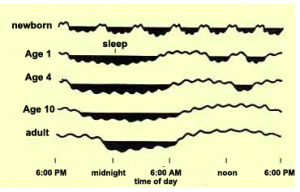
Moreover, the designer uses another visualization picture to support his record. Newborns alternate rapidly between sleep and wakefulness. As they get older, those sleep cycles begin to consolidate.

Both of these data visualization pictures effectively tell us that baby’s sleeping habit and the pattern they develop to adult’s sleeping habit

Reference: https://www.washingtonpost.com/news/wonk/wp/2017/01/05/what-its-like-to-sleep-like-a-baby-visualized-by-a-dad/?utm_term=.9afa48498bb2

The Traps When Creating Data Dashboard

Decision makers love dashboard because it offers them snapshots of operation processes, marketing metrics, and key performance indicators. Moreover, dashboard provides just-in-time information. Executives can make rapid adjustment. However, dashboard may mislead decision makers. There are three possible traps.

  1. The important trap: dashboard doesn’t have sufficient information providing to decision process. This may be caused by software default measurement or the consultant who establishes the analysis and does not understand that business. Therefore, when creating dashboard, designer should know the business well and make sure all the information on the dashboard is useful and critical. Dashboard should show the priority of business. It should align with business goal and business model.
  2. The context trap: it is caused by designer’s subjective judgement. Although all the elements on the dashboard are true, they build up an analysis with bias or without full consideration. Therefore, interpreter and user of the dashboard to ensure that the most relevant and useful metric is conveyed.
  3. The causality trap: it is caused by misattributed causality. Designers may present the grouping or data that doesn’t have causality.

To avoid these traps, in my opinion, knowing the business well, understanding the user, and getting other’s opinions may help to create useful, thoughtful, and effective dashboard.

Reference: https://hbr.org/2017/01/3-ways-data-dashboards-can-mislead-you