Time spent on the chart

This chart was published on the Economist in 2011 and talks about how people (in the age groups 15-64) from different countries spend the hours of their days. The author uses this to quantify and justify some ideas that we have about stereotypes at the national level. The author also uses a donut chart to show the constituent hours.


I started out by trying to understand what key points the author was trying to justify using the above chart.

Some key points that were very obvious were –

The french spend a good deal of time eating and sleeping; while the Japanese as a group are among the hardest working people spending on an average 9.8 hours in a day working on paid jobs and on the contrary spend the lowest number of hours in unpaid work (Understandable since the Japanese love automating jobs that are too mechanical, after all).


So after this, I went on to analyze the dashboard in terms of the key components:

  1. Is the visualization Truthful?

Based on the underlying OECD report (Data Source can be found here: http://www.oecd.org/std/47917288.pdf), the visualization is indeed truthful in what it depicts but, one point of concern might be that it may not be telling you the entire truth. The above report has a drill down by smaller age group buckets and is also dissected by gender. When we summarize this number over the entire population, it may not be entirely true. After all, sometimes summarization is only as good as sharing half the truth.

Also, when you look at the data, it gives you the data for all the 35 member countries. But, the author decided to only visualize 6 of them! Why?

2. Is the visualization Functional?

Yes, it is. It does a fair job of showing the trend even though a better representation might have been desirable.

3. Is it Beautiful ?

It is a clean and appropriate representation. But, it makes it a chore to look at the different nationalities based on a given color. Also, the colors being from a common palette and very identical makes it a bad choice since, identifying which color represents which component becomes a chore.

4. Is it Insightful?

While it does the basic job of depicting what it is meant to, it also shows us some new trends like -The Japanese people spent the greatest number of hours in grooming closely followed by the United States (This might also explain why the cosmetics and grooming industry is thriving in these two countries). So, I believe it is insightful.

However, showing this trend at a lower granularity and by gender would have made it more insightful.

Also since there are 35 countries under OECD,  a representation grouped by region or showing all the countries, might have been more desirable and could have also led to more insights.

5. Is it Enlightening ?

Looking at the visualization from an audience perspective, I believe the visualization just picks on data to prove a point and does not go far to call for action based on this.This is a major set back for this dashboard!


What could have been better?

Like I had said, it would have been better had the author decided to use a filled bar chart and showed the number of hours as percentages than as number of hours in a day and all of it summing to 1 or 100%. Also, showing the different activities as distinct colors would have done the trick of showing the contrast.

https://drive.google.com/open?id=0B0buBv_pWnS4NEkxQWJyYXpOYms


Visualizations that make you dumb!

Introduction:

This visualization- books that make you dumb  was featured on boston.com  in 2008- http://archive.boston.com/bostonglobe/ideas/brainiac/2008/01/books_that_make.html

The author obtains the average SAT scores from different universities and also pulls the top 10 books that the students at these universities recommend. For example, if your SAT scores are low, you are likely to get admitted to a mid-tier university where the fellow students around you are also following content that is not very intellectually compelling.

Using this, he tries to identify which books are read by students in the low SAT score bucket and otherwise. By doing this, the author takes an unconventional and interesting stab at tagging the books based on intellectual calibre rather than the converse approach where we tag intellectual calibre based on books(weird but interesting, yes!)

What is the authors claim?

To be able to understand the visualization better, it is imperative to understand the question the author is trying to answer.

So, I went on to define the objective dimension:

What does this visualization do ?

The visualization aims at using the average SAT score as a proxy measure to gauge the intellectual prowess and classify books based on how many intellectuals are reading it.

Who is it targeted at ?

The visualization was featured on boston.com and gawker and was possibly targeted at  the readers of these journals.

How does he do it?

He uses the average SAT scores from colleges and the top 10 books they recommend.


Analyzing the visualization from a subjective standpoint

So, for any visualization to be successful and serving well, we expect it to be –truthful, functional, beautiful, insightful & enlightening. 

Truthful-  So, there are a couple of things here –

                                Data + Assumptions–> Visualization 

Data – The visualizer pulls this data about average SAT scores and top 10 books recommended from all colleges on Facebook. So, he is typically looking at these books from an 17-18 year olds perspective.

The choice of books would have been very different if there were no age group restrictions. For example. Don Quixote is considered the greatest book of all time (based on – http://thegreatestbooks.org/) in the classic genre but, this book is practically not anywhere in the list. So, this list is heavily skewed in favor of the the preferences of 17- 18 year olds and is unlikely to convey any inputs to people from other age groups.

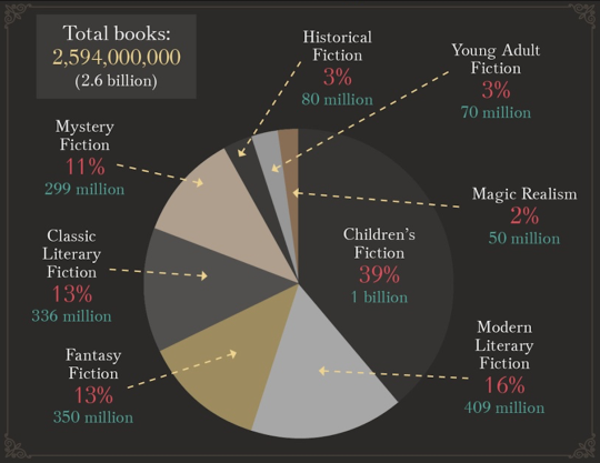
If it were to include to other genres, the distribution of genres would also be vey different with classics constituting only 13% of the total(Source: https://ebookfriendly.com/most-popular-book-genres-infographic/).

Also where did Shakespeare vanish ? He might be the most famous author of all time (Source: https://www.smashinglists.com/ten-most-famous-authors-of-all-time/2/). But, he definitely doesn’t seem to be on the list of many 17th year olds!

Another point of concern is that while SAT scores are descriptive of the whole population, the book recommendations are provided by a pool of ‘Active-On-Facebook’ students only.

Also, there seems to be a disconnect between the color coding on the graph and the genre in the underlying raw table. I wonder if some of the changes to the genre were made by the author. For eg. Lolita is classified as ‘Erotica’ in the above visualization while the underlying data classified it as a ‘Classic’.(Underlying data can be found here-

Assumptions– The author uses an assumption that the SAT score(not EQ  or IQ!) is a measure of intellectual capability.

Another assumption that he uses is that when people with high SAT scores(the smart & intellectual ones) read a book, it makes the book an intellectual one which I find quite questionable?!!

Functional-  I would expect a functional chart to convey something or answer a question.

So based on the authors analysis , if I were to understand which books are read by “intellectuals”, the top 2 that catch my eye are- hundred years of solitude and Lolita(really?!!)

Beautiful- The chart is very unwieldy and long with font sizes that do not appeal to my eyes.Also, the title- “books that make you dumb” is very misleading. It is just a catchy title and does not convey anything.

However, two commendable things are – the choice of colors(which is soothing) and the fact that the author has the books color coded by genre based on data from LibraryThing.com

Insightful- While the idea of relating books to intellectual ability is not new to the audience, how these play out with college freshers is! Their taste clearly is different from that of the broader group.

Enlightening- Calls for change? The above chart just describes the situation and does not include any call for action per se.


What would have made this visualization more rewarding ?

The analysis behind this visualization has a lot of depth and there is much that can be said. So, I decided to re-create this visualization using the same underlying data to specifically answer some questions that I had.

(I used Beautiful soup to fetch the data from the page and tableau for visualization)

What are the most common genres that students of this age group like and endorse?

https://drive.google.com/open?id=0B0buBv_pWnS4YUV2SG1SdWQyX2c

Which genres have the highest raw SAT  associated with them?

https://drive.google.com/open?id=0B0buBv_pWnS4WmpOZGgyYl95UTg

Which genre contributes the most to the top 100 books ranked by SAT score?

https://drive.google.com/open?id=0B0buBv_pWnS4bGFwR2hwN19hdTA

Last but not the least , which books are most endorsed by students ?

https://drive.google.com/open?id=0B0buBv_pWnS4TGl2ZmYwSEZNOUU

Looks like Harry Potter closely followed by The Bible make the top 2!

I strongly believe in the power of focussed dashboards and visualizations, aimed at answering questions than exploratory dashboards where the end-user is left to leverage his own imagination. After all, visualizations main goal is to help people understand what the data is telling them!

Last but not the least, I created a metric that is a mixture of the number of schools that endorse the book (popularity) and the SAT score( the proxy metric for intellectual ability) to recommend the top 10 books in the dashboard below with a call to action.

https://drive.google.com/open?id=0B0buBv_pWnS4d29vaWhXZHpyRkE


Uber and alcohol related crashes

Introduction

The above chart was featured on the Economist early this month. The above talks about the impact of Uber on the number of alcohol related crashes in New York City. The chart claims that it shows these numbers in contrast to other counties.


Some of the key takeaways from the above charts are that alcohol related crashes have reduced since the time Uber was introduced(indicated by the red line in the time line). The graph does a fine job of showing the drop in crash rates in all the counties except Staten Island.

However, the representation does not do full justice to the point that the author wants to convey. Some key questions that I would consider before creating a visual representation like this would be –

  1. What is the key point I am trying to convey?

The author wants to convey that something led to something. So, one of the key ways to prove this point in this case would be to show the negative correlation between the two parameters. There is no mention of an increase in Uber adoption leading to a drop in accidents from the time Uber was introduced. The other problem with the visualization is that it talks about the number of accidents and not specifically about the accidents related to drunken driving.

2. Is it possible that if I sliced this data across a different time duration, I might be able to prove otherwise?

While the drop in accidents is certain and definitive, there is also a visible hockey-stick like trend visible after 2012 in Brooklyn and Queens.So if I was to prove that the authors claim is wrong , all I will have to do is zoom in on 2012-2013 and show the increasing trend.

3. Why break by counties when you are talking about NYC as a whole?

The fact that the author has diced the geography by county creates a question about the consistency of this trend at the overall level. When rolled up at the overall level, it might be possible that this trend is not quite accurate.

4. Why 3 month moving average?

The metric of choice for representation in the graph above is the 3 month moving average. As we know, moving averages smoothen out any spikes in the trend. However despite the fact that it smoothens out values, there are spikes that are visible indicating high variance. So rather than visualizing the moving average, the author might have been able to make a strong case by simply visualizing the absolute number of accidents every year.


What could the author have done better?

To begin with, the author could have defined the metric more specifically around instances of alcohol induced  accidents rather than just simply accidents.   In addition to that, showing the negative correlation in Uber adoption versus the number of alcohol related accidents for starters(the scatter plot creates a stronger impression when we talk about correlated events despite the fact that correlation does not imply causation) would have gone a great deal further in explaining the point the author is trying to make . He could have also swapped the metric of choice-3 month moving average of number of crashes with the absolute number of crashes caused by drunken driving rolled up at the year level. Had he added these elements, I am sure he would have gone  a great deal further in convincing people about the claim he/she is trying to make.

The cost of healthy eating – A comparison

This is a graph from the New York Times in May 2009 that was published to substantiate a claim that healthy food options were growing more expensive while junk food options were growing cheaper. It uses change in price of items relative to overall inflation  as the measure to substantiate this claim.

http://www.nytimes.com/imagepages/2009/05/20/business/20leonhardt.graf01.ready.html

As we all know, the visualizations beauty is in the eyes of the consumer!

The following are some keen observations from the end-users/consumers perspective.

Who is the end user of this visualization and what is the intent?

The end user of this visualization is the reader of the newspaper to whom the author is trying to convey a trend that the food industry is moving towards. The author uses the consumer price index as a proxy for measuring the cost and compares it relative to the overall inflation. The author does a good job at conveying that healthy foods are growing expensive more rapidly (higher slope) than the unhealthy options that are growing expensive at a “less-rapid” pace. (smaller slope).

However, please do not let the visualization fool you into believing that beer is growing cheaper 😛 Even if beer rises at 0.85 times the inflation, its price is still increasing, not falling!

The snippet in the top also states that the cost of unhealthy food has fallen in the last few years and can be misleading.

How does he do it?

The author uses a trend line to show the upward movement in the cost of healthy options in food choices and downward movement of the unhealthy options used.

The authors choice of graph to describe the year over year growth is good. However, his choice of point of comparison -overall inflation in goods is a little hard to perceive unless the person takes the time to understand the metric.

What makes a good metric ?

Since the consumer of this information is anybody who reads the news, the metric would be easier to assimilate if it was simple and stupid. So rather than contrast the value in comparison to overall inflation, the author could have used the absolute increase in prices as the metric.

It is because of the same reason that there might be a tendency for the consumer to perceive the downward slope as a drop in price rather than a less steeper increase in price.

What could have been done better in the visualization?

Trend rather than plot the absolute values: Rather than show the trend line, the author could have focused on the overall trend that shows whether the cost is moving up or down. This would have conveyed the same meaning and would have been simpler to understand.

Consistency in what you are representing : Comparing fresh fruits and vegetables to specific items in the “unhealthy” list provides a good comparison but, its clearly not an apples-to-apples comparison. Ideally if you are comparing two objects, we need to make sure we are comparing identical objects. In this case the comparison is between a basket of objects(fresh vegetables) and a single object like butter etc.

Also, the fresh fruits option had a percentage while the remaining items did not contain the percentage making it inconsistent.

Choice of colors: The choice of colors goes a long way in creating certain associations in a persons mind. Colors like green and shades of yellow are usually associated with positive things while colors like bright shades of red are associated with caution and danger. The choice of colors that have been used in the graph is consistent with what the author tries to prove using his argument.

Conclusion:

While the graph does  a good job of proving the point, when we look closer it is not conclusive to prove that healthy foods are getting more expensive and unhealthy foods are getting cheaper. The author could have done a better job simply by opting for a simpler metric to report and comparing similar objects.