NBA Player Statistics

Link to the dashboard: http://mikerazar.com/chart-it/2015/01/14/nba-player-statistics-dashboard/

Background

The author uses three dashboards to compare NBA players based on their statistics including offensive metrics, defensive metrics and other metrics. According to his explanation, for all graphs, x-axis represents the player’s career seasons. Y-axis represents each NBA statistics, such as field goal percentage and points per game.

What I like:

This dashboard gives a clear vision of data by using line chart to show the differences between players. For example, in the free throw percentage dashboard of offensive metrics, we can clearly see that Kobe Bryant and Michael Jordan have the free throw shooting accuracy compared to LeBron James.

What I don’t like:

First, I think it’s not a good idea for the author to set the x-axis as the player’s career seasons. The author should think about what his audience is going to be, NBA teams or the public. The setup will be fine if the audience is the public. They will be able to who is the best player based on their lifetime value. But if the audience is NBA teams, it will be more valuable if the author can change the x-axis into regular season, such as Season 2014-2015 or Season 1997-1998. The reason for that is because the game intensity is different in the past and now. Kobe Bryant may face a more tough defender than Michael Jordan in the past. So the information will be very limited for team trading purpose.

Second, as I mentioned previously, the game intensity in each period is very different. Also, some players may focus on offense more and some players may focus on defense more. So it will be hard for the audience to compare the players based on some many charts. In order words, when the audience want to determine a top offensive player, which graph should he pick, points per game or assists per game? So a better way will be to give a total score to each player and come out a final graph. Namely, the author can set a coefficient value of each statistic based on its importance. For example, set a total offensive score for each player. It will let the audience make a pick easily.

Conclusion

This is a good dashboard, which represents its data clearly towards the audience. However, the author should think about more on who his audience is and what will be a more efficient way to present the data.

Reference:

http://mikerazar.com/chart-it/2015/01/14/nba-player-statistics-dashboard/

http://scholarship.claremont.edu/cgi/viewcontent.cgi?article=2302&context=cmc_theses

Education quality — Tuition vs Graduation Rate

Description:

This graph uses tuition vs graduation rate as a measurement to determine the education quality. In this graph, X-axis is the 6-year graduation rate and Y-axis is the tuition. Also, public institutions are represented as blue, private non-profit institutions are in green and private for profit institutions are in brown. The size of the bubble indicates the full-time-equivalent.

What I like:

The author did a good job on telling the audiences why he creates this graph. His research starts from a story that a student who has 3.9 GPA drops out of school because he thinks the tuition he paid won’t be paid back in the future. Therefore, his graph focused on tuition vs graduation rate. [1]

He also separated all the education institutions into three main kinds, which makes the analysis more accurate. Besides that, size of the bubble is very functional. This meets the requirement of aesthetics. It’s very easy for the audience to read the message directly from the graph. For example, the audience can easily figure out that the brown bubble on the left is the largest one. Also, most of the tuition of public school is below $10000, as well as, for the private non-profit institutions, the graduation rate has the positive relationship with tuition.

What I dislike:

The graph doesn’t meet the requirement of validation. The data of the graph is not accurate. According to the data from NCES, public institutions have the lowest graduation rate, which is below 30%. [2]

Also, the data showed in this graph is very subjective. There exist many other external factors, which will result in the difference in the final result. For example, some student many have double major. This will also increase the tuition and duration of graduation years. Moreover, the data focus on the 6-year graduation rate. However, some majors, such as medical science or , may require more than 6 years, and there majors may have a lower graduation rate with higher tuition.

Therefore, the author has a good approach to the question. However, the accuracy of the graph still needs to be concerned.

Reference:

[1] http://alfredessa.com/2014/01/measuring-education-quality-a-first-look-at-graduation-and-retention-rates/

[2] https://nces.ed.gov/programs/coe/indicator_ctr.asp

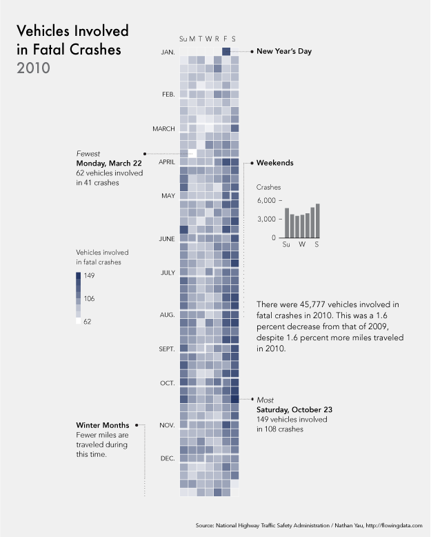
Blog 2 — Vehicles are in fatal crashes

This is a very cool graph, which is in the calendar view of the amount of car fatal crashes in 2010. On the left side of the graph, the rows indicate the month of the accident. The column indicates the actually date. Also, the difference between the shade tells how many vehicles are involved in fatal crashes.

The author doesn’t have a clear statement of his claim. I’m confused whether the author wants to claim that the vehicles involved in fatal crashes have the close relationship with data. For example, we can see from the graph that most vehicles involved in fatal crashes happen on weekends. Or he wants to claim that on the festival there will be more vehicles involved, such as New Year’s Day.

Also, although the author uses the validate data from the National Highway Traffic Safety Administration, the author still needs some other conditions besides date to convince the audience. These conditions could be weather, geography or unpredicted disasters. For instance, heavy snow in December may increase the amount of vehicle is involved in fatal crashes. However, in December, Boston will have the heavy snow, but California may not have the snow in that season. Therefore, the evidence of the graph can’t convince the audience very much.

Besides that, the author does a good job on showing the distribution of amount of vehicles involved. It’s very easy to see that the darker square has the largest number and the white square doesn’t have any vehicles involved.

Overall, this is a good visualisation. What I really like this graph about is that the calendar view is very creative and the idea is very new to the audience. The audience will be interested and easy to get the author’s idea. The author will be able to change the audience’s thought on viewing the amount of vehicles involved in fatal crashes based on date.

Reference:

http://www.coolinfographics.com/blog/2012/1/11/calendar-visualization-of-fatal-car-crashes.html

The 25 Top Causes of Car Accidents in the US

Blog 1 — Hits for the search term ‘Obesity’

I found this graph in the article could “Obesity: Are We Food Obsessed?”. The author wants to use this graph to prove a statement written by Professor Greg Whyte that, when facing with obesity, people are more focused on the diet rather than the physical activity, but they share equal importance.

This graph shows the search rate for the words related to obesity. It is very clean and simple, which gives the audience a direct view at the first glance. For example, we can easily see that diet has the highest rate. However, this graph is not so clearly, which will mislead the audiences.

First, there are two items on the top right – Pubmed and Google. I think these are the two search engines the author wants to focus on. But these two items have two different units, seconds and millions. In my view, million is the for the hit rate. What does seconds stand for confused me a lot.

Second, there are four colors in the graph. Two for Pubmed, two for Google. I’m also wondering, what’s the differences between two colors for the same item. It’s unclear. In other words, the author didn’t give enough information in explaining the meaning of colors.

Third, the title of this graph is missing some parts. The author uses ellipsis after the words ‘Obesity’, which will confuse the audience whether the author is focusing on anything else.

Overall, this is a good graph that clearly shows the results on hits for the search terms. It tells the audiences what the author is looking for, why he thinks in that way and how the results prove the statement. This graph also leads the audience to think in a different way that they focus more on the diet when losing the weight than doing the physical exercises, which might not be right.

Source : http://blogs.discovermagazine.com/neuroskeptic/2012/03/24/obesity-are-we-food-obsessed/#.WOwDslPys_W