How the Recession Reshaped the Economy

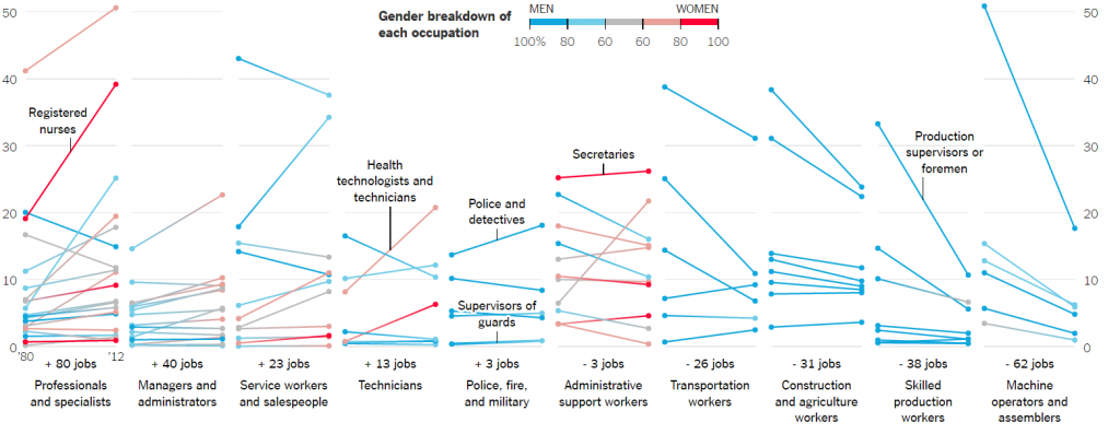
The chart in this visualization appropriately shows that, five years since the end of the Great Recession, how the American the economy has regained the total of nine million jobs it had lost during the economic recession. The major part of this economic recovery was that not all industries recovered the lost jobs equally. Each trend line below shows how the number of jobs changed for a particular industry over the past 10 years. The claim of this visualization is that how the recession reshaped the nation’s job market, industry by industry.

Overview of the visualization

  • The creator of this visualization has categorized the jobs as per industry.
  • The legend in the plot appropriately shows the consequences of the jobs for about a decade. It has covered a vast range of jobs that were recovered and grown, jobs that were recovered to jobs that were declined due to a recession.
  • The X-axis shows the change in wages by industry and the Y-axis shows the change in the number of jobs since recession by industry.
  • The line plots accurately do this explosion thing showing breakdowns and highlights in the data.
  • On scrolling down, we get to see charts showing the trend of the job market by industry. The creator has drilled down to show the underlying information in detail and each chart shows that whether particular jobs of an industry have recovered and grown or only recovered or declined etc. Each chart shows the number of current jobs and the average salary for that job. On hovering over the line chart we get to see a number of current jobs and average salary changing as per the time period.


Conclusion

The created visualization follows the following principle of the visualization

  • Overview first
  • Function First, Form Second

Charts like this is helpful to predict the next financial crisis and build programs for recovering economy.

Reference – https://www.nytimes.com/interactive/2014/06/05/upshot/how-the-recession-reshaped-the-economy-in-255-charts.html

The Rhythm of Food

Over the years Key food trends can be revealed via Google search. From the rise and fall of recipes over diets and drinks to cooking trends and regional cuisines.

The first visualization shows the top Google search volume for different things related to food i.e. Veganism, Moscow Mule, Fat-free etc.

Another best thing about this visualization is that it appropriately shows the collected weekly trend of a number of dishes and ingredients over the past 12 years. These searches were then plotted on a year clock.

The attractive thing about this visualization is that after plotting on a year clock we can investigate the seasons and rhythm of food around the world. It shows that when is the google search for dishes or ingredients at peak, a radius of the clock gives us the number of the google search, The volume of the google searches in particular months highlights the natural season of the food.

The best part is that the visualization has shown which food is at the peak in a month. It shows the natural season of the food including food and veggies.

Also, it shows the most common patterns across the year, i.e, which items fade in and fade out in a year, which food items are at peak during the holidays or special events.

It also shows that the seasonality varies across the world.


Reference – http://rhythm-of-food.net/

Image Reference – http://rhythm-of-food.net/

Valuable Sports Franchises

This visualization is about the Top 50 Most Valuable Sports Franchises. This visualization has a unique contribution in the sports space.

  • The visualization has taken into consideration the data sets of years competing and a number of championships which is the best thing about this visualization because the serious fans will be able to recite about their favorite team.
  • Another great thing about this visualization is that the creators have tried and distributed static visual content, but mixed in engaging formats that journalists are excited to share.
  • The brand value or the franchise value is shown as the circles having the size equal to the franchise value.
  • If anyone is interested in watching any sport, then the sort by sport functionality helps anyone to view franchise value for that particular sport.
  • The bottom axis highlights the number of years a franchise has been competing.
  • On hovering over the circle gives us the details about the franchise such as the name of the franchise, Forbes rank of that franchise, franchise value, number of championships won and number of years competing

This interactive visualization has gathered huge engagement numbers, sparked passionate conversation among fans around the world. Visualizations like this help any journalist teams to inspire stories across top-tier and targeted sports blogs.

Reference – https://www.columnfivemedia.com/work-items/interactive-most-valuable-sports-franchises

Image Reference – https://www.columnfivemedia.com/work-items/interactive-most-valuable-sports-franchises

Is it the Earth’s Orbit ???

bloomberg-climate-change

In our course, we have been taught to tell stories through our visualization, rather than simply showing the data. That is exactly what Bloomberg Business has achieved through their visualization. Bloomberg has come up with a story telling visualization to list down the various factors which might be the reasons behind global warming. Each screen of this visualization lists on of the many factors, starting from Earth’s orbit, sun, deforestation, to Greenhouse Gases; and shows the effect of temperature of all these factors over the years since 1880 to 2000. All the information is displayed in a very informative fashion with the help of line graphs and trends lines moving along the time line. Also, there is an explanation for each of the graphs mentioning why the developer has considered a particular factor as a reason for global warming. There are also graphs combining and comparing two or more of the above-mentioned factors with each other.

In my opinion, Bloomberg has done a great job in telling their story. The visualization is both interactive and informative. The developers have been able to establish a perfect balance between the two by creating attractive visualizations and also focusing on the main purpose of visualization, which is giving information.

Reference: https://www.bloomberg.com/graphics/2015-whats-warming-the-world/

The Changing Nature of the Middle – Class Jobs

jobs

The visualization is that about the changing nature of the types of jobs, the jobs that pay the salary between $40,000 – $80,000. The types of jobs that pay wages as stated above in 2014 dollars — have shifted since 1980 is the claim of this visualization. The visualization depicts that few job positions are male dominated production occupations while some of the job positions out in the market are female dominated. The x-axis of the visualization shows the number of increase or decrease in the jobs in various domains. The y- axis shows the percentage share of each occupation and the line plot shows different occupations which contributed to the increase or decrease in that domain.

  • One of the best parts of the visualization is that it clearly shows the gender breakdown of each occupation. The legend for the plot shows that the plot uses stepped colors to show the percentage of male or female dominance in a particular occupation. For example, the first section of the visualization shows that in professionals and specialists domain people can be dietitians and nutritionists; Librarians, archivists, and curators etc. and the color of the plot shows that whether that job is male or female dominated.
  • Another feature of this visualization is that it also depicts which occupations are the biggest gainers and losers by showing the occupations which have gained and lost share; the increase in jobs per 1,000 middle – class jobs; and also, the percentage change in their share.
  • The best feature of this visualization is that it shows which industries have the majority share in the jobs per 1,000 middle – class jobs and which sex dominates it.

Reference https://www.nytimes.com/interactive/2015/02/23/business/economy/the-changing-nature-of-middle-class-jobs.html

Gun Deaths in America

Gun Deaths in America is not a new phenomenon. These events are still prevalent in the American states. Many laws and policies have tried to reduce the number of gun killings but a majority of these attempts have failed this country. The project of Five Thirty Eight has explored multiple datasets collected by Centers for Disease Control and Prevention’s Multiple Cause of Death database, which is derived from death certificates from all 50 states and the District of Columbia and is widely considered the most comprehensive estimate of firearm deaths. This project has an interactive graph showcasing more than 33,000 annual deaths in the country.

The categories covered are as follows:

1) suicides among middle-aged men

2) homicides of young black man

3) accidental deaths

The visualization shows that the suicide rate is nearly 44 per 100,000, men in the middle-age category and geographical group have more than three times the risk of dying by suicide than the national average. For example, In Wyoming, approximately 80 percent of suicides are men; a quarter is men ages 45-64.

The visualization of the homicide category includes deaths by assault and shootings by police officers. The age group of the people in this category was in the range of 15-34. The visualizations also show the mass shootings and accidental killings by police officers during terrorist shootings. Each visualization gives us a rough idea about the ratio or number of killings in various states. Such visualizations are important to make people realize and bring the number down


Reference: https://fivethirtyeight.com/features/gun-deaths/

The Wizards’ shooting stars

In any game of basketball, shooting points ultimately boils down to taking and making shots. The Wizards have been known for their offense. Their average offensive rating is 103.0 points per 100 possessions which have put them in a three-way tie for 16th position in the 30-team NBA. The Wizards have had efficient shooters around the basket and from behind the three-point arc in the last season. The Wizard’s Shooting Stars dashboard has been designed to represent the performance of the team’s shooters. The dashboard has the list of all the Wizard’s players for last season with their best shots, their shooting range, performances in different shooting zones, shot distribution etc. The dashboard creator has used an appealing way to represent the shot trajectories for the shooters categorized as missed and made shots. Also, he has used a unique way of representing their shooting percentages based on varying distances and linked it to the actual figures of missed and made shots. The dashboard has a UI which is easy to understand for the users with an attractive view. Overall, this dashboard can be considered as a good example of well-designed visualization.


Reference – http://www.washingtonpost.com/wp-srv/special/sports/wizards-shooting-stars/

The Wizards' shooting stars
The Wizards’ shooting stars

The Changing American Diet

food

The Food Availability Data System helps the US Department of Agriculture to keep a track of the type and consumption of food on an average day for the past several decades. The data in this database reflects the amount of food available for human consumption in the United States and is the only source of time-series data on U.S. food availability in the country.

This system which they have built keeps a track of how much food is produced as well as the consumption of food starting from 1970 through. The major food categories include meat, veggies, and fruits. This database takes regularly consumed foods and aggregates them into approximately 800 core foods with similar raw agricultural commodities. Converting these regularly consumed foods into raw agricultural commodities allows for easier cross referencing with chemical residue databases.

The visualization which they have constructed is very helpful to keep a track of the food consumption in the US. The columns represent the food categories and each chart in the column highlight, in the timeline format, the food consumption. Items move up and down based on their ranking in each group during a given year.


Reference – http://flowingdata.com/2016/05/17/the-changing-american-diet/


The Movingness of Drought

droughtmovement

Drought has always been a hot topic of discussion in United States. Drought in United States is similar to the other parts of the world. If the precipitation level goes below the normal precipitation, then it leads to the phenomenon known as drought. Droughts are usually more dangerous and destroying in nature than tornadoes, cyclones, winter storms and flood all together combined. Drought is more destructive in nature because its effects doesn’t show up immediately but shows up gradually over a long period of time.

I am personally amazed by this visualization because it represents the effects of drought over a span of 5 years in a single static map. The map above has aggregated D1, D2, D3 and D4 . Following is the description of the effects caused by these drought levels

D1

  • Damage to crops, pastures
  • Request of restrictions for water use

D2

  • Crop or pastures losses likely
  • Water bodies start showing reduction in water levels
  • Water restrictions imposed

D3

  • Major crop losses
  • Widespread water restrictions

D4

  • Exceptional crop losses
  • Drying of water bodies
  • Water emergencies

Some places in USA are experiencing severe drought conditions and such visualizations can be really informative and useful to take serious actions to prevent drought

Reference:

Five Years of Drought

Tableau Desktop Dashboard

Tableau Desktop tool is an extremely popular and widely used tool for BI and is reviewed by BI professionals very highly overall. Tableau Desktop is really a successful tool because of its uniqueness or it is just popular because of its ease of use?  What are the pros and cons of such a widely used tool? How is Tableau Desktop better than its competitor tools, and where might it lag behind them?tableau

Pros :

  • Dashboards are easy to publish and share dashboards
  • Critical, time-sensitive ad-hoc reports can be generated within minutes
  • Dashboards can be automated
  • Root causes issues can be identified and resolved by using simple steps
  • Easy trending and other data cuts
  • Using Tableau operational expenses can be reduced.
  • Best part is data connectivity, tableau provides a wide range of sources to connect with data ranging from very basic method of storage of flat files to more advanced method of storage of online servers
  • Tableau’s data visualization suggests best practices for all kinds of data to users

Cons :

  • It is not possible to put multiple metrics on the secondary vertical axis.
  • Complex joins and formulas require custom SQL coding as metric calculations are SQL based.

References :

Tableau Desktop Tool