Pets Industry Analysis Bad and Good Examples

When I was doing my individual project, I did a lot of research on the pet’s industry. Surprisingly, I found out that pets are serious business.

As pets are playing a more important role in peoples’ lives, there has been a huge growth in the industry. It could be the reason that more people are devoting themselves on their careers than having children, or it could be the reason that a lot of people are waiting until later in life to have children even decided that they don’t want to have children at all. Pets are taking the place of children and their owners are generally referred to as “pet parents”.

Bob Vetere, American Pet Products Manufacturers Association COO and Managing Director said:

“The strong growth in the pet-care industry demonstrates what an important role pets are playing in the lives of Americans. They have become a part of the family. Spending across all sectors, from pet food and veterinarian care to toys and treats, reflects what lengths we are willing to go to for our pets. ”

I found some classic good & bad visualizations on the pets’ industry analysis.

The Bad:

I absolutely have no idea why they are using pie chart here.

1.Fail to choose the right chart. The idea of data is not representing the parts to whole relationship. It doesn’t even have the percentage ratio on the chart. And the representing parts don’t sum to a meaningful whole.

2. The labels are in different font. I assume that the smaller the portions are; the smaller font the labels will be. But it will make it even more difficult for people to read the small portions.

3. The high contrast color is burning your eye. The good part of these color is that it is very eye-catching, but it is too pop that it could be a bit distraction.

4.Unnecessary 3D effect. The 3D effect is gilding the lily, and could mislead readers sometimes.

The good:

This chart chose a much better presentation of the second “bad” pie chart.

  1. The bar chart is better to represent the comparison in between different portions.
  2. It not only has the labels for each tab, it also has a unique silhouette on each tab to represent a different animal. The presentation is not only effective, easy to understand, but also very elegant.
  3. Unlike the previous pie chart, the color selection of this chart is also with high contrast, but beautiful at the same time. It is eye-catching, but it won’t over power the information that the chart wants to present.

Better:

If I’m going to make some changes to the first pie chart, I would do it in this way.

https://drive.google.com/open?id=0BwmDkc-M_2qyT1paSW1PVXhnOUk

The good visualizations can be improved in the following ways as well:

  1. The number on the axis could be in the same font for easy reading.
  2. The “millions” on each tab could be deleted
  3. There could be a follow-up chart explaining that though there are more dog owned households, there are more freshwater fish, cats, horses, etc., per household. That means there is a hug market in pet purchase for these kind of pets.

Conclusion:

The pet market is strong and growing. Consumers are more willing to spend on pet pampering than ever before and this trend is set to continue. A good visualization will help audience to better get the KPI(claim) of the pet industry and make good judgement call(action).

Reference:

  1. Pet Franchise Industry Overview

http://www.franchisedirect.com/petfranchises/petfranchiseindustryoverview/18/286

  1. Pet businesses will prosper: Industry trends for 2014 and beyond

http://www.multibriefs.com/briefs/exclusive/pet_businesses_will_prosper.html#.WSUSD7zyub8

3.     Follow industry trends: Grow the most successful pet business
http://exclusive.multibriefs.com/content/follow-industry-trends-grow-the-most-successful-pet-business/pet-care

Function First, Form Follows

The Ice Bucket Challenge, sometimes called the ALS Ice Bucket Challenge, is an activity involving the dumping of a bucket of ice and water over a person’s head, either by another person or self-administered, to promote awareness of the disease amyotrophic lateral sclerosis and encourage donations to research.

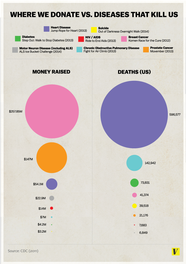
It went viral on social media during July–August 2014. The following visualization was trying to show how much money the ALS Ice Bucket Challenge has raised compared to how few die from the disease relative to other diseases.

There are 8 different diseases/causes considered, and each one is associated with a color. The sizes of the circles are proportional to the dollars raised for (on the left-hand side) and deaths caused by (on the right-hand side) the 8 diseases/causes. The graph looks pretty at first glance, but it suffers from the following problems:

What I like about it:

The colors are eye catching, and the bubbles are vivid.

What I don’t like about it:

  1. Similar to pie charts, it is visually difficult to see the relative difference among diseases in the same category (deaths or dollars); readers are left guessing the relative sizes of the circles.
  2. Because the dollars and deaths are not aligned by diseases, it forces the reader to look at one disease at a time; it is very difficult to spot a pattern between the 2 categories by diseases.
  3. There are too many colors. I find myself going back and forth to the legend. It shouldn’t be so hard for the readers. Moreover, the colors are in no particular order; not alphabetical, not by deaths, nor not by money raised. This is way too confusing.
  4. The font could be too small. The labels and number would be quite difficult to read from a distance.


Someone redid the graph, and came out with this dot chart above. It sure is easier to trace the relationship between the deaths and the money raised. But it still make it very difficult to illustrates the difference between the death tolls of diseases and the money raised to battle them.

In efficient visualization, we don’t need to present every detail information. On the contrary, we just need to point out our claim to the audience.

Re-creating the graph: 

The simple comparison line chart or bar chart will do a better job. Since we agreed in class that “function first, form follows”. This chart does a better job comparing the 2 categories by diseases than the bar charts with faceting. If we want to make sure that this chart is still functional for color blind people, we can minimize its color choices. “Get it right, Black & White.” I like how efficiently this minimalistic graph is able to convey the relevant information.

https://drive.google.com/file/d/0BwmDkc-M_2qyTjBESklxS2NuNnM/view?usp=sharing

(I uploaded the picture of the chart onto my google drive)

Conclusion:

In efficient visualization, a lot of times “less is more”. The first priority is find out the claim, and leave out the unnecessary information. ” Function first, form follows.”

References:

  1. Makeover Monday: Where We Donate vs. Diseases that Kill Us

    http://www.vizwiz.com/2014/09/donations-vs-deaths.html

  2. Redesign: Where We Donate vs. Diseases That Kill Us [OC]
  3. https://www.reddit.com/r/dataisbeautiful/comments/2er3zq/redesign_where_we_donate_vs_diseases_that_kill_us/

The Beauty of Roses

This week I watched an old movie about Florence Nightingale. It was a really great movie, and I was blew away by how great Florence Nightingale is. She is best known as the lady of the lamp, the founder of modern nursing who cared for thousands of soldiers in appalling conditions during the Crimean war.

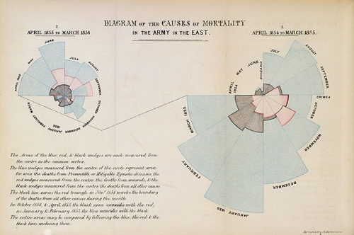
Later on, I found out that Florence Nightingale was also a superb statistician. In 1857, she created a revolutionary a controversial diagram, called rose diagram. It forced the British government to create better and cleaner hospitals.

This is the Nightingale Rose chart.

The charts illustrate from 1854-1856, the solder’s death in each month according to the cause of the death using different colored “rose petals”.

The message that the diagram delivered was potent and direct – hospitals can kill. It’s also fascinating that the diagram revealed that if the right improvement were made those mass deaths in the hospital could be avoided.

There are 4 benefits of Nightingale Rose chart : 1) The color is very eye catching, and the audience is willing to read more at the first sight 2) Each slice takes an equal sector of the circle, making labeling much cleaner; 3) Each slice still maintains an accurate area comparison with other slices (by making the radius of the slice equal to the square root of the value); and 4) Nightingale also put another contrasting rose chart to show that the death could be avoid with the right improvement.

Nightingale was the first to use a statistical graphic as a call to action. The diagram convinced the public that the epidemic disease could be controlled and that is the purpose of the graph. And force the British government to spend money on the sanitation.

This is exactly what we are trying to achieve in our data visualization class. The purpose of a diagram is trying to make a claim and creating value.

The Nightingale Rose chart illustrates that how powerful can a good visualization be. But it also occurred to me that the larger blue “rose petal”could be miss leading.  We cannot “cherry picking”on how we present the data. Representing raw data visually should reveal, not conceal.

Reference:

  1. Worth a thousand words

The Economist

https://www.pinterest.com/pin/128704501821544284/

  1. Did Nightingale’s ‘Rose Diagram’ save millions of lives?

http://www.florence-nightingale-avenging-angel.co.uk/?p=462

  1. Florence Nightingale — História da Enfermagem — O filme completo

https://www.youtube.com/watch?v=sYZnzt0CJtE

Just save the pies for desserts

The charts are there to help us to understand more about the data. But it’s so easy to design a bad visualization. In general, the point of charts is to make it easier to compare different sets of data. The more information a chart is able to convey without increasing complexity, the better.

The primary strength of a pie chart is the part-to-whole relationship, however, pie charts only make it easy to judge the magnitude of a slice when it is close to 0%, 25%, 50%, 75%, or 100%. Pie charts visual attributes is hard to compare.

Here’s a pie chart of the party breakdown of the European parliament:


Can we really compare the slices to figure out the distinctions in size between each and every pie slice? The only thing that is obvious to us is that the EPP and S&D are bigger than any other pieces. And the color of each individual slices are very similar, make it very hard for users to match the label to each slice.


Moreover, people love dressing up their pie charts today. Adding a third dimension of depth to the picture, throwing in some lighting effects and contoured edges. It’s pretty and eye-catching, but is it more meaningful or easier to interpret? Actually, by adding depth to the pie and changing its angle, we’ve made it more difficult to interpret. People do this all the time, and that’s because an angled 3D pie chart is an excellent way to lie to you.


Looking at this chart, S&D — the red party — appears to be roughly even with EPP, the teal party. It looks greater than it actually is, because of the depth that’s been added. The slices are now more difficult to compare, because the angle skews their appearance.

If we take out each individual slices, will that make it easier to compare each individual slice and figure out an ordering from largest to smallest? The reality is, humans aren’t very good at comparing slices of a circle when it comes to size.

Dashboard is to present information in a way that can be quickly read and easily understood. Bar charts makes it better to compare the magnitudes of each part.

Here is a bar charts of the same date. You can compare each and every party to each and every other party.  You’re just comparing the length of rectangles in order to understand what’s going on.

If a bar chart is doing its job, you shouldn’t have to struggle. Just save the pies for desserts.

Reference:

http://www.businessinsider.com/pie-charts-are-the-worst-2013-6

The Worst Chart In The World

https://www.perceptualedge.com/articles/visual…/save_the_pies_for_dessert.pdf

Save the Pies for Dessert