Retail Trends

Retail trends always keep on changing. With digital transformation taking charge in all the industries, retail is no exception. Retail trends during the holiday season especially, are interesting to study.

Following are some visualizations around these trends in retail during the holiday season. The Claim of all of them is that the sales rise high during the holiday season in retail. The Audience is different players in the retail sector.

Following is first of the set, which shows number breakup based on key holidays. This gives a good picture of how much is spent during different holidays.

https://drive.google.com/open?id=0Bzau8FgD0T1AUmRTLTQ1cFdEZXM

Things missing in this visualization:

Incomplete data: The year of the data is not mentioned in the source which leaves the data incomplete.

Unreadability: As many figures are mentioned in the pie chart along with multiple colors, it’s difficult to read the data.

Following is another way to look at the data where it shows the overall retail sales over the years and also shows the specific percentage of e-Commerce in the overall sales. This gives a good picture of the total sales trend in retail with a focus on eCommerce.

https://drive.google.com/open?id=0Bzau8FgD0T1AQnBRUmJta2FZTWM

Context: One thing missing in the above data is, it doesn’t mention if its US specific data or any other countries are involved as well, that would help put these values in context.

Following is another such visualization in the same category. This  demonstrates the sales during holiday time along with the YOY % increase over time. However this focuses on the Online sales. The warrant in this case is Forrester which makes it more genuine.

https://drive.google.com/open?id=0Bzau8FgD0T1AM0RnNWxqZEs0OXM

Things that could be done better:

I feel if all the above data points are put together if would give a good picture of the retail sales trend.

  • First chart should be the ‘overall retail sale’ showing YOY % increase.
  • Then, a deep dive into the ‘e-commerce’ specific sale per holiday to show YOY change against the overall sale by holiday.
  • And finally the chart which shows absolute number of sale for retail by holiday season over years, as a bar chart.

References:

Silicon Alley Insider Chart of the day

https://images.search.yahoo.com/images/view;_ylt=AwrTcYR9jR5ZTV8APKwunIlQ;_ylu=X3oDMTIyZmFoZWxnBHNlYwNzcgRzbGsDaW1nBG9pZAMyNGQ5M2IzYjRkZGFhOGEzNzhhM2FhNmIyMWRlYjYwNgRncG9zAzYEaXQDYmluZw–?.origin=&back=https%3A%2F%2Fimages.search.yahoo.com%2Fyhs%2Fsearch%3Fp%3Dholiday%2Bsales%2Bgraphs%26n%3D60%26ei%3DUTF-8%26fr%3Dyhs-mozilla-002%26fr2%3Dsb-top-images.search.yahoo.com%26hsimp%3Dyhs-002%26hspart%3Dmozilla%26tab%3Dorganic%26ri%3D6&w=610&h=404&imgurl=s-media-cache-ak0.pinimg.com%2F736x%2F80%2Fbb%2F65%2F80bb6502df47c107be613ce4f9605017.jpg&rurl=https%3A%2F%2Fwww.pinterest.com%2Fliberteks%2F2017-smb-success-trends%2F&size=18.0KB&name=Retail+%3Cb%3EHoliday%3C%2Fb%3E+%3Cb%3ESales%3C%2Fb%3E%2C+Explained+in+5+%3Cb%3EGraphs%3C%2Fb%3E&p=holiday+sales+graphs&oid=24d93b3b4ddaa8a378a3aa6b21deb606&fr2=sb-top-images.search.yahoo.com&fr=yhs-mozilla-002&tt=Retail+%3Cb%3EHoliday%3C%2Fb%3E+%3Cb%3ESales%3C%2Fb%3E%2C+Explained+in+5+%3Cb%3EGraphs%3C%2Fb%3E&b=0&ni=144&no=6&ts=&tab=organic&sigr=11saqpief&sigb=15j33p5de&sigi=12f22raio&sigt=120clcnqq&sign=120clcnqq&.crumb=nVfANCsALA/&fr=yhs-mozilla-002&fr2=sb-top-images.search.yahoo.com&hsimp=yhs-002&hspart=mozilla

CBRE 2016 Holiday Sales Chart


DDOS Attacks in UK

Denial of service attack (DDOS) attacks are a kind of cyber-attacks. Customers in Industries like Finance, Insurance, Retail are often a target of such DDOS attacks. A machine or a network resource in such attacks is made unavailable for the user. Cyber security companies offer solutions to counter such attacks. This dashboard talks about how DDOS attacks affected UK in 2012

What I like about this visualization

  • I believe the claim of the visualization is pretty clear, where the type of businesses affected, the attacks penetration, and current weak offerings are shown. This intuitively points towards need of a better solution.
  • Audience for this dashboard I believe are institutions in UK in areas like finance, insurance, retail etc. If presented to such audience, a fairly right message comes across from the visualization. The subtle next steps suggested with the visualization would make the audience aware of the situation of DDOS attacks in UK market in general and prompt them to go back and access risks in their network.

Things I don’t like about the visualization and Improvements

  • Facts (Actual Numbers) are Incomplete : On closer look, one of the flaws in this visualization is that it talks about percentages but does not give idea about how many institutions or individuals were interviewed/reviewed for this analysis. For example: It says 1 in 5 organizations experience DDOS attacks.

How can it look better – If the base number (number of people/institutions interviewed) for this statistic is mentioned then it gives a better picture of severity.

  • Flow and Story from the Data: Though the data depicted is relevant, the flow of data could have been show better.

How can it look better

How Many organizations were attacked? This should just give out numbers instead of the pie charts. There is no need of pie charts to show how many organizations were attacked. The big reveal using numbers would intrigue users to dig further.

Which industries stand to lose? Instead of pie charts, having a  bar chart giving out absolute numbers (number of individuals/ companies) instead of percentages would give a clear picture on numbers. Having this graph would bring out comparison between the telecom and Finance industry numbers and give a quick and clear picture of how much Value and how many people stand to lose in these industries

  • Need of Multiple data sources – Additional graph shown below could be combined with the existing information to give a more complete picture money lost in different industries.

(Found below visualization with gives insights into the UK DDOS attacks in UK for year 2012 for different industries)

Based on the above points, a revised version of this graph is seen here – https://drive.google.com/a/scu.edu/file/d/0Bzau8FgD0T1Aa0xhSVJvUDdZR3M/view?usp=sharing

** Absolute numbers in the above chart are assumed since those numbers are unavailable.


Sources:

http://i1-news.softpedia-static.com/images/news2/22-of-UK-Businesses-Hit-by-DDOS-Attacks-in-2012-Study-Shows-2.png?1373988801

https://www.neustar.biz/enterprise/img/resource-center/assets/uk-ddos-2012-003.png


Email Security

Cyber security is the buzzword today. Institutions are getting more and more cautious about how should they secure their applications. The above dashboard comes from a company which provides malware protection.

A dashboard according to me is supposed to convey critical information that’s important for the intended audience. There are few things that are good about this visualization and few things can be done better. Following is my take on this visualization.

Things I like about this:

  • One of the graphs above shows an array of threat vectors which gives good first level view of the kind of threats they saw on the accessed network.
  • The source countries are depicted from high to low flow in the form of a bubble chart with country’s flag which quickly helps identify these countries and the scale of the attacks coming in.
  • Both the above factors (Threat Vectors in first case and attack flow from different countries in second case) show comparisons between different elements.

There are few things which could be done better in this visualization

  • A good dashboard should demonstrate a story, by combining and linking different data elements. In this case, this dashboard just gives out lot of information and the reader on its own has to make interpretation of the data.
  • Information that 58 Un-reviewed, 9- Discovered and 25 Quarantined gives the first level information and then the user would expect more details on total number of threats detected/Total events seen and the associated breakup. But the following graph just mentions 220 threats in last 7 days and the graph associated  does not intuitively give out any information or breakup of that initial level information. If this is done, it would link the two elements as Total Threats Vs breakup on threats detected on each day.
  • The next two graphs on severity and threat type depict incomplete information. The threat type graph just gives types of threats and depicts ‘no numbers’ for each type Vs the total number of threats detected to get an overall picture. The graph on severity gives out severity numbers but the components on X axis for which this severity is depicted are completely unknown. Additionally, as there is no known benchmark to compare these values against, this graph doesn’t help take any actions.
  • Overall, this dashboard lacks a drill down of information and more explanation on each of the element mentioned.

With current information available, a better way to demonstrate this visualization could be,

https://drive.google.com/open?id=0Bzau8FgD0T1AVHRSalNXY0x2V2M

Threats severity graph with details on severity numbers and names of components against which severity is marked would give detailed insight to the audience.

Overall the above dashboard links the elements better, compared to the original dashboard.

Note: ‘Threat Type’ numbers and ‘Total Threat’ break up numbers are dummy numbers assumed just to demonstrate in the visualization above.

Reference: https://blog.threattrack.com/cso/wp-content/uploads/2014/03/ThreatSecure-Dashboard-Threat-Landscape.jpg

Sleep Habits of Geniuses

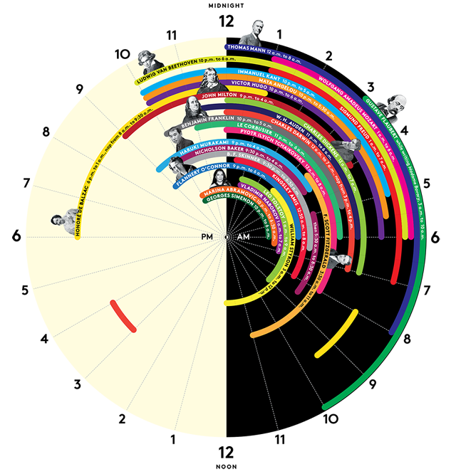
Usually any visualization or an infographic is created with intent to give the audience a one-shot view of the subject matter, then the content associated with it elaborates the first level view. However, some charts fail to communicate the information effectively. The chart considered for this blog is an example of such infographic.

The above chart depicts ‘sleep schedules’ of geniuses. In terms of my comments, I would start with things I like about this graph, then things I didn’t like as much and ways to improve it.

Some of the things I like about this visualization are:

  • The color distinction of black and white for the AM and PM times is very apt, that way audience can quickly notice the change in time.
  • The round shape resembles shape of the ‘clock’, this shape helps quickly visually associate the numbers with hours.
  • This visualization is insightful, gives out new set of information and combines it in one visualization

Things I disliked about this visualization are:

  • I would say this visualization is not aesthetically pleasing. Though the color selection of hours is good, the schedules shown have many colors and in some cases, the same color is used to depict schedules of two different people which creates some confusion. For example, one may think that there might be some link between those names.
  • This visualization can’t be termed as Functional, it contains a lot of information but it’s not conveyed effectively. Additionally, this visualization does not intuitively show any comparison between sleep habits of these people and doesn’t help readers infer anything.
  • For few people, faces are attached the information while few people just have names written which creates some visual inconsistency.

Better Way of Representation:

I believe, a better way of representation could be the one where differentiation or variation in the sleep times is immediately visible. A timeline chart/ Gantt chart may be a right choice here. (currently, as there is a lot of information reading the various rings is very difficult). Alternatively, in a timeline or a Gantt chart, Every column  would be associated with an hour in a day and every line item would correspond to an entry of sleep schedule of a person in hours. Every line item would also show Name of the person on the side. This way a clear association between the name and hours will be established and this chart would intuitively bring out comparison in sleep habits of different people .


Reference: http://junkcharts.typepad.com/.a/6a00d8341e992c53ef01a3fd25a481970b-pi