Charity done wrong?


Below visualization is part of an article named –The truth about the Ice Bucket Challenge: Viral memes shouldn’t dictate our charitable giving. This article talks about the rationality of the choices people make while donating money for healthcare. It suggests that these choices are often driven to donate for a disease that has affected a loved one, as opposed to the diseases which have impacted more people or have the minimum funding from government and healthcare companies. Other times, these decisions are not even based on ethical or emotional values, but on the celebrity involvement, for ex- ALS Ice Bucket Challenge.

To support these very facts, below visualization was used. It talks about major causes of deaths and money raised for each of them, which (when you analyze the picture for good 10 minutes) shows that the charity choices are going really wrong and are not being done for the right causes.

There is absolutely nothing working for this visualization which can make it a worthy of such a strong claim i.e. “the donations are not going for causes which need the most urgent attention”.

Problems with the picture:

  1. Color Palette: It take a while to realize that each color indicates a cause, and to make it worse, there are 3 colors (breast cancer, HIV/AIDS and motor neuron disease (including ALS) which belong to same family, making it difficult to differentiate, and impossible for the color blind.
  2. Alignment: First look at the picture, a person, heuristically, would expect deaths and donation for every cause to be aligned together. In other words, first circle would should death and donations of the first cause and so on. Once your realize that’s not the case,it is practically matching the columns like. Understanding the pattern at once is almost impossible.
  3. Circular representation: The circles do not help in understanding the amounts, this is just a poor choice of pictorial representation, when it could have been easily shown by a line or bar graph.
  4. Legend:  If the graph choice was correct, the labels would have been enough making the legend redundant. Correct label and graph would make it really easy to display the point it is supposed to make.
  5. Data problems: It is the legend that makes you realize that the sub-text is actually the organization against which the donations are being done. This means that we are not even talking about the entire donation made for the cause in the country but still comparing it with the over all deaths.

Re-Designed Graph.

Source

US Recession Rebound Faster Than Other Advanced Economies.

There was a time when I wanted to use pie charts for everything. They looked great and they showed data with great clarity. But now if you google “pie charts are the best” , the first article that pops up is titled – “Pie Charts Are the Worst” and the search result went to the extent of calling them ‘Evil’! This is when I realized that I used pie charts only for percentages with not more than 3-4 pieces in one chart, and this was 10 years ago.

Below visualization is part of an article which talks about the employment growth of G-7 countries after the great recession. The two pie charts were originally part of a report released by the Council of Economic Advisers under the Obama Administration, to support that fact that the United states created more employment than all the other of G-7 combined since 2010. In other words, the rebound of the US economy was much faster than other advanced economies.

At first I really liked this visualization. The things which are working well are:

  • The visualization is quite crisp. It clearly states that the chart on the left shows share of total employment for each of G-7 countries, and the right one shows the net employment growth. One can confidently claim that the charts talk about the 7 countries and comparatively the US is doing much better than others, which is the essence of the article.
  • There is a clear mention of what time range is considered for the data used, validating the fact that the time after the recession of the late 2000’s is in consideration.
  • The sequence of countries are same in both charts with names labelled. This makes it visually easier for the user to compare each country for its total and new employment growth
  • A note is pro-actively added about rounding explaining that components may not sum to totals.
  • Source citation is also one of the best practices which is not followed much but in this case it is clearly stated.
  • There is no data overflow.

But going back to what I started with, pie chart is a great visualization technique when there is a need to show how a whole picture of is segmented  (into few parts). The data sets for which pie charts are really helpful are the ones:

  • which can be condensed to exact percentages.
  • which do not break into more than 3-4 pieces.

Keeping this in mind, the things which could be improved in the above charts are:

Titles and Labels:

  • One needs to read the whole article to realize that the claim of the visualization validates the title.  The visualization lacks a more suggestive title.
  • The time range is same for both the charts but still mentioned thrice (redundant). The space could have been used for the title.
  • The sub-title has “percent” mentioned to show that the numbers are in-fact percentages, “%” sign next to the number would have served the same purpose and would have made easily readable along with saving the space.
  • When pie charts have more than 3-4 pieces it becomes really difficult to tally the slices with the legend to identify which slice represents what. Therefore labeling is done for every piece (Country name and percentage in this case).The is of course across the entire chart (given it is circular) making it look messier.

Data Layout:

  • Although countries have the same sequence in both charts, ordering them in ascending percentages would have been a better choice.
  • The choice of slice colors could have been more pleasant, right now it looks too stark.

If I had to make this visualization, it would look like this .

Learning from the class:

  • A visualization needs a clear context and claim to make it more independent. This helps user get the crux of the subject without actually reading the article created around it.
  • Judicious choice of graph/chart is critical in terms of user friendliness and aesthetics. In this case a bar graph serves a better purpose than a pie chart:
    • Comparisons become much easier.
    • Data is not cluttered all across the visualization.
    • Lesser labeling is needed.

Reference:

Business Insider Article: http://www.businessinsider.com/us-economy-added-jobs-faster-than-all-g7-economies-combined-2017-1

Report: https://obamawhitehouse.archives.gov/blog/2017/01/06/eight-years-labor-market-progress-and-employment-situation-december

Opinions about Pie chart and alternatives: https://www.quora.com/How-and-why-are-pie-charts-considered-evil-by-data-visualization-experts

Beer Belly of the USA!

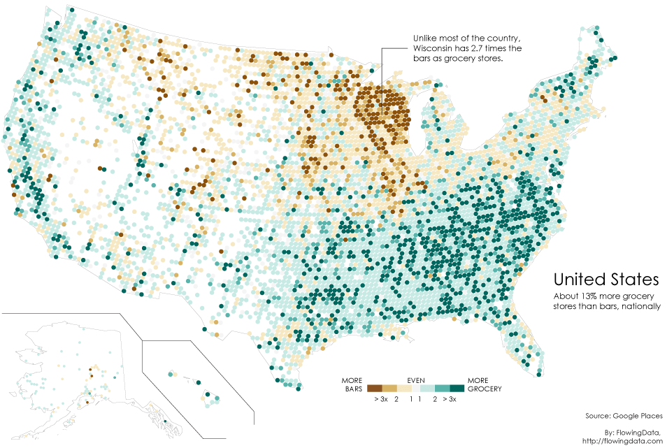
The visualization below is part of an article-cum-experiment – “Where Bars Outnumber Grocery Stores” authored by NATHAN YAU posted to a site – Data Underload.

DESCRIPTION:

Author built this map to verify a claim made in an older article claiming the central-western region of the country can be called the “beer belly of the country” since the bars outnumber the grocery stores in and around that area.

This map is made with a help of a two-category (number of bars and number of grocery stores) map picked up from the Google Places API. The nice thing about the Google Places API is that businesses are categorized and searchable. Pulling the count of bars or grocery stores in each area of the country is particularly easier. To build this visualization, for every 20 miles, the author searched within a 10-mile radius for bars and grocery stores and got the ratios.

Basically, the more bars, the darker the brown and the more grocery stores, the darker the green. And as per the older claim, it can really be seen that high bar concentration in Wisconsin, whereas the rest of the country has significantly more grocery stores.

Positives:

The need for the visualization is clear – to find out where in the country bars are outnumbering the grocery stores and verify that central-western region of the country is really the “beer belly of the country”.

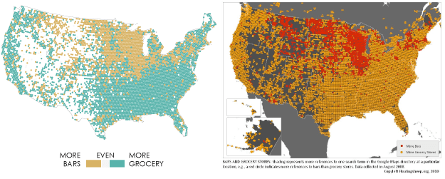
Data picked is accurate since it checks out when compared to that of the older article which made the initial claim. (comparison below)

The calculation done for pulling out ratio is also quite clear and sensible. The factors considered are very precise while plotting in the map giving it a great clarity.

Negatives:

Although the need for the visualization is clear, the interpretation of the visualization will change with the audience. The conclusion can vary from – “people in the state with more bars must drink a lot” to “people just prefer bars over restaurants” to “bars serve food too” or “people in states with lesser bars just drink at home”. Theses variations arise because of insufficient factors being taken into consideration for this analysis.

First off, the definition of “beer belly” is place where alcohol consumption is maximum, but there is no consideration of that in data collected. There are so many factors which ideally should be taken into consideration to call a place the beer belly, like:

  • Alcohol production vs consumption
  • Pubs (only liquor) vs Restro-bars (serves food too)
  • Profits and growth of bars

The data considered is not enough to justify this claim. The accuracy of the data can also be questioned since we are completely depending on one data source – Google places API. Government records (considered of the highest accuracy) might not necessarily tally with these.

In conclusion, I think the visualization is not the problem, the process of getting to that map is. Data does not do justice to the needs.

Sources:

Article: http://flowingdata.com/2014/05/29/bars-versus-grocery-stores-around-the-world/

Author: http://flowingdata.com/about-nathan

Site: http://flowingdata.com/category/projects/data-underload/


Blog Post 1: Paid Paternity Leaves across countries.

Source

Description:

This visualization was part of a Forbes article- Why Paternity Leave Is Just For The Rich. It is relatively a simple visualization which attempts to show the number of paid paternity leaves across different countries with USA being in center. And noticeably, there are no paid leaves granted to new fathers in the US.

It can be called variant of a pie chart with slice sizes being indicative of the number of leaves; more the leave duration, bigger is the slice size.

Critique:

Things going well:

  • Clarity: With country names and leave duration clearly mentioned, the visualization is quite clear in conveying the information it intends to.

Things not going too well:

  • Consistency: It misses out on consistency with respect to following aspects:
    • Leave duration: Some leave duration are in months, some in weeks and the rest in days.
    • Country representation: The purpose of putting US in the center of the graph and all other countries around it is unclear. Does it mean that the US provide no paid paternity leaves?
    • Color scheme: It could have been per country instead of duration. UK, Denmark, Australia, Venezuela, and Kenya seem like part of one country.
  • Completeness: There is no mention as to why only these specific countries are present, this makes the information seem incomplete.

Redesign:

https://docs.google.com/a/scu.edu/document/d/1z8GG1ZDTENt-xmmc2cfFNu2yZydmGPUBCBSic7LeqSM/edit?usp=sharing