CORE PRINCIPLES OF DATA VISUALIZATION

In a beautiful and apt analogy, Stephen Few, the Principal of Perceptual Edge encapsulates the purpose of data visualizations – Visualisations are just tools. Just as tools made it easier to build houses, visualization make it easier to portray complicated data. The purpose of visualizing data is served if and when it takes the burden of effort off the brain and puts it on the eyes. In order to accomplish that, he recommends a few core principles:

SIMPLIFY – Perhaps the most important of all, simplification of complicated data should be the first purpose of any data visualization. Choosing the apt type of representation and adding only the most essential/important of data helps in simplifying the complicated data. Care should be exerted to make sure that this does not come at the cost of oversimplifying and omission of important data.

COMPARISON – When using data visualization techniques to compare and contrast two sets of data, it is essential to juxtapose them to offer an easier comparison. Human brain finds it difficult to keep the comparison data in memory and it is cumbersome to have to turn back every other second for comparison.

ATTEND – Visualisation of data should be done in such a way that the audience process the most important data at the first glance itself. Highlighting the important part of the data or using tools and techniques to emphasize the principal parts would serve this purpose admirably.

EXPLORE – A good data visualization should enable the viewer to gather the data it was meant to portray just by looking at it. It should also be flexible enough to allow a directed or exploratory analysis with ease. A good visualization tool must be designed keeping this in mind as well.

DIVERSITY – A data visualization may have different facets to the data it is representing. Different views of the same data may provide different insights. The quality and efficiency of data visualization increase if it allows for the same data to be analyzed from different perspectives and to see the relation between them.

THE WHYs OF DATA – In addition to showing the data, an ideal data visualization should also encourage the viewer to find an answer to the reason/cause behind the distribution of data.

SOLUTION TO POSSIBLE QUESTIONS – Most of the time, viewers take in the data given in the visualization without any question. But a good data visualization should be designed in such a way that it would be able to answer any potential questions. This could be achieved by incorporating more filters and/or software.

In Stephen Few’s words, the best software is the one which you don’t realize that you are using. By putting these basic principles in practice, anyone can design such an efficient data visualization tool.

 

CARDINAL RULES OF DATA VISUALISATION

The main purpose of visualization is to represent the data in such a way that it becomes easy for the viewers to focus on the important details. This allows for a fair amount of flexibility on deciding the type of data representation. Different situations call for different designs, but there are certain cardinal rules that shouldn’t be broken lest it leads to confusion and misunderstanding. A few important ones are:

Baseline should be zero for bar charts

The data represented in bar charts are always correlated to the length of the bars. Hence, it is imperative that the baseline always starts at zero.

1

The picture above depicts the type of error that would creep in when the baseline is changed from zero. It is seen that the first bar is progressively shortening while the second one, though shortening, looks comparatively tall, giving a false representation.

Over-segmenting pie/donut charts

The general consensus is that the use of pie charts for data representation should be minimized. While that is a discussion for another day, pie charts, if not done properly face a lot of restrictions.

The picture shows everything that could go wrong while designing a pie chart. It tends to clutter if the number of sections goes past four or five. A pie chart like the one depicted above gives no information to the viewer. It would be a better idea to go for alternative representation types for representing data involving a lot of variables.

Respecting the parts of a whole

Data representations which are used to portray multiple distinct non-overlapping proportions should keep in mind that the final representation to do justice to the whole. Consider the given example. While the figure on the left adheres to the principle of respecting the parts of a whole, the one on the right shows exactly what could go wrong in such a representation.

Serve the main purpose

The main purpose of any data representation is to show the data in a lucid and appealing manner.

The whole purpose is defeated if the data representation doesn’t portray the data in a way that is not easily perceived by the viewers. Altering symbol sizes and shapes, using transparency and organizing data into subgroups are some of the ways to counter this problem of overplotting.

Explain the encodings/symbols

Never assume that the data represented is obvious and easy to understand. It would go a long way in increasing the quality and relevance of the representation if everything used is labeled and attributed to.

For example, a downward slope, as shown in the picture, could be used to any decreasing variable under the sky. It is only when the axes are labeled and the context explained that the representation starts making sense.

Source: http://flowingdata.com/2015/08/11/real-chart-rules-to-follow/

IDENTIFYING MISREPRESENTATION IN DATA VISUALIZATION

Data representation has evolved significantly in the past couple of years. There has been a monumental increase in the use of different visualization methods to depict data in efficient and more lucid ways. This has revolutionized the field of data representation beyond measure. But there is a flipside to this – an increasing number of visualizations that knowingly or unknowingly mislead the audience. To exploit this ever-improving field more, it is imperative that the viewers have a fair idea about the ways data representations mislead them so as to avoid the potential landmines.

Truncated Axis

trunc

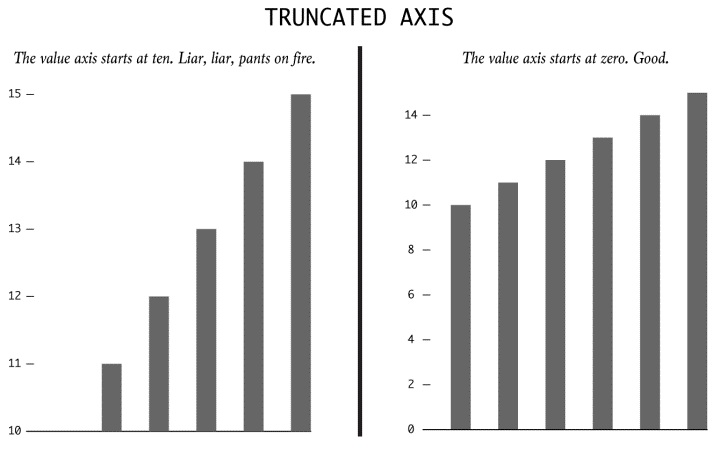
There is a high likelihood of the viewer being misled by the bar graph above if he/she was looking just at the bars and not at the axis. The one on the left has been truncated so that the values start from 10 instead of 0. Implication? Values larger than it actually is.

Dual Axes

dual

Typically used to represent correlation and causation, the take-away information from the representation above may not be an accurate depiction of the data since the scales to which the lines are drawn are different on either sides.

More than a 100% ?

This is usually seen in pie charts and wedge diagrams. The sum of all the wedges might show a value which is more than 100%. A perfunctory glance might not be enough to make out the error and as such, like in bar charts, the data represented might actually be more than it actually is.

Absolutes and Relatives

absol

Another major flaw in representing data can be seen in the representation above. The darkened areas purportedly show the number of crimes(and by extrapolation, the danger levels) of various cities of the USA. A casual glance at it misleads the viewer into thinking that the darkest areas are the least safe because of an increased number of mishaps but in reality, the map has not been adjusted to account for the population in the cities.

Taking things out of context

taking

The bar chart on the left, in isolation, says a vastly different(and obviously deceptive) story to the actual context. A casual glance shows an increasing trend, but in reality, the data shows a minimal increment in comparison to the time period before and after it.

Using illusions to deceive

dimen

The area of the third box is actually three times the area of the smallest box. But a data representation involving these boxes seem to give a vastly different picture as the area of the biggest box seems to much more than the actual three times.

Source : http://flowingdata.com/2017/02/09/how-to-spot-visualization-lies/

PRINCIPLES OF DESIGNING A DASHBOARD

The advent of dashboard designing software has made dashboard designing quite a simple task. Data collection, refinement, quoting the references and linking the same constitute most of the work to be done before dashboard designing. It should be kept in mind that a dashboard is a tool that makes it easier for the viewer to make sense of the plethora of data and complicated relationships which has been assimilated in it. Hence, a dashboard should be simple, user friendly and eye-catching. Anybody would be able to design a near-perfect dashboard if they imbibe and put into practice the following few principles:

  1. Right Chart Type: This might seem pretty obvious but it has the scope to destroy all the work previously done on the project. Selection of the right type of the chart has to be the foremost consideration before designing any dashboard. Different charts have different strengths and weaknesses and as such, care must be exerted in choosing among them.
  2. Overcrowding the representation: A dashboard loses its purpose and becomes meaningless if the target audience cannot easily grasp the information given in that. That is exactly what happens when too much data is squeezed into a particular chart. The idea of making dashboards must to be to make the data representation lucid and not to put every bit of information together.
  3. Playing with colours: Colours are great at commanding attention to the representation, but care needs to be exerted while choosing them. Intense colours may be used to highlight something of importance, but it might not be a good idea to use multiple dark colours as this may overwhelm the senses of the viewer and deflect the attention from the important things. Moreover, for comparison studies, it would be a better idea to use different gradients of the same colours.
  4. Providing context: A dashboard is just a nugatory collection of figures, shapes and colours if no context is provided. Therefore, providing context is the most important part of any dashboard and should be at the top of the checklist. Some of it may seem obvious to the designer, but it is always a good idea to provide context for everything that the designer wishes the audience to know.
  5. Consider the audience and the venue: Another easy to ignore, but a potentially tricky factor that to be considered is the type of audience, the venue and the media that is used to view the dashboard. Each dashboard should be tailored to suit the particular user group it is designed for.

Source : http://www.datapine.com/blog/dashboard-design-principles-and-best-practices/#

How to Choose the Right Data Visualization Types

At a glance, data visualization is about drawing a picture with your data rather than providing numbers and facts. Going by this definition, anything put forth to represent the data counts. But not every way of representation is apt for every situation. Different situations(depending on the data and audience) call for specific ways of representing data. With that in mind, I am listing out five different ways of data representation and their optimal usage. 

1) Bar Graphs 

Bar graphs could be horizontal, vertical or stacked. While horizontal graphs are used mainly for comparative ranking, vertical graphs(column) are used for showing chronological data. Stacked charts are a bit more complicated in that they usually show the part to whole relationship. The problem for bar graphs, in general, is that it gets cluttered if there is a huge amount of data to be represented. Moreover, labeling would be difficult with a cluttered graph.

2) Maps

Maps form one of the most complete ways of representing data when various geographical areas have to be compared/contrasted. Maps can do more than just displaying data. They can direct action as well. Despite all this, maps have their disadvantages as well. Simply put, if the data that needs to be visualized does not involve a geographical area, it doesn’t need a map. Moreover, as with bar graphs, too much data can clutter the map and filling the map with data points doesn’t make for a pleasant viewing, not to mention inundating the viewer.

3)  Line charts  

Trends. Dynamism. Volatility. Line charts portray these aspects with an unerring efficiency. They display relationships in how data changes over a period of time. A cursory glance at the line chart given below lets the viewer know that the amount of sales by means of credit cards were the highest(this is just a minute part of what the whole chart says).

As with most other ways of representations, line charts become confusing if the number of variables to be represented shoot up. Besides, a legend is imperative to decipher the meaning of the chart and the viewer may be forced to constantly refer to the same for interpretation.

4) Area charts

Like its close relative, area charts too are most effective when used to represent time series relationships and for facilitating trend analyses. Area charts are of two types, unstacked(which is basically a line chart with enclosed colored areas) and stacked area charts. Stacked area charts and more informative and consequently, is used more. They portray a part to the whole relationship.

As long as one sticks to stacked charts for representing a part to the whole relationship of not more than 6-7 values, an area chart seems to be a perfect choice. Unstacked charts clutter quickly and can be used only for 3 or fewer values.  

5)  Scatter plots

If correlation in a large data set is what one needs out of a representation, scatter plots are the way to go. The data set needs to be in pairs with a dependent and an independent variable. Upon distribution of data, the result would show a positive/negative/neutral correlation. The addition of a trend line would make it more informative by highlighting the correlation and shows how statistically significant it is.

Contrary to most other forms of data representation, scatter plots need a large amount of data to appear meaningful. A scatter plot with only a few variables would appear empty, with little to no information provided for the viewer.


Source : http://www.datapine.com/blog/how-to-choose-the-right-data-visualization-types/

KPIs AND THEIR APPLICATION

Key Performance Indicators, better known as KPIs are measurements made at certain intervals(weekly, monthly, quarterly, yearly and so on) which provides the business owners an indication of the relative health of the business. Even though it is imperative to consistently measure KPIs in any flourishing business, most small scale business owners ignore it citing the practical difficulty in measuring the same.

Parallels can be drawn between KPIs in business to KPIs in the health sector. It is not just a single instance(in most cases) that triggers concern and treatment from a doctor, but a series of suspicious/abnormal results. Similarly, KPIs in business takes more meaning when the measurements are taken repeatedly and over a period of time.

In business, KPIs are of two categories – Leading and lagging. As the name suggests, leading indicators provide the owners with a glance into the future while lagging indicators are all about the results of previous actions/policies. Leading indicators are useful in predicting the general direction of the business and as such, can be used to alter/continue the course of action depending on the predicted outcome. On the other hand, lagging indicators provide an assessment of the direction in which the business moved in the given period of time.

While useful in its own right, the true potential of KPIs is unlocked when the best of both worlds are combined. For example, a businessman can keep a target revenue for the end of the month and work on achieving it. Leading KPIs can be utilized to assess the progress and depending on the situation, changes can be made if required to achieve the target.

While measuring KPIs, one needs to be prudent in selecting the necessary indicators. Great care must be exerted in the selection of the variables since an increase in number or a seemingly important, but inutile variable could potentially confound the measurements. Research by Drs. Kaplan and Norton came up with a solution for this in the form of their Balance Scorecard, which emphasizes focus on four key areas – Financial, Customer, Internal Business Process, and Innovation and Learning. This framework is meant to align the goals of a business with the strategy and long-term vision.

Source : http://www.business2community.com/small-business/what-are-kpis-and-how-do-you-use-them-01641939#8VF8KMOItt9HgRGI.97

An Ambiguous Representation

Due to the increasing amount of data and the increased use of data representations, it is natural that mistakes and ambiguity creeps into many of the representations. This most likely arises from the fact that in order to look distinct and striking, the designers tend to use shapes, figures and representations which look ornate and fanciful, but fails to do what it is designed to do – To give the viewers a good understanding of the data it is based on. Given below is an example of how trying to look distinct may tarnish the purpose of the representation.

The representation is designed to show the number of EU scholarships grants made available for students. The footnotes mention that a total of 270000 students were given the scholarships this year(2012-13) – highest since its inception. Which brings us to the first problem faced by the representation. The representation does not show/mention the total number anywhere. Even if we tend to look past this particular data omission, we are faced with another question. What parameter is used to illustrate the figures? Line length or the angle?

A careful analysis of the representation points towards line length as the parameter used to represent this data. But, the human brain is wired in such a way that it notices patterns and colors before raw data and numbers. As such, a cursory glance might confound the viewer into assuming that the parameter in use is the angle. Perhaps more important is the almost unavoidable error which may arise while trying to make sense of this representation. Take the case of Germany and Turkey, for instance. From the statistics provided to embellish the representation, it is clear that the number of scholarships for students from Turkey is less than 1/5th of the number of scholarships for German students. But it is nigh impossible to come to the same conclusion by looking at the representation.

The only word I can use to describe the representation for Spain is – strange. It looks like it has gone around the circle by 280 degrees, but in reality, a bit has been broken after ninety and have stuck it at the left.

In conclusion, even though the ‘bar chart’ looks distinct and different to the viewer, the information it has been designed to portray comes out as confusing, misleading and frankly, wrong. Upon further reading, I found that this type of representation is aptly named the ‘racetrack’ representation where the inner tracks are shorter than that outer ones, which results in the designer having to stagger the starting positions. I can safely say that it would be quite some time before I use this to represent data.

Source: http://junkcharts.typepad.com/junk_charts/2017/01/race-to-the-top-erasmus-edition.html

http://www.ibercampus.eu/-270-000-students-benefitted-from-eu-grants-to-study-or-2076.htm

CHALLENGES FACED BY DATA VISUALIZATION

As the amount of data available for comprehension increased exponentially, the need to represent the same in a coherent, concise and simple manner popped up as well. This resulted in the emerging field of data representation and this has a dynamic effect on our society. The evolution of data representation from a something as simple as a graph to interactive applications and advanced 3D representations has completely changed the face of the data analysis. The advances made in the field may be immense but there still remain a few stumbling blocks that has to be overcome in order to maximize its potential.

Paradoxically, it is the advancements made in the made in the field of computers and animations that are proving to be a hurdle now. Virtual reality, for example, has the potential to augment the existing ways of data visualization and elevate it to a superior level. This has been put to test by Goodyear tyres and used the interpretation to enhance the performance of their F1 tyres. But VR has been associated with the entertainment sector for so long that efforts to incorporate the same technology for data analysis in say, a Fortune 500 company has met with ridicule. Research to make the VR headsets compact are ongoing but it might take a few years to come to fruition.

Augmented reality is another technology making waves in the market currently, not least because of the popularity of Pokemon GO. Among all the new technologies, AR has the best and immediate chance of improving on the existing data representations. The challenge though lies not so much in its implementation as its augmentation. The overlaying data used to augment the representation should be clear, concise, and non-befuddling and should serve the purpose of augmenting, not distracting.

The other challenges of data representation are contingent on the users and developers. The majority of data representations are still done in 2D and as such, banal. Hence, to make the data representation distinct and interesting, the developers would have to resort to innovative ways of data representations. This could include vivid colors, interactive applications and collection and representation of more interesting data. As such, there is an increased demand for technical expertise and a channeled scientific approach in processing data representations. There is a dearth of data scientists currently, something that a lot of universities are trying to combat by offering new courses pertaining to data analysis. The differing levels of comprehension among the group the data representations target is another challenge presently faced by data representation. This particular problem is much more difficult to tackle as there is no individual solution to this. The best way to tackle this would be to form a protocol for interpreting data representations.
Even though there are challenges facing data representation these days, they pale in comparison to the progress made in the field in the past decade. Judging by the pace with which the field is evolving, it wouldn’t be surprising if the challenges listed above do not exist anymore by the next few years.

Source : https://channels.theinnovationenterprise.com/articles/the-5-biggest-challenges-facing-data-visualization

ENERGY CONSUMPTION BY SOURCE IN THE USA

Being the fifth largest country in the world in terms of land area and the third largest in terms of population, it is not surprising to find the USA in the second position in terms of percentage consumption of energy(19.2% of the total world consumption). This figure can be reconciled with another recently acquired data: a dramatic climb in urbanization(more than 80% as of 2015) resulting in a commensurate rise in ‘megaregions’ – Cities which either have/are projected to have a population of 57-63 million by 2025. Consequently, the energy required is derived from a wide range of ‘primary sources’.

pic1


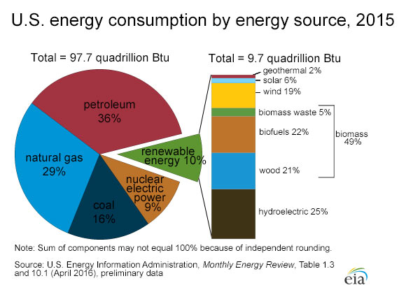
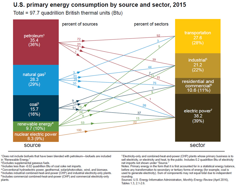
The pie-chart above provides a bird’s eye view of the distribution of the sources of energy. The chart is pretty straightforward and serves its purpose with aplomb – Even a perfunctory glance enables the viewer to grasp the percentage distribution of energy sources, both renewable and nonrenewable. But things get more interesting(or irksome, depending on the way one sees it) when the association between the energy sources and percentage utilization too is incorporated into the same representation. Here, have a look.

pic2

This representation shows (almost) everything depicted in the initial representation and much more. The difference between the two is stark as a cursory glance is much more likely to confound the viewer than to provide them with an idea about the energy distribution. But upon careful comprehension in a systematic manner, it becomes apparent that the second representation is packed with more information as it depicts not just the source of energy and the sector where it is used, but also the percentage of energy source used and the percentage of energy generated in the corresponding sector. For example, 72% of petroleum(which provides 36% of the total energy) provides 92% of the energy required for transportation(which as a whole uses 28% of the total energy).

The representation above epitomizes the adage ‘A picture is worth a thousand words’. Once the viewer grasps the key required to unravel the huge amount of data depicted in the representation, it provides him/her with everything he/she needs to know about energy sources and its utilization.
Source – http://www.eia.gov/energyexplained/?page=us_energy_home


DATA VISUALIZATION – HOW CRITICAL IS IT?

In the era of computers and the internet, it is hardly surprising that we are exposed to a startling amount of data on a daily basis. Most of the data is presented either in a clutter or in the forms of complicated graphs, pie charts, balloons and tables which would prove to be a challenge for the unprepared mind. To make things worse, an almost unlimited access to computers and the web has already set the tone for the exchange/sharing of a huge amount of information. If one is to tackle this problem efficiently, there need to be certain methods to sort out and arrange the information into a more organized pattern.  Renowned journalist David McCandless acknowledges this problem in his TED talk and presents his viewers with a unique and practical approach towards mitigating the same.

To make sense of the myriad of information, start off with the obvious – Use our eyes more, but use it with purpose. The importance of this is laid bare in a study which shows that around 75% of the information entering our brains for processing is through the eyes. Evolution has designed eyes in such a way that it can detect patterns, colors and shapes ‘in the blink of an eye’. This would allow us to concentrate on the important aspects more and to put aside the frivolous information.   

Context is extremely important when it comes to making sense out of data. The importance of this is made obvious by comparing and contrasting the absolute and relative figures. While an absolute figure shows the data as a whole, relative figures take into account a lot of factors and provide a more detailed analysis of the same. This brings to our attention an important point – Data without context can be misleading and may result in confusion.

Organized data may be made much more useful by building on a large database of information and converting it into an interactive application which sorts out and projects the information necessary for the user. This reflects positively on how a clutter of data may be organized and programmed into providing a lot of useful information if worked on in the right way.

Source : http://ed.ted.com/lessons/david-mccandless-the-beauty-of-data-visualization