The Snowball of Debt

With varying debts across the countries after global recession, people have been questioning its implications. To answer this question, blogger Simon Kuestenmacher created the Snowball of Debt. The visualisation measures the amount of debt for a country divided by its population, indicating the amount every individual owes to his country’s national debt.

From the figure, we can see that Simon has cleverly combined colours and visual aids to illustrate varying data. The maps of the countries have been carefully placed around the centre based on the amount its individuals owe to the country. Since, the people of Japan owe the highest debt, this country has been placed in the centre. Similarly, with the lowest debt owed by its people, Liberia occupies a position in the far end of the circle.

The countries have been given different colours based on public debt as a percentage of GDP. This also helps to categorize each country based on their economy and an individual’s capacity of payback. The trend in the chart is pretty clear: Wealthier nations have higher debts with its people owning more to their country. the countries with lowest debt owned per person are relatively poor. The reason for this could be the lack of opportunity for these nations to take national debt due to the unwillingness of investors to offer them loans.

A lot of conclusions can be drawn and a lot of information can be retrieved from this figure. The user has aptly applied the principles of aesthetics to his idiom by keeping the visualisation attractive and equally informative.

Reference: http://www.freshplaza.us/article/7756/The-snowball-of-debt.


Most Popular Programming Languages

Github has recently release a graph showing the changes in popularity of different programming languages on its platform from 2008-2015. Github is an online repository offering revision control and source code management on the web for its users. Most of the budding developers have been using Github over the years to host their project source codes. Looking at Github’s popularity, various coding boot-camps and academies are now using this graph to decide on their course curriculum.

The graph helps us to understand the various languages which have been on Github since 2008 and their changing trends. We can see that, Ruby and JavaScript have been amongst the top since 2008, with JavaScript still ruling the charts. Also, we can see that the languages like Perl and Objective-C have become extinct on this platform over the last few years, while CSS and C# have gained their place on the chart. Java has also gained a lot of popularity of Github, starting at 7Th position in 2008 to becoming the second most popular language by 2015.

The graph, in my opinion, is very informative and can be a helpful resource for its audience. It is simple, easy to understand and very clear in its claim. Students who want to learn a programming language with the end goal of securing a good job can use this graph to choose amongst the top few languages.

Reference: https://mybroadband.co.za/news/software/136148-most-popular-programming-languages-on-github-2008-to-2015.html

https://www.fullstackacademy.com/blog/is-the-programming-language-taught-at-a-coding-bootcamp-important

Eyeo Crowd Cloud

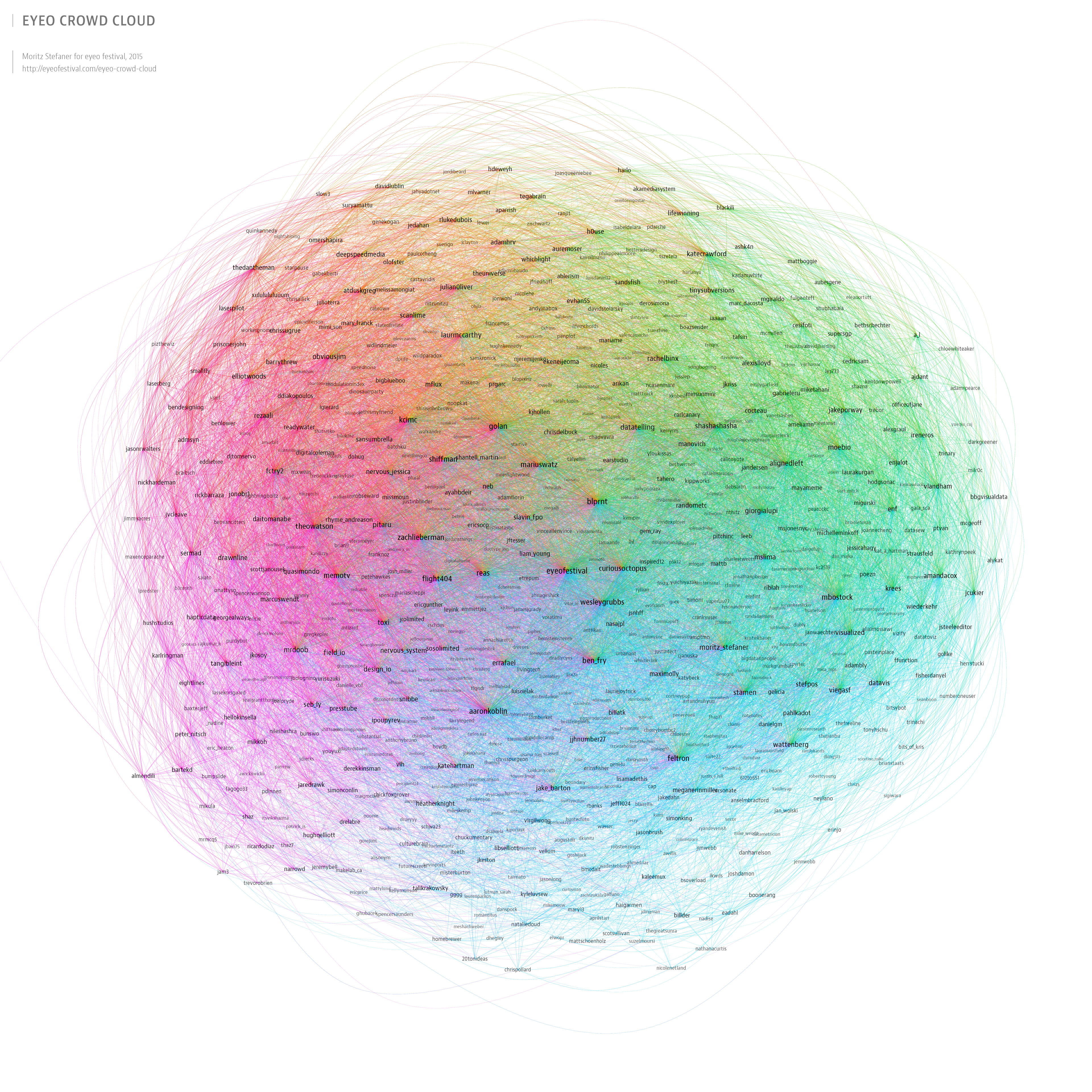
Since 2011, the Eyeo Festival is bringing together creative coders, data designers and creators at the intersection of data, art and technology for inspiring talks, workshops, labs and events. The idea behind the festival is inspired by the notion that we live in a decade of an exceptionally exciting time to be interested in art, interaction and information. Following on this principle, Eyeo has managed to gain a large number of followers over the past 5 years. Looking at its increasing popularity, Moritz Stefaner created an Eyeo Crowd Cloud for 2015.

He created a network map based on 852 twitter accounts of various registered speakers, workshop presenters, panelists and attendees from 2011-2015, related to the Eyeo Festival. Though network is a good way to show the followings for different speakers, it is difficult to different between a speaker, a presenter or an attendee by just looking at the visualization. Also, because of the large number of followers and following incorporated in one network, getting exact figures of data is not possible from this network. Though, Moritz has used different font sizes for account holders based on their number of followers, there is no solid claim reflected here. In my opinion, using graphs and trend lines to show the increasing popularity of the festival and the speakers over the years would have told a better story and would have been more informative.


Reference: http://eyeofestival.com/eyeo-crowd-cloud/

Is U.S. about to hit recession?

“Next year, we will hit recession”, calls Chad Shoop, Editor, Pure Income.

In his recent article, Chad states that the trend in durable goods for the year 2016-17 is an indicative of the country on the verge of recession. According to Chad, durable goods orders can be considered as a measure of company’s confidence in its growth. Rising orders shows confidence that the economy will continue growing, while falling orders shows shrinking economy and curtailed spending.

The durable goods trend has shown a fall only twice over the past two decades. Once before the 2000-2001 recession and second time during the midst of global financial crisis of 2008. For the remaining years, i.e. from 1992-2000, from 2001-2008 and from 2009-2016, this graph has rose at a choppy but steady path. There is a pattern here. Each time this graph has turn lower, it has been a signal for imminent recession-today is no different.

The U.S. Census Bureau News generate these graphs every year. It is a simple line graph with trends lines indicating the rising trends in it order patterns over the last two decades. The figures to the right show the amount invested by companies in the durable order goods over the years. The graph makes its claim very clear in a very simple way, warning us about our future.

Hence, we need to prepare ourselves for a recession like investment- environment. We need to find a strategy to make profit from declining stocks before it is too late. Because, as Chad states, “Crash is coming. It’s just a matter of when, not if.”

Reference: http://thesovereigninvestor.com/us-economy/new-signs-economic-recession/

Is interactive visualisation always a good option?

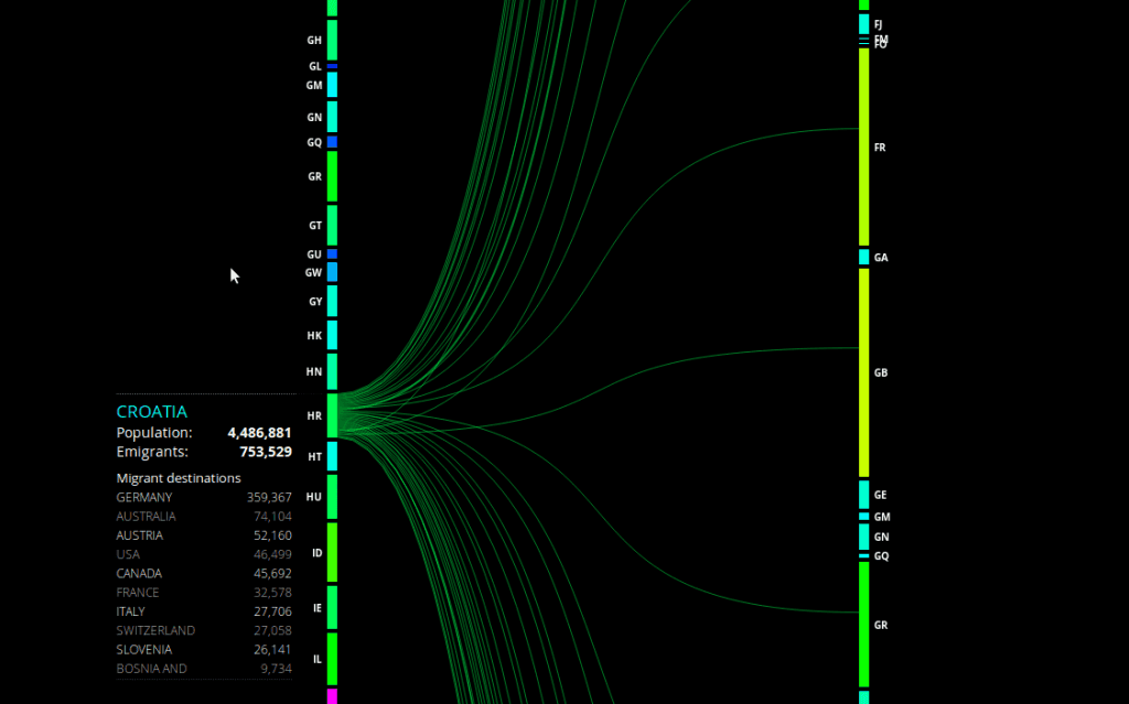
Peoplemovin is an experimental data visualization project which shows the immigration status of people from around the world. Created by Carlo Zapponi, this interactive visualisation shows flow of 215,738,321 migrants as of 2010. The data has been collected from the World Bank and plotted as flow charts representing the flow from emigrant country to the destination country. The blocks on the left represent emigrant country and the blocks on the right are the destination countries. Carlo has used attractive colour schemes with a different colour from blue to red to compare a particular country with the rest of the world. For example, the immigration details of India show that the largest number of Indians have migrated to the United States. The thickness of lines is used to represent the volume of immigrants. But it is difficult to get the exact figures by just looking at these lines. For this reason, the detailed figures for each country’s immigrants can be seen in a table on the left, based on the country selected by the user. Though, the visualisation is very attractive and informative, listing all the countries on the same page makes the columns on both sides very long, making it a little difficult to see the connecting flow lines. In my opinion, the visualization could have been simpler and more information.

Reference: https://datavisualization.ch/showcases/peoplemovin-visualizes-migration-flows/

Dangers of Bling Data Visualisation

Data Visualisation is making its way into mainstream recently. However, this gaining popularity is leading to increasing misconceptions about making attractive visualisations. The purpose of visualisation is to provide information which otherwise would be very difficult to infer from the voluminous data available. Hence, more emphasis need to be given on conveying the correct information rather than incorporating too much “bling” into these representations.

Info-graphics can be catchy, aesthetically pleasing, thought-provoking. But these features would not hold any value if the info-graphics cannot fulfil their purpose of telling informative stories. Let us consider the example of stream graph of movie box office receipts over time.

Steam Graph of movie box office receipts from New York Times


The graph definitely looks attractive. But can it explain its obvious intent? Probably not. It would take us some time to understand that the peaks of the curve represent the weekly sales of each movie and the area under the curve represents the total receipts. It is unclear why certain movies are below the zero line. Also, comparing different movies seems difficult by just looking at the graph. In short, no matter how appealing the graph looks, it fails to be a good-decision making tool.

Hence, while creating any data visualisation, we should not its true purpose. We need to keep in mind that visualisations are meant to define the data behind the data. And so, we should try to focus on making an informative data visualisation rather than a bling data visualisation.

Reference: http://www.information-management.com/news/news/the-dangers-of-bling-data-visualizations-10025306-1.html?zkPrintable=1&nopagination=1

TradeGecko – A good Inventory Management Software Program

Before dashboards were introduced, all major organizations maintained their data in spreadsheets. A lot of time would be spent on these spreadsheets which eventually would affect the working of the organization. Frustrated with spending entire day in spreadsheets for mundane business administration, Carl Thomson, a former fashion designer shut down his clothing company in 2011. It was out of this frustration that TradeGecko was born in 2012. TradeGecko was one of the newest entrants in the Inventory Management System’s market which was filled with poorly designed archaic IMS software. Following the principle “Good Design is Good Business”, TradeGecko stepped up in the UI department, making some tedious inventory management processes less painful and much easier to eyes.

Thomson launched TradeGecko with a goal to offer clean and intuitive IMS to small business owners. Its flat and sparse design, as opposed to traditional IMS, allows easy visualization of inventory levels, sales statistics, and others. The dashboard uses on screen cluttering, presenting only essential information. Also, its cloud-based platform ensures that information stays updated in real time.

In the market where many software designers ignored the essentials of a good design IMSs for retailers, Thomson brought a positive change. His software today is considered as one of the few well-designed program for IMS.

Reference:http://www.softwareadvice.com/inventory-management/spotlight/user-interfaces-2014/

Vaccination rate and measles outbreak simulation

Scientific meaning of Vaccination states that it is “the injection of a killed or weakened organism that produces immunity in the body against that organism”. An immunisation is the process by which a person or animal becomes protected from a disease. Measles, causing skin rashes and flu like symptoms including fever, cough and running nose. It is a highly contagious disease caused by the virus. Even though it is rare, almost 20 million cases of measles happen every year worldwide. 90% of the people who haven’t been vaccinated will catch up measles if they are near the any measles infected person. Nowadays, Measles vaccines is given in combination with mumps and rubella and the type of measles vaccines available are as follows is in the form of MMR – II (Measles mumps and rubella vaccine). MMR vaccine is a live attenuated viral vaccine used to induce immunity against measles, mumps and rubella. Giving two full doses will make sure that 99% of the people will be protected against the disease. Sometimes cases may happen that in spite of people taking vaccinations end up being infected and don’t develop immune response to the disease thus leaving them vulnerable.

Chart

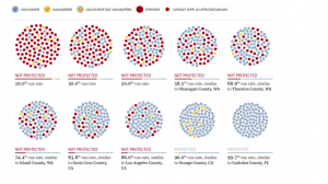
The chart appropriately highlights the percentage of VAX rate, an indication of whether or not the person may end up being infected by measles. The chart also demonstrates that the states having a particular percentage of VAX rate. Finally, it shows that the vax rate should be at least 90% for an individual to be safe against measles.

Psychology behind information dashboards

Information dashboards should be designed keeping in mind the psychology of its end users. Below is an example of dashboard designed for marketing teams to collaborate on budget and keep track of spending on target. This dashboard has been strategically designed to provide a sense of control amongst its users. It gives the users necessary resources to predict and plan the future, helping them to complete critical tasks in time.

This Marketo dashboard helps marketing teams collaborate on budgets and keep spending on target.

Above is an example of dashboard for marketing teams to collaborate on budget and keep track of spending on target. This dashboard has been strategically designed to keep a sense of control amongst its users. It gives the users necessary resources to predict and plan the future, helping them to complete critical tasks in time.

Human mind is believed to have short-time memory and can’t store much information when bombarded with unusual pieces of data. The dashboard in above example has been designed in a way to overcome this limitation.  The use of charts and dashboards here reduces dependency on short-term memory. It’s easier to remember ups and downs in sales through a simple line chart than remembering exact figures from table. Also, this dashboard uses drill down option while giving a summary of critical data on a single page making it easier to understand the presented information. But most of all, its simple! Which is an important principle both in business and real life. These three factors make the above dashboards a good example of design which keeps in mind user requirements and creates a perfect dashboard.

Refernce: https://uxmag.com/articles/the-psychology-behind-information-dashboards

Digital Evidence Dashboards

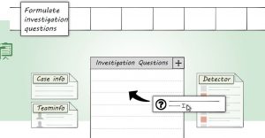
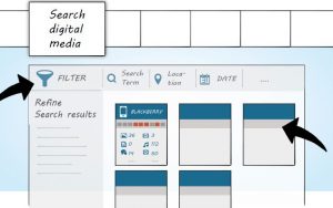
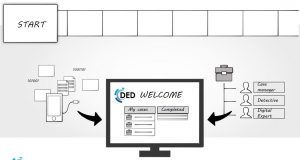
Digital forensics has been one of the reputed branches of forensic science for years. But with the advancements in technology and the huge amount of data being collected daily, digital forensics needs newer process to investigate crimes. The recently talked about solution involves combining digital forensics with big data analysis. But another new project has been initiated by certain companies in this field. The project is called Digital Evidence Dashboard. The idea behind DED is organising digital evidences for faster resolution of crimes. The project aims to reduce the turn-around time for investigations to help law enforcement reduce bottlenecks. DED would enable case manager, detectives, digital experts and investigation teams to perform their individual investigations on the case and still be able to collaborate with each other through features like continuous reporting and progress monitoring. By requesting an account on this dashboard, even common man can help the forensics in solving a crime. DED holds the potential to increase investigation capacity and get faster results by aiming for bulk cases and looking for clues relevant to entire investigation. And hence, might just prove to be the much-needed boost in digital forensics.

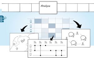
The proposed design for DED includes:

Analyse FIQ Search Digital Media Start


Demonstration Website link: https://www.digitalevidencedashboard.com

Reference: http://www.ey.com/Publication/vwLUAssets/EY_-_Forensic_Data_Analysis/$FILE/Forensics-Data-Analytics.pdf