Student Debt at Colleges and Universities Across the Nation

This visualization provides a complete picture of the student debt across different universities in the USA. Firstly, this visualization provides two chart options – a scatterplot and map to visualize the same data. I feel that the map representation is better than the scatterplot as we can identify the universities by their location and it helps us to have e better perspective of the different universities in each state.

Things I like:

  • Firstly, the visualization is interactive and provides data for a five-year period when the play button is used.
  • A lot of filters are present to drill down the universities thus helping to get insights on different categories like type o institution, enrollment size, graduation rate, graduates with debt%. We can easily identify the universities with high tuition fees and high graduate debt rate which should be avoided.
  • The size of bubbles is depicted by enrollment size.
  • An option is provided for searching a particular university.
  • A detailed description of graduate’s debts appears when clicked on a particular university

Room for improvement:

  • Filtering cannot be performed on the basis of more than one category at a particular time. This hinders in providing a detailed analysis of the different universities.
  • Also, an option should have been provided to depict the bubble size based on graduate debt.
Reference: http://www.nytimes.com/interactive/2012/05/13/business/student-debt-at-colleges-and-universities.html

New York Taxis Rides

This interactive visualization made using Tableau visualizes the preferences of NYC residents when it comes to commuting either using the old fashioned yellow cabs or Uber. This dashboard consists of two visualizations.

The first visualization shows a detailed view of the traveling habits of NYC residents. It is further divided into two subparts. Part A is a bar graph showing the average taxi rides for each one hour in a day and we can see that 6 pm to 7 pm is the busiest hour with people returning from offices. Part B focuses on the average taxis rides per day in that particular hour. The interconnectivity among the two graphs is excellent. Also hovering over each bar or point shows the details.

The second visualization focuses on the percent difference in rides of Uber, yellow taxis and other services over time. There is an evident shift in preferences of the NYC residents towards Uber. The curve for Uber is rocketing compared to yellow taxis and All other which are plummeting. One excellent feature of the visualization is that the audience can see the value for all the three line curves at a point in time when hovering. But this visualization only focuses on data of a short period of July to September of 2014. More insights can be gained if we can have the recent data on this as it might be possible that the craze for Uber has subsided.

Overall, we get a complete picture of the traveling habits of NYC residents.

Reference: https://public.tableau.com/en-us/s/gallery/new-york-taxis 

The Middle East: Key Players and notable relationships

This interactive network visualization sheds light on the complex relationship between the different countries in the Middle East. Anyone willing to understand the relationship between these countries can have a good overview of the political situation in the Middle East. This visualization focuses on four different relationship factors: ‘love’, ‘hate’ ,’good’, ’strained’. At a first glance, the visualization seems to be overcrowded and clumsy, but it also provides a lot of factors for drilling down and filtering.

Things I liked:

  • Depicting the relationship with an interactive network graph is excellent.
  • Filtering on the basis or Country or group which helps the audience to have a better understanding of the position of each country. Hovering or clicking on each country provides the filtering.
  • Filtering on the basis of the relationship types.
  • A short description pops up providing details of the relation between two countries when one country is selected and other is hovered upon.
  • The use of different color and line type in depicting different relationships helps identify them easily when a particular country is selected.

Room for improvement:

  • The visualization also distinguishes the entity based on whether it is a country or group. But the colors used for ‘Group’ and ‘Non-Muslim’ has little difference. Also, there are no means of filtering on basis of this. So, it becomes ambiguous.

Reference: http://www.informationisbeautiful.net/visualizations/the-middle-east-key-players-notable-relationships/

Best Dog in Show

This infographic depicts information about the different types of dogs available and aims to categorize the different dogs and predict the best dogs. The visualization is projected in an x-y axis and divides the dogs into 4 different regions: Rightly ignored, inexplicably overrated, Hot Dog, Overlooked treasure.

Things I liked:

  • The graph is aesthetically pleasing as images of the actual dogs used which helps us relate. Also, the use of transparency is excellent.
  • The classification of dogs based on size by portraying actual size difference and the use of color to identify the dog type helps us easily identify each dog.
  • All these provides us with excellent options if we want to buy one, which in this case is the category ‘Hot Dog’.

Room for improvement:

  • Ailment should be deducted instead of being added in the score calculator.
  • No indicator is provided of the amount of exercise or attention required for each dog.
  • This infographic could be made an interactive one with the details like name and all elements of data score being shown when hovered over each dog symbol. Here viewers cannot view the value of the parameters on which data score is calculated.

Lastly, I would mention that each dog is suited for a specific surrounding and perform unique functions so comparing them on the same platform would be unfair.

Reference: http://infobeautiful4.s3.amazonaws.com/2014/11/RETINA_Best-in_show.png

World’s Biggest Data Breaches

Data breaches are highly damaging for both the company and its consumers. This interactive bubble chart depicts the biggest data breaches that occurred. The bubbles represent the different companies which faced data breaches. This visualization has a time scale as the y-axis where the breaches are categorized according to the year it occurred. The visualization also provides more elements to filter and categorize the data. For example, the bubble color and the bubble size which have 2 mutually exclusive indicators called ‘year’, ‘method of leak’ and ‘no of records stolen’, ‘data sensitivity’ respectively.

Things I liked:

  • Firstly, by the time scale, we can easily identify that the number of data breaches has drastically increased over the years which raised a lot of concerns.
  • Secondly, the visualization portrays a complete picture of the data breaches and covers every aspect ranging from the method of the leak to the sensitivity level of data.
  • Thirdly, hovering over each bubble provides details of the breach and on clicking first time it provides a summary of the event, but on clicking the second time it redirects to the actual news article.
  • We can select any combination of the four categorizing indicators mentioned above.
  • A legend provides filtering options based on the type of industry and the type of data leak.

Things that can be improved:

  • The color range used for depicting ‘year’ is very subtle and distinguishing is difficult.
  • Attention diverts to the ones in orange which is predefined as an interesting story.

Reference: http://www.informationisbeautiful.net/visualizations/worlds-biggest-data-breaches-hacks/


Domestic violence in Spain

This interactive dashboard provides a comprehensive information about murders of the woman due to domestic violence in Spain. It contains 5 simple separate visualizations to convey the story.

  • First one provides a line graph representing the deaths of woman per year due to domestic violence. Although the rate was quite high in 2008 and 2010, currently it is going down.
  • The second one depicts the count of murders per month. It has a color range of different shades of violet depicting an indication of the count.
  • Third one indicates the same information but on the map of Spain.
  • The fourth one is a bar graph denoting the number of murders by either partners or ex-partners.
  • Fifth is also a bar graph depicting the age range of the dead women in Spain.

Each chart is very simple on its own, but together with the others, they portray a holistic picture of the murders in Spain. The use of the same color range helps to connect faster with this visualization. We can easily identify that Andalucía and Cataluña are the most violent regions. Users can also perceive that woman are mostly murdered by their live-in partners and are usually in the age range of 31-40.

Reference: https://public.tableau.com/en-us/s/gallery/domestic-violence-spain

50 Years of Crime

This interactive visualization created using Tableau presents information about decades of crime data across the United States. This interactive dashboard provides options to either view Property crimes or Violent crimes. In addition, this dashboard provides flexibility to the users in interacting the data. This dashboard consists of 3 charts:

  • A heat map with different shades of violet indicating the severity of the crime rate in each state.
  • A line chart indicating the different crime rates across time starting in the 1960s to 2012 for each state.
  • A scatterplot of crime rates versus state population.

Things I liked:

  • All 3 charts are interconnected and when one particular state or line graph is selected all the chart shows information about that state.
  • The crime rate versus population chart gives the users a deeper understanding where users can identify states which have low population but high crime rates.
  • In the line graph, users can select one state and hover over the others to give an indication of difference.

Things that can be improved:

  • Holistically the first graph provides a lot of insights into the data without having to filter different states. But the line graph is on a whole quite clumsy and doesn’t convey information without filtering.

Reference: https://public.tableau.com/en-us/s/gallery/50-years-crime-us

How recession reshaped the economy of USA

The USA underwent many recession periods and one of the most significant was the recession of 2009. It affected the USA’s economy and changed the future for many industries. The interactive visualization below depicts the growth of different industries pre and post-recession.

Reference: https://www.nytimes.com/interactive/2014/06/05/upshot/how-the-recession-reshaped-the-economy-in-255-charts.html

This is an excellent interactive visualization which is detailed and depicts lots of information at a first glance without overcrowding the visualization. The information is classified very well and presented via two different dimensions.

  • Firstly, via the usage of colors ranging from deeper shades of green to deeper shades of red depicting the industries which have recovered and booming and the once which are declining.
  • Secondly, via dividing the industries according to either lower or higher wage that particular industry generates.

The visualization automatically drills down to specific industries when one scroll down helping to understand the trends. One amazing thing is that a detailed description pops up whenever one hovers over any line graphs. This contains area graph of the average salary and also the number of jobs at any year from 2004 to 2014. By analyzing this we understand that consulting, computing, oil and gas industries have recovered and grown whereas apparel manufacturing and construction industry have greatly declined.

Out of site, out of mind

pic

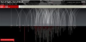
This is a dynamic interactive visualization of the fatalities in drone attacks on Pakistan in the time frame of 2004 to 2015.  As the title suggests after 1 or 2 weeks, the news goes out of mind. But the plight of the people lingers, despair over lost ones, destroyed homes. This stunning visualization illustrates the frequency of drone attacks on Pakistan which increased drastically after 2009. As a result, a lot of innocent children and civilians lost their lives.

This infographic dramatically brings to light disturbing facts that should not go unnoticed. In order to eliminate high-profile targets innocent blood is spilled. Only 1.6% of the population killed constitute terrorists compared to 5.7% children and 16% civilians. Can this be justified in any way? A description pops up giving detailed facts of the attack when one hovers over a particular point on the visualization. The replication of bombardment as a technique narrates more than what words can express. Also, use of red color to symbolize the blood of innocent children is very thoughtful. This visualization is really captivating and generates serious thoughts about the people living in Pakistan, fearing their impending doom.


Please refer to view the full interactive visualization: http://drones.pitchinteractive.com/

State wise percentage depiction of HIV unaware population in United States of America

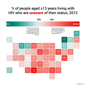
Today, we live in a world where unaware HIV is a huge risk, to those individuals and to others. So, it is of high importance that the US Government and people become aware of this and take necessary actions. This graph explains the percentage of the population(age>13) who are unaware of their HIV status in each state of USA.

Depicting this information in a color map graph is an excellent chart selection to visually explain how each state is affected by unaware HIV population. This graph can also be represented using a line graph, scatter plot or bar chart indicating the percent of the unaware population on the y-axis and different states on the x-axis. But, illustrating the information on a map of USA, allows readers to easily locate their own state or any particular state and view the percentage.

Also, the use of two different colors and varying intensities gives the viewers a holistic view of the situation of the country. It is easily determined that the south and mid-west regions are the most affected. Therefore, the health authorities of USA and the various states should come up with ways of dealing with this persistent issue.

Reference: http://dadaviz.com/i/4328/