A Virtual Reality Guided Tour of 21 Years of the Nasdaq

The virtual reality tour of market data allows readers to literally ride the Nasdaq stock exchange through 21 years of growth and collapse. The “roller-coaster” conceit paired well with the Nasdaq data as it rose through the dot-com boom of the late 1990s and then busted. The slow recovery over the next 20 years culminated when it surpassed its previous peak, which is when this project was published. The visceral sense of height helps readers understand the precarious nature of the dot-com boom, and the plummet thereafter allows users to experience a sense of fear and uncertainty.

This project uses true 3D to allow users to experience an immersive world populated with this data visualization. users can optionally attach their phone to a Google Cardboard or any other 3D viewing device for a completely immersive experience that tracks your head movements and provides slightly different images to each eye, simulating real 3D. Without an attachment, readers can still move their phones in 3D space to view the 360-degree world. On the desktop, they can click and drag their mouse. Holding your gaze on a button triggers the action, allowing readers to bypass more complicated clicking interfaces.

The project is built using three.js, a relatively new library that allows programmers to render three-dimensional content in the browser. The data visualization itself was powered by D3.js, which was fed into the 3D environment.

Reference: http://graphics.wsj.com/3d-nasdaq/

The Start Up Boom

Living in silicon valley means you will be surrounded by numerous start-ups. But how many of these startups actually succeed? Here success is identified as crossing the ‘Billion Dollar’ mark. Most of the companies are venture-backed private companies. The claim of this visualization is to show how the Billion dollar start-up boom happened after 2014.

The visualization tracks all the start-ups who touched the billion dollar mark and how they went beyond that in a span of 2 years. The visualization defines a semi-circle of 3 radii. The first one marks the billion dollar mark, the second marks $10 billion and the 3rd one marks $40 billion. The start-ups across 3 major geographic locations are marked, viz., United States, Asia, Europe, and others. The visualization being interactive has a time slider below which shows dates from the year 2014 to 2017. Also, you can differentiate the companies on the basis of the industry. The drop down list shows different types of industries through which you can drill down to a specific industry or you can look at all the industries at once.

The visualization strongly supports the claim to show the boom of startups after the year 2014. The idioms used could have been a bit different so as to show the name of the companies extensively but the main claim of the visualization is to show the ‘Boom’ which appropriately displayed.


Reference: http://graphics.wsj.com/billion-dollar-club/

Virtual Reality for Data Visualization

We are living in the age where there is so much abundance of data that we have started referring as ‘Big Data’. With such tremendous amount of data, it is the need of the hour to visualize this data using cutting edge technology which will help Big Data visualization easier.

One such technology is Virtual Reality. With VR as the medium to visualize data, we will be able to immerse ourselves in the data, have more natural interactions and view multi-dimensional data in a much easier way. Some of the reason which conveys the exact reasons to use virtual reality for data visualization are mentioned below –

  • More Space –

Imagine yourself completely surrounded by the visualization of the data. It’ll give you a 360-degree view in which the data can be visualized in a more visceral way.

  • Lesser Distractions –

When your all your vision is covered with the visualization there are lesser possibilities of the distractions to deviate your attention from the main objective.

  • Multi – Dimensional Data Analysis –

By adding different senses of sound and touch we can visualize data in various dimensions. With the current technology development, it is actually achievable to feel data by wearing the haptic feedback gloves.

  • More Natural Interaction –

Keyboard and mouse interactions would be replaced with touch and movements. This will help us better perceive the data as we will be using more than one senses to visualize and analyze data.


Reference : http://pwc.blogs.com/analytics_means_business/2016/08/5-reasons-to-use-virtual-reality-for-data-visualisation-.html


Meteor Showers: Celestial anomaly mechanics demystified with visualization

Meteor showers on Earth are caused by streams of meteoroids hitting our atmosphere. These meteoroids bits of rock that were once released from their parent comet. Comets can produce debris by water vapor drag. As a comet orbits the Sun it sheds an icy, dusty debris stream along its orbit. If Earth travels through this stream, we will see a meteor shower. Although the meteors can appear anywhere in the sky, if you trace their paths, the meteors in each shower appear to “rain” into the sky from the same region.

We always wonder how the meteor shower work and also where and how do the originate. This visualization tracks their path and origin and also the day of the month it will occur.This new 3D experience offers a great way to understand the journey of the meteoroids and the sources of meteor showers on Earth. All major meteor showers are mentioned in this visualization. The different functionality like viewing the meteoroid shower from the earth or following the earth in its orbit, provided in this visualization helps the user understand the actual dynamics of a meteoroid shower and also tracks the time of occurrence.

This visualization shows these meteoroid streams orbiting the Sun, some stretching to the outer regions of the solar system. It lets you select the meteor shower in the menu to see the corresponding meteoroid stream in space.

Visualization: Click Here

Note: Their meteoroid orbits are based on those measured by NASA’s CAMS video camera surveillance network and were calculated by meteor astronomer Peter Jenniskens of the SETI Institute and NASA Ames Research Center.

Reference: Click Here

Yahoo Finance Stock Market Dashboard

Financial Data consists of a time series of price and volume values for a wide array of assets. Financial information can be characterized by the following attributes: large amount, multi-dimensional and abstract nature, complex information structure, hidden information. Making it always perplexing and difficult to understand. Visualizing financial data becomes an arduous task. Some of the important Financial indicators are –

  • Moving Average Convergence / Divergence (MACD),
  • Relative Strength Index (RSI),
  • Simple Moving Average (SMA),
  • Exponential Moving Average (EMA),
  • Rate of Change (ROC)

Yahoo Finance Stock Market Dashboard shows all the above-mentioned indicators and also other possible indicators on its dashboard which makes it complete. It gives you various option to compare different dimensions. It gives you all the important indicators including the Dow Jones Index, S&P 500, Nasdaq and all assets like Silver and Gold rates are updated dynamically. We can select between different time frames for the comparisons and can compare between different stocks. The best part is the Trending tickers in a pallet which shows the important elements like the highest gainer stock, the least gainer, the most active and so on.

The important aspect of Yahoo Finance Stock Market Dashboard is its completeness. And the interactiveness it gives the user to use the dashboard by personalizing it by showing the favorite stocks and the last visited stock.

Ref:  Yahoo Finance Stock Dashboard

Key Properties of Interactive Data Visualization

Interactive Visualization enables the display and intuitive understanding of multidimensional data provides a variety of visualization chart types and enables users to accomplish traditional data exploration tasks by making charts interactive. Interactive Visualization implies the use of heat maps, geographic maps, link charts, and a broad spectrum of special purpose visualizations that surround processes that are inextricably linked to an underlying analytics.

Any enterprise at some points starts trending contextual data for making decisions affecting their operations on daily basis. With this trending, the business question which needs to be answered becomes the focus.A visual representation can be done in many ways but here the context matters for better understanding and better decision-making which is provided by Interactive Visualization. Interactive Visualization begins with a data presentation architecture that seeks to identify, locate, manipulate, format, and present data in such a way as to communicate its meaning optimally.

  • 5 Key Properties of Interactive Visualization –
  1. The Novice User – Even the naive users should be able to examine the data and find all the patterns, correlations and navigate through the visualization easily.
  2. Driving Processes – The processes must be well defined. Phase completion should be visually shown and should be real-time.
  3. Data Must Tell a Story – Data must tell a story that instantly relates the performance of a business and its assets. The users should be able to select data and change perspective for a better result.
  4. Data Correlation – The trends which can be dynamically formed between multiple datasets should be easily found.
  5. Prescriptions – The users must be provided with at least some prescriptive analysis. They must also be prompted with the steps to follow to get the desired result.


Ref : http://www.forbes.com/sites/benkerschberg/2014/04/30/five-key-properties-of-interactive-data-visualization/#2b128fd744eb

Budget Puzzle: Empowering the people with Data

In the democracy, though the masses are bestowed with the power to choose, the empowerment becomes futile with the lack of information provided about the choices given. People have little or no idea about the policy making processes, the budgeting process, etc.

In line with the global trend of democratizing access to information and empowering people, this data visualization does an excellent job of demystifying the process of balancing the national budget. By placing budget balancing in the hands of everyday users, this visualization taps into the power of collective thinking to solve big problems.

In this interactive visualization, readers are asked to come up with a set of cuts that would sufficiently reduce the deficit for both 2015 and 2030. Some policies save more money in the near term than others, and some policies, have much more long-term savings.

The country’s ultimate deficit solution will have to include a mix of medium- and long-term savings.The spending options are broken into four categories: domestic programs and foreign aid; the military; health care; and Social Security. To achieve these savings, readers are asked to choose a mix of tax increases and spending cuts.

Visit this Link – BUDGET PUZZLE 

The Fallen of World War II : A Masterpiece Of Data Storytelling

We all know the tragedies surrounding World War II. The human loss over that period was beyond any measure. Neil Harron made this highly engaging data-driven story comprehending the fatalities of the tragic event and conceptualizing the large numbers pertaining to human tragedies.

This interactive 18 min video is divided into 3 parts. The first is an analysis of soldier fatalities by nation, while the second tackles civilian deaths (including the Holocaust). The final section provides a fascinating and illuminating overarching perspective of WWII in the context of previous conflicts and those that followed.

This visualization has all the necessary elements needed for storytelling. The charts are loud and clear, the comparisons are accurate and the visualizations give you not one but many jaw-dropping moments. The details provided in the visualizations are very rich and unambiguous. There is an interactive part which shows you the exact figures of the deaths and the background surrounding it. The visualizations for most of the part shows the death toll in different part at different times but the end gives you that staggering moment when it focuses on peace and compares the fearful tragedies of the past and how comparably at peace we are now.

Please do watch this video, It’s worth your time!

Ref: The Fallen Of World War II

Visualization Redesign: The Ambiguity of Presidential Election Map

Data Visualization always aims at providing clarity to the audience. More clear the visualization, easier it is for the audience to better judge the numbers they are seeing. Having said that, on account of the completion of recent presidential elections, I would like to shed some light on the ambiguous presidential election map we are shown during the elections.

Map of 2012 presidential election results

Our TV screens are bombarded with the above image trying to tell the audiences who might win. But this map is of little use considering the priority of this map is geographic accuracy and NOT electoral importance. In the elections, the electoral importance of a state and not its geographical size decides the results. Massachusetts has four times as many electoral votes as Montana but a much smaller geographic area. Now you see where the confusion is! To give a clearer understanding of the election proceedings, The New York Times designed this “nifty alternative”.

The Redesigned Alternative

As you can see the states are depicted by a square and the state’s electoral importance decides the size of the square.The size is approximated in proportion to the number of electoral votes. The squares are arranged according to the geographical location so as to not cause any confusion over the location and can locate the states easily.


Reference: http://elections.nytimes.com/2012/ratings/electoral-map

Global Warming “Spiraling” Out Of Control – Data Visualization

Global Warming has been a “Hot” topic around for some time now. With all the ambiguity surrounding the topic, one almost always hears some contradicting statements about the climate getting hotter or not. On one side we are given some scientifically calibrated data while on the other hand, we hear about colder and prolonged winters on most of the part of the world. While people try to understand global warming relatively, it is a fact irrespective of where one stays that “We are living in a hot world which is getting hotter!”

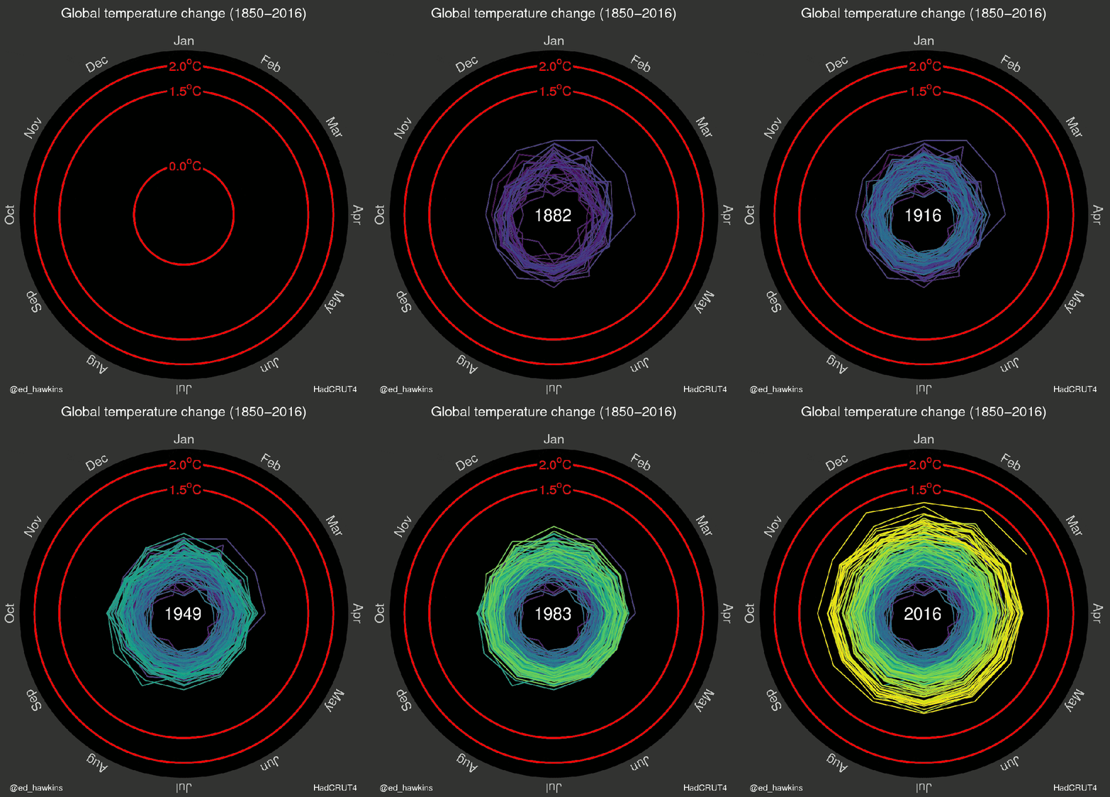
To give an evident revelation about Global Warming, Dr. Ed Hawkins, a scientist of the National Centre for Atmospheric Science at the University of Reading, gave this mesmerizing visualization on what’s exactly the situation is on global warming giving an excellent overview.

Global Warming Visualization spanning 150 years
Global Temperature Change spanning 150 years

The above visualization appealingly shows the undeniable trend of the growing temperature spiraling out since 1850. It very aesthetically shows month wise temperature change observed till 2016 with the baseline of 1.5-degree celsius and 2-degree celsius which are goal limits of global warming according to international standards. It clearly depicts how the global warming has accelerated in the past few decades.

Reference : http://mashable.com/2016/05/10/visualization-global-warming/#rrBnE43gIgqT