Hotels or Airbnb? Redesigning the map

The quarter has almost come to an end, and Spring break is not far. I have some travel plans, and was looking for places to live. With all the hype about Airbnb, I thought of checking the prices out and the rate difference between a hotel room and an Airbnb room.

I came across a map of US, and the number of Airbnb units in each city. Find the map on this link – Map with Airbnb Units . This map has the number of Airbnb across select cities as size. A larger dot means, there are more number of Airbnb in that city. Upon hovering, a tool tip pops up, which has the average price of a Airbnb unit and a hotel room for the city. For the kind of audience this chart is meant to be , the people who want to compare prices across cities, this is not the best way to do. Essentially because the comparison values aren’t out there explicitly. The size does indicate that number of Airbnb are more in those cities, but it has no indication with price. A better way would be do find the difference in the price of the hotel and airbnb and plot that as bars across each city. In that way the price difference would be more visible and on the first glance, an idea can be obtained about where the Airbnb units are cheaper, which are the cheapest.

A dashboard can also  be built, showing the number of Airbnb across each city as it is, then adding the visualization which shows the difference and a line which shows the price difference relation and the number of airbnb units. Are the number of Airbnb units related to the average price ? Do more units mean a lower average price? Such analytics can be derived.

 

Visual Imagery and Simplicity

Last week, I wrote a blog about how visual embellishments and imagery can be useful and help in remembering the data for a longer time.

But, again, the context and the simplicity plays a very important role when using visual imagery. Below is the link for an info graphic, which depicts what do travelers hate the most about travelling.

http://junkcharts.typepad.com/.a/6a00d8341e992c53ef01bb0793f46b970d-pi

This info graphic is poorly organized and instead of making data flow simpler, it is just complicating it more.

Reading the info-graph takes a while and it  strains  the eyes.

The upper left corner says 37% hate to sit in a middle seat, and the aircraft is drawn in the center. This data would have looked much better if the number was placed on the seat. Or best, just present the numbers in the form of a table

37 % Hate sitting on the middle seat

25% Don’t like chatty neighbors ; so on and so forth

Reading the data would take much less time than figuring out each corner of the info-graph and then thinking about why that information was placed where it is.

It is good to use info-graphics to make the data more attractive and present it in a creative way, but then, things like readability, organization, structure and SIMPLICITY should also be kept in mind.


Using Visual Imagery in Charts

Eye beats memory. Visual Analysis. Visual Exploration.

These are a few keywords and jargon that we have been using and dealing with in our course. This week I came across a very interesting topic, the use of visual imagery in charts. The debate was, is visual imagery treated as junk or is it useful in charts?

The main question is, why do we visualize data? Why do we create visualizations? To convey a few facts, or to represent what is happening? To depict the data visually. But another question is, whom are we visualizing the specific data-set for? Is it for a niche audience, for an article that targets the general market or for some sales team to make some decisions?

When it comes to making visualizations for the general people, the concept of visual imagery kicks in. Consider for an example, a chart depicting the type of drinks consumed by Manhattan on a Saturday night. There are 5 drinks, Beer,Martini,Cocktails, Champagne and Wine.

If shown to the mass, are they going to remember simple bars and the figure depicting the number of drinks, or a chart which is representing the same information more creatively yet simple. For instance, icons of beers , wine glasses and martini glasses for each category instead of the normal labels?

From personal experience, some information is better remembered when associated with pictures. The below linked paper also mentions that people were able to recall the visual imagery charts in a better way after a longer period as compared to the normal conventional charts.

When it comes to visual embellishments , I feel  the audience of the visualization is very important. A marketing executive or a sales executive wouldn’t want to see images for monsters in monstrous costs or pictures of beer in the sales trends, but the general audience will be able to remember it in a better fashion.

References – View page 9 , figure 10 for the chart I am taking about here

http://hci.usask.ca/uploads/173-pap0297-bateman.pdf


Choropleths or Cartograms?

A choropleth map is a map in which the areas are shaded or themed according to the measure of the variable being displayed on the map.

We have been using such maps often, for representing population density, electoral votes, GDP income and more.

Advantages

  • It provides an easy way to visulize how the values of a measure are changing across the area
  • They are useful to visualize two variable decisions like the electoral maps. It can clearly indicate the colour differences and hence reading the map becomes easy

Disadvantages

  • When using maps for multiple ranges, it becomes difficult to distinguish each value. For eg: Using choropleth maps for Population density, differentiating the shades for similar values of population density becomes difficult.
  • The intervals need to be chosen carefully to depict a color change

Cartograms

Cartograms are maps in which the size of a geographical area is drawn proportionately to the value of data it contains. For eg : For mapping the popultaion density of different states, since New York has the highest population density, the size of New York will be considerably bigger than it actually is geographically.

Advantages

  • Cartograms are good at showing the relationship between spatial units
  • They give a clear idea about the size and the value of the measure

Disadvantages

  • Sometimes they become difficult to read as the shape gets distorted
  • Not sure about what to do with 0 or negative values
  • More data is needed to plot the states/regions as polygons

I have been doing a project which deals with Population density. I tried my hands on generating a Cartogram in tableau, and it required far more efforts than plotting a choropleth map. Cartograms definitely size the data accordingly, but recognizing becomes difficult as labelling in cartogram is tough.

Personally, I would stick to Choropleth maps for a basic map and then use bubble chart to visualize the regions according to the size, where each bubble would represent the value.


References-http://www.clearlyandsimply.com/clearly_and_simply/2015/04/cartograms-in-tableau.html


Simplifying maps to make sense

https://medium.com/@tviit/the-new-york-city-subway-map-redesigned-9a3f776c7627#.32dju0mli

Over the long weekend, I was traveling to NYC for some work and needed to use the subway system for commuting. For non-newyorkers it is a task about what line goes where and how many connections overlap each other.

This is a visualization I came across while reading more about the subways systems. The left hand side shows a simplified version of the original map that is being used by the metro.

There are multiple lines which have been assigned multiple colors.

For example, R,N and  Q lines signify the yellow color and these lines run on several stations. But Q doesn’t go beyond 57th street. That is clearly seen on the redesigned chart on the left.

This chart also shows the junctions and the intersections. On the 42nd street station, all the lines 1,2,3,R,N,Q and S intersect. This can be seen clearly on the redesigned chart, while it takes a bit to decipher that from the original map.

The different thing that they have done is they have visualized multiple lines for each color. Like yellow runs through R,N and Q, they have made 3 separate lines to visualize the yellow R ,N and Q lines as compared to a single line in the original map. These multiple lines makes it easy to track.

On a first glance, the redesigned map looks much simpler, cleaner and neat. Though it has the exact same amount of information as the original map, the new one is simpler to read.

In creating visualizations it is very important to keep in mind a sense of simplicity. For someone who is looking at the visualization for the first times, congested visualizations become difficult to interpret.


References :  https://medium.com/@tviit/the-new-york-city-subway-map-redesigned-9a3f776c7627#.32dju0mli

Heat Maps, to use or not to use?

https://www.bloomberg.com/news/articles/2015-12-03/electric-cars-can-t-take-the-cold

This week we had an interesting discussion in class, about when to use heat maps and how to interpret them.

I came across this heat map. The claim is, Since electric cars generate power less efficiently as the temperatures drop, they are sold more on the West coast than other regions of USA. And obviosuly, there are other reasons like West Coast being more technology savvy than the rest, also adds up to the sales.

About the visualization –

  • The heat map  is U.S electric vehicle sales by region
  • On observing we see, that there are 4 patterned boxes for 4 regions and California is in light blue
  • On the first glance, one state and other regions seems confusing
  • It takes time to interpret the heat map

The Underlying meaning

  • The visualization depicts the 4 regions and the sales made in each region in September
  • What they have tried to show is, even on the West Coast, California sells the highest number of electric cars.
  • The number of cars sold in California, is greater than those combined for Midwest, Notheasrt, South and the remaining West region.
  • But, this could be shown through a bar graph as well, comparing sales in California with the rest. That would have been easier to interpret in the first look.

Apart from temperature, factors like population should also be considered. California is the most populated state , as per the region available, so that could be one contributing factor as well.


References –

https://www.bloomberg.com/news/articles/2015-12-03/electric-cars-can-t-take-the-cold

Game of Thrones, Visualized, Simplified!

https://flowingdata.com/2016/06/03/game-of-thrones-discussions-for-every-episode-visualized/

When I tell someone today that I don’t follow or enjoy Game of Thrones, GOT as popularly known, because it confuses me, they treat me like an outcast. GOT is one of the most popular shows right now. With so many things happening in each episode it is pretty easy to get lost somewhere.

This is an interesting network graph, which represents the connection of all characters mentioned in an episode. a network graph shows the connection between two things. There are nodes and if they are related, they are joined by a path. Here, each character is a node and the connections are the lines joining them. The color represents the affiliation of each character. The size of the node represents  how frequently each character was mentioned. More so,it is combined with the twitter analysis and it also shows the smiley used most frequently with each character.

For example, in this episode, Robb and Walder were mentioned together and it symbolizes a heartbreak over Rob. We see the big red node; indicating that Daenerys was mentioned for the maximum number of times.

What I did not understand is the size of the lines joining the characters.  Some are joined with thick gray lines, some with red, some with light purple and that is something I was not able to interpret why.

References – https://flowingdata.com/2016/06/03/game-of-thrones-discussions-for-every-episode-visualized/


What is the most popular major in the US?

http://degreesearch.org/blog/the-most-popular-college-majors/

This blog post is about the info-graphic I came across while searching for what degrees do the students of US opt for. The data is a little old, this info graph was created in 2013.

In the above mentioned infographic, there is a pie chart, which lists down the top majors preferred by students for undergraduate studies.

Things that went wrong about the pie chart –

  • It is a PIE chart!
  • There are too many slices, and hence it becomes difficult to comprehend the data

Things which are okay-

  • They have percentages for each major, and color coded the labels, so interpreting gets relatively better from a pie chart.

Major Takeaways

  • More men prefer engineering majors than women.
  • Women tend to pursue health care and psychology disciplines.
  • People prefer education and business degrees more for masters/ further studies. This chart breaks a myth that I have, which was engineering is the most chosen major for masters.

References – http://degreesearch.org/blog/the-most-popular-college-majors/

Need some time-management ideas?


This is a visualization of how some of the most creative people utilize their time throughout the day. This type of a chart is called a Gantt chart. A Gantt chart is a chart in which series of horizontal lines depict the amount of work done/utilization over a period of time.  These type of charts are used to depict time frames and utilization.

From the above given visualization we decipher the time frames creative people give to daily tasks. Out of the 26 people illustrated here, only 4 of them sleep beyond 8 a.m. No wonder there is a bedtime fable, Early to bed, Early to rise, Ready to Shine. Taking enough rest is important to rejuvenate the mind and come up with fresh ideas.

21 out of these 26, like to work till the late hour, or wake up early to work. The Gantt chart is not similar for any of these people. It turns out that everyone has their own specialty and a different style of working.

I specifically liked this chart because we can select different activities and that gets highlighted.

Get inspired, and go pick your idol to make the most of your time and shine on!


References – https://podio.com/site/creative-routines

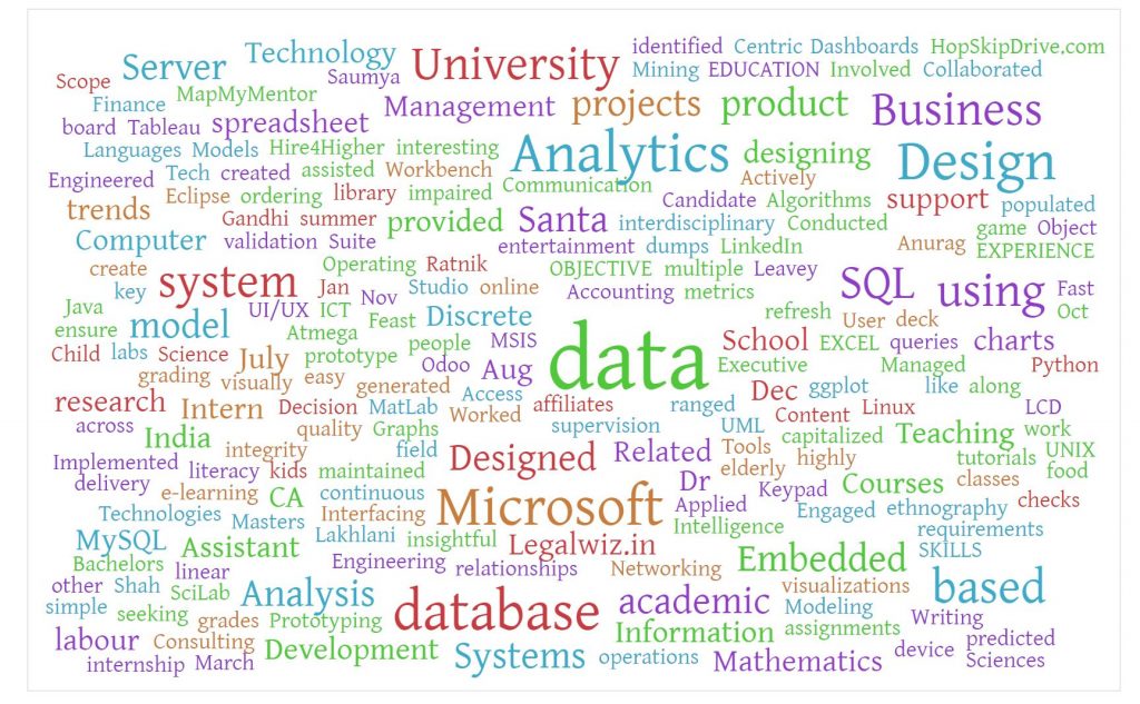
Word Cloud from Resume

Word Cloud

This is the quarter when I am applying for internships. After speaking to the career counselor at school , she suggested me to generate a word cloud out of my resume. I tried to create a word cloud via an online word cloud generator. I used https://worditout.com/word-cloud/create to create the word cloud.

For creating the word cloud , I copied the text of my resume and clicked on generate. Essentially, word clouds represent the frequency of the words used , higher the frequency bigger the font of that specific word.

This is the visualization which resulted from my resume. I am interested in data analytics and new product development, hence words like data, analytics, business, design, database, SQL are used more, and that is reflected in the cloud.

Upon first look , I was able to spot the words data, analytics, and Microsoft. It can be inferred that these words are used the highest number of times in the text on my resume. This word cloud gives an overview of the words and my interests out of my resume. By simply looking at it, certain domains can be identified within a second, where as it takes time to read through the whole resume document.