Things to know about Data Storytelling

Data analysis doesn’t only involve making visualizations and quantifying data. The data analyst should be able to tell  a story through all the analysis he/she has done. The story made should be credible and should convince the reader about the story tellers expertise.

  1. Story teller is the expert: While designing any visualization, the designer should be well aware of the data. Even if the visualizer is manipulating the data, he should be aware where to draw the line and keep the data relevant. There are people relying on the information the story teller is giving so the accuracy must be kept intact.
  2. Know your audience: It is important for the story teller to know his audience. The information that can draw the attention or keep them engaged should be present in the story. The information representation should be simple so that they don’t have to be experts on the subject being discussed.
  3. Story should have context: While creating a story the story teller may assume certain things and forget to give context for the analysis. The audience does not have the complete information regarding the subject and may not understand the context behind the story. While stating any co-relations the story teller must make sure to give information on why he felt like relating two values so that there is no doubt in the audiences mind.
  4. Design matters: The brain can understand visualizations faster than numbers hence the visualization design should be simple but effective. The audience should not be bombarded by information and the dashboard should have only similar pieces of information. Comparative charts are useful while story telling as it helps the audience understand the meaning behind it faster.
  5. Use visualization Strategically: The order of visualizations in a story telling is crucial. The order in which the visualization is presented determines the effect of the story. The sequence should be logical and make an impact on the viewer’s mind.

Source:http://blogs.sas.com/content/customeranalytics/2015/06/15/6-things-learned-data-storytelling/

Characteristics of Deceptive Visualization!

Data visualization is widely used to convey information, to prove certain facts and to show trends. But often the visualization are deceptive, they are modified in such a way that they prove a certain claim. Following are some techniques to identify data visualization deception:

  1. Truncated Axis: The Y-axis can be altered with to exaggerate the values being represented. Instead  of having the origin as 0, it can be started with any different value to give an illusion of higher values. This is one the most common techniques for deception.
  2. Area as Quantity: Using area coverage to denote quantity is also a widely used data deception technique. The values can be denoted as circles or any other shape denoting area. Some area shapes can appear to be greater in size but may not have the correct interpretation of the information. One-to-one mapping between data and graphical is a better way of using area as quantity.
  3. Changes in Aspect Ratio: This type of deception is applied to line charts more often. The aspect ratio change may give an illusion of increase or decrease of one quantity against the other. Changes in it can alter the viewers perception about a graph.
  4. Inverted Axis: Inversion of axis leads to the change in the direction of the trend. This gives the user a notion of the reversal of the correct information. This technique doesn’t exaggerate or underestimate but completely change the notion of a visualization.

Source: https://medium.com/@Infogram/study-asks-how-deceptive-are-deceptive-visualizations-8ff52fd81239#.58vad76t0

5 Steps to Better KPI Graphs

In the business community KPI graphs are often shown to represent important metrics related to performance. Here are few important tips to remember while making KPI graphs-

  1. Don’t have distracting backgrounds: While showing important statistics it is important to not have background which may distract the viewer from the underlying message. Bright colors should be avoided while creating graphs as they might be distracting. Use of gridlines should be done wisely as they might make the chart feel too clustered.
  2. Use titles and labels: Efficient use of titles and labels can help the viewer understand the chart better. With proper labeling the user can immediately understand what is being measured against a certain parameter. Chart titles give the overall description of the issue being addressed in the graph.
  3. Use dual axes: The use of two axes is that it allows the user to measure two values against each other with proper measures. If the two metrics have different scales it is important to show them on different axes. Showing them on the same axis can give an altogether different meaning to the graph.
  4. Too much data is bad: If too much information is added to the graph, it may confuse the user. The reader can get overwhelmed by the amount of information and the meaning of the graph may not get through. Hence the graphs should be separated and only relevant information needs to be shown.
  5. Pick the chart wisely: While deciding on the graph, the designer should be careful on the chart selection. Pie charts and donut charts must be avoided as they might not communicate the correct values of the data. They can create a wrong impression on the viewer and can be misleading. Simple bar charts and line charts should be used instead to convey information.

Source: https://www.targetdashboard.com/blog/125/5-Steps-to-Better-KPI-Graphs.aspx

Interactive Visualization- 5 Key Properties

Interactive visualizations are often used to show insights from the data sets. It gives the user to select filters and view the data to see patterns or trends. But creating interactive visualization can get tricky. The following key points should be followed while creating a dashboard-

  1. Ease of understanding for Novice User: A new user who does not have a full understanding of the data set must be able to do analysis without wasting much time on the visualization. They should be able to understand the trends, correlations and anomalies using the tool and make faster decisions based on the visualization.
  2. Driving Processes: The visualization should highlight the KPI’s and important metrics which drive the business processes. They must be visually enhanced by using right kind of colors or patterns which makes it easier for the user to identify them. The representation should be simple but granular as well so that no vital information is left out, but it is also easier for the user to make sense out of it.
  3. Data must tell a story: The data should be analyzed in such a way that it unfolds a story. The user by applying appropriate filters should be able to see different perspectives leading to a decisive conclusion. The interactive dashboard should be such that is gives a high level overview and takes the user to granular details of the data.
  4. Data correlation: On viewing the visualization the user should immediately be able to identify the hot spots which need immediate actions. They should be able to find trends in the data set by viewing the relationship between different data streams and different data sets at times.
  5. What next?: Every data visualization should comment on what could happen could happen next? By using predictive analysis, some predictions should be made about the trends in the future. By using calculations and algorithms the data analyst can give some recommendations about the future of the data trend.

Source: https://www.forbes.com/sites/benkerschberg/2014/04/30/five-key-properties-of-interactive-data-visualization/#1f83815e589e

Difference between Metric and KPI

While creating visualizations showing the Key Performance Indicators (KPI’s) for any business, it is extremely important to understand that not all metrics are KPI’s and hence are not useful in evaluating the business.

What is the difference between metrics and KPI’s?

A metric denotes the numeric value of the measure, whereas a KPI explains what is being measured. A metric can be a calculation of different metrics eg average. KPI uses quantifiable metrics to evaluate the business goals. They help to make calculated business decisions based on the metrics obtained.

KPI helps business owners to understand basic business profits like break even points. A balanced scorecard can be created to evaluate the different operating elements like financial growth, customer satisfaction and business processes. This helps business owners to track the progress of their business.

KPI’s help the business owners in the following ways-

  • Design good lead strategy
  • Choose an effective marketing method which is cost effective
  • Define an appropriate pricing strategy for its products.

By combining KPI’s with useful metrics a company can communicate its performance with the internal or external stakeholders. This helps them to identify the areas to work on and improve for the business to do better. It gives the picture of performance against the goals set by the company.

Sources- http://yourbusiness.azcentral.com/differences-between-kpi-metric-24392.html

http://experience.stratusinteractive.com/blog/whats-the-difference-between-a-metric-and-kpi

http://www.bscdesigner.com/quantification-measure-metric-kpi.htm


Heatmaps decoded!

Heat maps use color variance for data visualization. They are intensive used for displaying variance between different variables, displaying any particular pattern between them and if any correlation are present between the variables.

  • The rows and columns of a table form the matrix structure of the heatmap. Each cell of the matrix contains color coded data or numerical data which is displayed on a color scale. The matrix data represents the relationship between the variables of the row and column associated.
  • A legend should be given alongside the heatmap for better understanding of it. Numerical data requires a color scale which has different colors blending into one another to show variance of high and low in the associated data. While categorical data is color coded.
  • Heat map uses the color differences to display changes in value, hence it should be used to give a more generalized view of the numerical data. Heatmap should not be used to display sensitive data which needs to be represented accurately.
  • Heat maps are best used to show changes in values over time. Any column of row can be used to denote the time changes.
  • The colors in the heatmap should be chosen carefully as the difference must be visible immediately to the human eye. Rainbow color schemes are highly used as humans can perceive more shades of those colors. Grey color scales must be avoided as they are difficult for perception.
  • The best use of heat maps are done to show temperature changes in a city or town over months or years or to depict the hottest and coolest places to stay.

Source: http://www.datavizcatalogue.com/methods/heatmap.html

Top 5 Tips for Getting the Most Out of Your Tableau Dashboard

Tableau is widely used to create visualizations and dashboards to analyze various kinds of data and derive useful results. There are a few simple tricks to make the tableau dashboard more efficient:

  1. Do not join different types of sources: While creating visualizations we tend to join different data sets. It is important to consider the file types while performing joins. Joining a database to an Excel file and then to some other tableau extract. This can be hazardous for tableau performance. It takes a lot of time to fetch results from different file types and perform calculations based on it. It is crucial to not join too many different file types for better performance.
  2. Calculations should not be too complex: If the data needs to be processed by performing way too many complex calculations, it should be done in the source file and not tableau. Tableau calculations should be kept short and simple. It helps to perform calculations faster and retrieve results in a short time.
  3. Reduce number of report in the dashboard: Too many reports in a dashboard takes a lot of loading time. The number of reports in a dashboard should be precise and too the point. There is no use in creating a new report to visualize every small detail. The reports should be made efficient by displaying right amount of information. This helps improve tableau performance.
  4. Do not bring unwanted data: Before loading the data into tableau, it is important to performs checks whether all the data is necessary for visualization. If some columns or rows are not needed for the visualization, they can be filtered out before bringing them into tableau. Too much of data results in increase in parsing time which reduces tableau efficiency.
  5. Use Parameters instead of  Quick Filters: Using parameters helps reduce load time of the dashboard. The user can insert the values in parameters to see results related to the input. Quick filters displays all the possible results a user can see but it leads to increase in loading time of the report.

By following these simple rules, efficiency of tableau dashboard can be increased.

Reference: https://www.excella.com/insights/top-5-tips-for-getting-the-most-out-of-your-tableau-dashboard

Visualization Mistakes to Avoid

In class and while working we have come across many ways of making an effective visualization. The visualization can be made more effective by keeping in mind few simple points-

  1. Displaying too much data: It is extremely important to not confuse the reader with bombarding of information. The data must be precise and correct. It should be easy to summarize for the reader.
  2. Oversimplifying data: Complex data should not be oversimplified for visualization purpose. This can change the entire meaning of the data and the reader might interpret it in a wrong way. Hence oversimplification of data must be avoided.
  3. Choosing wrong visualization: The designer must understand which king of chart would be useful for which kind of data. The use of pie charts and donut charts must be completely avoided as they give the wrong interpretation of information. Also 3D techniques must necessarily to make the visualization more appealing.
  4. Not following conventions: It is necessary to follow correct conventions while designing any visualization. The x and y axes should always be present while quantifying the data. Correct annotations must be used wherever needed. The graph should always be labelled to understand the correct meaning of it.
  5. Don’t use hard to compare data: While creating visualization it should always be kept in mind that is there is a comparison, it should be of similar nature. Non related data must not be used for comparison as it does not make any sense.

By following these simple steps an effective visualization can be achieved.

Reference: http://www.techadvisory.org/2015/07/data-visualization-mistakes-to-avoid/

http://designroast.org/the-7-most-common-data-visualization-mistakes/

Two Centuries of U.S. Immigration

Capture3

This visualization represents the immigration growth in the United States from the year 1820 to 2013. The visualization represents 10,000 people using 1 dot. The dots change dynamically to depict people migrating from different countries across the world. This visualization also enables users to see the top 3 countries from where the immigration has be the highest in a given year.

Good points about this visualization:

  • Dynamic data changing which enables user to understand the meaning of the visualization without spending a lot of time to understand it.
  • Color coding: Changes in the colors of the countries when migration occurs helps the user to spot the countries from where people are coming to the United States.
  • Visualization Speed: The density and speed of dots changing also helps in understanding the increase in the immigration over the period of years.
  • Scaling: The year range scale also gives a clear understanding of the visualization without giving any room for ambiguity regarding which year the data is representing.
  • Legend: The legend also helps in giving exact numbers for the years and the top 3 nations the immigration has been the highest from.

Points to be improved:

  • A comparative visualization could have helped to understand the variation in immigration from the different countries by using dynamic bar charts. This would have helped the user to see the density of immigration coming in from different nations.
  • A legend depicting whether the colors assigned to the different countries have any significance would have enhanced the user experience.

Conclusion: A good visualization clearly depicting the insights of the observation.

Source: http://blog.visme.co/best-information-graphics-2016/ 

Reference: http://metrocosm.com/animated-immigration-map/


What does an American do at any given point in the day?


1

2
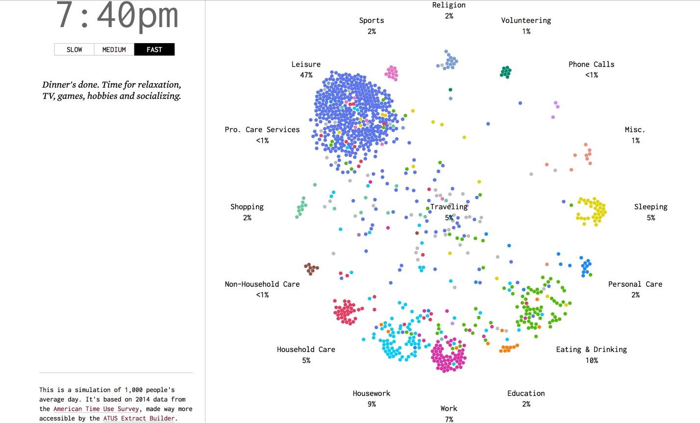
The visualization shows the tasks which Americans are engaged in at any given point in the day. The basic concept being each dot represents a person. The data is for 1000 people surveyed in 2014. The study of the data will help us to know daily habits of Americans and assist us in determining why so many are still in bed at 8:00 in the morning.

The activity beehive shown above is intended to be animated. As in, it changes every minute and updates the activities being carried out by people.
The result may help in determining problems with daily routines.

Good Points about the visualization:
• Easy clustering observed: The clustering of points easily shows what most of the people are doing
• Coloring segregation: Each activity is assigned a color, making spotting different clusters easier
• Color changes: The dots change color before switching from an activity to another. This makes it convenient to see how many are about to get to another activity from the current one.
• Minute data: The data is displayed per minute, which is a good precision considering there are 1440 minutes in each day.
• Visualization speed: An option to modify the transition speed is given. This makes it customizable for the user to look at leisure as well as a highlight, whatever suits.

Points for improvement in the visualization:
• Too dynamic: the data changes every second even in the slowest mode, which may not be desired in case the end users need time to process the visualization.
• Alternative: This type of visualization needs more area and dots moving from one point to another. We could use dynamic bar graphs changing to indicate comparative activity study. Pie charts could also be suitable as the total area remains constant with just the sub-sections changing.

Conclusion: It is a fair representation given the changing points in time, although some slight improvements could be made depending on the intended audience.

Source : http://flowingdata.com/2015/12/15/a-day-in-the-life-of-americans/
Reference : http://www.scribblelive.com/blog/2015/12/28/9-best-data-visualization-examples-2015/