How to create a simple Bar chart using D3.js? Part 2

In the previous post we saw what an svg element is how to define it, what the domain through the xAxis and yAxis and range through xRange and yRange are how to fit it according to the data set.

Next is to transform the xRange and the yRange into the plotting space and draw a line across the plotting space.

This function d3.svg.line() is used to draw a line graph for which we need to create a line generator function which returns the x and y coordinates from our data to plot the line. How is this line generator function defined?

var lineFunc = d3.svg.line()

.x(function(d) {

return xRange(d.x);

})

.y(function(d) {

return yRange(d.y);

})

.interpolate(‘linear’);

The .interpolate(‘linear’) function call tells d3 to draw straight lines. Next step is to set the ‘d’ attribute of the svg path(as mentioned in the xRange and yRange) to the coordinates returned from the line function.

vis.append(‘svg:path’)

.attr(‘d’, lineFunc(lineData))

.attr(‘stroke’, ‘blue’)

.attr(‘stroke-width’, 2)

.attr(‘fill’, ‘none’);

As we can see above the line color is set using stroke, line width set using stroke-width, fill is also set to none so that the graph boundaries are not filled.

Next step is to create the bar chart. As seen earlier the axes has already been created hence we just need to modify the exiting code a bit.

yAxis = d3.svg.axis()

.scale(yRange)

.tickSize(5)

.orient(“left”)

.tickSubdivide(true);

The yAxis starts at 5 because 5 is the minimum y value of the sample data. Hence yAxis needs to scaled from 0. Hence the yRange function needs to be modified like this:

yRange = d3.scale.linear().range([HEIGHT – MARGINS.top, MARGINS.bottom]).domain([0,

d3.max(barData, function(d) {

return d.y;

})]);

In case of bar charts ordinal scales help maintain a discrete domain hence we will be using ordinal scales instead of linear. rangeRoundBands helps in dividing the width across the chart bars. The spacing between the bars are set to be 0.1 can be altered according to user’s preference. Hence the final xRange is defined as:

xRange = d3.scale.ordinal().rangeRoundBands([MARGINS.left, WIDTH – MARGINS.right], 0.1).domain(barData.map(function(d) {

return d.x;

}));

Next step is to create rectangular bars for the chart data. Our sample data will be bound to the rectangles using x and y coordinates to set the height and width of the rectangular bars.

vis.selectAll(‘rect’)

.data(barData)

.enter()

.append(‘rect’)

.attr(‘x’, function(d) {

return xRange(d.x);                    // sets the x position of the bar

})

.attr(‘y’, function(d) {

return yRange(d.y);                    // sets the y position of the bar

})

.attr(‘width’, xRange.rangeBand())                         // sets the width of bar

.attr(‘height’, function(d) {

return ((HEIGHT – MARGINS.bottom) – yRange(d.y));                    // sets the height of bar

})

.attr(‘fill’, ‘grey’);                           // fills the bar with grey color

Final step is to set the CSS properties of few of the elements.

.axis path, .axis line

{

fill: none;

stroke: #777;

shape-rendering: crispEdges;         // provides hint on what tradeoffs to make as the browser renders the path element or basic shapes

}

.axis text

{

font-family: ‘Arial’;

font-size: 13px;

}

.tick

{

stroke-dasharray: 1, 2;                     //this property helps css in creating    dashes in the stroke of the Svg shapes

}

.bar

{

fill: FireBrick;

}

Finally our bar chart from the sample data is ready, with all the styling elements. A detailed version of the code base is available here:

http://codepen.io/jay3dec/pen/fjyuE

Hope this post encourages you all to try a simple bar chart on D3.js.

Reference : https://www.sitepoint.com/creating-simple-line-bar-charts-using-d3-js/


How to create a simple Bar chart using D3.js? Part 1

For many classes I have sat wondering why should I learn to use D3.js when I can create a simple bar chart in Tableau within seconds. However, after reading a couple of articles online and also a few blogposts from this course I got intrigued and wanted to write on my understanding of the creation of a bar chart using D3.js.

D3.js as we all know is a Javascript library which helps visualize data using HTML, SVG and CSS.

All of us are aware of HTML and CSS. So, what is this SVG after all? SVG is an XML based vector image format with support for interactivity and animation. SVG allows three types of graphic objects:

  • Vector graphic shapes such as outlines (boundary for your bar graph) consisting of straight lines and curves
  • Bitmap images
  • Text

These graphical objects can be grouped, styled and transformed into previously rendered objects. SVG is like your paint tool which draws your chart based on the measurements you give and axis and boundary defined by you.  You can include interactivity with your SVG as well and bring in animation to your chart through javascript that accesses the SVG DOM (document object model) Document_Object_Model.

So to first start your bar graph, you need an svg element to plot it and render it with the available data.

<svg id=”visualisation” width=”1000″ height=”500″></svg>

This code defines the svg element’s border or a small box with the mentioned height and width.

Next step is to create the x and the y axis of your chart for which you need a fixed range and domain for both the axis.

Domain – defines the maximum and minimum value of the data set displayed on the graph

Range – amount of the domain that the svg will be covering.

How will you fix the domain and the range? What sets that minimum and maximum value? The axis needs to scale according to your data and we need to take this into consideration while setting the values for the domain and the range.

For this example, I am using the following dataset:

var lineData = [{ x: 1, y: 5}, {  x: 20, y: 20 }, { x: 40,  y: 10 }, {  x: 60, y: 40 }, {  x: 80, y: 5}, { x: 100,  y: 60 }];

Now that the SVG is defined next step is to define a margin because each HTML element is considered as box on any web page. It consists of margin, border, padding and content. The width and height of the entire bar chart should also be set initially.

var vis = d3.select(‘#visualisation’), WIDTH = 1000, HEIGHT = 500, MARGINS = { top: 20,  right: 20,  bottom: 20, left: 50 },

<!— The x-range and the y-range represent the domain of the x- axis and the y-axis.

The range value takes into consideration the left and the right margin.

The next step would be to tie the domain to the data set using d3. Max() and d3.min() methods. –>

xRange = d3.scale.linear().range([MARGINS.left, WIDTH – MARGINS.right]).domain([d3.min(lineData, function(d) {

return d.x;

}), d3.max(lineData, function(d) {

return d.x;

})]),

yRange = d3.scale.linear().range([HEIGHT – MARGINS.top, MARGINS.bottom]).domain([d3.min(lineData, function(d) {

return d.y;

}), d3.max(lineData, function(d) {

return d.y;

})]),

<! – – Both the axis are appended to the SVG element by use of the append function – ->

xAxis = d3.svg.axis() .scale(xRange)  .tickSize(5) .tickSubdivide(true),

<! – the Y axis needs to be oriented towards the left hence orient function is used. – ->

yAxis = d3.svg.axis().scale(yRange) .tickSize(5) .orient(‘left’).tickSubdivide(true);

Both the axes have been transformed keeping the defined margin in view so that the axis do not touch the SVG margin. I will be continuing this post next week to add the lines of the bar chart and also CSS styling element. Hope this post encourages you all to try a simple chart on D3.js.

Reference : https://www.sitepoint.com/creating-simple-line-bar-charts-using-d3-js/


Will the recent immigration rules under Trump administration impact the American economy?

Many Silicon valley companies opposed Trump’s immigration order immediately a week after it was implemented because the US innovation economy relies heavily on foreign talent. Also, it make it more difficult for US companies to continue with their day to day business operations and to recruit, hire and retain the world’s best employees.

Main Intention:-   So far since Trump was elected, four bills related to reforming the visa programs have been presented to the Congress. This has caused a huge concern among the Tech community since they feel these bills could be a stepping stone to a huge change in the entire legal immigration system. The four bills are:

Bills presented on visa program reforms

Understanding the viz :- The below visualization is first broken by Visa holders and Green card holders and further partitioned by the type of the worker visa. Let’s direct our attention to the worker visa section which has a total of 807,212 visas. Workers with these types of visas take a lower salary in comparison with American workers which thereby implies drop in American worker wages.

Main types of worker Visas and segmentation of green card holders

One of the above bills proposes to raise the salary cap for obtaining a H1-B visa to 100k per year. Another bill proposes to curb the replacement of American skilled workers with cheap H1-B or L-1 workers.

As we can clearly see from the below plot on green cards, only 14% is employment based whereas a huge 33% belongs to spouses or children of green card holders working in US. These green card holders could potentially compete for US citizen jobs.

Critiquing the visualization:-  

  • For the bigger box chart on Visas, a better representation could be to use percentage instead of total number of visa holders of each type.
  • Also, when the main focus is on employment visas it can be highlighted better with a different color that catches the attention of the audience (“Eye beats memory”).
  • The segmentation of the different types under employment visa again can be shown more clearly using a better tool tip.

KPI :–

  • Number of visa issued in 2015
  • Number of green card holders in 2015

Argument:-

Why does US need these foreign workers?

They are talented, skilled and top class competitive workers. Their expertise and labor is beneficial for the economy which raises the standard of living for Americans. This helps US compete more effectively on a global scale.

Reference: https://www.washingtonpost.com/graphics/national/visas-impact/


The Real difference between Google and Apple

Both Apple and Google are powerful and successful companies driving today’s cutting edge innovation and technology. The below visualization talks about the patents obtained in both these companies and how it translates into their organization structure.

Right: Apple Left: Google

Argument: Apple has a more centralized organization structure, originating from it’s well known design studio. Google, however has a stream of distributed open source approach to their new products.

In order to prove this difference in organization structures, a data visualization company, Periscopic charted the last 10 years of patents filed at Apple and Google as a complex network of connections.

Understanding the visualization – Each blob is a patent inventor. As many patents can have multiple inventors , each line is a link between the inventor and the co-inventor. While Apple’s viz looks like multiple blobs scattered across, Googles’ viz looks more like a monotonous single blob which is evenly distributed.

According to the patent data, in the last 10 years:

  • Apple has produced 10,975 patents with a team of 5,232 inventors.
  • Google has produced 12,386 patents with a team of 8,888 inventors.

The proportion of patents seems to be similar, however, there is a group of highly connected experienced set of inventors at the core of Apple, however for Google its more evenly dispersed. This translates to a more top down, centrally controlled system in Apple. Google on the other hand has a more flat organization structure with many teams having experienced inventors.

KPI – Average number of inventors listed per patent.

  • Apple – 4.2
  • Google – 2.8

Because of even distribution of patents at Google one is bound to think that the average number of inventors listed on a patent should be more in Google than at Apple (from the above visualization). However, the underlying data denies this. On an average an inventor in Apple produced twice the patents than an inventor in Google.

Audience for the visualization – Periscopic helped develop a product called PatentsView which is a visualizer for American Institute for Research and US Patents Trademark Office.

About PatentsView – It transforms the patent database which is made public for over a century, into a viewable network of connections. The patents, can be viewed by company or can be sorted according to the creator or topic.

Main Intention – According to the CEO of Periscopic, they wanted to utilize the publicly available patent data to find interesting patterns and also inspire others to explore this data.

Reference: https://www.fastcodesign.com/3068474/the-real-difference-between-google-and-apple


Data Cleaning tips and tricks for our visualization projects

As many of us have started working on cleaning our data for our project work, I thought of sharing a few tips and tricks that I came across for cleaning your data sets while using Tableau.

  1. Get involved with your data

After you have identified the final argument and the different claims that support your argument, the next step would be to understand your data. It may not be sufficient to just look at the column headers, it’s a good idea to think through what the data represents. Check for the data types, values that each column can take if they are within the expected range (an e.g. price range of fruits per kg in a grocery store from $0 to $40.) Be vary of empty or null values. (E.g. in our first assignment the null values for x Coordinate, y coordinate, latitude and longitude did result in a key insight). You can also try to spot initial patterns in the data set.

  1. Never trust your data at the first sight

It may so happen that the first set of 50 -100 rows of your data may be well formatted however there may be errors in the rest of the rows making it difficult to visualize your data. Also, it’s always better to double check your understanding of the data so that you don’t make wrong assumptions. This will save a lot of initial data prep time.

  1. Avoid cleaning your data manually

It’s always better to use the in-built Tableau Data Interpreter for cleaning messy data sets. It’s an easy way to strip out title, footnotes, empty cells and multi-row column headers and create a usable table. The data interpreter is also very useful in extracting sub tables from excel files. i.e. when multiple table are place on the same sheet and separated by a empty spacing in between.

  1. Standardize your data

Use the same naming convention for column headers across all your data sets. For example, if the same column appears in multiple data sets if you standardize it’s easier to remember the column name. This may apply to the data values as well. For e.g. CA and California are the same but may not be recognized in Tableau. It’s a good practice to group these values. Try to use the same unit for measures that you want to aggregate by applying a calculated field. (for e.g. total number of items sold per category and profit per category in a retail store should both be an integer type)

These data sets cannot be linked without using standards
                                   These data sets cannot be linked without using standards


  1. Iterate your data cleaning process

Try to focus on the main issue blockers in the first iteration and start your first data visualization. Based on the insights you get, you can apply better data quality techniques to refine your dashboard to sell your story.

Reference: https://public.tableau.com/en-us/s/blog/2016/05/5-tips-cure-your-data-cleaning-headaches


Visualizations that really work

After working on the visualization exercise 2 I really got to appreciate the amount of effort taken by designers to convey the meaning of the charts effectively. Tools such as Tableau give us chart suggestions to choose from depending on the measures and dimensions we choose. The advantage of this is translating the chosen attributes into a visualization is convenient for anyone even without data skills. But, this doesn’t necessarily serve the purpose of the insights that you would want your visualization to communicate. (Going back to our viz exercise 2, it may not be enough if you compare MSIS with other degrees it would be more effective to show MSIS is a better program to choose because it offers a more stable mid-career pay with less uncertainty.)

Steering away from viz exercise 2, on a general note when you’re trying to think through the purpose of your visualization you could start of by answering two questions:

  1. Is your data trying to show ideas or statistics? – this leans more towards the underlying data rather than the form of visualization. E.g. for idea – organization structure chart. E.g. for data-driven – Revenue growth for last five years.
  2. Are you declaring something or exploring something? – An example of declaring something is if you want to project the quarterly sales of 2016 to your manager with the available sales data. However, if you want to understand why the sales performance is lagging. You suspect that there is a seasonal drop and want to prove the same with a quick visual which become an exploratory kind of visualization where form takes priority over the available information.

Now that you know what you want to communicate to your audience the next step would be to analyze the type of the chart to choose (i.e. when to use a bar chart over line chart). Also, thinking through an effective way of using the color palette. Other aspects could be the ordering in a bar graph, starting your x axis from zero, etc. While following, these chart making rules you should always make sure your chart is communicating your claim/insight clearly.

Reference – https://hbr.org/2016/06/visualizations-that-really-work

Why does your audience matter in data visualization?

Typically a resume is only a single page as recruiters have only seven seconds to skim through and decide if you could be a good fit for the company. On a similar note, if your audience is the executive board they have very limited time to glance through your viz, which means you need to present accordingly. Secondly, consider the amount of information your audience already have and how effectively you can discover new insights, answer their questions and objectify the argument. A chart designed for your manager may not be applicable for your customers. Hence, it’s always better to understand your audience before designing your visualization.

One interesting technique which can help in our story telling project would be to break up our charts into several slides while presenting and finally show a combined dashboard collating all the sheets which can portray our story better. This storyboarding technique ensures that your audience looks at the right chart when you want them to. Another good technique for a smaller audience is to draw attention to key charts by giving curated handouts which can be saved for future reference. This is a great way to keep your group engaged through your presentation.

Reference:  https://www.techchange.org/2015/05/21/audience-matters-in-data-visualization/


Netflix color analysis of original cover

The two visualizations show the color analysis of three Netflix original series in 2013. The sole purpose of this visualization is to derive customer insights and attract more users to watch the shows.

View post on imgur.com

This analysis is helping the company to find out the distance between users and further develop an algorithm to determine the  average color of titles of each user over a period of time which will help improve their personalized recommendation system. Eventually Netflix will be able to track if there is an ideal color for an original series or if different colors can be used for different audiences. The first visualization shows that House of cards and Macbeth has a lot of similarity based on the cover.

View post on imgur.com

Again, the color pallet used for House of Cards and Hemlock Grove is again very similar which may be misleading since differences do exist based on genre, cast, plot, development and production. However they have a huge contrast in comparison with Arrested development. These visualizations are alone not self-explanatory. A dashboard along with customer’s viewing habits, recommendations and ratings can convey the required insights needed to make important business decisions.

Source: techblog.netflix.com

Which cities have hosted the Olympics

This visualization shows a basic distribution of which cities hosted the Olympics from 1900. Interestingly, in 2022 Asia will be hosting its eighth Olympics at Beijing.

Blogpost2


The map is meant to represent all the cities which have hosted the Olympic games since 1900, whereas its main focus seems to be only on a few cities. The labeling in the map and timeline is inconsistent. There are certain data points with both cities and countries mentioned while most of them don’t. The format of hosting year is not uniform either. The header of the post which says that Asia is hosting the games for the third consecutive time does not correspond to what is portrayed on the timeline. Also, the labeling of each continent is unnecessary as that is evident from the map itself.

Map can be made more interactive by providing a hovering feature for each data point or bubble to give details on the hosting city such as name, year it hosted, size of each bubble can represent total budget allocated or total spent. Milder color coding could be used with milder shade showing past data (wrt hosting year) and brighter shade for more recent data.

Reference:

https://www.washingtonpost.com/graphics/sports/olympics/olympics-collection/


Four ways to slice Obama’s 2013 Budget Proposal

The federal budget is a political document released by the president every February to the Congress. This is a highly important, as it shows the president’s priorities set for the upcoming fiscal year and the funding required by each federal agency among other aspects. The key users are federal agencies, corporations, tax payers, SMB’s, etc. almost everyone in the country. Hence it is important for the budget graphic to portray the information, story, goal and visual form articulately to the users.

The primary budget measures are total revenue, total expenditure, ten year projections, deficit, debt, GDP, percentage of increase or decrease over the year each of these broken down by type and departments. The below data visualization was done using D3.js and SVG.


Capture
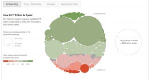
It gives four distinct views of what the budget looks like and the transition between the views is excellent as the existing bubble itself divides into the two types which helps the user look at the underlying data from a different perspective. The size of the bubble is proportional to the amount of money allocated. The color combination is also apt with green showing increase in money from 2012 and red showing corresponding decrease.

Reference:

http://www.nytimes.com/interactive/2012/02/13/us/politics/2013-budget-proposal-graphic.html

https://flowingdata.com/2012/02/15/slicing-obamas-2013-budget-proposal-four-ways/

https://www.nationalpriorities.org/analysis/2012/presidents-budget-fy2013/