Pie Charts and Interactivity?

For this blog, I want to go back to the first class and talk about one of the first things we learnt – Pie Charts are a big No No for visualization.

The visualization I picked talks about countries from where the highest immigrant populations are coming into US from a time period starting from 1960 to 2015. While the data that is analyzed is huge and shows diverse and a changing trend over time, using a pie chart to represent it has made it less intuitive and informative. What makes it worse is using interactivity with pie charts to show the data change over time.

The interactive visualization, by using the slider underneath it, we can see how the immigrant population is changing or is for a particular year. But,

Firstly, This visualization violates the very basic – Eye beats memory rule of thumb. When I use the slider to move from one year to another, it is very difficult to remember and compare how the trends have changed for different countries.

Secondly, what makes it even more difficult is that since no actual numbers are mentioned for countries; the areas for some countries as displayed by the area on the pie chart look very close to each other and  it is confusing to compare.

Thirdly, I do not understand  how to order them. While I can make out what is perhaps the largest and the second largest values, rest everything is vague. Also, changing countries over time doesn’t help.

Fourthly, while they have tried to keep the use of colors in a consistent fashion, since immigration from countries is changing and some countries are getting added or removed over time, the color change is puzzling.

What I would do to change it?

I want to go back Hans Rosling’s version to display the data to show the countries that have the largest immigrant populations coming into US and how it has changed over different years. The interactive version will make more sense and by visualizing the data on one chart, it becomes easier to compare and analyze.

Or Keep it Simple – Since the MPI wants to show numbers over a long period of time across several countries – I will use a table. It is simple, straightforward and will provide for an easy comparison.

Source – http://www.migrationpolicy.org/programs/data-hub/charts/largest-immigrant-groups-over-time

Would you create a resume like this?

Michael Anderson is a web designer and this is his resume. While a resume like this will definitely catch the recruiter’s attention, is it serving its purpose?

Firstly, by looking at the resume, we can see that this guy has definitely used an innovative approach to portray his designing skills. He explains what he did from ’95 to ’98 in terms of employment and academia, his primary skill sets and his behavioral skills using different types of idioms ; but is it helping the audience to derive the required conclusions?

As professor mentioned and as we all can see, the 3-D charts used here are quite confusing. Both the daily intake & output and primary skill sets charts are difficult to understand and analyze.

I do not understand how the different fields in the daily intake and output are related w.r.t. each other. The scale and the values are not clear. Does having less coffee increase his productivity, humor, communication etc. or they are individual graphs mapped across time independently without any relation.

Similarly,  for primary skill sets, the idiom used is a donut and its 3-D – it breaks two main rules of visualization. The comparison that he is trying to show is not clear. It is mapped according to his % personal time invested in these skills. But we do not have a scale or any way to actually get the number of percentage.

For the area chart, I do not understand the usage of color. What does the different shades of a color signify? Do the overlap of area charts mean that he had multiple responsibility during that time?

Also, on the first glance, the usage of color across the resume confused me as well. I was trying to identify if there was any connection between similar colors in different charts.  Apparently, there isn’t.

This resume is definitely interesting and different. I feel its attractive yet meaningless. What are your thoughts?

Michael Anderson’s Website – http://theportfolio.ofmichaelanderson.com/

Horizon Graphs – Yes or No?

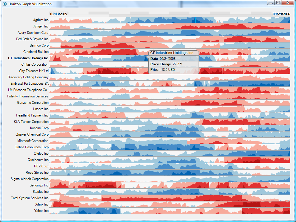
This week I found an interesting dashboard. Lets step back for a second and try to understand what’s going on here.

This is a Horizon graph. This is another way of representing time-series in a visualization. Created by a company called Panopticon, it allows users to display 50 or so sets of time series values that can be compared against each other. They are space efficient and quick to analyze once you get a hang of them (that’s what some people say)

Lets have a quick analysis –

  • The visualization uses different shades of blue and red colors to show positive and negative values and different shades of these colors to show bands.
  • By mirroring the chart, flipping negative values and using a different color the height of the chart is cut into half.
  • Using bands also reduces the height leading to the ability to show more data on one graph.
  • Easy comparison can be done between different multiple charts without scrolling, going to multiple pages etc. Remember, eye beats memory.
  • It can successfully deal with increasing data densities by adding bands (2,3 or more)

For me, It is extremely overwhelming. For a person who has never worked with Horizon graphs before they seem challenging to understand and analyze. I feel there is too much information that is being visualized here which can lead to lost clarity and incorrect interpretations. There can be errors in estimating data and how does one ensure accuracy? I feel I will be going back and forth a lot just to confirm that I am reading the right values.

But as many people have said, Horizon Graphs take some time getting used to but once you know how to use them, they works well!

What are your thoughts?

Source- 

Horizon Graphs Revisited

What is a Data Visualization’s Goal?

The ultimate goal of data visualization is to make it easier for management teams and the business people to make informed decisions. Data visualization makes it easier to analyze a set of information. With background information, business objectives and business goals, visualizations provide an additional context.  With a good visualization you can point out areas of improvement, areas with potential, weak spots etc. They provide a way of communication that can be easily understood by the audience, saves time and leads to informed decision making.

Hence, it is very important to be critical and ask yourself – What do you want to represent with this visualization? Is it making sense? Is it easily understandable? Does it convey the right meaning? For example, lets consider this visualization below –

https://www.theguardian.com/news/datablog/gallery/2013/aug/01/16-useless-infographics#img-4

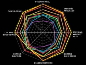
This a radar chart that is designed to assess cars by comparing different car features against each other. This is a classic example of eye beats memory. It is confusing and difficult to understand.

  • What do the different colored lines symbolize?
  • The colored lines used to connect the different features are highly confusing and difficult to make sense of.
  • While comparing one feature to another, you constantly need to remember the value of that feature to another.
  • Don’t even try comparing multiple features, it will require you to really squint your eyes and maybe create a table just to understand what’s going on!
  • I don’t know what how to judge whether each feature is good, average or bad? How do I define that?

The creator of this visualization did not think whether this visualization will help or hinder information analysis. There was no thought put into how it will prove to be an effective tool for decision making. In my opinion, it is a pointless visualization. What do you think?

Source –

https://www.theguardian.com/news/datablog/gallery/2013/aug/01/16-useless-infographics

Key Performance Questions

This week we discussed KPIs and business metrics in class. Why are they important and how do they help?

For companies to gain competitive edge and knowledge from data they need to completely understand and define business objectives. These business objectives become the underlining principles on which business metrics and KPIs are defined and dashboards can be designed. These help the companies to achieve their goals by providing them a direction and guidance.

But how do we make sure that we have the right KPIs?

Many a times people pick KPIs randomly and later on realize that they are not quite right for them. Otherwise they pick too many KPIs just so that “all angles are covered,” which leads to confusion as to what exactly are the performance drivers. Hence, it is very important to decide on the right KPIs that matches strategic objectives.

I landed on this article by Bernard Marr who has developed an approach to bridge the gap between strategic objectives and KPIs which is called Key Performance Questions (KPQ). This basically is a simple approach which requires you to identify performance related questions that you need to answer before defining a KPI. Once these questions are decided, the management can then ask themselves what data and information we need to answer these questions?

We can also use the same for our projects and assignments. Before designing a dashboard, ask yourself questions. We can start with high-level and generic questions which can later evolve into more specific and detailed ideas. Having these questions will give more clarity to what we plan to achieve.

Some examples can be –  What is the key focus? What value am I trying to bring from this visualization? What is the goal and action? What will be the impact? What data will best represent the case? I believe that the concept of 5-WHYs can also be of help here. It will help provide us the right direction and create better visualizations!

Source – https://www.linkedin.com/pulse/20140814161947-64875646-what-the-heck-is-a-key-performance-question?trk=mp-author-card&trk=mp-author-card


Hans Rosling: What I learnt from his visualization!

After professor posted the video link of visualizations created by Hans Rosling, I saw the video. It indeed was a very different way to show visualizations and present data. To me, it seemed more like a movie with changing visualizations that made sense, were easy to understand and portrayed what they were supposed to show clearly.

I went ahead and searched for some of his interactive visualizations – Gapminder.com . I just concentrated on the visualization for Life expectancy over years (although there is so much more data that can be added and information that can be viewed).  Here are some of the things that I really liked –

  • Use of bubble charts – In this week, we had discussions about using the right idioms to represent data. While a bar chart seems right to me about almost everything, I liked how bubble chart was used in this visualization and conveyed the meaning of the data.
  • No Trend lines – The first thing that comes to my mind when I have to represent data over time, are trend lines.  Using bubbles to change sizes and show trends (move up or down to show increase or decrease) across years to represent data was very innovative and interesting for me.
  • Interactive Visualization – This visualization can be customized and interacted with in so many different ways. It gives you a chart to show data over the years.  You can filter it and view data, compare data across countries, regions etc. It adapts quickly when a selection is made and transitions quickly.
  • Just Enough – You can interact with individual piece of data and even though there is so much information in this visualization, it is not overwhelming. They have displayed and organized it appropriately.
  • The video feature is super cool! Definitely check this out!

Why Should I use D3.js?

In the past two weeks, we have discussed concepts of D3.js and also worked on a couple of visualizations. There was one thought that was continuously present in my mind – we can create these visualizations using Tableau in seconds. This is too much work.

SO WHY ARE WE EVEN USING D3.js? That is when I decided to do some research. D3.js is time consuming but provides some really cool features.

  • Easy Integration with web – Data visualizations created with D3.js work on web. We can interact with any part of the DOM giving it the flexibility to accordingly change. (Eg – https://bost.ocks.org/mike/uberdata/)
  • User Interface Features – D3.js can be used with applications to create advanced user interfaces with charts, analytics etc. directly built into them. It not only gives flexibility to the developers but also provides them with a huge list of libraries that can be reused to create visualizations.
  • Customization – What to do when you need to create visualizations that are not available with prepacked solutions? D3.js allows you to be as creative as you want to be and create visualizations that you want to use and that represents your data best.
  • I don’t want to share my data – Use D3.js. It is best to create visualizations for clients that are external to the company and want to interact with specific information, using D3.js. You can control what they can see and how much they can interact with a visualization.
  • Interactive Visualization Online – With D3.js, you can create visualizations that deal with smooth data transitions without having to refresh views, clicking multiple buttons etc. With D3.js we can transition from one data view to another and with so much ease – D3 Show Reel Demonstration . The data is parsed easily making it interactive and meaningful.
  • Community  Support – D3.js  boasts of a very strong open source community support to help people when they are stuck as well as learning resources.

Source – https://www.linkedin.com/pulse/why-you-may-want-consider-powerful-open-source-d3js-data-guerino

– http://www.scribblelive.com/blog/2013/01/29/why-d3-js-is-so-great-for-data-visualization/

Wharton’s Ad: What do you interpret?

This was an ad that appeared in The Economist by Wharton University.

Ad - Wharton University
Ad – Wharton University

While the visualization is eye catching, what it is trying to convey is confusing. The first glance explains nothing, but based on the caption, I was able to figure out that this is a frequency wave that the university is using to reflect the experience level (in the number of years) of various professors in their Finance department. We can see that some professors are highly experienced while others are not.

Now comes the confusing part. I was not able to understand what the different colors symbolize – were they only used to make the image more striking or do they have some other meaning. Also, this graphic does not emphasize on the professor’s teaching experience and specializations in the finance field, rather it shows that around 1/3 of the professors do not have a lot of experience. There is no way to understand how the different professors can impact prospective students, based only on their level of experience. Also, I see no connect between the graphic and the perception that Wharton is trying to create about their finance department (or the text written in the ad).

This visualization is an empty graphic designed to look pretty with no real takeaway.

Source – http://creativegood.com/blog/the-wrong-info-visualization-whartons-ad/

Global Warning – A Myth or Reality?

Tweet
Graph 1

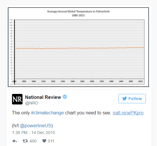
In Dec 2015, National Review published an interesting tweet that showed visibly no major change in the annual global temperature from 1880-2015.

This graph makes global warming look like a myth. The temperature has been shown as almost constant with no significant change over time. Then why is everyone so worried? What are they saying when they talk of rising temperatures and its harm to the planet earth?

Lets take a closer look –

Temperature
Graph 2

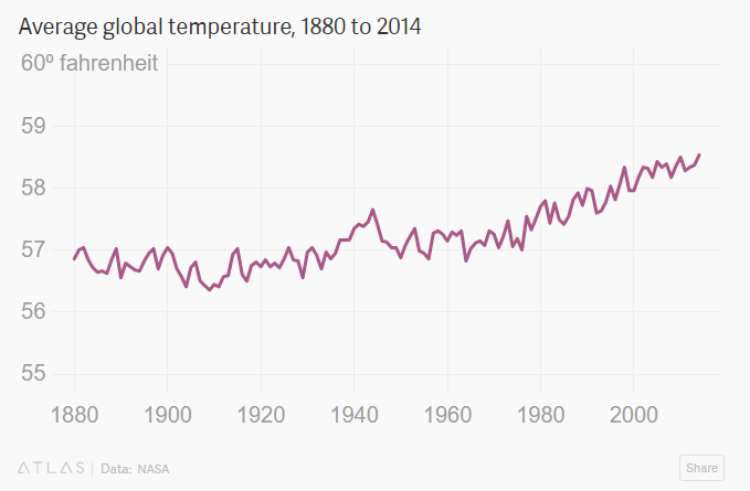
This is a classic example of how not using the right scale can distort data and deceive people. What Graph 1 ignores to mention or highlight is that even a change of one degree in average global temperature is important and by starting the y axis from 0, the scale is making the temperature change look irrelevant. Misleading visualizations having skewed axes results in misinterpretation of data.

Graph 2 on the other hand, by starting the y axis at a higher number shows the pattern accurately and thereby will help in making informed and correct decisions.

Hence it is very important to choose the right y- axis and it is perfectly acceptable to not start your axis at 0 because at times, like in this case even the minutest fluctuations matter.

Source –  https://qz.com/580859/the-most-misleading-charts-of-2015-fixed/

Less is More

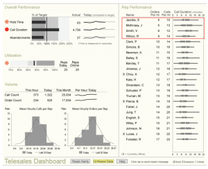
In a world overflowing with data, using it in the right way so as to extract maximum information and perform meaningful analysis to make right decisions is the key. The management needs information quickly and at a glance. Hence, it is important to have a dashboard design that highlights the key points, is structured, focused on management’s requirements and not overly complicated and confusing. Simplistic dashboard designs can help in better decision making than dashboards that are flooding with information.

Sales Dashboard

For example, this is a telesales dashboard that emphasizes on some of the important features that the company will want to track in order to understand their overall performance. It is easily understandable and the information displayed is not overpowering. The graphic mediums are subtle and red color is used to make it easier to notice details. The dashboard has a flow with the most important piece of data on the upper left corner. It is not highly decorated and only displays what’s necessary. It contains clear legends with properly marked headings and descriptions (where needed).

Sometimes, poor visualizations and displaying too much information can take away the most important aspect of a dashboard – easy data availability.

Source – https://www.perceptualedge.com/articles/Whitepapers/Dashboard_Design.pdf