Using interactivity to explain a complex topic: Why Buses Bunch

We have seen countless examples of visualizations that represent business data i.e. they show metrics or provide a viewpoint. However, another very important use of visualization is visual discovery. We can use visualization to explain complex topics using techniques such as storytelling or gamification. One such example is the visualization that I am talking about in this blog. The visualization here explains what “bus bunching” is using a simple visual game with analytics. Before I critique the visualization, let me explain what “bus bunching” means. This phenomenon occurs when there is a delay in the arrival of a bus, followed by multiple buses to arrive in quick succession later.

What I liked in this visualization?

  • The example taken to explain this topic is a very simple one – two buses and four bus stops. The start point in this visualization is something which any one with zero or little knowledge about the topic can understand. However, the author has provided options to complicate the scenario by adding interactivity. This is achieved by clicking on the interactive dashboard which shows the bus number and the passenger count.
  • The user of this visualization can also get information regarding history of passenger wait times by viewing the area chart which appears when we hover over any of the bus stops.
  • The instructions are laid out in a clear and concise manner, without disrupting the user’s attention.
  • There are also interactive provisions to play/pause/reset the phenomenon.

What I disliked in this visualization?

  • The visualization does not help account for passengers in/out. The count of passengers at bus stops usually varies, but this has not been accounted. Hence, we can only see the phenomenon of bus bunching.
  • The bus stops have multiple data points (in circle shape) that come up when we play this game. However, it is not clear as to whether that is the total number of passengers that get in or out at that stop.

I would like to mention that these kind of visualizations should be used for educational purposes in order to simplify complex topics. For these kind of visualizations, the selection of visualization tool is very important since traditional idioms, such as line/bar/area chart, may not work and it is very challenging to create custom idioms. For such scenarios, we have visualization languages such as D3.js to help in creating innovative idioms like the one explained in this blog.

References:
http://setosa.io/bus/

Interactivity in Tableau (continued, again!)

We are focusing on Actions this week. The set of features within Actions allows the user to connect multiple visualization/dashboard and link a visualization to an external URL. The first feature i.e. connecting multiple visualizations, allows a visualization to act as a filter item for another visualization or as a data highlight item. Sounds confusing? Let’s take a detailed look at these features –

  • Use as a filter action: This action can be used when a visualization has to be used as a filter item for another visualization (this holds good for a dashboard, as well). This is particularly useful when there is data that is interlinked between various visualizations. Instead of keeping a filter card, the user can have an additional visualization, which acts as a filter, thereby making better use of space and adding more context into the analysis. While creating the filter, the user has to select the source and target visualizations which will be used by the filter action. The action trigger can be set using the following three options:
    • Hover: The trigger for this action is when the user brings the mouse over the data point in the source visualization. This kind of action is good in cases when the user is performing data exploration, rather than data analysis. This is because while doing data exploration the user will be quickly scanning across the data points rather than stopping at a single data point to perform any analysis. Also, if the number of records in the data set is large, hover action could cause performance lags.
    • Select: The trigger for this action is when the user selects the data point in the source visualization. This action is suggested when the user has to perform data analysis or the number of target visualizations that get affected are large.
    • Menu: The trigger for this action is when the user selects a data point and selects the appropriate option provided in the context menu. A menu action is best used when the user wants to provide the user with an extra layer of choice before applying the action. A good practice is to use this action for cases where the user has to be navigated away from the existing screen (it could be a different dashboard/visualization/URL).

The user also has options to choose from when he/she clears the action trigger. An example from our speed violation data set could be if we have two visualization in a dashboard. The first visualization shows the map of Chicago with the addresses marked as per violations reported. The addresses are also clustered based on geographical zones – north, south, east, and west. The second visualization shows the history of violations for each address, along with additional statistical data such as deviation from daily average, max/min for that address, etc. We may want to put a hover filter here on the map for each cluster so that the user can see a subset of the total addresses which are grouped based on their geographical proximity.

  • Use as a highlight action: This action is used when the user needs to highlight data points based on the trigger action. The non-highlighted data points still remain on the view but are grayed out, whereas in the case of the filter action the “out data” points are removed from the view temporarily. This kind of action is useful in the following scenarios:
    • The data set is large.
    • The non-highlighted data set is important for spatial reasons i.e. the proximity of highlighted/non-highlighted items is important to the user in his/her analysis.
  • Use as a URL action: This action is used when the user should be redirected to a resource outside of Tableau environment, such as a file path, URL, or send a mail. A user should be navigated away from the visualization/dashboard only when it absolutely necessary or is part of the visual discovery process. Therefore, this feature needs to be used with caution. Some sample use cases for using this feature are as follows:
    • User needs to be showed data that is not in a format that can be represented in a visual format. For e.g. links to legal documentation in the case of contract negotiation dashboards.
    • User needs to be navigated to a different but relevant data set that is not part of the data set being presented. This could be done in cases where the subset of the data, that is being linked, is needed for verification purpose.
    • The dashboard/visualization is part of an enterprise application. The data point that is being used as the action trigger is passed a parameter to the enterprise application for further business processing.
    • A user needs to be alerted/informed by mail based on a data point in the dashboard. The email feature can be setup to send an alert/information mail with the data present in the user’s trigger.

Actions provide a new dimension for the user to interact with data, in addition, to the visual representation. While setting up interactivity with actions, the points to consider are the number of source/target visualizations, whether filtering applies to each element, and the user workflow.

References:

Interactivity in Tableau (continued)

This week we will take a look at sets and groups feature in Tableau. Let’s start with sets –

Sets are user defined fields which help in viewing a subset of the entire data. We can create sets on dimensions using conditions or specific data points. It is interesting to note that whenever the underlying data changes, sets are recomputed based on whether they are constant sets or compute sets. Seems quite similar to filters, isn’t it? Yes, a lot of the functionality is same, such as dynamically obtaining a subset of the data and the ability to be applied across the workbook. However, the differentiating point is that sets can be used in other calculated fields. This is particularly useful, when creating a subset of the data, using a set or filter, is just the starting point of your analysis. Let’s take a look at how we can create sets:

  • Constant sets: This option is similar to that of the Keep Only/Exclude option while creating filters. Using this option, the user can select the data points which he/she is interested in and then keep those only in the visualization for further analysis. The important point here is that once created, the data points in the set do not change dynamically. This can be achieved by selecting the data points in the visualization and selecting the Create Set option in the Tableau prompt. There is also an option to perform a negation operator by selecting the “Exclude” option in the following prompt. For our speed violation data set, if we have a map of violations in the map for Chicago with the addresses marked as per violations reported, the user can create sets based on areas of interest or select the top three violations and just focus on those.
  • Compute sets: Using this option, the user can create sets which dynamically change when the underlying data changes. To create such a set the user can select a dimension and select the create option. There are three options to create sets – general, condition, and top. The general tab allows the user to view the entire list of data and choose from it. The condition tab allows the user to create a condition based on which the set will create the subset of the data. The third tab, known as “Top”, is probably the most used for numerical analysis. This tab has options for the user to perform Top N or Bottom N analysis. For our example data set, we can use a set to create a Top N analysis of addresses with the highest number of violations. This can be extended further by making the “N” value as a parameter, allowing the user to specify how many addresses he/she wishes to see in the “Top List”.

As a final point on sets, it is important to mention the IN/OUT option which helps the user switch between the subset and the rest of the data.

Groups are similar to a set and help to organize the data better in a visualization. They help to create hierarchy within dimensions, thereby helping the user organize the data items within a dimension. We can create a group by manually selecting the data items in the visualization and then choosing the Group icon which comes up in the Tableau prompt. This way the group that is created gets automatically added to the shelf/card. You can also create groups by selecting a dimension and performing right-click and then create option. If the list of members is huge, like similar to our data set containing a huge list of addresses, the create group option also gives us a “Find” option using which we can do a search on the dimension members. For e.g. if we want to create a group for addresses with the name “N WESTERN” in it, then just search using this string and the members get highlighted from the entire list. Another interesting use case for groups is to use it for data standardization. We may have encountered data sets which contain the same data member spelt in various ways, such as “Santa Clara University”, “SCU”, “Santa Clara Univ.”, etc. This kind of data set will create problems when we want to aggregate measures for Santa Clara University. This problem can be solved by grouping the above mentioned items into a single group since they represent a single entity.

We will take a look at actions in the upcoming blog!

References:

Interactivity in Tableau

Tableau is good at creating visualizations for us using a few-clicks. However, when it comes to interactivity among visualizations, we have to do it all by ourselves by using the features provided in Tableau – this can be a daunting task (as evidenced during assignment #3 🙂 ). To make our lives a little easier, let’s take a quick look at some of these features and see how we can use them for our speed violations data set.

Filters are one of the most basic interactive feature that can be used in Tableau. They are primarily used to engage the user’s attention to a subset of the data. Let’s take a look at how we can add filters to our visualization:

  • Using Keep Only/Exclude option: Using this option, the user can select the data points which he/she is interested in and then keep those only in the visualization for deeper analysis. This can be achieved by selecting the data points in the visualization through several clicks or dragging and then choosing whether to retain (Keep Only option) the selected data points or exclude (Exclude option) them from the view using the Tableau prompt. As an example, say we have the map for Chicago with the addresses marked as per violations reported. The user can focus on different parts (for e.g. north, south, east, and west) of the city by selecting addresses in the region and then using Keep Only option for further analysis.
  • Using filter shelf: The user can drag different dimensions and measures into the filter shelf to apply a filter. This option gives the user a wide variety of options, such as range, condition, wildcard, etc., to apply the filter depending on the parameter which is being used. Let’s take the same example which we used above, the user can do a wildcard filter for addresses having the string “N WESTERN” in it (there are seven unique addresses with this string in our exercise data set!).
  • Interactive filter as a card: The user can be given the ability to filter in/out of the dataset by having an interactive filter card along with the visualization. This can be achieved by clicking on the drop-down menu for the field in either the row or column and then select “Show Filter”. This will open up a filter card for the selected field, next to the visualization. Using the same example, we will have a filter card with options to select “All” the addresses or individual ones. This filter can be modified to be presented in various ways such as “Single Value”, “Multiple Value”, or “Wildcard Match”.

We will take a look at sets, groups, and actions in the upcoming blogs!

References:

Is a Waffle better than a Pie?

Through our class and blogs, we have discussed as to why pie charts are best left alone. One of the reasons for avoiding pie charts is the difficulty in judging the area of each slice, since it is dependent on the angle at the center. So the question now is, if we were to remove the angle element from a pie chart, would the resulting chart be more useful?

To start answering this question, let’s first identify a name for this resulting chart and look at some of its characteristics. The resulting chart is called a Square Pie Chart or more commonly known as a Waffle Chart. The waffle chart is represented as a square/rectangular block consisting of small tiles. Each tile in the block contributes to the entire sum/percentage of the block and is weighted equally. Therefore, the waffle chart manages to provide a balance between the visual aspect and the ability to synthesize the data. The biggest advantage of using a waffle chart, over a pie chart, is the ability to synthesize data down to 1%. This is possible by comparing the various parts (area) of the waffle (which in most cases is a square, thereby making calculations easy – number of cells in row multiplied by number of cells in column).  Even when compared to a bar chart, a waffle chart looks more interesting and can answer questions such as “x is y times greater/smaller than z”.

However, just like in the case of a pie chart, we need to be cautious when deciding which visualization to use. The critical factors to keep in mind will be the number of categories being described and the value difference between each measures. In addition to these two factors, we also need to tailor the visualization according to the audience, the context/setting, and the message being delivered.

References:

http://tableaulove.tumblr.com/post/56368410545/yummy-yummy-tableau-waffle-charts-from-jesse

http://bl.ocks.org/XavierGimenez/8070956

https://community.tableau.com/thread/125926

http://junkcharts.typepad.com/junk_charts/2008/06/the-right-scale.html

World Population Dashboard

United Nations maintains an interactive dashboard containing visualizations about world population and related parameters.

The things that I liked about the dashboard are:

  • The back/return button at the top left corner of the map is very intuitive since they follow common application norms, such as undo/return on Microsoft applications.
  • The icons used for fertility are super likable!

The things I did not like about this dashboard are as follows:

  • The color mark used in the map tells which countries have higher and lower population without giving a numeric range to it. Worse yet, even when you hover on a country, there is no tooltip to mention the current population. Ideally, when you think about world population, we would want to know the growth rate for each country. This is probably the second most important data point (first being the current population) when you talk about the population domain. Both these data points are available in the additional parameter section to the user if he/she clicks on a country/region.
  • There are four text filters at the bottom of the map, which partitions the world based on development index. When the user clicks on any one of these, the additional parameters get populated for the filter region selected. I would have liked the countries which fall under each of these indexes to be highlighted in the map when each of the filters were clicked. This would have helped the user to understand which countries are falling under them.
  • When you click on a country, the map zooms in and its data points are presented in the additional parameter section. I don’t see the zoom feature fulfilling any purpose.
  • The tooltips for “Maternal and newborn health” visualization is incorrect and there is no tooltip for “Sexual and reproductive health”.

References:

http://www.unfpa.org/world-population-dashboard

GitHut: A visualization about GitHub statistics.

GitHub is the most widely used source code management and version control tool available on the web. With its increasing user base and code repositories, GitHub repository can help in identify trending programming languages. This trend has been captured by a project called GitHut by combining repository statistics and Git specific trends on programming language.

What I liked –

  • The active repositories chart gives a quick overview of the growth in the number of active repositories over time. The intent of the visualization is not to analyze the growth in repositories, but to give the user a detailed picture of which programming languages are contributing towards this growth. This chart, even though, placed right at the top does not sway the user’s attention too much because it’s sized-down, when compared to the repository language chart.
  • The repository language chart displays a wide range of information in a very easy to analyze manner. The wide range of parameters being analyzed, such as active repositories, number of pushes and forks, year first publishes, and open issues, can be easily tracked for each programming language by mouse-hover functionality over the language. This tracking works by mouse-hover over any of the data points, making it easy to track based on the parameter most useful for analysis. We can also compare multiple languages by selecting them with mouse-click. This functionality will highlight all the data points for the selected languages to be compared.
  • The top active languages chart section consists of 50 charts. This section can be analyzed based on percentages or total value, which is a good way of allowing users to compare statistics. Also, the scales for the 49 charts are dynamic i.e. when the user brings the mouse over the chart, the scales are shown. This helps in keeping the entire visualization clean.

What could have been done differently –

  • The top active languages section displays a separate chart for each programming language. Since the time scale under consideration (Q2/12 to Q4/14) and the repositories scale (1K to 100K) are same, I think a single chart with a filter would have sufficed. The following are the advantages by doing this:
    1. The author could have saved space.
    2. Eliminated the need for the user to scroll up/down.
    3. Given the ability to compare two, or more, languages based on active repositories.

References:

http://githut.info/

A visual depiction of Tech IPO’s.

The visualization being analyzed describes how Facebook’s IPO in 2012 compares with other tech IPO’s since the 1970’s. The IPO trends are presented as a series of five scatter plots by varying the y-axis alone. Though the visualization does a good job in explaining the comparison, I feel the entire analysis could have been demonstrated by a single visualization. My opinion is based on the following:

  • There are three main colors used to represent the companies. The manner in which these colors are used, shows that the companies have been grouped based on a time range – orange ranging from 1970 to 1994, purple ranging from 1995 to 2002, and blue from 2003 to 2012. This color based grouping is redundant since there is an x-axis representing the time range. I feel the color mark should have been used to depict one of the measures being discussed, say for e.g. first day change or three-year change.
  • The first two visualizations use a standard numeric scale to show differences in the company value, in current dollar terms. Since this difference varies greatly between companies and over such a wide range of years, the scale to be used should have been logarithmic. The reason behind this is, whenever we are trying to represent values which have a huge difference between min and max, using a logarithmic scale ensures a readable plot of the values, without distorting the actual percentage differences between them. The creator of the visualization has used logarithmic scale from the third chart onwards.
  • The visualization plots company value data for more than 100 companies. Even with the logarithmic scale, it is very hard to know the companies and their data points. There is a search bar which helps in locating companies if you knew what to search for. Since the number of companies is large and not everyone looking at this visualization may know of companies since the early 1970’s, I feel the creator should have added a sorted list of all companies in a separate group box to the side of the main visualization. The reader could then just scroll through the list and look at the various companies for which data was plotted.
  • The fourth and fifth visualization shows the trend as per the other two measures i.e. first day change and three-year change. The trend of average stock rise and negative returns which the creator is describing is depicted using change in size of each bubble. I feel this was not required because these measures were also present in the first three visualizations as well using a tooltip.

References:

http://www.nytimes.com/interactive/2012/05/17/business/dealbook/how-the-facebook-offering-compares.html

Napoleon’s invasion of Russia: A data chart.

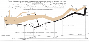
Long before we had sophisticated tools to create visualizations, we used to rely on charts to convey our messages. These charts had to be manually drawn with precision and patience. One such chart which is famous for its precision and content is Charles Minard’s map of Napoleon’s invasion of Russia in the early 1800’s. A cursory look at the map below shows data labels strewn across as if it’s a painter’s canvas.

Blog2

However, a deeper look at this chart points out why this is considered as one of the pioneering works in the field of statistical graphics. To lay the details in simple terms, the chart combines five data plots:

  • Size of Napoleon’s army: The size of the army while marching into Russia is denoted by the width of the brown/beige bar, whereas the size while retreating is depicted by the thinner black band.
  • Direction of invasion: The direction is depicted in standard notation by using left-to-right as invasion and the reverse to denote retreat.
  • Geographical plot of invasion: The chart shows a map of Russia in terms of the places visited during invasion and retreat.
  • Temperature: Plot of the temperature recorded during the retreat.
  • Time plot during invasion: Shows the duration of retreat as a time series.

What impressed me the most in this chart?

  • The chart is able to incorporate and explain different dimensions in simplistic terms.
  • Even with the complexity of having a wide variety of dimensions, there is no loss or over-loading in details.
  • The addition of temperature is a clever one, since it allows the reader to make cause-and-effect analysis.

Reference:

Billboard Top 100 over the years

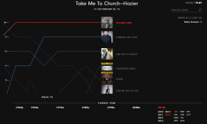
The Billboard Top 100 has become a standard in the music publishing industry for songs based on their record sales and their “air time”. A look at the referenced visualization shows the top 5 songs over a period of 58 years.

Blog1

Though the visualization helped me take a trip down memory lane, I had few gripes with the presentation of it. First, the layout used for the entire visualization wastes a lot of real estate on the screen. More precisely, the filters for changing the year are placed at the bottom when they ideally could have been placed on the left side where the most visible filter (find an artist) is placed.

Secondly, the axis for the main visualization element is difficult to read as the horizontal axis (containing the month/year) is constantly moving and the vertical axis (containing the chart position) connects with the song across the timeline using a line graph which is difficult to read and grasp when the visualization is in “play mode”.

Furthermore, the threshold colors used are not intuitive since there are no legends to understand the gradient change i.e. from red to blue to light grey.

Reference: How Music Evolved: Billboard’s Hot 100, 1958 – 2016: http://polygraph.cool/history/