Should I learn more visualization tools?

In the recent years, the internet has seen a surge in the number of dashboards and visualizations – some that communicate a message succinctly yet far too many that are colorful and pretty but don’t serve their intended purpose all too well. Thanks to the availability of data and the proliferation of “big data” visualization tools, it has become extremely easy for data enthusiasts – both amateurs and experts alike to create dashboards and share them across the web. While the growing enthusiasm about data visualizations is definitely encouraging, it is important to better understand the framework that underpins a great visualization to make a meaningful impact. The problem begins when we skip learning concepts and jump directly to learning tools.

Personally, until a few months back, I was under the impression that I could learn the art of visualizing data by simply learning a tool such as Tableau or QlikView. However, over the course of the past few weeks, I have come to realize how important it is to understand the underlying foundations and frameworks to create an effective visual that truthfully communicates a trend or a claim. For example, I’d never given too much thought into who my audience was and how my visualizations were driven by them and not the other way around. It is worth noting that the fundamental concepts of visualization and framework remain the same, no matter what tools we use. Hence, tools without frameworks are mere tools that serve little purpose.

Reference:

www.daydreamingnumbers.com/blog/learn-concepts-not-only-tools/
Telling Stories or Solving Problems

The data visualization landscape can be divided into two broad categories:

Hedonistic Visualization: It only shows how cool something is or represents an “Interesting to know”  information. Here is an example – 

https://fivethirtyeight.com/features/when-donald-trump-attacks-gop/

Narrative Visualization: It supports a narrative (often journalistic, sometime scientific). Data Journalism is all about telling a simple story in the most attractive way to entertain the audience. But the problem here is there is a high chance of over exaggeration to bring out an interesting story. While data journalism is a tough art, the other extreme of narrating a scientific story is harder. In order to demonstrate the hypothesis scientists have generated, they face the challenge of where to stop overloading the audience with too much information. Do they have an option? Will the scientists be able to convince the audience if they condense their visualizations?

How about Problem Solving Visualizations?

This is a less commonly known category that is gaining importance. Singapore’s MRT Circle Line was hit by a spate of mysterious disruptions in recent months, causing much confusion and distress to thousands of commuters. Data scientists at GovTech’s Data Science Division in Singapore used visualization to discover the origin of this recurring problem. The below article discusses about the interesting case:

https://blog.data.gov.sg/how-we-caught-the-circle-line-rogue-train-with-data-79405c86ab6a#.sebeshx7o

Important point to note here is for most of the problems in automated systems, solutions really need to come from human reasoning(in this case through a series of visualizations). Hence visualizations are very powerful problem solving tools.

References:

http://fellinlovewithdata.com/

https://blog.data.gov.sg/how-we-caught-the-circle-line-rogue-train-with-data-79405c86ab6a#.sebeshx7o

When Trump Attacks!


The art of truthful rhetoric in visualization

Rhetoric is the art of effective and persuasive communication. Data is rhetorical by definition and can be used for truth finding as well as truth hiding, hence it it is a double edged sword. To ensure we develop a sound argument from data, here are few tips:

Context and Data Provenance:

There is hidden context in many visualizations, and this context helps give an accurate depiction of the data, even if the viewer is unaware that the context exists. One must ensure the visualization shows as much context as is reasonably possible. For example, if a survey had a sample size of only 10 participants, it is important to put that information on the chart for readers to gauge the magnitude of the impact of survey results and to evaluate our story.

Rhetoric in Truthful Storytelling with Data:

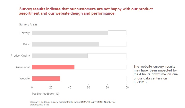
Let us consider the simple info-graphic that represents the results of a survey conducted by a company to review the worst performing areas of their website. There is clear indication of the source of the survey at the bottom, which includes the date of survey and number of participants. The color coding highlights the two weak areas. The most important piece of information here is what could have had a significant impact on the performance of the website – downtime in one of the data centers. Finally the conclusion is represented in the title of the visualization enabling the reader to quickly grasp the key take away from the visualization.

Representing uncertainties of data:

Most visualization techniques have been designed on the assumption that the data to be represented is free from uncertainty. Challenges with representing uncertainties:

  • Uncertainty tends to dominate certainty.
  • Uncertainty introduces a new direction to the story.
  • Uncertainty propagates quickly and could confuse the audience.

Though I have understood the challenges in identifying uncertainties, I am still exploring if one should always represent the uncertainties of data and how to best represent uncertainties without rendering the visualization less effective.

References:

https://faculty.washington.edu/jhullman/vis_rhetoric.pdf

www.daydreamingnumbers.com/blog/rhetoric-in-visualization/

http://www.scribblelive.com/blog/2012/06/07/context-in-data-visualization/

http://www.comp.leeds.ac.uk/kwb/publication_repository/2012/uncert.pdf

Know your Audience

Over the years, dashboards have evolved as a powerful tool that enables business users to make better and faster decisions backed by data. It serves as an important communication tool to transmit complex information about your business performance. When creating a dashboard, the first and foremost question to keep in mind is: Who is the intended audience? If the audience is not defined clearly, the message that is communicated may not be effective.

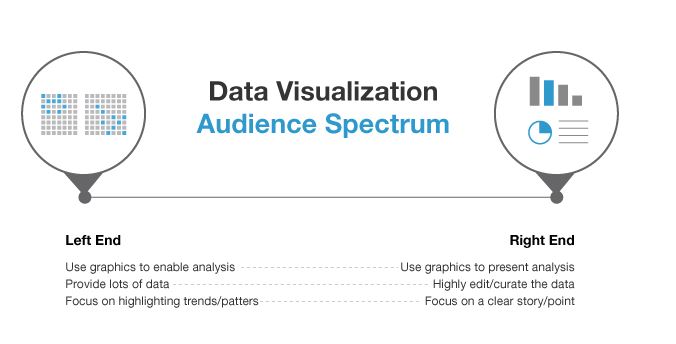
Audience Spectrum

Imagine a spectrum of audience for a dashboard. On the left side, we have data-hungry analysts and scientists who want as much information as possible. To cater to this audience, several dimensions in the data need to be squeezed into a tiny amount of space in the dashboard – so it’s vital to keep the graphic as clean and compact as possible. Rather than portraying a specific story and guiding the audience, we simply present the information in an easily consumable fashion giving the user full control in navigating the information.

On the other end of the spectrum, we have an audience that’s not as data savvy and would like the storyline presented with highlights and conclusions. The audience here is not familiar with the information and neither do they have a lot of patience to pore through it. One needs to advertise the data and explain it as efficiently and as quickly as possible with a primary focus on the conclusions.

These are the two extremes of the audience spectrum and there are varying degrees in between. It’s important to understand where your audience stands on this spectrum, and how much data do they need to see. Follwing is a link to one of the visualizations that I think might be appealing to an audience
across the entire spectrum:

https://www.nytimes.com/interactive/projects/vancouver2010/medals/map.html

References:

www.klipfolio.com/blog/first-rule-dashboard-design-audience
blogs.forrester.com/ryan_morrill/13-11-11-data_visualization_catering_to_your_audience

When KPIs fail!

KPIs designed without structure and clearly defined outcomes can lead to a mindless chasing of numbers, resulting in reduced performance. Here are few bad KPI practices:

1)Using KPI as a target:

A well-designed set of KPIs serves as a navigation tool that gives everyone an understanding of current levels of performance. If we use KPIs as indicators used and owned by everyone to identify areas of improvement, then they become powerful enablers of improvement. But if we use KPIs as targets, then we get what we measure, and nothing else. The article uses the analogy of comparing KPIs to torch. When used as a target, KPI will give a spotlight and leave other parts of the room in the dark.

2)Measure everything everyone else is measuring:

Sometimes businesses end up measuring KPIs prompted by external sources or the most recent leadership book. Bad KPIs are detached from business context and as a result are pointless. In contrast, authors of winning KPIs start with an analysis of the business context, thus making their KPIs successful as a
business tool.

3)Not separating Strategic KPIs from other data:

The key message of important strategic KPI is lost when it is lumped together in one long KPI report or a huge dashboard. Business leaders are time-poor and one needs to ensure that the critical KPIs are not lost in a sea of irrelevant information.

4)Hard-wiring KPI to incentives:

When KPIs are linked to incentives, they stop being a navigation tool and become a target an individual should hit to secure a pay rise or bonus. When this happens, individuals involved can become very creative in how they can manipulate the information to ensure they receive the incentive.

Reference:

www.simplekpi.com/Articles/5-Examples-of-KPI-bad-practise
www.linkedin.com/pulse/20140324073422-64875646-caution-when-kpis-turn-to-poison
www.bscdesigner.com/sound-approach-for-kpis.htm
Key Performance Indicators For Dummies By Bernard Marr

How NOT to use Tableau

1) Replicate a report or chart designed in another tool:

One cannot use Tableau to exactly replicate a visualization designed using another tool. It could be a very simple visualization, but Tableau may not be meant to do that exactly or it might be too difficult to visualize. Instead of trying to replicate a report or chart, one must understand the underlying purpose of the visualization and redesign it using Tableau’s best available features. In fact, this may give a whole new perspective to the original dataset. Undoubtedly, Tableau has some great features but it is not meant to exactly mimic other viz tools.

2) Try to show tons of data on one screen with a dozen (or more) quick filters:

Sometimes the dataset in hand is quite huge with several attributes and dimensions, no doubt Tableau can visualize large datasets. However, it is up to the user to decide what is important and what is not. Visualizing all possible combinations with multiple filters can be a failure. ‘One size fits all’ does not help. Building interactive views which take a user to different desired granularity levels of detail gives a much more holistic understanding and solves any issues surrounding displaying too much info on one screen.

3) Spend way too much time on formatting:

Tableau is a quick tool to visualize your data. There could be corporate design standards that one must follow while creating visualizations using Tableau eg- Using a particular font or certain color coding. It can be fun to explore different colorful representations of an info-graphic. Tableau supports formatting through a variety of dashboard objects, controls and formatting options. However spending too much time on formatting is not advisable. Tableau is not for “pixel-perfect” reporting.

4) Connecting to already summarized data:

A summary report is a natural way for a human to read data, but not for machines. Tableau wants to connect to a RAW data format, rather than data that has been manually classified and summarized into a table. The user might think that Tableau can visualize data more effectively if it is already aggregated and summarized. But Tableau is meant to do this and we are not saving any time or making the visualization any better by feeding it summarized data. Tableau needs raw and clean data, not summarized data.

Reference:

www.theinformationlab.co.uk/2013/08/27/how-not-to-use-tableau/

Comparing cooking oil

The infographic in the below link compares around 40 different cooking oil based on criteria : % Saturated, %Polysaturated, Ratio, %Monosaturated and % Transfat.

http://www.informationisbeautiful.net/visualizations/oil-well-every-cooking-oil-compared/

Any visualization that requires the user to scroll down more than once to get a glimpse of data, has failed. By the time I scroll down to Safflower oil, I don’t recollect what were the first 5 oils that I read about. This info-graphic could have been represented in a simple spreadsheet since the visualization does not anyway present the insights in a readable manner. The oil data is not ordered based on %Transfat or any other criteria. For every criteria, the info-graphic represents what is good and what is not, for eg. For % SATURATED : high = bad, but why is OMEGA-3 vs 6 represented without numbers. It is tedious to count the number of boxes to know what is the ratio of OMEGA-3 vs 6 for Corn oil. When I look closely, I realize I don’t have to count the boxes since it just represents the ratio between the prior values. How do you identify whether the oil flavor is strong, gentle or neutral? Based on the different shades of black color font used for the oil name. How complicated!!

Effective visualization of survey results

Communicating the results from an exhaustive survey is not an easy task. Let us consider the dashboard posted in the link https://public.tableau.com/en-us/s/gallery/attitude-towards-migrants

The dashboard represents the perception of social reality between young and old people in the UK. The questions are grouped neatly into categories and every survey result for a question represents the opinion of participants under 31 and over 60. The limited use of colors make the dashboard appealing and effective. All the survey results visualized here represent what percentage of participants in an age category responded in a particular way. But the choice of different forms of visualization for every category of question makes the dashboard interesting.

This simple visualization succeeds in communicating numerous findings from the survey without overwhelming the reader.

Reference: https://public.tableau.com/en-us/s/gallery/attitude-towards-migrants

The power of maps in visualization

Geo-spatial visualizations can be immensely powerful. Consolidating data from several countries across the world and representing them in a single visualization with tools such as intensity or heat map can tell quite a story. It is not always necessary to fill the map with all available data points. The map can be powerful even with minimum representation. In that aspect, I found the ‘Real time Web monitor’ by Akamai very interesting.

Akamai Real Time Web Monitor


Rather than showing the web traffic % in every country, the map only highlights countries with above normal network traffic. If one needs to dig deeper, the country-wise web traffic can be drilled down by expanding the plus/minus controls on the left. To make it simpler for users to locate a particular country, the countries are grouped by their respective continents. However, it must be noted that the web traffic for every region is calculated as a percentage of global network traffic while the above normal percentage figure is calculated based on region-wise normal network traffic. This does not stand out distinctly until you take a closer look at it.

I took a snapshot of the web monitor at 9.45 PM PST Friday 1/20/2017. The results were not surprising. Overall, the US web traffic was above normal, with California alone constituting about 3.9% of global traffic. In Asia, Japan topped the list followed by India and China. Underdeveloped countries in Africa had web traffic of only 0.1%.  It would be interesting to see how the trend changes during weekdays.

Image source:

https://www.akamai.com/us/en/solutions/intelligent-platform/visualizing-akamai/real-time-web-monitor.jsp

An appealing but failed visualization

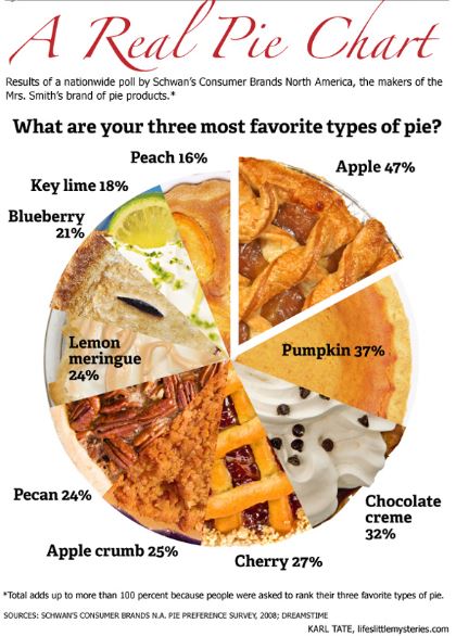
pie chart

The Pie Chart shown in the image would have been more meaningful if it had depicted the results of a simple survey – “What is your most favorite type of pie?” But it is trying to represent the top three favorites. The participants were in fact asked to rank their three favorites. Hence it is quite impossible to understand from this chart which pie was ranked No. 1 favorite by maximum number of participants. For example, though Apple pie tops the chart with 47%, it is quite possible that several participants voted Apple pie as their 3rd favorite, not their top favorite. Hence, in spite of attractive graphics, this chart is quite misleading, fails to communicate the survey results effectively and hence a failed visualization.

To avoid this kind of failure, understanding the data we are trying to visualize is extremely important. In this example, if pie charts were the way to go, a single pie chart would not suffice to depict the survey results. Also, while designing a visualization, giving too much importance to the graphics is good only if it does not take away the focus from the fundamental objective of the visualization – effective representation of data.

Image source:

http://euclid.psych.yorku.ca/datavis/gallery/images/pies/pie-chart-02.jpg

Reference:

http://euclid.psych.yorku.ca/datavis/gallery/evil-pies.php