All News Around The World In 1 Visualization

Unfiltered.News is an online interactive VIZ which visualizing the data from Google News, which watches more than 75,000+ news sources writing in 38+ languages worldwide. The goal for this visualization is to allow you exploring the news worldwide to find the topics and viewpoints that may not be covered in your location.

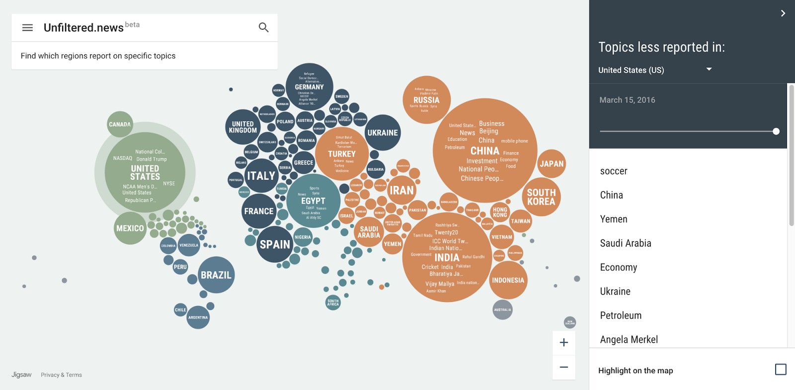
The visualization adopts an innovate idiom which combines the classic idiom of word cloud and bubble map. Each bubble represents a location or a country in the world and each word within a bubble represents a news topic in that location. Both the mark of circle and word has the channel of size. The size of a word represents the number of times that a topic has been mentioned in the specific date within a given location. The size of a circle is determined by the total number of topic mentions from publishers located in that location.

I believe the viz could help anyone to better know what’s happing around the world. However, the news topics shall be categorized and applying filters on it, which could help user target the news they interest in more easily.

Reference:

https://medium.com/jigsaw/if-you-are-reading-this-we-might-be-in-the-same-news-bubble-cb697270c698#.p2njeouxy

https://unfiltered.news/about.html


International Animal Trade

This visualization reveals the secrets of animal trading around the world in 2013. It was created by National Geographic and Fathom Information Design, which believe the visualization is useful for researchers and could helping policy makers view animal trade in a different light.

The visualization uses packed circles, which is similar to the classical idiom of Bubble Chart, but the difference is it has interactivity. The data is shown in a hierarchical order, with large animal groups, such as bird and mammals shown initially. When you click on circles, it will drill down to specific species.

The graph only uses one mark and three channels. Each mark presents a specific specie, and surrounded by larger mark which represents a specific group of species. The channel of size encodes the volume of trade and the color is to differentiating the animal species. The channel of hue is applied to represent the purpose of trade. However, one important information, the change rate of trade was not encoded here. I believe that element will show up in its next version, which could provide their audiences with more insights.

Reference:

http://news.nationalgeographic.com/2015/06/150615-data-points-infographic-animal-trade/


The Trends in Adult BMI in 200 Countires

The Trends in Adult BMI is an interactive visualization which show the changes in BMI (body-mass index) in 200 countries for the past four decades.

The visualization conveys its meaning effectively by using appropriate marks and channels. The X-axis is the timeline, from 1974-2014. The Y-axis is the percentage of population, from 0-100%. It uses only one marks and two channels, with the area as mark and the color/hue as channels. All population were categorized into 7 different levels of obesity, with the deep red as highest BMI level and deep blue as the lowest.

The visualization has two filters, one is filtering by gender and another is filtering the order of countries by different ways, such as obesity or underweight. Since the main audience of this visualization shall be some one like researcher, it will be better it could provide more ways of interaction which allows user do some further discovering. For example, a practical filter is filtering the data by people’s age. It could also filter the data by countries or continents.

Reference:

https://public.tableau.com/en-us/s/gallery/four-decades-prevalence-adult-bmi


14 Billion Years in 1 Data Visualization

The Histography project is an interactive visualization which records all events in our history into a singe page. It was created by an interactive designer named Matan Stauber.

The visualization use dot as mark. Each dot corresponds to a historical event. There only channel of the mark is its size. Some important events have larger size. All the data come from Wikipedia entries. When you click on a dot, the detail information of this event will show up.

There are many different ways you can browse the Histography. Either you can use the bottom slider to explore the events in a range of time or you can then filter down by category: for example, by music, religions, inventions. However, the data could be further categorized and adopting different levels of filters. It could help user target the events they interest in more easily. Also, the whole page could be zoom in and zoom out and applying more channels to encode the data. For example, it could reference another history Viz called ChronoZoom, which has the zoom in/out feature and a classified timeline.

Reference: 

http://www.citylab.com/design/2015/10/14-billion-years-in-1-animated-data-viz/410323/

http://histography.io/

http://techcrunch.com/2012/03/16/explore-13-7-billion-years-of-cosmic-history-in-your-browser-with-chronozoom/

http://www.chronozoom.com/#/t00000000-0000-0000-0000-000000000000@x=0


Visualizing Texas hold ’em

This interactive visualization is about the probability perspective in Texas hold’em. It was created by a software engineer named Chris Beaumont. The visualization shows us the first two hand win rates by enumerating and computing all possible (nearly 1.3 trillion) combination of hands. There are three graphs, which represent Average Hand Strength, Hand Frequencies and Weighted Hand Strength respectively. Our focus here is the last one because it is the most important part for players.

The VIZ only use cube (totally 13x13x4=676 cubes) as mark and color/satuation as channels. For any pair of two hands, the deeper blue represents the higher win rate and the deeper red represents the higher loss rate. Overall, it is simple and easily to understanding. But the contrast is low, you will be hard to differentiate which pair of hands has 60% win rate between other pair with 40% win rate.To be more distinguishable, it could use more channels, such as more color/satuation or more shapes to represent the win rates.

Reference:

http://chrisbeaumont.org/holdem_odds/#8H+QS

https://www.fastcodesign.com/3042982/infographic-of-the-day/a-data-nerds-guide-to-winning-texas-holdem


Visualization As Research Tool In Psychology

This visualization is created to help academics in the field of psychology. More specifically, it presents some important contextual and historical Influences in Psychology and also the related perspectives and psychologist.


The whole dashboard looks simple but elegant. It uses one type of mark and two types of channels to encode the data. The node presents each element, such as a psychologist or social method. The color is to differentiating types of information.  The size of node will be enlarged when user select a related node. The more relevant these two node is, the larger the node is. The hidden X-axis is time-based, from 19th centenary at left to 21th at right.

Using this visualization tool, I believe student will master the study of psychology in more easy way. And it also encourages student to self-explore. However, it will be better if it could provide us with the information about why the linked topic are relevant.

Reference: 

http://www2.open.ac.uk/openlearn/CHIPs/index.html


Bike Share in Philadelphia

This visualization is about the data of bike share station usage of Indego, which is a public bicycle sharing system that serves parts of Philadelphia at over 100 stations.

The purpose of this visualization is to help people to plan their commutes and avoid the busy hours in local bike stations.

As is shows, the x-axis represents different time within a day. The Y-axis is more complex, which represents the percentage of time the station is full or empty during that moment.

The graph itself only using a mark and two channels, with the mark of area and the channels of Color and Color saturation. However, the using of channel might no appropriate here. it might confuse people as it using deeper red to represents there are more bikes available. Because in our daily life, the color red always represents the signal of congestion or insufficience. Also, it lacks information density. For example, it could not present the difference in bike usage in each day within a week.

In fact, the author creates this graph because he thought his inital visualization is imperfect. But I don’t think so after digging out it. Here is his previous visualization.

Reference:

http://www.randalolson.com/2015/09/05/visualizing-indego-bike-share-usage-patterns-in-philadelphia-part-2/

http://www.randalolson.com/2015/07/18/visualizing-indego-bike-share-usage-patterns-in-philadelphia/

Which Country Won the Olympic medals

The streamgraphy below was created by two New York Times data visualization designers and it demonstrates the distribution of Olympic medals by country/area for each Summer event.

The time is on horizontal axis and each stack in the graph represents a country or an area. The more medal that country won at the event, the greater the height is on that point.

The graph looks fine, it has nice labels and appropriate color/contrast. It could help us easily understanding the trend of Olympic medals won for a country.

However, the data density in this graph is low. More channels shall be required here to encoding more essential data, such as the number of medals. Also, the graph might confuse people because the Olympic event is quadrennial, not as continuous as the graph represents. The simple mark of line could convey the same meaning, and the using of line chart might be more suitable  for this topic.

Reference:

www.nytimes.com/interactive/2016/08/08/sports/olympics/history-olympic-dominance-charts.html


Wind Trend Around The World

Project Ukko is an interactive data visualization jointly created by EUPORIAS, Barcelona Supercomputing Center and data vis designer Moritz Stefaner.

The project aims to create a seasonal wind prediction model that can be used in energy industry and scientific researches by analyzing and processing over 100,000 data points drawn from Euporias, a European environmental organization.

The most prominent part in this project which I would like to discuss with you is its expressiveness and effectiveness using of mark and channels.

The project use thousands of rectangles, each of them is a mark to represent the dataset in a specific location in the world. There are 4 channels which encode data into the mark:

  • The color opacity represents how well the prediction model performed.
  • The size represents the predicted wind speed.
  • The color and tilt together represent predicted wind speed trend.

By using these 4 type of visual channels, the project presents an aesthetic, simple yet high data-density visualization to us. However, we couldn’t know the wind direction from it, it would be better if it could encode this data in future.

Reference:

https://www.wired.com/2016/02/project-ukko-is-a-clever-way-to-visualize-the-complexities-of-wind/

https://blogs.scientificamerican.com/sa-visual/the-data-my-friend-is-blowing-in-the-wind/

Food Trend

The Rhythm of Food is an interactive data visualization website jointly created by Google News Lab and Truth & Beauty.

The project examines a wide range of  edible items, from sushi to Chinese dumpling, showing their changes in popularity among different seasons from past 12 years (2004-2016). The data sources come from Google Search Trends, a data pool which records what interest people have in.


The two things I am very interest in were its data validation process and its interactivity. To keep the data be valid at first, the project uses Google Knowledge Graph topics to obtain the clean data. For example, the search record of “apple computers” will be distinguished as fruit “apple” and thus omitted by system. The data chart has high interactivity. User could search the trend of a food and apply three levels of filters to obtain a specific kind of result.

However, the data from google search engine might not reflect the real world. The system could present a more accurate data visualization by enrich its data sources in future.

 Reference:

http://rhythm-of-food.net/

https://blogs.scientificamerican.com/sa-visual/visualizing-the-rhythm-of-food/