Visualizing Big data in Healthcare using Circos

The healthcare field has always been a favorite for analyst and data experts. The field is abundantly rich with large data sets and values, what we now call the “Big Data”. Analyzing large and multi-dimensional data in the field of genetics, genomes and biotech has always been a challenging task for analysts.

Most of the times, clinical data sets have a lot of fields and unstructured data. Healthcare data visualizations can be tricky and need utmost care in selecting the relevant data fields, measures and indicators. Because there is so much data involved, its structuring and visualization is a challenging process in itself. In a pile, full of insights, understanding the business needs of the clinical data and presenting them becomes difficult for technical experts like us. Data could be of various types like DNA types, Gene types, genome classification, disease virus classification etc. The person involved in creating visualizations and analysis may or may not have been acquainted with these terms biological and its significance. Hence, analysis of healthcare data becomes even more difficult. With various tools and software available in the market for data visualizations, one of them has stood out in terms of health care data.

Circos is an open source software package for visualizing data and information that visualizes data in circular layout is mostly advertised for data visualizations that have complex relationships between objects or positions. Circos is ideal for creating visualizations and illustrations with a high data-to-ink ratio [1] and multi layered data attributes making it ideal for clinical data analysis. Thus, for a data science professional in the field of health care and biotechnology , Circos is touted to play a very important part in making their tasks simpler.

References: http://circos.ca/

http://www.mastersindatascience.org/blog/10-cool-big-data-visualizations/


Data visualization and its analysis – Descriptive, Predictive and Prescriptive.

As data science students, all of us have heard the term predictive analysis which is basically forecasting or predetermining data for the future based on the trends and patterns of the past few years.As decision makers, stakeholders want to know what next lies in store for them in terms of the company’s future. Data visualizations on company’s performance, market value, stock prices are all indicators of what could happen next.

But there are two other dimensions to the analysis of any data or visualizations. Both are seldom heard and mentioned in market, and yet happen to have an immutable importance in the field of data analytics. These are descriptive and prescriptive analytics.

Descriptive analytics uses data aggregation and data mining to dig into the past data and understand “what exactly happened”. Prescriptive analytics on the other hand, use simulation to find alternatives and possible outcomes and answer “what can we do”.

Most companies conduct descriptive or predictive analytics on their data, mostly because they are trying to figure out what went wrong and what will be the future effects of it. They also hire professional experts to do the job of suggesting different recovery strategies, recommendations, and providing them with the best advice. However, the field of prescriptive analytics is relatively new and slowly getting its long-due attention. We rely on professionals and years of their knowledge and experience to prescribe what’s the best move for our companies. Predictive models, computational modeling and algorithms however are getting their long-due share of recognition as a more reliable and congenial way of approaching a business problem solution. They say to err is human and it has been proven right time to time! With all the amazing progress in data analytics, it is time now to move over human expertise and use prescriptive analysis.

References:https://channels.theinnovationenterprise.com/articles/data-analytics-top-trends-in-2017

What’s next? What lies on the future of visualization

As we are approaching the end of this class, we have had insights on what data visualization exactly means, how to create a good data visualization, how to distinguish between types of data and where to use which visualization. It brings all of us to a very logical question- what next? What more is to be explored in visualization and presentation of data? Industry experts and analytics enthusiasts feel like Sociograms and 3-d or multidimensional visualization will be the most sought out thing in the future. Sociograms in terms of data analysis, are essentially graphs that depict great amount of interactivity and relativity between its elements and understanding the way elements are connected to each other. Network theory has been an integral part of data analysis and Sociograms and coming-of -age network diagrams have made it easy to understand co-relation between seemingly non-related elements – for example crime and spread of diseases.

Another visualization that I can predict to take on the future of data visualization would be multi-dimensional figures and charts. Some of the research institutes are currently working on this technique that visualizations data in more than conventional 2-3 dimensions to show an in-depth insight into things. One such diagram that I found very interesting was a 5-D colorimetric diagram of the brain activity that can be seen on the page of  the reference link  below. Combined with interactive diagrams and high-level processing functionalities we might be able to predict and understand data patterns like never before.

References: http://analytics-magazine.org/data-visualization-the-future-of-data-visualization/
https://en.wikipedia.org/wiki/Sociogram

Interactive data visualizations – why and how they should be used!

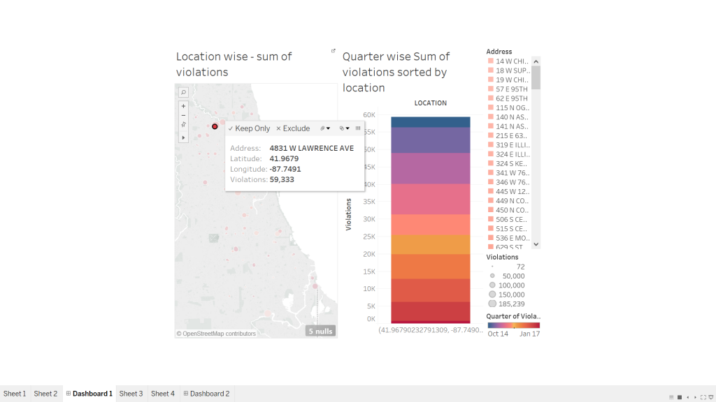
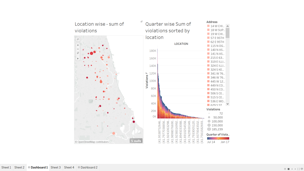
Last week we learnt about interactive data visualizations and its prominent highlights-how effortlessly and conveniently it merges and presents data based on different topics with the help of one common factor that binds them together. Interactive data visualizations are special types of info graphics that let the use play around, explore and essentially “interact” with the data and with what the visualization presents. However, like most other data visualizations, they have their own purpose and strengths when it comes to certain topics. In most cases, I have observed interactive data visualizations to be used in places where there is a lot of information associated with a certain data field (consider example of “state”) and cannot be adequately represented with one pie chart or line graph. This data is further sub-divided into related fields that tell us some more information about the “state field” like income or sex ratio, which would be further divided into income based on region or gender or occupation or sex ratio based on age group etc. While I was working on the project on interactive data visualizations, I realized that the entire essence of a good interactive diagram is the choice of field that would bind the two visualizations together. A field that is selected to be used as a filter, should relate the two charts in such a way that clicking on it would expand and bring forth more information about the concept. At the same time, we must be careful that the “filter / highlight action” on the dashboard is not repetitive of what the first chart does, instead the “action” functionality should bring to light additional information about the same field that could be completely represented using the first diagram.

2017-02-26 (1)

2017-02-26

P.S. I have referred by own assignment for this week- Interactive data visualizations to put forth my opinions for this blog.

Difference between info-graphics and visualization

A part of data analytics is to identify and distinguish a visualization and an info-graphic. They both are pictorial or visual representations of data; however, it is essential to use the right kind of representation based on the type, amount, context and relevance.
A data visualization is usually a representation of data as it is- without much editing and processing, usually representing the data as it is. They are mostly automated visualizations generated through algorithms or programmed codes. We can basically say that a data visualization is bound to tell you about the same data in a different way. It does not try to tell any story by itself.
Info-graphics on the other hand can be elaborate diagrams that tell you something using a lot of illustrations, graphics, pictures and icons. An info-graphic can be modeled, modified and designed to make the user look at it in a way or convey a particular message. Info-graphics can be creative and illustrious and omit some data to make the visualization fit the story line.
Again, all visualizations can be considered as info-graphics but the opposite is not true.

References:http://www.jackhagley.com/What-s-the-difference-between-an-Infographic-and-a-Data-Visualisation

Which visualization tool should I use for what kind of data?

In the field of analytics and data visualization, it is important to understand the type and meaning of the data we are dealing with, apart from understanding the data itself. Each data set will contain different type of data-statistical, numerical, informative data, demographics, trends, sales data etc. As data/business analysts and decision makers we are confronted with numerous types of data sets and it becomes essential to use an info graphic and visualization that would best depict them. Not only should our info graphics convey the message clear, it should be done in a manner the end party can assimilate it easily. Hence, it becomes important to understand which kind of tool/technology we can use to best visualize the kind of data we have in hand. There are thousands of software and online tools at our dispense, yet we must know which one is justifiable to use in which situation. I wrote this blog after I observed an online survey of tools and technologies that people suggested to use with a kind of data.

Data: Businesses, academics, statistical data, market data based on industry, topic, or country.
Tool/Technology: Statista
Pricing: Free, Premium at 49$/month

Data: Popular topics, online trends, and current events.
Tool/Technology: Google Trends
Pricing: Free

Data: Online tables, charts, and graphs.
Tool/Technology: Zanran
Pricing: Free

Data: Public opinion, social issues, and demographics in the U.S. and worldwide.
Tool/Technology: Pew Research Center
Pricing: Free

Data: Loads of infographics with customization
Tool/technology: Piktochart
Pricing: Lite $15/month & Pro $29/month.

Data: Animated graphics and charts
Tool/technology: Zingchart
Pricing: One-time fees range from $199 (Website) to $9,999 (Enterprise).

What does a day in the life of an average American look like?

This stunning dynamic visualization depicts the average life of an American based on the data collected in 2014 from The American Time Survey that has been created using CSS and D3.js.
Each dot represents a person, different colors represents different activities like sleeping, leisure etc. There is a time tab at the upper left corner and speeds of transitions like slow fast and medium. Every time a person changes a task or activity the corresponding dot will move from one activity to another.
The day starts off start slow as we see more people are sleeping or just beginning their daily chores. It then moves quickly to peak rush hours where people are travelling to work. The day in this dynamic visualization starts at 4:00am and runs for 24 hours. It is an excellent example of how dynamic visualizations can simplify a task where we must keep a track of thousands of people and their daily activities which is a strenuous task using conventional visualization methods like bar graphs or pie charts.

Also, this is a good example for understanding how each individual from a data set affects the whole pattern. For example, if 200k out of 1000k people start travelling at 9 am instead of 8 am, there is a monumental change in the trend. The example also contains mapping between activities using lines to better understand the transitions from one activity to another and understanding the most common ones like ‘household care’ to ‘personal care’ to ‘eating and drinking’.

Reference: http://flowingdata.com/2015/12/15/a-day-in-the-life-of-americans/

What does 2.5 years of your life look like in a data visualization?

During the course of our daily lives, we all perform several tasks each day. However, most of our time nowadays is spent on our personal computers and laptops. The data visualization I am talking about in this post turned into a stunning piece of art. Margin Ignac created a data visualization from his activities on the computer spanning around 2.5 years-web surfing, working on excel sheets, playing games etc.
He created this stunning visualization of the data collected from his computer over the course of two and half years documenting every small detail. He documented each activity usage that happened on his computer in every minute of the two and half years including the time when his computer was switched off.

He represented each day as a line with a different color for each different application that was running in the foreground at that moment on a black background.

7211194078_ff142634e9_z_detail_em every-day-of-my-life_2_detail_emta The data visualization looks well documented with a clear distinction for all the applications and patterns. We can easily make out different patterns like sleep hours, travels, holiday times from the distinct black areas between the colorful lines. Along with this, he further documented details like mouse clicks and keyboard hits. Although the data visualization isn’t of any prominent commercial use, the idea is well implemented and the results are stunning. His final info-graphics were shown at the Click Festival in Denmark in 2012.

References:       http://thecreatorsproject.vice.com/blog/25-years-of-computer-usage-turned-into-a-stunning-data-visualization


Understanding the origins of data visualization

In today’s world, data analytics and visualization have become an indivisible part of the industries. One cannot imagine processing of data without dashboards, data visuals, charts, graphs and stats. All these modern tools and techniques make understanding and processing data very convenient. Instead of convoluting the mind with intense number crunching, data visuals illustrate the same information, making the most of human’s unique photo memory.

image (1) image (2) image

This post isn’t about a visualization itself, but the origins of it. Born in Scotland in 1759, William Playfair, was a graphical illustrator who visualized and created amazing illustrations from pieces of information. His older brother John taught him that whatever could be expressed in number could be done using lines. This laid the foundation of many of his successful visualizations. Over time, he created many pie charts, graphs and bar graphs for data like Scotland’s trading partners, exports and imports and prices affected by war. He later assisted James Watt who streamlined the steam engine and served as his clerk copying complex drawings of his inventions. He went on to create the pie chart: dividing a circle into proportionate slices to represent corresponding data. Over time, his knowledge and acumen to understand and present data, helped him to create many such illustrations which would later lay down the basis of modern day visualizations.

Reference:http://www.atlasobscura.com/articles/the-scottish-scoundrel-who-changed-how-we-see-data

Friend or foe? A visual guide to understanding who’s with whom in the Syrian War.

Syria has been in the center of world attention for quite a while now, and not exactly for the merited reasons. Syria’s seven-year-old civil war, that began in 201 started off as a movement to overthrow Bashar-al-Assad and his government. The war is being fought between various “factions”-rebel groups, democratic forces and Sunni rebels, opposition groups that formed the Free Syrian Army (FSA) that are backed up by various foreign and regional powers and the government. In a web of intricate relationships and complicated loyalties it is difficult to deduce which power is backing up which group.With new internal and external entrants, entangled dynamics have taken a convoluted dimension. This data visualization chart is an interesting and orderly way of presenting the relationships of this civil war.Capture

Each party or group in the war is represented on the XY axis to be able to show multiple relationships that each of them has with the other. The legend and symbols are simple and makes the entire complex relationship easy to understand. I also loved the part where clicking on each symbol would present you with detailed status of the relationship. Overall, the chart is clean, systematic and provides easy to process information.

References-http://www.slate.com/blogs/the_slatest/2015/10/06/syrian_conflict_relationships_explained.html

https://en.wikipedia.org/wiki/Syrian_Civil_War