Effects of banning handguns

Here are 2 visualizations from Liz Fosslien blog that depict the effect of handguns on murders. First chart shows murders per 100,00 people of European nations that banned handguns compared to the nations that have not banned. The second graph shows the relation between 

Murder rates in European countries


Homicide rate versus average number of firearms per 100 people

Audience and the intent – The charts is intended for general public. The intent is not clear but the chart portrays that the murder rates are higher in countries that have banned handguns. Additionally, a simplistic interpretation would claim that banning handguns is futile, and may even have an adverse impact on murder rate. The second chart conveys that possession of firearms is a potential reason of increased homicide rates. 

Critique 

Validity : There are several questions regarding the validity of what is shown in chart 1. Europe has 44 countries so showing the murder rates of only a selected number of countries seems to be an attempt obscure the comparison rather than to reveal anything.

Deceptive : Chart1 is a snapshot at a given point in time and does not reveal anything about the causality. What if the case was such that, due to the high violence the countries had banned handguns. If so, then the chart is comparing apples to oranges because the countries with handgun ban is a  self selected group. The current country selection is clearly biased by the omission of significant countries like the United Kingdom since UK is one of the larger examples of a country where handguns were allowed but are no longer allowed.

Unclear grouping : It is not clear how the countries are ordered within each group in chart1. Certainly, the effect of putting Russia last in the ‘Handguns banned’ area, right next to the very-low Poland data point, has the effect of heightening the contrast between the two groups.

Incomplete data: The bubbles in chart 2 does not give any detail about what are the other countries being considered. Also, there is an outlier similar to USA with higher homicide rate and lower firearm ownership. This makes the analysis much harder because the U.S. is really in a class of its own and when if compared to other countries, countries with similar values for per capita income etc have to considered.

Betterment of representation and analysis –

For chart1, compare the murder rates over time within each country. Also plot violent casualties due to handguns so that handgun usage for violence is captured in the statistics. Also, create a chart such that in addition to capturing murder rates over time, the chart also depicts the violence rates before and after handgun ban. As mentioned, include all the countries in Europe to have a holistic view such that the relevant details are not obscured. This before and after comparison removes a lot of the inherent differences among countries and directly addresses the question.  As far for chart 2 is concerned, the scatter plots are a good way to show to show visualization involving two dependant variables (bivariate distributions) but a better way would be consider countries with similar per capita income, education levels and development index rather than comparing with underdeveloped countries.  Also each bubble has to show the corresponding country name.

USA Consumer Expenditure Over the Years

Here are visualizations developed by creditloan which depicts how the average US household spent their annual paycheck over the years. Below is one such graph for 2010 expenditures.

Description : The charts summarize the breakdown of consumer expenditures with respect to different categories like housing, food, healthcare etc. The underlying data is collected from the survey of the consumers conducted by US Department of Labor.

Audience : The chart is intended for general public to assess their spending. Additionally, the visualization provides a sneak peak to the government into the average household spendings to focus on the median income range households when planning policies, federal budgets and debt ceilings.

Critique :

  • The chart is overburdened with data. There are way too many images that are accommodated without absolute necessity. In addition to images, there are too many numbers, colors making it difficult to get to the information-of-interest.
  • Though the article introductions conveys that we are going to looking at how the spendings have been over the last couple of years, it is quite difficult to gain insight of data/category comparisons over the years.
  • The expenditure presentation over the years is not consistent at all. Representations for 2013, 2014 and 2015 are through infographics but 2010 and 2009 are represented in doughnut charts and 2012 data is represented through an embedded video.
  • Taking a closer look at the doughnut charts,  there are scaling issues with no ordering. The infographic lists all of the numbers in the Consumer Expenditure Survey in no particular order without providing any interpretation or relative comparison. Among the charts presented, the tabular format of 2011 representation seems to be the best as it is easier to read and get to the information-of-interest with not much looking around.

Betterment : 

  • The data from the survey can be better represented using stacked bar charts by year. The expenditure breakdown by category can be appropriately represented so as to track the changes in expenditure for a particular category over the years.
  • Each category would be represented by a different color. Though not-so-minor variations cannot be captured as the category in bar chart may not be aligned to the same line. To address this concern, the percentage values can be  put into each portion. This feature also conveys  what category contributed most of the expenditure for a particular year in a straightforward manner.
  • The stacked bar chart is an uncomplicated way of reading the changing trends over the years rather than having a consistent format of separate charts for different years.


References :

https://www.creditloan.com/blog/how-the-average-us-consumer-spends-their-paycheck/

http://www.hamiltonproject.org/papers/where_does_all_the_money_go_shifts_in_household_spending_over_the_past_30_y


Highschool graduation rate in USA

Twitter is a popular platform used by governments and leaders to communicate with public. Since the character limit for a tweet is limited, it makes sense to convey the intended information through charts rather than boring wordy reports with statistics. Here is one such tweet from Dec 2015 from WhiteHouse

Audience and intent – This chart is intended for public who is interested and constantly evaluating government’s performance. The Whitehouse wants to convey that the high school graduation rate is the highest in 2015 than it has ever been and implicitly highlight this as an achievement of the government.

Is the chart meeting the purpose?  To a certain extent and to people with not so keen eye for detail, yes – this chart serves the purpose. However, the chart does not represent high school graduation rate data in its entirety and is subject to speculations.

Critique

  • The type of chart used is vague. A column-like chart is represented using books with a 3D effect. 5 books represent 75% and 16 books represent 82% which is quite absurd.
  • The graduation rate is represented as a percentage. A percentage of what? I am assuming that it is relative to the number of students enrolled in 12th grade.
  • Thinking further, I would want to know if there is any change in number enrolled for 12th grade. I am assuming the proportion of high school aged section in a given population does not change drastically over the years,  so ideally as the population grows, the number of people/kids in high-school-age-group also increases. If there is no increase in the number enrolled with passage of years the chart seems to be misleading.
  • Also, this chart does not give out any information regarding the drop outs. For example, a school has 120 students for 11th grade out of which 20 dropped out. 99 students out of the 100 who were promoted to 12th grade passed the exams may imply the high school graduation percentage is 99% (99/100)  or 82.5% (99/120).

Betterment – In chart-making, choosing the appropriate form to represent the data on hand is of utmost importance. Ideally a line chart is suitable to show subtle changes in rates over time. However for the high school graduation rates we have different parameters involved. I would like to see in a given year the number of people between the years 17 to 21 years and the percentage of them with high school diploma. To represent these details, I would use a bar graph. Y axis represents the population number scale (number of people between 17 – 21 years) and X axis represents year. Each bar is stacked, i.e divided into 2 stacks with different colors, each color stack representing the number of people with high school diploma and without high school diploma respectively.


References:

Washington Post – Highschool graduation rate hits an all time high

Whitehouse archives – More students are graduating than ever

Mapping Migration in the United States

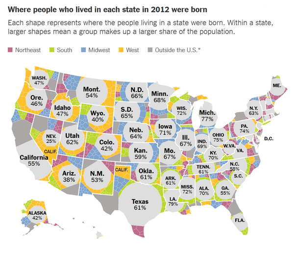
Due to recent discussions regarding immigrants, I wanted to know about the percentage of immigrants in each state and in the due course stumbled upon this 2014 report on mapping migration in New York Times. Here is a visualization that tells us “where people who lived in each state in 2012 were born” through a Voronoi treemap.

Color represents percentage of people born and living in the same in the same state. For example, 61% of Texans were born in Texas.

Treemaps are a well-known method for the visualization of hierarchical data but are limited to rectangular shapes. Additional challenges with tree maps are zero values and size distortion as the number of pixels (subdivisions) go up. These issues are eliminated using Voronoi treemaps which facilitate  subdivisions within polygons and creating treemap visualizations within areas of arbitrary shape.

Critique:  The objective is to convey the proportion of different categories of origins of people in each state. This is communicated using of geographical Voronoi treemap. Geographical maps are generally useful to represent spatially intensive data (the variable being aggregated over a region).  Since geographic size has no correlation to population, a geographic map is not an ideal way to represent population in general. The current chart however goes a step ahead to show proportions of population origin within state. For example, New Jersey has 10 times the population of Montana though the sizes the states on the map are contrary.  I am aware it is  not always possible to make each shape exactly the right size, however I think it is misleading to use the state shape and relative area to communicate these results. Also, 2 shades of gray – dark and light is used to represent people born outside US and people born in the state (and currently living in same state) respectively. In my opinion different colors should have been used contrary to different shades of a same color.  

How would I change it:  From the objective of the chart, we need a visualization that maintains regional relevance along with showcasing proportion of population origins in each state. To indicate population-origin proportions, a tree map with subdivided rectangular area (not Voronoi) works. To incorporate regional relevance with this, each state could be represented with a size proportional to its population with an area cartogram, instead of using the geographical shape of each state. An area cartogram is a map that alters an entire physical location by scaling a chosen economic, social, political, or environmental factor.  An example of an area cartogram of electoral results map (scaling factor being elections results of democrats and republicans) is shown below.

If a cartogram is used to represent migration map for USA, the visualization would consist a largest square for California, followed by Texas and smaller squares for other states. Each square (representing a state) would be divided into rectangular areas with size proportional to population origin category. I would use 2 distinct colors to to represent people born outside US and people born in the state (and currently living in same state)

PS : If the objective was to solely visualize population origin category with no regards no geography, bar graph would suffice. I would have the state names along the X axis, the percentage along the Y axis and bar graphs stacked side by side for each state. Thus, each state would have 6 bars (of different colors) representing population origin.

References:

Mapping Migration in the Unites States ( NYTimes, By Gregor A & Robert G, 08/15/2014)

Voronoi Treemaps

Migrations maps critique