After effects of redesign and deception.

Over the weeks, we have understood the ways to approach data, what to use, when to use and how to use charts to highlight your process, data and visualizations. So, this would be the last-run over the basics of what I learnt from this course, what I understand and how we could approach data and in result get the best visualizations to address it.

There are at least three key concepts we need to understand when starting a data project:

  • Data acquiring should begin with a list of questions you want to answer.

This is the part where we decide on the audience, the claim and the warrants that could prove your claim. Then it is advised to gather all the variables and records, rather than the subset that could answer the questions for the immediate story.

  • Data often is messy and needs to be cleaned.

Usually when we acquire data from a source we cannot confirm all the data is clean so there might a lot of time spent on cleaning the data. Also in cases of having multiple data sources, we could encounter fields that need to be joined have a mix of values, are misspelt or have variations that could get the standard down.

  • Data may have undocumented features

When we start to understand the data the first thing required is the data dictionary. There could be fields in the data that are addressed in different ways than the normal convention. For example, with gender addressed as M=1 and F=0. Also, there might be cases when a couple of fields in the data is not in the dictionary making it harder to understand it.

After the time spent on research and analysis of data to get the visualizations of the individual projects, this was the lesson I have learnt and will bear for all the future projects related to data.


http://datajournalismhandbook.org/1.0/en/understanding_data_2.html


Too Late to Start?

Human life span is considered as an average of 79-80 years, so what is the right age to begin a new venture to achieve success. When I was looking for ages at which entrepreneurs started their companies and made it big I found this very interesting visualization.

From the biographies of top 100 founders on the Forbes List they have found that 35 is the most common age to start one of the top companies in the world. The result is a bell curve, just like in school most people get grades somewhere in the middle, in life most people succeed mid-life, that is about 35, for the current generation.


The above visualization is interactive and puts together all the right things that we need in an interactive viz. The circles highlighted on click shows us the age, name and the company started by the entrepreneur. The most impressive thing conveyed from the viz is the claim that it poses. It is the right way to target your audience and deliver your message, and it does everything right to the dot.


This was just an interesting find that I wanted to share with the class. With the quarter almost coming to an end, we have almost figured out the dos and don’ts for visualizations. This is one such viz that made me think of how far I have got from where we started.


http://fundersandfounders.com/too-late-to-start-life-crisis/

How Visualizations really work

While creating visualizations we need to understand what is the purpose we are looking to get from the data. Usually the visualizations are based on the data that is being considered. The types of viz. are:

  • Conceptual visualizations focus on ideas and the goal is to simplify or teach
  • Data Driven visualizations focus on statistics and the goal is to inform or enlighten.

When I was working on my redesign project I understood the need to approach the data in a specific way and question if the information is conceptual or data driven. When I started out the question was whether I am declaring something or exploring something? With the declaring part, we usually focus on designing and documenting information to affirm something. With the exploratory part, we must focus on prototyping, iterating and interacting to confirm something.

But with today’s technology development it has become very easy to make visualizations that look good. The only drawback is that is boosts our impulse to “click and visualize” without thinking about the purpose or goals. This leads to charts that are inadequate or ineffective. And the path usually leads to visual discovery with no idea that what you are showing in a chart.

Visual Discovery is a complicated and as bigger and more complex the data gets, and the less you know going in, the more open-ended the work. And this was my journey to get to the visualization in my redesign project.


https://hbr.org/2016/06/visualizations-that-really-work

Week 7 Views.

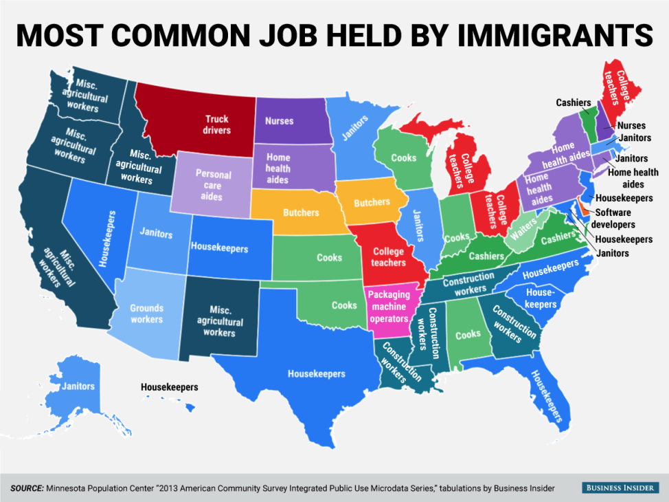
The map below shows the most common jobs per state, held by people who are from a non-US origin. Though the data is not quite clear on if the people are legal or illegal immigrants in this scenario, we can see that, 59 percent of the workers have lower than a high school education, compared to 31 percent of the rest of the labor force. (Mekouar, 2015)


This visualization contains a lot of data and could be represented in multiple better ways.

The main issues I would improve are:

Firstly, the representation of color and labels make the map look cluttered.

  • Having a legend would improve the above flaw to a certain extent.

Secondly, grouping the states and indicating the common jobs by % would present the data to create a better understanding.

The last thing according to me that would make more sense is to classify jobs by skill level and create an understanding on the education levels and the wage details.

As the weeks have passed, I have learned to appreciate and criticize details of each visualization. To create better and more influential visualization/ dashboards we should first ask the question “Why is it required?”. This has given me an understanding of how to better justify the data to your audience than just making an attractive visualization.


http://blogs.voanews.com/all-about-america/2015/08/24/most-common-jobs-held-by-immigrants-in-each-us-state/

Weather Matters.

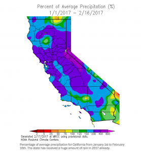
As we all know, this has been one of the wettest years in California in a long time. People have had evacuation notices due to high chances of flood and reservoirs overflowing. This has been the strongest storms hit since 1995. When I was going through daily news, I found this visualization and it looked very interesting. Though it looks like modern art with so many colors splashed, it makes a lot of sense when closely looked at.

Screen Shot 2017-02-19 at 12.06.18 AM


The visualization presents the precipitation (rain or hail) in % over the last month and half. I particularly liked this one as it shows all the exact points and helps understanding the most affected areas. The color scale being diverse does not collude and merge with each other and shows discretely the areas of regions. Even though this might be breaking one of the rules of thumb, of presenting in black and white. I understand that it is very helpful in this situation.


For our upcoming assignment of interactive dashboards, I feel this has created an impact on me to use what matters. When you want to understand the big picture to its core details in a couple of clicks, it helps to know what exactly is the message you want to convey to the audience.


So find the message you want to put across and enjoy the assignment!

https://www.washingtonpost.com/news/capital-weather-gang/wp/2017/02/18/historic-storm-pounds-southern-california-with-high-winds-and-record-rain/?utm_term=.13262146b08f

How to create better Dashboards.

Last week, we all completed the exercise 2 and for some of us this was the first dashboards we created. Even though using tableau to create a chart or a graph is super easy, analyzing it to get to the results you need is a time-consuming task and requires lot of iterations. So, after I completed my first dashboard I tried to analyze if that was the best I could do. This got me to research on the methods and approaches to designing great dashboards. Upon that I came across this article about “Designing and Building Great Dashboards

“Different people in the company ask for different data to be displayed and soon the dashboard becomes hard to read and full of meaningless non-related information.” (SMITH, 2015) So, focusing on these high-level design rules help us to create a dashboard that is worth the time and effort we put in to designing it.

Rule 1: WHO ARE YOU TRYING TO IMPRESS?

The most effective dashboards target a single type of user and just display data specific to that ‘use case’.


Rule 2: SELECT THE RIGHT TYPE OF DASHBOARD

Dashboards are of different types and each of them is used for performing a specific purpose.
The types of dashboards are Operational, Strategic / Executive and Analytical dashboards.


Rule 3: GROUP DATA LOGICALLY – USE SPACE WISELY

Grouping data is very important to get the dashboard right. Either grouped by department or functional area.


Rule 4: MAKE THE DATA RELEVANT TO THE AUDIENCE

Ensure that the data you display on the dashboard is relevant to the users. The components should always be designed thinking about the scope and for data to reach of your users.


Rule 5: DON’T CLUTTER YOUR DASHBOARD – PRESENT THE MOST IMPORTANT METRICS ONLY

Whether it is useful and useless information added to fill the dashboard cluttered dashboards don’t give the impact. It often takes away the focus from the important messages.


Rule 6: HOW OFTEN DOES THE DATA REALLY NEED TO BE REFRESHED?

For dashboards that are interactive, we always have to keep in mind that the data keeps changing and so the dashboard has to be updated.

https://www.geckoboard.com/blog/building-great-dashboards-6-golden-rules-to-successful-dashboard-design/#.WJ9m1rYrKRs

All bubbles in the air!

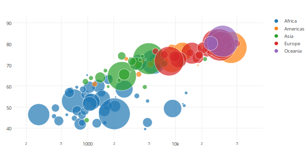
Bubble charts give you the ability to visualize up to 4-dimensions of data and are an absolute fan favorite! They communicate the count or proportion of a variable where the size of the bubble reflects the quantity in two dimensions. We could add the third dimension by plotting the different sized bubbles with x and y axis like a scatter plot. The fourth dimension is added usually by use of different colors (shades of a color) to sort data into categories.

The bubble chart shows a lot of data all at once, making it tricky and hard to understand the answer on the first go. The difficulty is in interpretation of bubble graphs. While they can give a quick comparison of values by looking at them, they are not as well suited for accurate determination of analysis of your data.

Best practices for Bubble Charts:

  1. Use when the audience is aware of the data and educated.
  2. Size bubbles appropriately.
  3. Do not use when data results in overlapping bubbles.

As we can see in the chart, there is total chaos and it creates a piece of modern art, with multiple perceptions at the user end. With no prior information on what data is being represented there is no clear understanding of the details and requires additional effort to decipher and generate an analysis. Hence at times bubble charts are as useless as pie charts.


http://www.quickbase.com/quickbase-blog/when-to-use-bubble-charts-to-display-your-data

https://visage.co/data-visualization-101-bubble-charts/

http://www.msktc.org/lib/docs/KT_Toolkit/Charts_and_Graphs/Charts_Tool_Bubble_508c.pdf


The Rise and Rise of Fin-tech!

When we consider Fintech, we think online payments, banks and money related stuff. There have been transformations with huge investments and by innovations like peer-to-peer models, crowdfunding, and contactless payments in Finance and banking. But there is so much more with the increasing tech like Robo advisors, Smart Contracts and Colored coins.

Fintech, has exploded over the last 5 years. The growth over years and to understand different types of Fintech companies from various sectors, the below infographic gives a clear insight. It also gives the spike in technology start-ups in 2012, or to see how new technology is reshaping the financial industry.

So far, the industry’s primary focus has been P2P lending and P2P wire transfers. Now the companies are moving towards areas like insurance, wealth management and corporate finance, the lesser ventured segments.

The visualization is appealing to me in multi-fold. It represents the data clearly separated as categories, shows the growth over years and presents the companies sorted per their sector and year.


img src: http://www.valuewalk.com/wp-content/uploads/2016/11/infographic-fintech.png

http://www.valuewalk.com/2016/11/financial-technology-fintech/

http://www.businessinsider.com/how-fintech-transforming-finance-2015-9

http://www.forbes.com/sites/nikolaikuznetsov/2016/11/22/the-next-phase-in-fintech/#736e473a4a29

When Connections Matter!

In this day of technology, our professional network has immense value as we need the right connections to get us places. Everyone today relies on their network to keep friends and family updated, to get in touch with people of similar interests, to find people suitable for their organizations or start a new business venture.

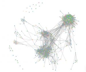
Socilab is an online site where we could analyze how wide our LinkedIn network is. Considering my network chart (image below), I found that I have multiple clusters of people either from the same location, from the university I studied in or my prior workplace. Considering it is real time data, the network chart helped me analyze my strong networks and where my network links are weak.

Network Charts are not very easy to read, but in situations like these give us an understanding on how wide and how diverse your network is with respect to location or industry. Use the link  http://socilab.com/ to create your own network map and analyze your connections.


Screen Shot 2017-01-22 at 11.27.03 AM


New Year Resolutions

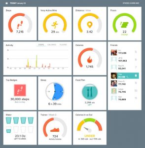
All of us at some time resolved to exercise more, eat healthy and lose weight. But the spirits that we start our resolutions slowly dies down over time and we give up unless we have someone guiding us till we have achieved what we started out to do. Today, we have apps to thank for, that track our movement, count the number of steps, monitor our breathing rate, help us exercise and do multiple analysis that help motivate us.

Setting a goal and following it has become easier and considering, reaching a goal gives you points or credits is an added encouragement. These apps have a clear structure that define different parameters that people want to track and work on.

fitbit

The above image is from Fitbit mobile dashboard. The representation influences the user as the measure for each unit of data is clear-cut. It shows the analysis for the day, summarize the overall performance, highlights the best you have done so far and guides to the target you want to reach. This improves the user’s performance as it drives them to push hard as they can continuously monitor and see themselves closer to the goal.

Image link: https://s-media-cache-ak0.pinimg.com/736x/3f/35/5a/3f355ae19bd41e86f14199056353ed2e.jpg