As a citizen of a country and a tax payer one should always be curious to know how their government is spending. Usually, government spending includes all government consumption, investment, and transfer payments.
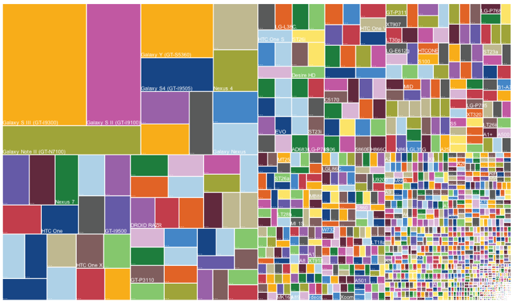
Every government releases their annual expenditure report and few of their visualizations can be misleading. Let me introduce to a viz called packed bubble chart, the size of the bubble represents the scale of a metric. Simply, larger the bubbles – larger the values.
Image 1.0 is a reference to a government’s spending in a year. They have spent close to $3.7 Trillion, yes it’s trillion it involves 12 zeros. That’s the huge amount spent by a government body, you could put 8.33 million people through all four years of college with $1 Trillion.

There are multiple drawbacks of this visualization, the amount spent varies by a scale that is thousands, millions, and billions. In image 1.0, all the expenditure are plotted on a single scale, it’s quite hard to visualize or know what kind of expense it is? The expenses which are in thousands or millions look quite small on this chart.
Secondly, targetted audience should be analyzed before preparing a dashboard. In this case, an FP&A (Financial planning and analysis) head will like to have a bird’s eye view. Where an HR manager would focus on headcount expenses. So, it’s better to who are your targetted audience in advance.is no category of expense, such as defense, administration etc.
There is no proper segmentation of departments. For an instance, there are multiple defense expenses and they all scattered. It’s quite tough to compare the overall drop or increase in defense segment.
The red color in the viz denotes that it has the highest drop in expense compared to last year. There is quite a long range of colors used and it’s difficult for us to interpret them in numbers.
How can we make this viz better?
Creating segments of expenses and form clusters to group them together. Legends should have only three to four to distinguish the scale of expenses so we can simply classify. Prepare dashboards based on targeted audience and restrict them to their respective departments to be accesed.
Source of the article: https://www.pinterest.com/pin/490822059366478830