Benefits of Dashboards in the Business World today

Dashboards are extremely important in today’s businesses. Below are some of its benefits:
1. Total visibility into the business: You will know what exactly is going on in your business at all times with the use of a dashboard. How good were the sales last quarter/year, how is the marketing going on, how is the response of customers on the new product, etc. It becomes easy to compare such trends in the business.

2. Big time savings: The reports generated can be automated and live results can be seen. This saves a huge amount of time. This time then can be used for other useful purposes.

3. Improved results: You intuitively start improving your results once you see your key metrics on the dashboard. You start working better, trying to make that sales/profits graph go up.

4. Reduced stress: You can scan every aspect of your business to see how you are doing. If there’s a problem, you’ll know who exactly to contact to fix it. This increases easiness and reduces stress.

5. Increased productivity: You can measure performance numerically. When the employees see the results numerically, they naturally work hard to improve them. They try to make sure that they don’t have red arrows anywhere (a mark to show failure/doing poorly)

Reference:

6 Benefits to Building Your Dashboard Today

Building KPI Dashboards in Tableau

The main task of dashboards is to provide the insights. Key Performance Indicators (KPIs), as the name suggests, help us to know how a business is doing or how is a specific process doing. This usually involves comparing current values or historical trends against a target value.

I have two methods to point you towards the blogs, for building KPI dashboards:

1. Tableau provides dynamic shapes to show good news/challenges. The upward pointing green triangle is shown for any good news/success whereas the downward pointing red arrow reflects failure or a lower result from the last one.

It’s very simple to generate these in Tableau and the steps are explained on the website:

http://www.thedataschool.co.uk/emily-chen/building-kpi-dashboards-with-shapes/

2. This method involves making two views – one showing the current values, the other showing the historic trend (in this case, revenue). This post explains how to align these two views together or how to deal with them by interlinking the two separate sheets on a dashboard.

https://www.interworks.com/sites/default/files/RobertKPI1.png

This is explained on the following website:

A New Way to Visualize KPIs in Tableau

Personally, I liked both. It totally depends on which one you choose to present your research and insights.

References:

A New Way to Visualize KPIs in Tableau


http://www.thedataschool.co.uk/emily-chen/building-kpi-dashboards-with-shapes/

Data Visualization process in D3

The visualization in D3 (or basically any visualization tool) is carried out in the following steps:

1. Data acquisition – Obtain the data from a source (disk or over a network).
2. Parse – Give it a structure for its meaning and then order it into categories. The amount of data might be immense, but it is necessary to put it in a structure to make it easier to convey the message to the others.
3. Filter – Only keep the data that matters, which is in the interest of your claim.
4. Mine – Apply methods from statistics or data mining as a way to discern patterns or place the data in mathematical context.
5. Represent – Choose the idiom that fits to represent the data. Eg – bar graph, scatter plot, map, etc.
6. Refine – Improve the basic representation to make it more clear and which better give the insights by looking at it. You can change the color scheme or change the entire idiom.
7. Interact – Add methods for manipulating the data or controlling what features are visible. D3 is very powerful in this section.

To start implementing in D3.js, you can follow the tutorials given on the website:
https://www.dashingd3js.com/d3js-first-steps

Reference:
https://www.dashingd3js.com/the-data-visualization-process

Google Flights

Ever wondered how many things move in the sky daily? Well, Google Trends came up with an answer to our question with their Google Flights Visualisation. Google Flights is a visualisation designed to show the flights moving over U.S. one day before Thanksgiving, 2015. The visualization begins with the start of the day and shows all the flights that have crossed U.S. in that one day till midnight. While the visualization does not give the flight details, users can easily understand which times of the day are more popular for international and domestic flights and, for flights to and from different hubs around the country. The visualization does use different color codes for various airlines but due to the fast-moving inbuilt timeline, users cannot make the most use of this feature.

In my opinion, though the visualization is very attractive, it is not very informative. No real data can be inferred from just looking at the screen. There is no option to filter out the data based on international or domestic flights, or based on different airlines for any given point in the day. The zoom-in and zoom-out feature also doesn’t seem to be of much help since no new data is visible even after zooming in on a particular point. According to me, this visualization could have been better if the user had tried to represent more data than focusing on animations.

Reference:

http://googletrends.github.io/iframe-scaffolder/#/view?urls=Thanksgiving%202015%7Chttps:%252F%252Fgoogledataorg.cartodb.com%252Fu%252Fgoogledata%252Fviz%252Fbf595f4c-7381-11e5-9ec5-42010a14800c%252Fembed_map&active=0&sharing=1&autoplay=0&loop=1&layout=narrative&theme=red&title=A%20day%20in%20the%20life:%20US%20Thanksgiving%20on%20Google%20Flights&description=The%20day%20before%20Thanksgiving%202015%20shown%20in%20US%20domestic%20and%20international%20air%20travel%20booked%20with%20Google%20Flights

Process of making Dashboards – Design Thinking

Picture – https://i2.wp.com/www.tableaufit.com/wp-content/uploads/2016/05/Design-Thinking.png?resize=700%2C332

There are 4 phases of designing a dashboard: What is? What if? What wows? What works?

What is? – This is the part that no one likes. It involves understanding the data, involves a ton of sticky notes and sadly, a 101 crash course on doing the work. People tend to skip this part.

What if? – This is the part which most people want to do first, without understanding the data. We simply throw ideas out here, just like spaghetti at a wall. If it doesn’t stick, it will, at a later stage. Many ideas come and we have to filter out some of the outlandish ones.

What wows? – This is the moment when you feel you have conquered the world and you’re at cloud 9. We begin to realize what Tableau can do. The goal here is prototyping.

What works? – This is the final product. Usually, by this point, we have clarity and have a rock solid dashboard.

Reference : http://www.tableaufit.com/humans-dashboards-tableau-design-meets-ideo-aka-design-thinking/

Is Your Dashboard Useful?

A dashboard cannot help you communicate your data effectively if you don’t know how to build it. Having a dashboard will not make you data-driven, having a useful dashboard will. A useful dashboard is the one which is understood just by having a glance at it. There are 5 stages to make a useful dashboard:

Stage 1: Curiosity
Identifying the need for being data-driven but not what has to be done to become data-driven.

Stage 2: Play
Building your first dashboard and analyzing data. However, you haven’t identified the right business tools and processes.

Stage 3: Clutter
Manipulating the data by sharing the dashboard with colleagues and discussing with them. Business metrics are to be identified to reach business goals.

Stage 4: Clean Up
Deciding business goals and metrics that align to achieve the goals. The ownership of metric is not yet identified.

Stage 5: Focus
Understanding what data is driving the business and what can be done to achieve the goals. Being data-driven.

Dashboards are never static, they change as your business goals change.

References:

TV Dashboards/ Wallboards

A TV Dashboard (or a wallboard) is a tool used to display key business metrics in real-time. TV Dashboards have evolved over the years from office whiteboards to office monitors that continuously display a business’ data.

They give businesses a clear view into their KPIs and allow all employees to have a better understanding of performance. Dashboards can dramatically improve a business.

The benefits of TV Dashboards include:

Transparency: It helps to maintain transparency at all levels in the company. Each and every employee, no matter what his/her position is in the company, is able to see the same metrics and this helps to reach the goals clearly.

Real time business decisions: The changes in the metrics are real time and this helps to take business decisions immediately whenever any improvements/changes have to be made.

Metrics driven: Decisions are made according to the changes in metrics and not any gut feeling. This improves the results of the decisions.

Here is the link to an image of a sample wallboard of a company:
https://www.klipfolio.com/images/content/dashboard-examples/dashboard-example-marketing-performance.png

Reference: https://www.klipfolio.com/resources/articles/what-is-a-tv-dashboard

Scorecards vs. Dashboards

Very often, many organizations use both the words – ‘scorecards’ and ‘dashboards’ so interchangeably that is it difficult to differentiate between the two. Here’s the difference:

Scorecards

A scorecard is a type of report that measures and compares your performance against your projections and goals. It evaluates the success and failure of your efforts, based on key performance indicators (KPIs).

Dashboards

Dashboards are made up of multiple reports, allowing you to easily compare and contrast different reports or access diverse data sets in one place. Scorecards can be included and viewed on a dashboard with other types of reports as well. Dashboards can be customizable and present different views from the CIO to a staff member in the company. Ideally, you want all the data to be pulled from a single data repository to ensure accuracy within your reports.

Scorecards provide serious value to an organization if done correctly. With scorecards, businesses can evaluate their goals and direction, determine if they are on track, assess trends and patterns and utilize resources in the most efficient way possible.

References:

http://www.bscdesigner.com/dashboard-vs-balanced-scorecard.htm

D3

D3.js (Data Driven Documents) is a JavaScript library used to produce interactive and dynamic visualizations on web browsers. It is the successor to the Protovis framework with better performance and with a focus on web standards. Many companies like Datameer, The New York Times use D3 for their visualizations. Moreover, the OpenStreetMap project also uses D3 to build interactive, editable map of the world.

D3 was developed by Mike Bostock, Vadim Ogievetsky along with Prof. Jeff Heer from Stanford University in 2011, when the development of Protovis was stopped.

D3 makes use of SVG (Scalable Vector Graphics), HTML5 and CSS standards. The most commonly used input file formats are JSON, CSV, geoJSON. It makes the user control the final visual effects to a great extent. The API is very easy to use and it makes a different level of visualizations with a reasonable amount of codingtumblr_msxucqhY061stz40uo1_500.

Here are some of the mindblowing examples implemented in D3.
http://bl.ocks.org/mbostock

Fitbit

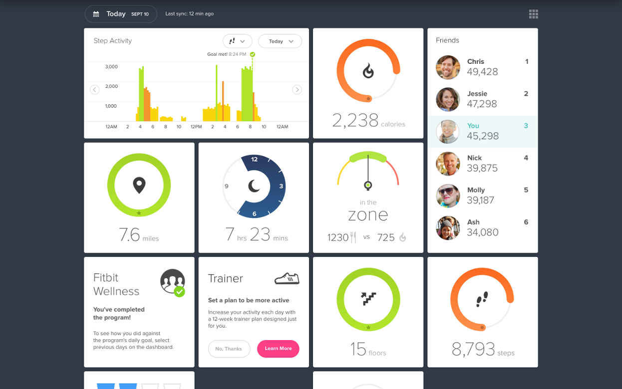
Fitbit is a company headquartered in San Francisco, California, known for its products which tracks all the daily activities of a person including number of steps walked, climbed, ran; as well as heartbeat, sleep time and other metrics involved in the health of an individual.

Fitbit provides this interactive dashboard which shows all the physical activities of a person and the consumption of food to keep track of the fitness level. The daily stats highlights the progress towards daily activity goals. Each tile on its own behaves in a dynamic way and allows us to see more detail information and history.

Having a better view of the data and the daily progress, one can make more informed health choices and know what exactly he/she is lacking behind.

Reference: https://blog.fitbit.com/heres-what-makes-the-new-fitbit-dashboard-awesome/
Photo source: https://static0.fitbit.com/simple.b-cssdisabled-png.hd53c63eab7cc1316845e4b4084fbc504.pack?items=%2Fcontent%2Fassets%2Fzip%2Fimages%2Fapp-dashboard%2Fscreen%2Fweb_Next_Gen_Dash%402x.png