5 TIPS FOR CREATING EFFICIENT WORKBOOKS

  1. Think strategically about the data you absolutely need. Reduce the size of the data set by removing irrelevant data from the file. For example, dropt the data three years ago, if your analysis is only about current year. This may help you remove at least one-third of the data before you started. You may also use aggregation to reduce the number of records. Prepare data before it gets to Tableau.
  2. Limit filters. One way to reduce filters on a dashboard is to use dashboard actions instead. Using a sheet as a filter or adding a filter dashboard action that runs on hover or select provides a more efficient means for filtering the rest of the dashboard.
  3. Reduce the number of marks. The more marks that need to be processed, the longer it may take for the visualization to appear. Depending on your analysis requirements, it may not always be possible to reduce the number of marks on a view, but sometimes there is an opportunity to change the level of detail to improve efficiency. Consider ways you can aggregate data points into hierarchies and / or make the analysis less granular.
  4. Efficient Rule. While the calculations are very powerful, they can come with a cost to the efficiency of the workbook. Not all data types are created equal in terms of efficiency, with data types going in this order from most efficient to least efficient: Boolean > Integer > Float > Date > Date Time > String
  5. Reduce sheets, dashboards, data sources. This tip not only helps with efficiency, it will help you keep your sanity and improve the end user experience. If you do have several dashboards that are connected, create a navigation dashboard that helps the end user locate the most relevant views for their specific business questions. This same technique can be used from within specific dashboards (i.e. add a URL action to run on Menu that links the end user to another dashboard / additional information).

Reference: http://www.evolytics.com/blog/tableau-201-5-tips-creating-efficient-workbooks/

Financial KPI Dashboard For Executive

The first thing that comes to mind when thinking of an executive dashboard is tracking fiscal performance. This dashboard displays financial KPIs like current revenue, quick ratio, and short term assets. The idea behind any executive dashboard is to provide a concise, but accurate view of business performance so executives can get the information they need “at-a-glance” to drive the business forward. In the quest for brevity, however, it is important to provide executives with an easy way to to get a more granular view of the business.

  • Left top corner is the Sales Growth, which measure the pace at which your organization’s sales revenue is increasing or decreasing. This is a key metric for any organization to monitor since it is an essential part of growth projections and is instrumental in strategic decision-making.
  • Left bottom corner is the Quick Ratio, which measures the ability of your organization to meet any short-term financial obligations with assets that can be quickly converted into cash.
  • Right part is about Working Capital, which measures your organization’s financial health by analyzing readily available assets that could be used to meet any short-term financial liabilities.

Reference: https://www.klipfolio.com/resources/dashboard-examples/executive/financial-performance

How To Make A Waterfall Chart In Tableau

A waterfall chart helps understand how positive and negative values of dimension members are contributing to a total.

Here is an example visualizes how each Sub-Category in the Sample – Superstore dataset is contributing to total profit:

  • Create a vertical bar chart, make profit as measure, sub-category as dimension. Add a table calculation to the Profit measure so that it calculates a ‘Running total’ on ‘Table (Across)’.

  • Change the mark type from ‘Automatic’, which is currently bar, to the ‘Gantt Bar’ mark type, like below:
  • In order to get the Gantt bars for each dimension member to properly line up, you first have to create a new calculated field which takes the measure in the waterfall chart multiplied by negative one. (e.g: -[Profit])
  • Once this calculated field has been created, this is the measure that you drag to the Size Marks Card to create the waterfall effect as we showed in the beginning.

Reference: http://www.evolytics.com/blog/tableau-201-make-waterfall-chart/

Building Interactive Dashboards With Tableau Actions — Google Image Search

Doing a google search or google image search from a dashboard is another action that we should try. So, what is the benefit of it? In the visualization, users can explore news stories or related images by following links provided within the Tableau dashboard for thousands of different data points.

Here is a good example provided by the following link:

https://public.tableau.com/shared/BCTCC8K6H?:toolbar=no&:display_count=yes

Clicking on any location will open a new browser with a Google Image Search for that location. Then how to do it:

  • Google search the images of the locations and copy the URL that appears in the browser. (e.g: the link of Kansas City is https://www.google.com/search?q=kansas+city&source=lnms&tbm=isch&sa=X&ved )
  • Go to any of the dashboard ‘Dashboard>Actions> URL’. Paste the URL you just copied. Replace the actually useful portion of the URL for the query, which is the text immediately following the “?q=”, with a field from your data.
  • Add the field from your data source (e.g: I want to change the city location) , for which the information you want to change interactively by clicking the arrow that appears next to the empty URL box.

  • Finished! If you click on any location point on the map, a Google Image search is executed with the name of that city (from my underlying data) as the search query.

Reference: http://www.evolytics.com/blog/tableau-201-3-creative-ways-to-use-dashboard-actions/

Building Interactive Dashboards With Tableau Actions — Embed A Youtube Video

Last time, I introduced how you can use Tableau Action Filters. This time, you will learn how to embed a video from an external source into your dashboard to highlight something interesting.

First of all, you need to get the youtube video URL you like. To do this, go to a youtube video and click “share > embed”. Copy the source link in src=”…”, like the highlight in the picture:

Next, you should save your Youtube URL in your source data file as an column just like other regular attributes.

Go to the “Dashboard > Actions> Add Actions > URL” in the top navigation from any dashboard view. Click the arrow that appears next to the empty URL box. You should be shown a list of options including the URL field in your underlying data. Click the URL field so that the video associated with a particular record will start when the action is run.

WX20170214-175952@2x

This is a example dashboard embed youtube videos for “MLB Integration by team”. If Clicking on any hall of fame player, represented by a blue Gantt bar, it will load a short biography of that player on the scoreboard.

TO BE CONTINUED…

Reference: http://www.evolytics.com/blog/tableau-201-3-creative-ways-to-use-dashboard-actions/

Building Interactive Dashboards with Tableau Dashboard Actions–Filters

To interact with your users, you want to transfer the control to them to discover more and make insights they find easier to retain. Here, I will share three different ways to leverage dashboard actions to improve your user experience.

Dashboard actions in Tableau allow you to add logic to dashboard components that create actions somewhere else. For example, you can add logic that says, “If a user clicks on Dashboard Sheet 1, I want something to happen on Dashboard Sheet 2.” To set up a dashboard action, navigate to “Dashboard > Actions> Add Action” in the top navigation from any dashboard view. Three types of action will be presented: Filters, Highlight, and URL. This week, I will introduce the filters first.

  • Filter – If you click on sheet one, sheet two will be filtered to whatever you clicked on sheet one. Example:  Here is an overview of the dashboard.

We could make every individual dashboard sheet as a filter for the entire dashboard by hovering over the sheet, clicking the down arrow that appears in the upper right, and selecting “Use as Filter” (on all three sheets).

Then when clicking on any sheet, the other sheets are filtered to whatever I clicked on. For example, if we click on Washington in my map view, the trend line and bar chart sheets will be filtered to just that state:

If not all of the sheets have enough data to show the details of each state, you should set the filters separately for each chart, for example only the bar chart instead of the map.

TO BE CONTINUED…

Reference: http://www.evolytics.com/blog/tableau-201-3-creative-ways-to-use-dashboard-actions/

Tell A Meaningful Story With Data

Data will be remembered only if presented in the right way. Often, executives and managers are being bombarded with charts, graphs, dashboards with complex data analytics. The reason why they struggle with the data-driven decision making is that they don’t understand the story behind the data. In this way, a powerful story with data means a lot.

Stories are meaningful when they are memorable, impactful and personal.  When data and stories are used together, they resonate with audiences on both an intellectual and emotional level. To tell a meaningful story, you’d better:

Identify the audience. What does the audience know about the topic? There are usually five types of audience in common: novice, generalist, management, expert and executive. The novice is new to the subject, but doesn’t want to oversimplification. The generalist is aware of the topic, but looking for an overview understanding and major themes. The management want in-depth, actionable understanding of intricacies and interrelationships with access to detail. The expert want more exploration and discovery and less storytelling with great detail. The executive only has time to glean the significance and conclusions of weighted probabilities.

Use data visualization to complement the narrative. There are mainly two visual narrative genres: one is author-driven narrative, which doesn’t allow readers to interact with charts; the other one is reader-driven narrative, which provides ways for reader to play with the data. Those two should be balance intended by author with story discovery on the part of reader. A good data visualization should stands on its own. If you take it out of the context, the reader should be able to understand what the chart is saying as well. A good data visualization also should be easy to understand. while too much interaction can be distractive, the visualization should incorporate some layered data so the curious can explore.

Reference: https://www.thinkwithgoogle.com/articles/tell-meaningful-stories-with-data.html

Clarity or Aesthetics? –A Quantify Way To Achieve Both

An Analogy to translate the world of data visualization from mechanical engineering.

To somehow quantify the “clarity” and “aesthetics”, we create a Cartesian coordinate system with clarity mapped to the horizontal (x) axis and aesthetics mapped to the vertical (y) axis. Therefore, four quadrants are created:

  • Northeast-Quadrant I : clear + beautiful;
  • Southeast-Quadrant II: clear+ ugly;
  • Southwest-Quadrant III: confusing + ugly;
  • Northwest-Quadrant IV: confusing + beautiful.

Tips to achieve both:

  1. Avoid confusing your audience with the wrong chart type.

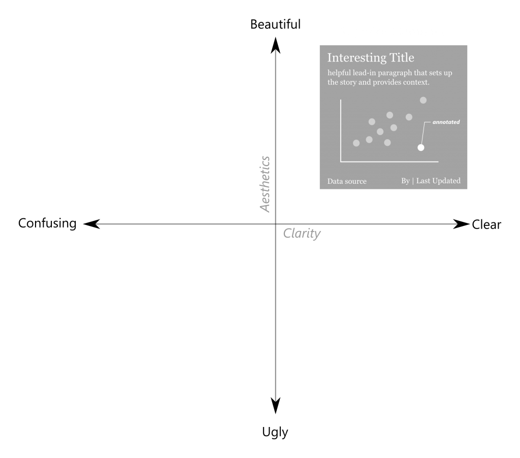
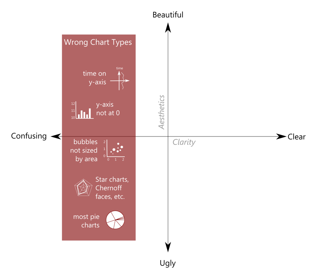
2. Avoid horrifying your audience with poor design elements.

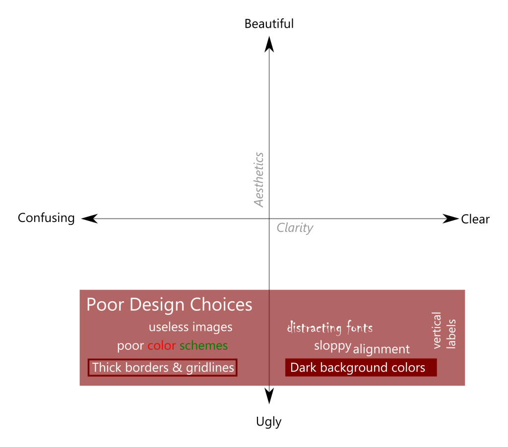
3. Incorporate helpful elements to increase both clarity and aesthetics.

Reference: http://dataremixed.com/2012/05/data-visualization-clarity-or-aesthetics/

A Quick Guide to Spotting Graphics That Lie

1. BROKEN SCALES SHOW DRAMA WHERE IT DOESN’T EXIST.

This might be the most common way graphics lie. Something that changes by 1% over 10 years and something changes by 100% over 1 year could look like exactly the same trend and range on the chart. Be careful with the truncated Y-axis, which is quite misleading.  A good example is:

At a glance, the blue bar looks much bigger than the red bar, as the Y-axis starts from 0.400 and each point is 0.05 more. However, when displaying the data with a zero-baseline Y-axis tells a more accurate picture, where the difference is not that much.

2. SHOWING DATA ON TWO DIFFERENT SCALES CAN MAKE FOR AN UNFAIR COMPARISON.

Is 100kg more or less than 10 feet? You can’t give the answer, right? Because the units are different. We can’t compare two different elements, even though they are in the related field. A good example is:

Looking at the chart on the left could make you think U.S. gross domestic product (GDP) surpassed the unemployment rate around March 2015. But that comparison is meaningless if you put them in the same graph.

3. IGNORING POPULATION SIZE MAKES RATES IMPOSSIBLE TO COMPARE.

When talking about number, translating to percentage is usually more convincible and scientific, as you should keep in mind the whole population or the total. A good example is:

Chicago suffered more murders in 2014 than Detroit, but that doesn’t mean they’re more dangerous. If you consider the population of each city, the comparison changes greatly, as Detroit came to the most dangerous position.

4. DECORATION CAN BE DECEIVING.

Be careful when you choose some very shinning charts. Too many decorations may display the real value in a misleading vision. A good example is:

A 3-D model looks more modern. The number shows that Christians should be the biggest group. But due to the 3-D effect, the Muslims seems occupies a larger amount of green on the left chart.

Reference:

http://blog.heapanalytics.com/how-to-lie-with-data-visualization/

http://news.nationalgeographic.com/2015/06/150619-data-points-five-ways-to-lie-with-charts/

Tips For Effective Data Visualizations

  1. Use Good Data: Data quality is the first principle. Good data should be accurate, concise, and valuable. Use the data that is meaningful and targeted to the reader rather than some common knowledge that everyone knows.
  2. Tell a story: Make your visualizations as a logical story. Although graphs, charts, tables are helpful and attractive, they are not all of your presentation, but proper complement to boost your message and idea.
  3. Choose right visualization and keep it simple: Some graphs could be very creative, colorful, fancy, but make sure you choose the proper and right visualization and keep it as simple as you can. Because the goal of visualization is to display your data accurately and easy to understand.
  4. Label the data: Give as much description and information to your figures, statistics, etc, so that the data is more easy to comprehend.  For instance, a title tells what you are going to interpret; an aix on the graph tells how the data is measured.
  5. Organization is the key: Good organization helps readers digest the information you want to convey. The organization of graphs and charts includes using the solid line or non solid lines, misrepresenting data, obscuring your data, etc.
  6. Be open to unexpected insights: Schedule a little bit more time in your iteration for dealing with unexpected insights. When a new insight is uncovered, try to think about the impact. Sometimes, an insight looks like not directly relative to the topic, but you’ll find it delivers business value in the end.

Reference: 

  1. https://www.thoughtworks.com/insights/blog/five-principles-effective-data-visualizations
  2. http://www.copypress.com/blog/9-tips-for-making-your-data-visualization-more-effective/
  3. https://blog.hubspot.com/marketing/data-visualization-mistakes#sm.0001sa9p6lkrrcpjval18kj8srjdb