Using heat map for tracking a website

Heat maps are useful for a website tracking mechanism. These days it is the analysis of eye versus mouse tracking. Here is an interesting fact, analysis shows that only 10% hovered over a link and then continued to read the page looking at other things. A heat map is used to show which areas of the page are viewed most by the browser user.  Following are some interesting types of heat maps on a website:

  1. Algorithmic heat maps – gives low traffic sites and idea of how people use their site
  2. Click heat maps – gives an idea where people are clicking and where they aren’t
  3. Attention heat maps – help you see which parts of website are most visible to users
  4. Scroll heat maps – Scroll maps are interesting way to till what limit users scroll down and where users tend to drop off. This helps business to prioritize the content.

Heatmap tools are used with interesting algorithms to analyze the user interfaces. Analyzing user interface takes into account colors, contrast, visual hierarchy etc. The analytics tells the business what is working and what is not, further, helps them to optimize their website. If business wants to introduce something new on the website, the heat map can be used what could be the best place for it. This is helpful for business to enhance the areas that are getting more clicks and removing the areas not getting enough clicks.Text can be altered to see what is holding the attention of visitors

Disadvantages:

  1. Business uses it for support instead of illumination
  2. Ignoring some data inaccuracies can open up to a completely different results
  3. Heat maps can be helpful at a high level and as a way to communicate problem areas to less analytically savvy in the organization.

Overall, this is a great tool for optimization of a web page but should not be used as the only source of determining project and test planning.

References: https://conversionxl.com/heat-maps/

https://www.linkedin.com/pulse/20140915173712-76871428-what-are-the-benefits-of-using-a-heat-map-for-a-website
Visualization Tool – QlikView

This blog is about comparing Tableau with another tool called Qlikview, for creating visualizations.

These days the performance driven executives only have a few seconds to convince a skeptical audience. The most effective way to convince an audience is by using graphs, visualizations and interactive dashboards that tell a story. The visual elements that one uses should have clarity and easy comprehension to complex business messages. These days with the intervention of big data, people do not want to just have the graphics, they want to create business insights from that data and analyze the trends and patterns.

For this, there are three tools in the market – Tableau, QlikView, D3.js which are worth mentioning. These are known to have gone beyond the average capabilities of the text and present ad-hoc reports. These tools have the capability of giving the user easy access to manipulation with the data and present some business intelligence advantage and create interactive analytics. However, I want to discuss more about QlikView as it has not been discussed during this course.

QlikView is a more specific Business Intelligence or BI tool which is now expanding at a rapid rate globally. It offers an integrated BI platform and comes bundled with demos, training manuals and tutorials. It also comes with the ease of deployment and configuration. It has a patented technology called ‘associative technology’ which can help in deriving intelligence and insights on demand. Another point of distinction is that it loads all the tables into memory to enable interactive queries and create reports. However, QlikView seems to lack the logical structure and GUI is not as impressive as Tableau. Also, the visual outputs are time intensive and not intuitive as Tableau.

Reference: https://www.experfy.com/blog/qlikview-vs-tableau-review-two-visualization-giants

Tableau ‘Show Me’ tab – to use or not to use?

We all struggle to present the data in the most impressive visualization in Tableau. Most of the times, the ‘Show Me’ menu comes to our rescue. One of the most common mistakes in designing graphs is choosing the wrong graph type from this menu. Below are its possible issues:

  • Upon selecting the parameters when you click on ‘Show Me’, it stops you from thinking out of the box and limits your creativity.
  • Few very useful chart types are never displayed. Chances are that once you select the measures and dimensions; the tab gives you a bunch of options and neither fits the claim.
  • Sometimes, it portrays chart types that should never be used. For instance, for creating the visualization of the market share, it shows the options of pie chart, which might display a complete misleading claim that the you want to tell.

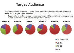
This can be substantiated by looking at the following visualization:

audience-pies

Issues with this visualization:

  • It has perceptual problems as no labeling of the shares is done
  • Very difficult to make comparisons for the same age across multiple brands
  • Results are conveyed but cluttered with long text
  • It uses multiple pie charts

How this graph is improved:

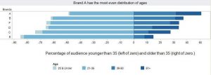
brands1

  • It facilitates age comparisons much better than the multiple pie charts and enables the audience to see the age distribution of each brand
  • The color scheme is subtle yet powerful. The color intensity increases with increasing age, so one need not refer to the legend at every brand
  • The legend and labeling is clearly shown with age groups
  • The intended message to be sent across to the audience is displayed clearly

One needs to think of the best way to put across the claim of the visualization without limiting to the existing charts. 

Reference:https://www.forbes.com/sites/naomirobbins/2011/11/29/thinking-outside-the-chart-menu/#1b4d7b59171a

Connected Cars (3D Really?)

We all know that IoT aka Internet of Things is one of the most talked about topics today. You’ll be amazed to know that approximately 23 million vehicles around the world have internet access and big data such as engine controls, driving behavior and automatic crash notifications are going and getting uploaded on the cloud. It is predicted that by 2020; 152 million vehicles will be connected via internet.

Let’s look at this visualization and see if it has succeeded in what it is trying to convey.

Visualization link: Connected Cars

While 3D visualizations can provide rich information, many people have trouble comprehending them. This visualization presents an amalgamation of graphs which are beautifully represented in vibrant colors and each one utilizes different forms. However, the fundamental issue with this visualization is that this uses unjustified 3D graphs. In this, 3D is offering no increase in viewer comprehension. The first four dashboards are still easy to decipher, however, the major problem lies with the last two.

For instance, the fifth graph represents two features merged into one i.e the most innovative car maker for communication and the most innovative car maker for drivers assistance based on an index score. Firstly, the graph shows no mathematical correlation between these two indexes.Secondly, the graph is presented in overlapping 3D triangles with the values labeled with long lines placed close to each other making it difficult for the audience to compare two companies on this index (eye beats memory!!). This representation actually confuses the audience in terms of judging the depth, size and position of objects and could be presented in relatively simple bar graph comparative.

Finally a pie chart is used to represent driver’s willingness to share the connected car data with OEMs, that too in 3D (double mistake). The colors used also overlap and interfere with the interpretation. If observed closely, the 34% drivers who anonymously want to share the data and 31% who wish to share data in lieu of an incentive has only a percentage point difference of 3; however, on the graph it seems that the difference is more because of the unnecessary 3D effects poured in the pie chart.

This visualization can be improved by rotating the axes to make its cross section perpendicular to the planes of presentation. Any suggestions from the readers are also welcomed on how to improve this visualization.

References:

https://www.tableau.com/sites/default/files/whitepapers/dashboards-for-financial-services.pdf

http://onlinelibrary.wiley.com/doi/10.1002/meet.2011.14504801345/pdf

Facebook Friendships

This visualization is extremely interesting with good aesthetics. As was discussed in class last week, this visualization covers most of the important aesthetics concepts such as getting it right in black and white (almost), no unjustified 3D and resolution over immersion.

Facebook worldwide friendships mapped

However, it is not as simple as it looks like. A lot of background analytics have gone into consideration before preparing this visualization. Let’s see how to decipher this.

Firstly, weights were defined for each pair of cities as a function of distance and the number of friends between them. Then the cities with were connected using the count of number of friends. The cities with the most friendships between them have been drawn on the top of others. The color ramp has been beautifully used so that the lines are created depending on the weights; which also means that the stronger the connections, the lines would be more visually prominent.

However, there are some fundamental problems with this visualization. Firstly, there is no legend or text representing what the visualization is all about. There should be a mechanism for the audience to know what it wants to assert basis the color, thickness and degree of shading of the connected lines. Secondly,  few areas on the map show no lines and is dark. This may be due to the fact that Facebook has not reached those locations or the usage is not prominent in such countries or the data is unavailable for all such locations; which is not clear from the infographic.

The visualization could be improved by making it more interactive. A highly visual dashboard like this should enable the audience to perform basic analytical tasks such as drill down and examine the underlying data. For example, if one wants to zoom in and see the number of the friendships within the country or with another particular country; one should be able to do that.

Immigration and banned countries

Recently President Trump released an executive order to ban immigrants from seven countries. This visualization is simple yet powerful in conveying how it will impact the immigrants who already are living in USA and what is their education, salaries, etc.

Demographics for immigrants from banned countries

The immigrants from these seven countries constitute to about 2% of the total population of USA. The dashboard shows the percentage of the immigrants and their level of education and comparing them to the US national average. It can be seen that immigrants from Iran, Libya and Syria with advanced degrees is higher than the US national average in this domain.

Further analysis shows that residents from Iran and Syria are more likely than the population to be engineers, managers and teachers. These immigrants are also scattered in almost every state. With the US Median salary for such blue collar jobs is $54,645 pa; the salary of Iranians in the same job bracket is over $65,000. 

The dashboard also shows that the figures for Iran residents is higher than the other six banned countries, because the number immigrants from Iran prospered from 1980’s to 2010, which means that the higher the number of immigrants; higher with be the absolute number of managers, engineers and people holding blue collar jobs. As discussed in lectures, in this case, enumerating the figures in ‘percentage’ or ‘average’ is a better representation of these statistics.

Further, the representation of now-citizens has been appropriately depicted in percentages, most immigrants have now become residents of the United States. Further, about 10,000 of these immigrants have also served in the US Army. Also. the residents are also scattered geographically, with no specific area of concentration.

As per news reports from NY Times, more than 856,000 people have been affected by this ban but only 3 of countries were known to be in violent attacks since 2001.  Most accused have been from countries not listed in the ban and many were born in the United States.

We will have to wait and watch on how the ruling will actually affect the immigrants, visa holders and permanent residents.

Real time Web Monitor

Today’s blog is about the real time information about the traffic and web attacks worldwide.

This activity is performed by a company called Akamai. It constantly monitors the internet conditions on these two parameters worldwide and presents on the graph real time.

https://www.akamai.com/us/en/solutions/intelligent-platform/visualizing-akamai/real-time-web-monitor.jsp

These two graphs serve the following purposes:

  • Monitoring greatest web traffic
  • Cities with the slowest web connections also known as latency
  • Geographic areas with the most web traffic also known as traffic density

This visualization is interactive and one can look at the network traffic and attacks country wise.

Analyzing this visualization, one can observe that the highest network traffic is in the UK and European subcontinent. However, the maximum number of attacks is in California with an average of 1,423,212 attacks per 24 hours.

However, it seems like this monitoring tool focusses on only certain areas and does not provide a comprehensive overview of the attacks in countries like Canada; South American and African countries. Further, no information is available for the network traffic in the Indian subcontinent. This does not mean that there is no network traffic in those areas but it means that the comprehensive data is not available for all the countries.

Happy 10th Birthday to iPhone

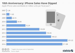
Today’s blog is about the iPhone sales and how the trend has been. The iPhone hit a milestone when it turned 10 years old but the graph doesn’t look very encouraging. The iPhone sales shows a dip of 19.34 million units in fiscal year 2016.

a

As seen in the initial years, the growth of iPhone sales increased at a rapid rate showing an outright success story till 2015. However, the percentage growth in sales, as compared to previous year, had already started declining.

One might infer from this graph that since the iPhone sales declined in 2016, Apple faced losses. But in fact this is not true. Apple has multiple other businesses apart from iPhone. So if seen otherwise, overall Apple is doing exceptionally well. Apple reported its quarterly revenue of whopping $46.9B, making it one of the most profitable companies in the world.

Since 2017 marks the 10th birthday of the iPhone, people are eagerly waiting for the new iPhone release this year and hoping that the graph also shoots up for the new iPhone.

Source:www.apple.com/newsroom/2016/10/apple-reports-fourth-quarter-results

https://www.statista.com/chart/7469/the-iphone-still-is-apples-cash-cow-despite-declining-sales/?utm_source=Infographic+Newsletter&utm_campaign=9874be6e6c-InfographicTicker_EN_Early_00004&utm_medium=email&utm_term=0_666fe64c5d-9874be6e6c-295733669


Its time for Trump

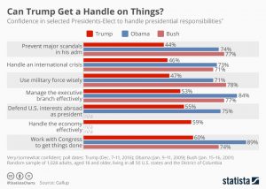
With just a day left for Trump to take the Presidential oath, here is an interesting comparative analysis based on a survey conducted by Gallup. This showcases how much Americans are confident that Trump will be able to handle his presidential duties as compared to his predecessors – Obama and Bush.

1

The visualization presents that Trump has a much lower favorable rating of how he would be able to prevent major scandals, handle an international crisis and even defend U.S. interests abroad as a President as compared to his predecessors.

This visualization may be misleading to a few, unless one looks at it closely. This survey does not actually show the presidential capabilities and success of the Presidents in their respective offices. The results are based on the responses of how Americans predict his Presidency would be, before the President actually takes the office.

This is due to political polarization and low trust in the government that has created an opinion that is more challenging for Trump as compared to the predecessors. Looks like Trump will begin the office with much less support from Americans. But this is in no mean a parameter to estimate the success of Trump’s actual Presidency.

Source: http://www.gallup.com/poll/201158/skeptical-trump-handle-presidential-duties.aspx?g_source=Politics&g_medium=lead&g_campaign=tiles

https://www.statista.com/chart/7394/will-trump-get-a-handle-on-things/?utm_source=Infographic+Newsletter&utm_campaign=156ba881b2-InfographicTicker_EN_Early_00004&utm_medium=email&utm_term=0_666fe64c5d-156ba881b2-295733669


Nokia – Microsoft acquisition. Worth it?

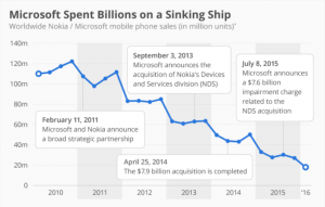
In early 2000, Nokia was at the most luminary position in terms of mobile phone market. However, within a decade, Nokia was uprooted from the mainstream market due to numerous reasons. In 2013, Microsoft acquired Nokia for $7.9 Billion, to provide Windows Operating System for the Nokia mobile hardware and it was hoped that Nokia shall revive its market position. Microsoft invested in Nokia with the aim of providing hardware for its Operating System. However, as rightly shown by the visualization shows below, Microsoft spent billions on a sinking ship.

Microsoft-Nokia

The figure depicts the Nokia mobile phone sales from 2010. When Microsoft announced the strategic partnership in 2011, the global sales of the Nokia mobile phones was 105M. When the partnership was materialized in 2013, it fell drastically to 61M. Further, towards the completion of the acquisition in 2014, Nokia’s ship had already sunk with the global sales to a meagre 40M only. This depicts a sales dip of 62% in just 3 years. Leading this, Microsoft announced acquisition impairment charges of $7.6B.

Microsoft is the leader the Desktop OS, but it completely failed to integrate its software to Nokia’s hardware. Hence, Microsoft could not revive Nokia’s sinking ship even after being the market leader in desktop OS.

Source:https://www.statista.com/chart/4848/nokia-and-microsoft-mobile-phone-sales/