What Happened to the Photography Industry in 2016

This article gives four ideas about the camera manufacture industry and the market forecast: Smartphones killed the compact camera market, Mirrorless are not fulfilling their promise, The DSLR market is shrinking, and Cameras are for older people.

Audiences: Anyone who cares about the camera industry. The competitor of the camera industry  such as iPhone and

Purposes: Show how the camera industry changes during 2009 to 2016, and make predictions for the next couple years.

Advantages: This dashboard contains a lot of information. The use of color is favorable, some of the data are highlighted with bigger font so that audience can get the idea quickly.

Disadvantages:

When you look close into the graph, there are many logical mistakes and some of the visualization do not make any sense.

In the left corner visualization, 5.9 million cameras is more than 6.3 million cameras.

Below the career market overview, 34% share of the camera market is more than 52%.

108 non-interchangeable lens cameras were made in 2010, but 108 cameras is the same as 100 cameras when put on an axis.

To conclude, some of the visualization have logical problems. I recommend using tableau to generate the dashboard.

Reference:

https://lensvid.com/gear/lensvid-exclusive-happened-photography-industry-2016/
Data Visualization Charts from the U.S. Congress Floor: The Good, the Bad and the Ugly

This article analyzes how data visualization charts are used in United States Congress. It gives good, bad, and ugly examples to give the idea that not all congressmen are good at data visualizations, and sometimes, they fail to convey their ideas to their audiences.

Audience: Congress, CSPAN audience, public who concern about this topic.

Purpose: Using data visualization to show how important their proposals are, and influence them voting for them, not voting against them.

Advantage: A simple and powerful bar chart will represent the data clearly and convey a simple idea to the audience. For example, the first bart chart in “The Good” part created by Senator Dianne Feinstein send a clearly message: “Two-Thirds of Gun Owners want to renew the assault weapons ban.”

Disadvantage: Since the article is written in 2014, probably most of them are lack of data visualization knowledge. I see two bar chart and two hamburgers in this blog post. From this class, there should never be bar charts in the congress. They should consider  using tableau instead of drawing cars like the last visualization. Since the data visualization technology is developing fast nowadays, i believe it is better for congressmen to take one or to data visualization class.

Reference:

http://www.scribblelive.com/blog/2014/05/12/data-visualization-charts-form-the-u-s-congress-floor-the-good-the-bad-and-the-ugly/

The Top 100 Defense Contractors in the US by Country and the Money US Pays them

You can find the data visualization here: https://www.reddit.com/r/dataisbeautiful/comments/5wzqtw/since_were_looking_at_defense_spending_heres_the/

Audience: Anyone is interested in How many companies are helping the US defense

Purpose: In the data list, the audience can only see the rank, and sort each column by clicking headers. Using charts or graphs to visualize confusing data is easier than poring over spreadsheets or reports. In this case, the visualization can easily show which company contribute the US defense.

Advantage: Audience can easily see which country has the most companies.

Disadvantage:  The audience can read only about 50% of the company names on here. Need a better way to label.

I know the color code represents the country. However, in the right bottom corner, it is a little confusing for the audience to extinguish the difference.

Some possible solutions:

I will switch the color code from country to continent, it will be easier for the audience to group them. Also. it will give extra information about US’s relationship among those countries. Also, put some company details in the graph will be good.

Reference:

http://people.defensenews.com/top-100/

Fantasy Football Dashboard Advantages and Disadvantages

http://overflow.solutions/special-projects/2016-fantasy-football-dashboard/

This Dashboard shows the creator’s Fantasy Football Draft. There are four graphs in the dashboard: Player listing sorted by project score, points by rank, box plot of projected FF points for each player by position, and points by position and team. All the four graphs are interactive, and i believe the interactiveness creates better understanding of the data visualization as well as confusing the audience.

Audience: Anyone interested about the fantasy football, and want to be successful in it.

Purpose: Help the audience to choose a good pick.

Advantage: They are many information in this dashboard. The interactive part makes it easy for audience to filter the data. The use of color help the audience understand the role of players.

Disadvantage:

  1. In the points by rank graph, it is hard to distinguish the cross, circle, square, and etc. in the small interface. Also, in the dashboard we do not know the difference between the symbols.
  2. The audience may get confused by so many filters. Maybe do not group them together and put them closer to the graph.
  3. Do not like the player search option, there are not so many player in the database. Barely use it.

To sum up, is you are new to the fantasy football, this graph will confuse you. If you are a addict player, this data visualization may help you a lot.

Reference:

2016 Fantasy Football Dashboard

http://overflow.solutions/special-projects/2016-fantasy-football-dashboard/

KPI Visualization Analysis

Since this week we are introduced what is a KPI and how KPI consists of. I choose to analyze a mediocre KPI design.

http://www.dashboardinsight.com/dashboards/tactical/perpetuum-money-maker.aspx

This dashboard is supposed to help traders report all their activities to their customers: when the traders sell or buy, customer daily profit, market KPI’s for exact date and time, risk level. So, customers get a clear idea of what was a situation and why the trader performed in this or that manner. Here are some key changes that this dashboard needs to change:

— Remove all the 3D segment in the graph. We have talked about 3D data visualization in the previous class. Most of the time, it does nothing other than confusing the audience.

— The top right table contains too many raw data and detail. Actually, the data is not even visualized in the dashboard. The author should follow the rule: KPI = metric + goal + action + time frame. A gauge with a leveler graph will work.

— Unidentified figure in the left bottom corner.

— Un identified figure in the Day Result table. what does the figure “81” and “245” mean? Properly label widgets should be added to this dashboard, ensuring the viewer quickly knows the meaning of them.

Reference:

Perpetuum Software’s Personal Moneymaker Dashboard

http://www.dashboardinsight.com/dashboards/tactical/perpetuum-money-maker.aspx

Key Properties of Interactive Data Visualization

“Data may not contain the answer. The coordination of some data and an aching desire for an answer will not ensure that a reasonable one can be extracted from a given body of data.” While Tukey (1915-2000)

In order to build a successful interactive data visualization, the graph should have these properties: the Novice User, Driving Processes, Data must tell a Story, Data Correlation, Prescriptions: “What should happen next?” 

To verify those opinions I choose one of the most famous interactive data visualization introduced by Hans Rosling:

http://www.gapminder.org/tools/#_state_time_value=2015;&marker_select@;&opacitySelectDim=0.00;;&chart-type=bubbles

The Novice User: the interactive visualization is ordered by the time and country. it is very easy for novice user to play with, and obviously we can see overall the life expectancy is increasing. Also, the difference between countries and continent is showed clearly.

Driving Processes: The visualization use animation to show the audience how the population changes years from years.

Data Must Tell A Story: Hans Rosling even make a 4-minutes video for the story part. Pease check the reference.

Data Correlation: The user can immediately know not only of hot spots that require attention, but also effortlessly find trends based on the dynamic relationship.

Prescription: What should happen next?

Please see the youtube down below, there is an overall trend at the end of the video.

Reference:

Hans Rosling’s 200 Countries, 200 Years, 4 Minutes – The Joy of Stats

https://www.youtube.com/watch?v=jbkSRLYSojo

Life expectancy vs Income

http://www.gapminder.org/tools/#_state_time_value=2015;&marker_select@;&opacitySelectDim=0.00;;&chart-type=bubbles

Five Key Properties of Interactive Data Visualization

http://www.forbes.com/sites/benkerschberg/2014/04/30/five-key-properties-of-interactive-data-visualization/#28008b0a44eb

Interactive data visualization

The following data visualization has four buttons for audiences to select different years:

https://flowingdata.com/2016/06/28/distributions-of-annual-income/

Last lecture we talk about the if we need to use interactive data visualization to make our point. In my opinion it depends on the case, and i do not think too much interactive things are helpful. Take the above visualization for example, the author only give four choices: 1960, 1980, 2000, 2014. Also, the data visualization has animations when user switch years. The animation plays an important role in this visualization because we can see and compare the amount changes between different majors. I find it super fun to play with this data visualization even though it has four choices.

So, my conclusion is, as long as the interactive data visualization can give use an idea about the difference between selections, it is a good visualization.

Also, I found an article about how to make interactive data visualization successful. Maybe I will table about it int the next blog post.

http://www.forbes.com/sites/benkerschberg/2014/04/30/five-key-properties-of-interactive-data-visualization/#eb593ab44eb0

A visual guide to Donald Trump’s media habits

If you are an heavy social media user, your life could be easily visualized like the following graph. As we know, the new president of United States of America Donald Trump is a heavy twitter user. He tweets almost about everything in his life including the newspaper he reads, the movie he watches, etc. As a result, the Washington Post posts a week visual guide to Donald Trump’s media.

https://www.washingtonpost.com/news/politics/wp/2017/01/24/a-visual-guide-to-donald-trumps-media-habits/?utm_term=.2ce7d83b2136

As we can see, if Trump does all his tweeting by himself online, we can generate a week schedule by visualizing the data. Today, CNN reports that White House discussing asking foreign visitors for social media info and cell phone contacts. I believe visualizing the social media data is one way to track and forecast terrorist attack.

Next bar chart shows what Trump has tweet about watching:

https://www.washingtonpost.com/news/politics/wp/2017/01/24/a-visual-guide-to-donald-trumps-media-habits/?utm_term=.2ce7d83b2136

In the original post, the author does not explain what is the axis stands for. So one improvement the visualization could make is to say more about the above picture. I assume the figure stands for the frequency in one week.

Reference:

https://www.washingtonpost.com/news/politics/wp/2017/01/24/a-visual-guide-to-donald-trumps-media-habits/?utm_term=.2ce7d83b2136

Choose Your Ideal Analytic Job Market

Screen Shot 2017-01-22 at 1.29.06 PM


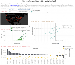
The dashboard above is to show which cities should a software developer choose. Four data visualizations are showed to audience including 2015 software developer job distribution in US, Jobs vs. Income, City live ability Score vs. Median Salary, and % Change in Jobs. The project is posted in the tableau website, and users can also check other kinds of jobs visualization including Research Scientists, etc.

The first impression I make is there are so many information in this dashboard. If a data analytics show this dashboard to his boss, the boss will probably get confused by those words. One solution can be implemented to this project is the author can create another visualization include all four aspects, and ranking those cities. When the author shows his work to other people, he can show top three cities for each aspect. I do not think anyone prefers staying at those bottom cities.

Reference:

https://public.tableau.com/profile/matt.wheeler#!/vizhome/ComputerandAnalyticsJobMarketsAcrossUS/WheredoTechiesWanttoLiveandWork


Changing the Game

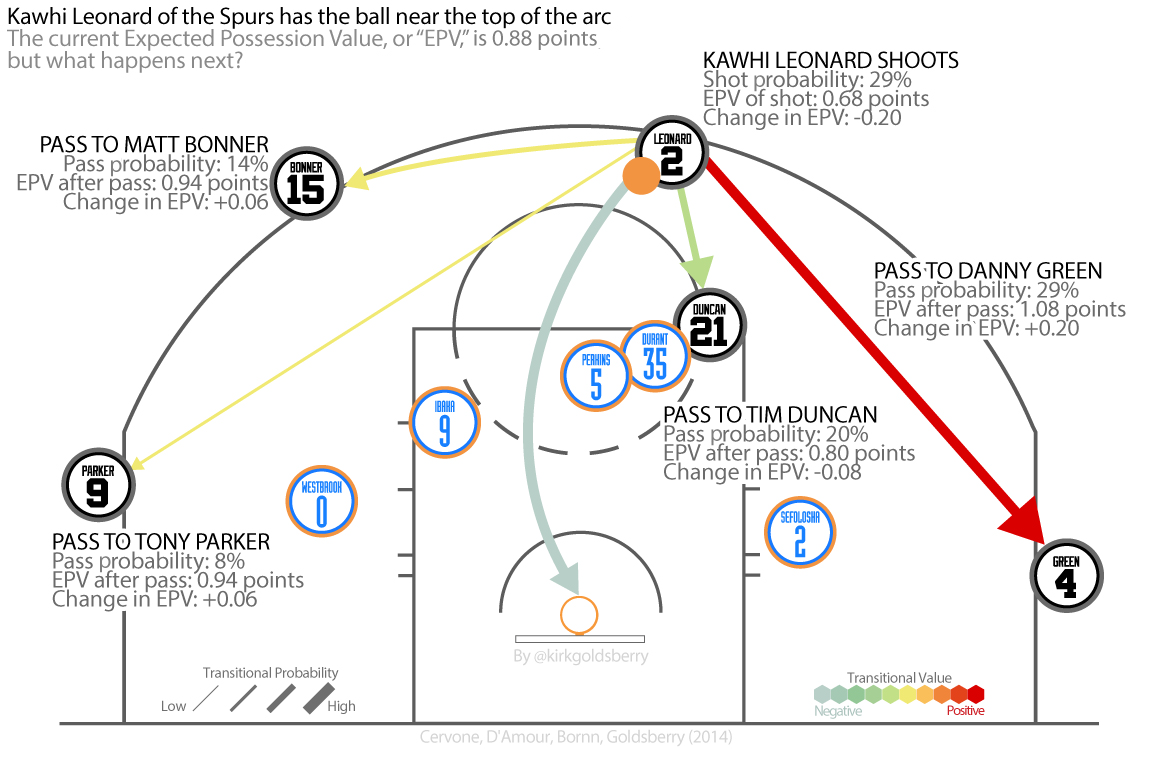
Data visualization in sports is straightforward. For example, the most intuitive way is to show the ball movement in basketball court is to visualize the data on a basketball court like below.

Like the graph shown, the best decision that Kawhi Leonard choose would be passing the ball to Danny Green at this point. It will give the team EPV(expected possession value) 1.08 points. the data visualization using the color from light to dark to show the transitional Value. The visualization is very easy to interpret. Coaches may change their decision bases on this.

For the data prepare and cleaning, the STATS SportsVU cameras are installed in arenas. The camera set tracks every ball movement and the results. So the data is very reliable.

The visualization will not only show the ball movement decision, but the player movement. There are 82 games for one NBA team to play in one season. Then the file size, complexity and success rate are going to increase. So in the future, basketball will not be the only sports using this technology. The way athlete playing the game is going the change.

One more thing I found interesting in basketball data analytics is that not everyone is buying it. For example, Charles Barkley, a former NBA player now a basketball commentator at TNT, constantly raging against the correlation between basketball data analytics and team performance. It is always fun to watch old school analytics arguing with new one.

Reference:

Welcome to Smart Basketball

https://www.theatlantic.com/entertainment/archive/2015/06/nba-data-analytics/396776/

Taking Data Analytics to the Hoop

http://www.ibmbigdatahub.com/blog/taking-data-analytics-hoop

NBA drafts Big Data

https://rc.fas.harvard.edu/news-home/feature-stories/nba-drafts-big-data/